|
| Group |
Round |
C/R |
Comment |
Date |
Image |
| 77 |
Mar 24 |
Comment |
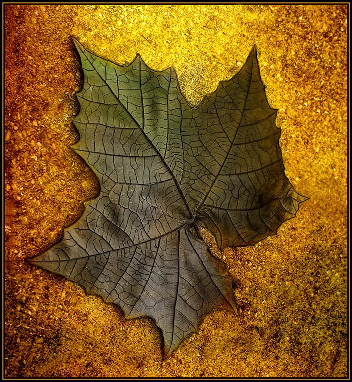
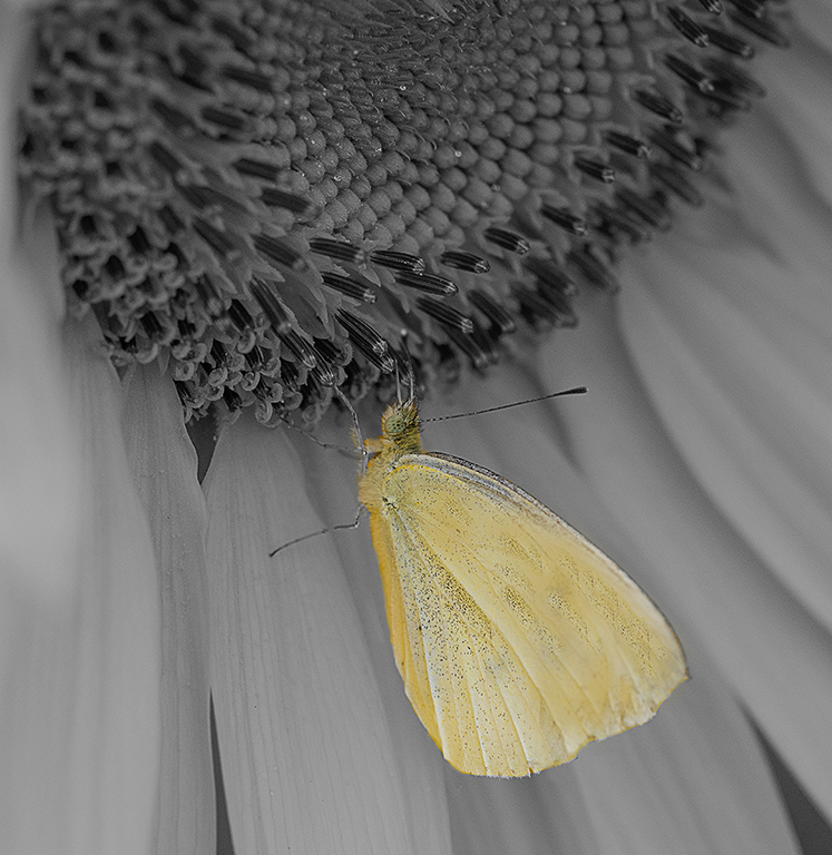
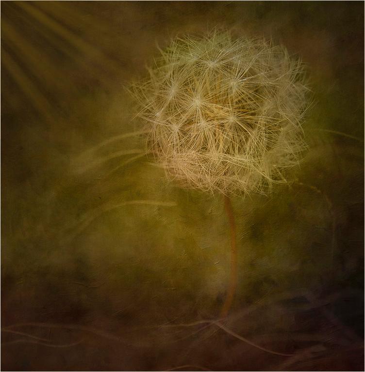
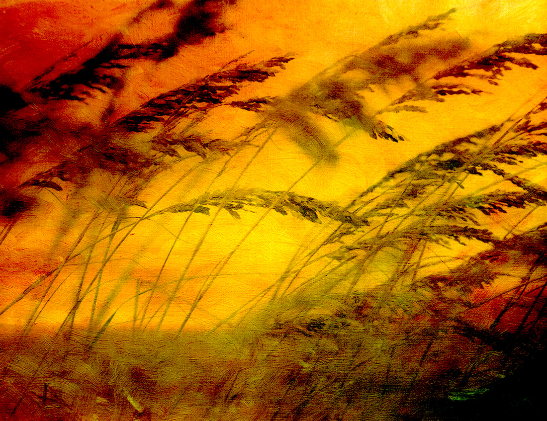
Jan, This image is very creative. Love the tones and the textures with a little hint of color. I really like the detail in the objects when I cropped it a little. I flipped it. This image is a fine art piece. Love it. |
Mar 17th |
 |
| 77 |
Mar 24 |
Comment |
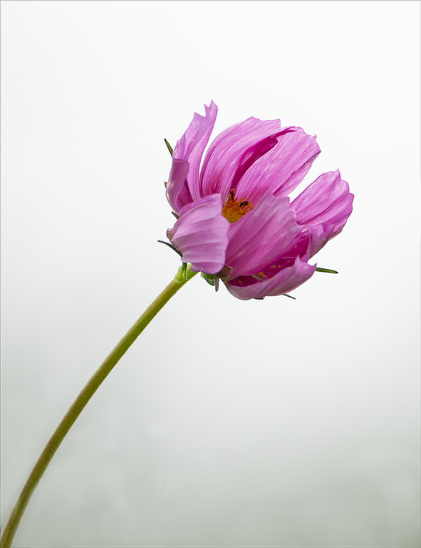
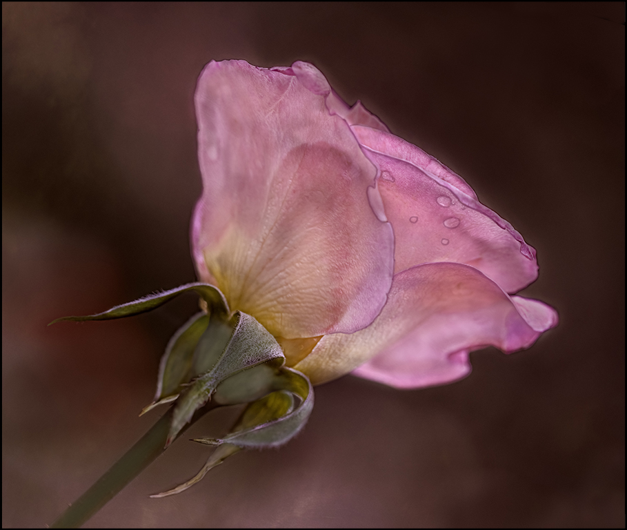
Denise, I really love your image. When I first looked at it, I thought it would be beautiful too in Black and White. After Jan put her visual feedback. I thought I really like her feedback too. So, I have the image with more space and the flower at more of angle and Black and White. I find the green stem is a little too much contrast. But, I love the image and the way everyone has viewed it so differently and all look great to me. |
Mar 17th |
 |
| 77 |
Mar 24 |
Comment |
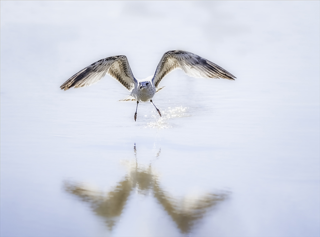
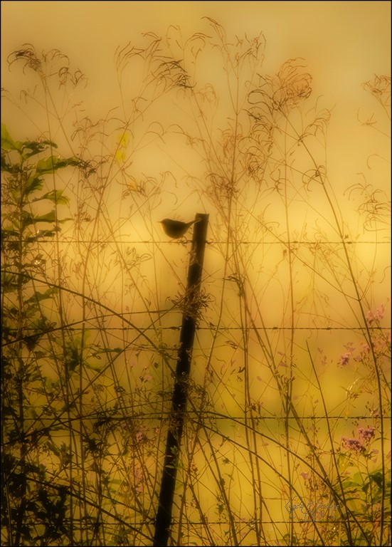
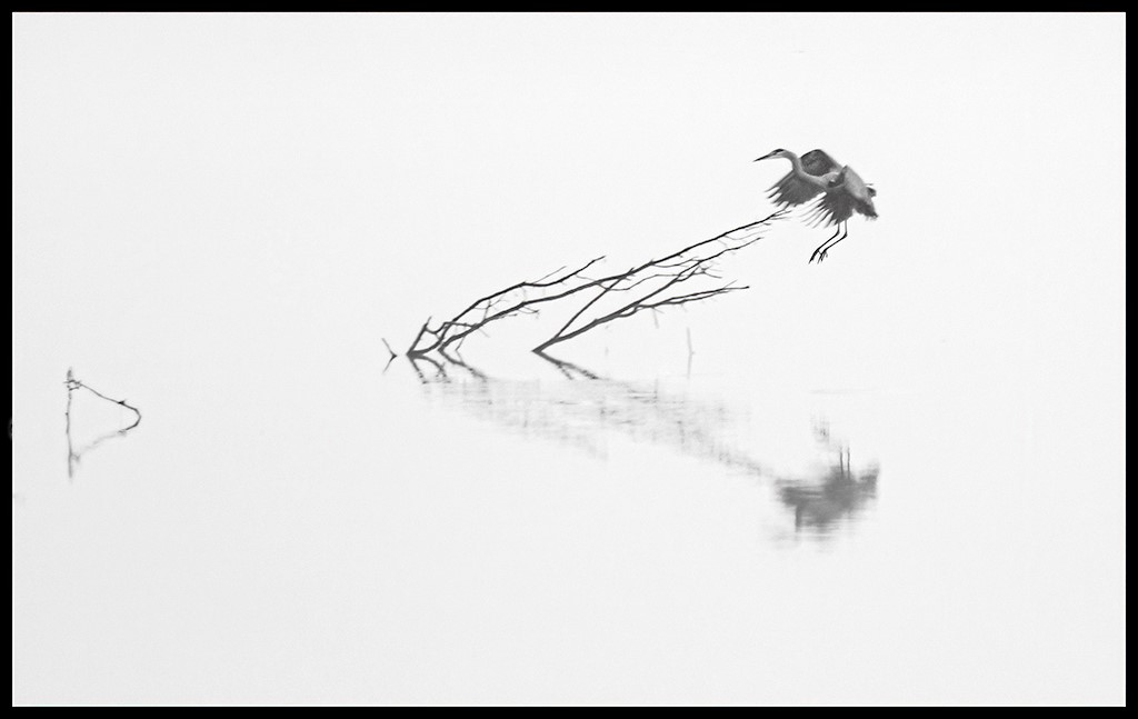
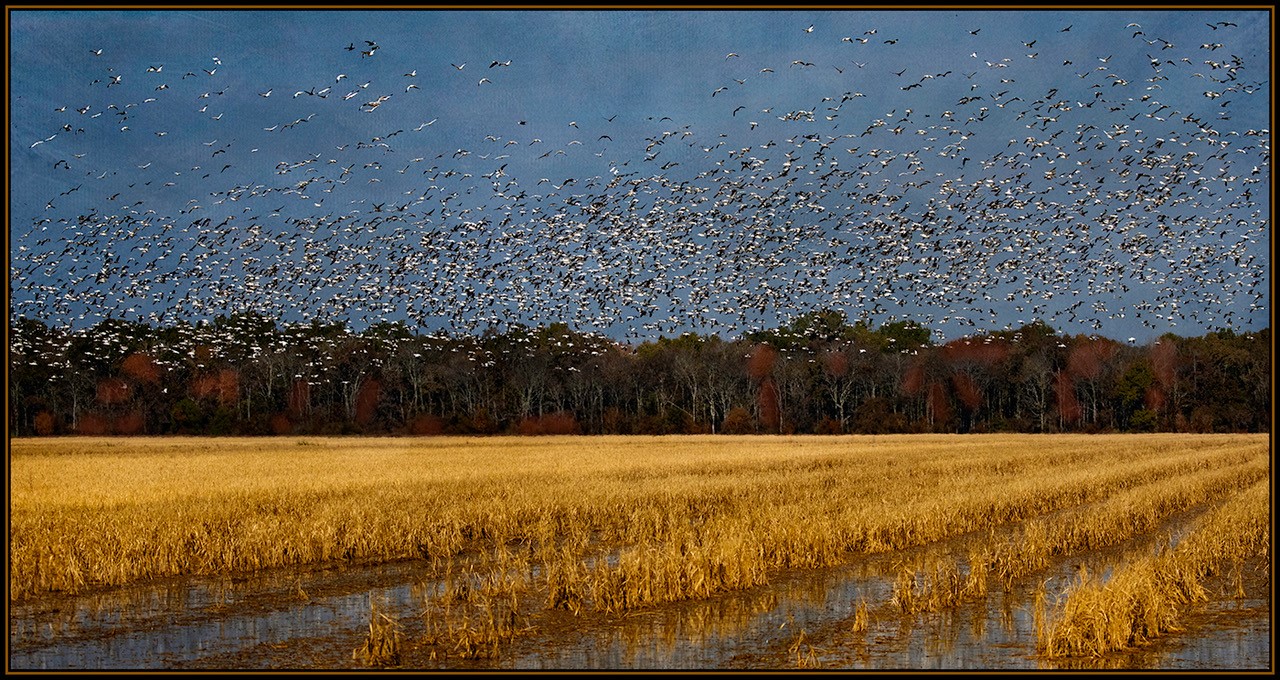
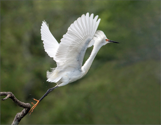
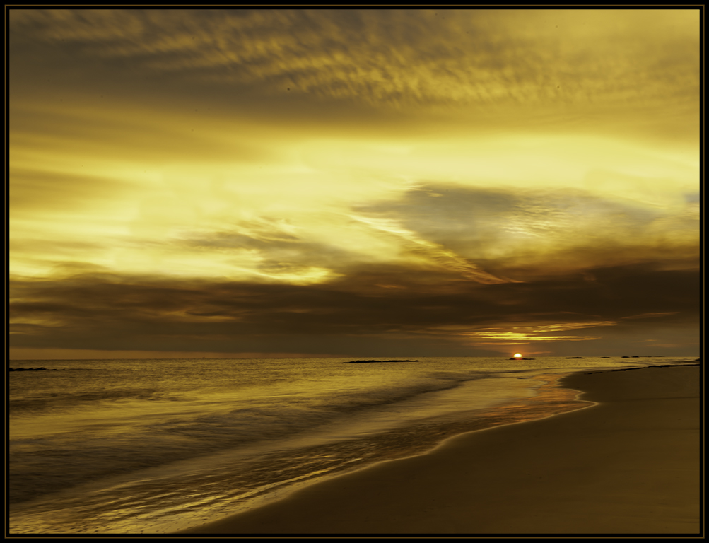
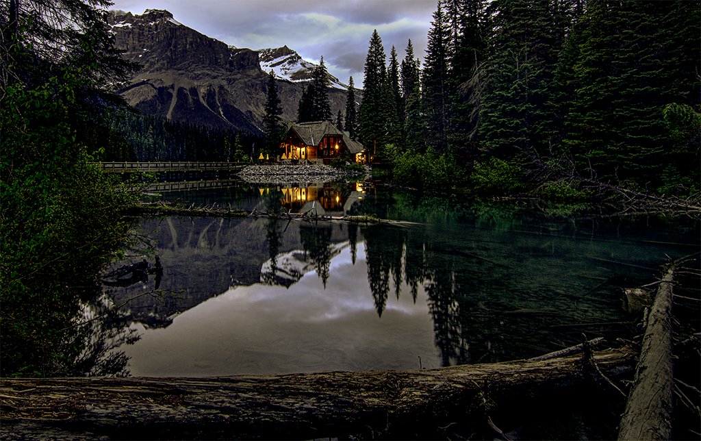
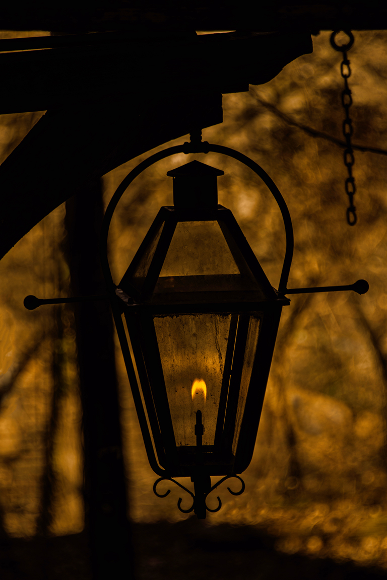
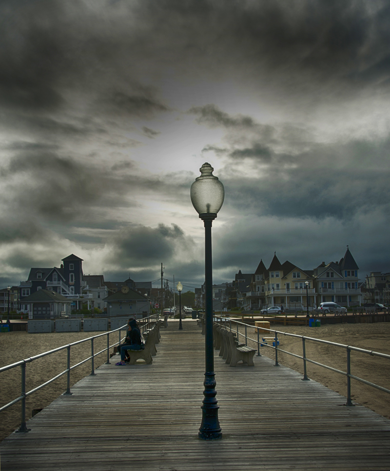
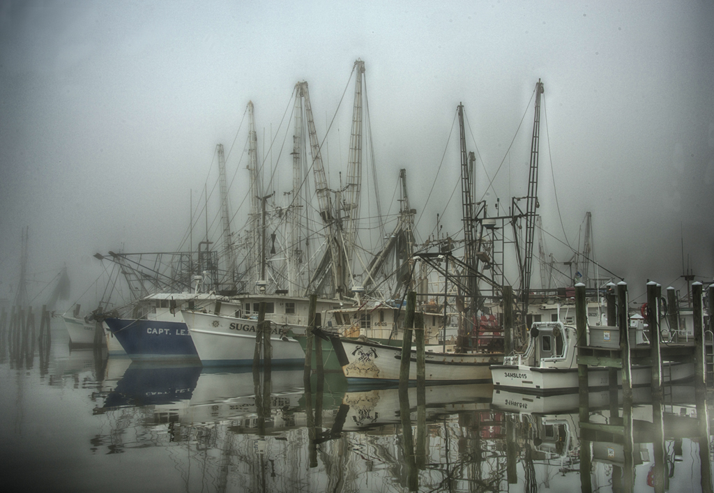
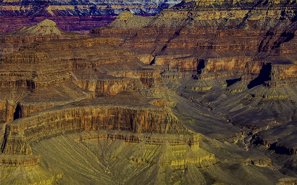
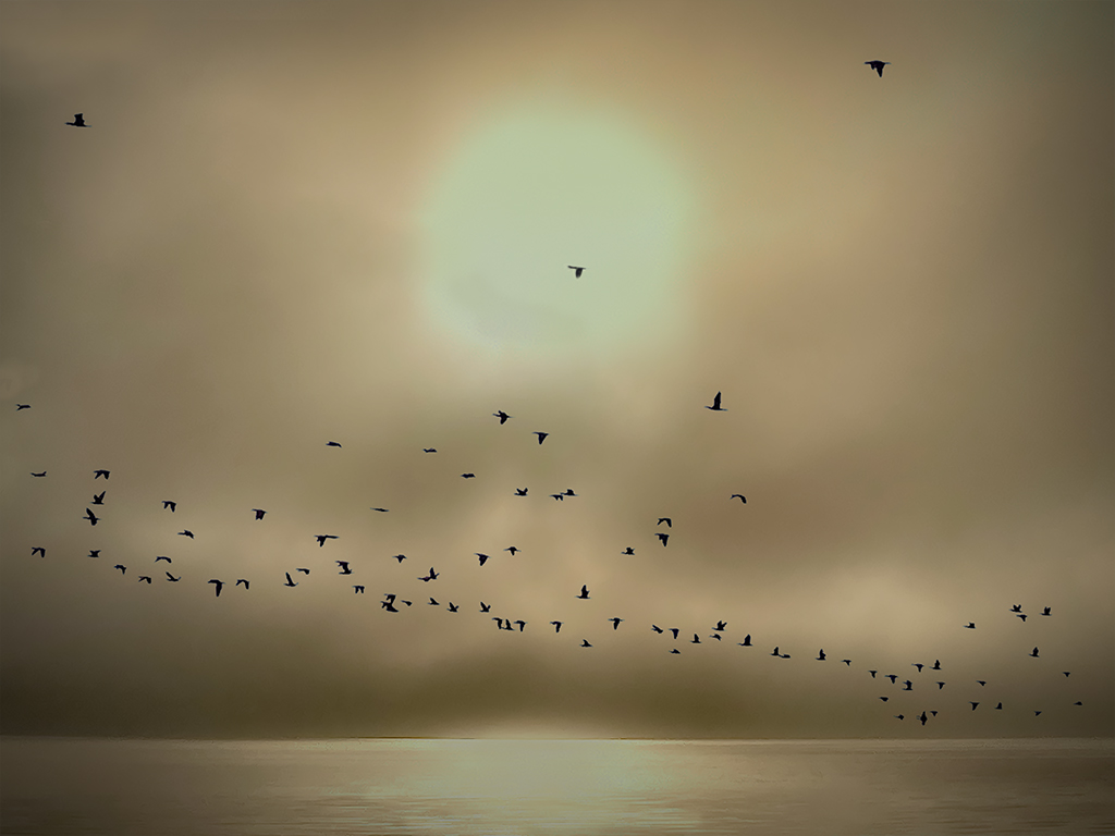
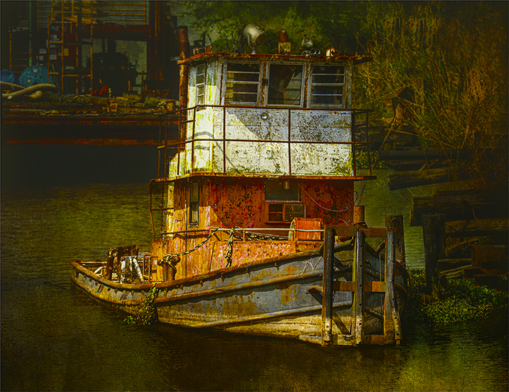
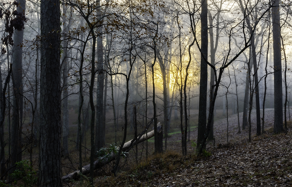
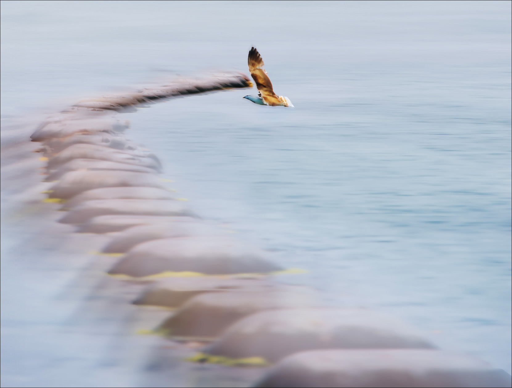
Hello Mary, What an interesting story and the image reveals that too. That looks like a very mysterious place to be. I love the colors of the mussel pots and the leading line to the hungry bird. I do have a visual feedback. I cropped the image. I added some space at the top to give the bird more room. I felt like my eyes kept wandering to the top of the image. I cloned out some space between the bird and where the pots stop. I wanted to give some separation there. I tried to pull out the shadows under the birds breast and face. I love the ICM you applied to this image. |
Mar 8th |
 |
| 77 |
Mar 24 |
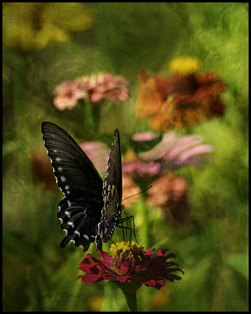
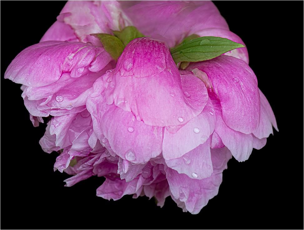
Comment |
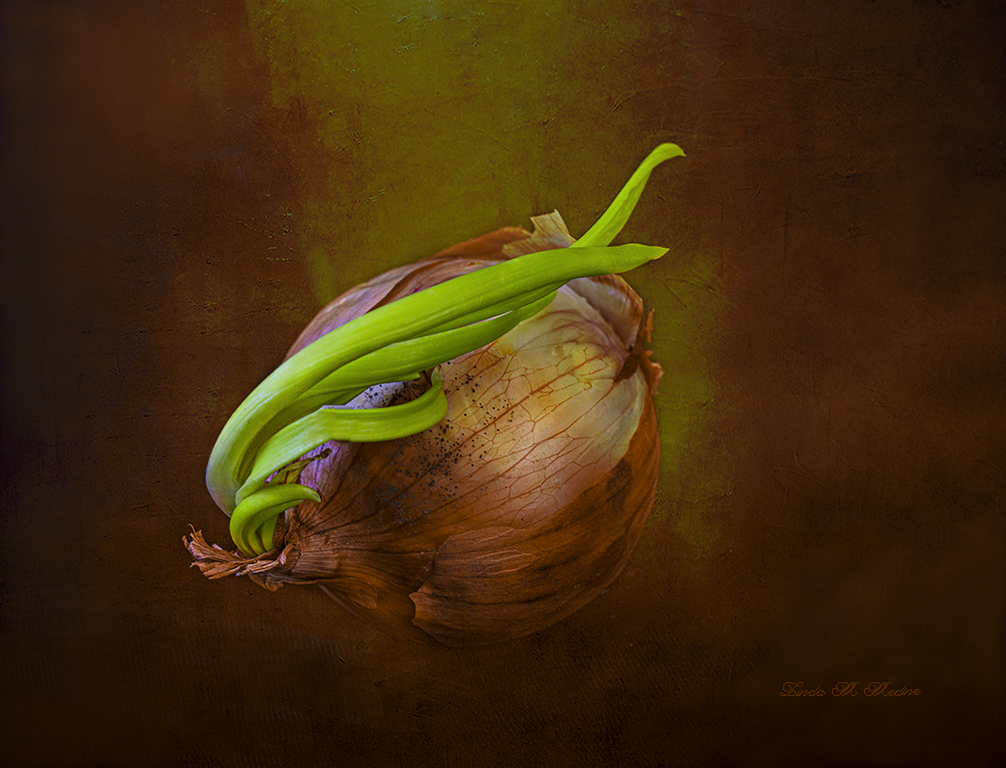
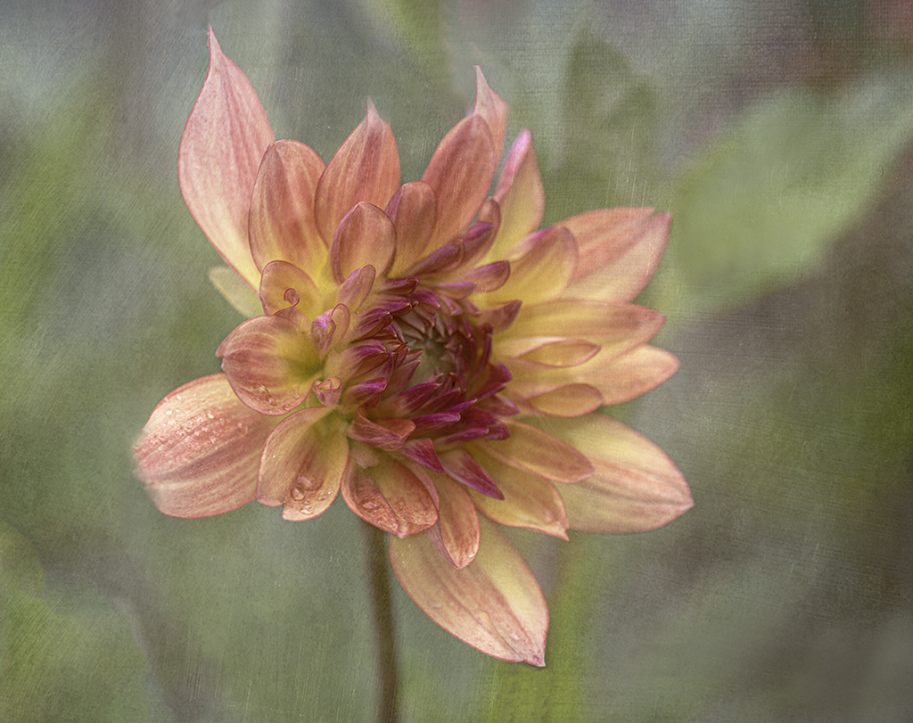
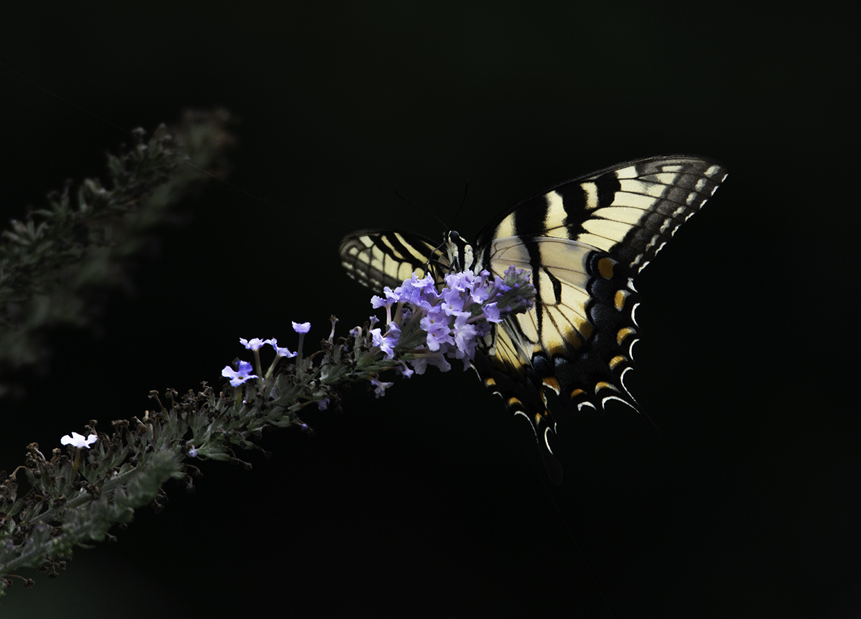
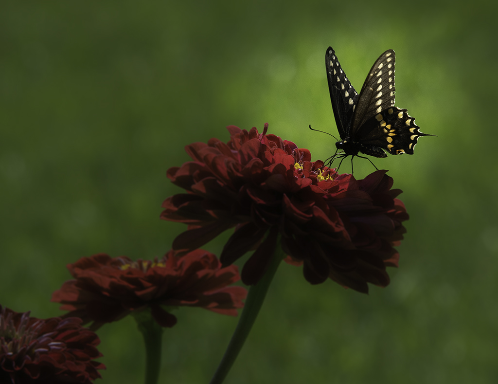
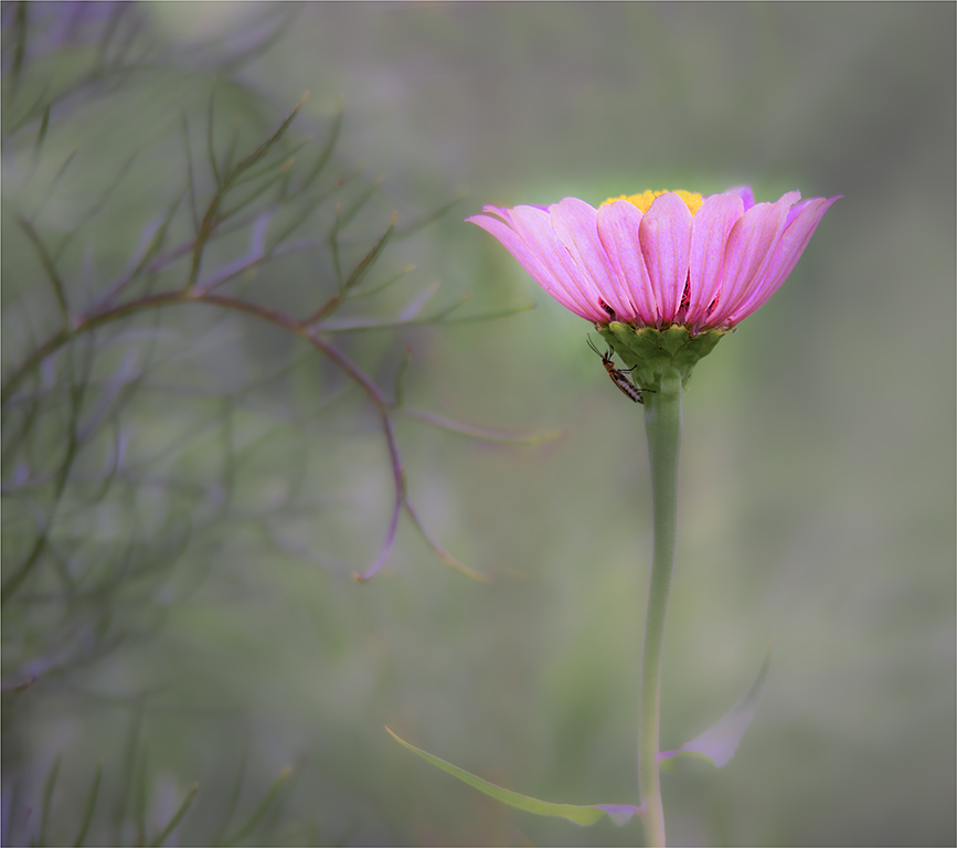
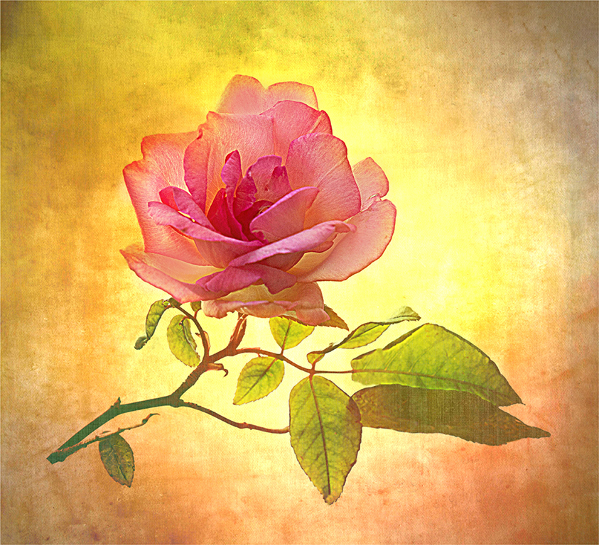
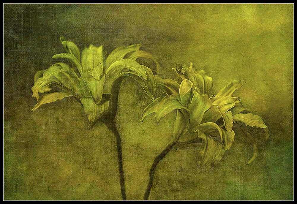
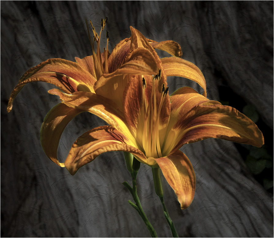
Connie, Beautiful Flowers. Like the background you have chosen. I like textured backgrounds too. I have a visual feedback. I cleaned up the two stems. I see the old green background. I cloned out some of the stems. I lighten the background and used the negative sliders on textures. I was looking for a softer background where it would not be competing with the beautiful flowers. Darken the background and made the crop larger to give the flowers more room. Changed the border to 2 pixels white. I wanted the flower to pop more. Good job on the contrast. I used photoshop and camera raw. |
Mar 8th |
 |
| 77 |
Mar 24 |
Comment |
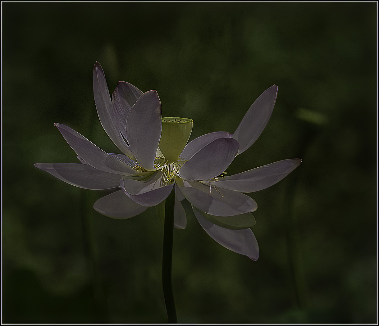
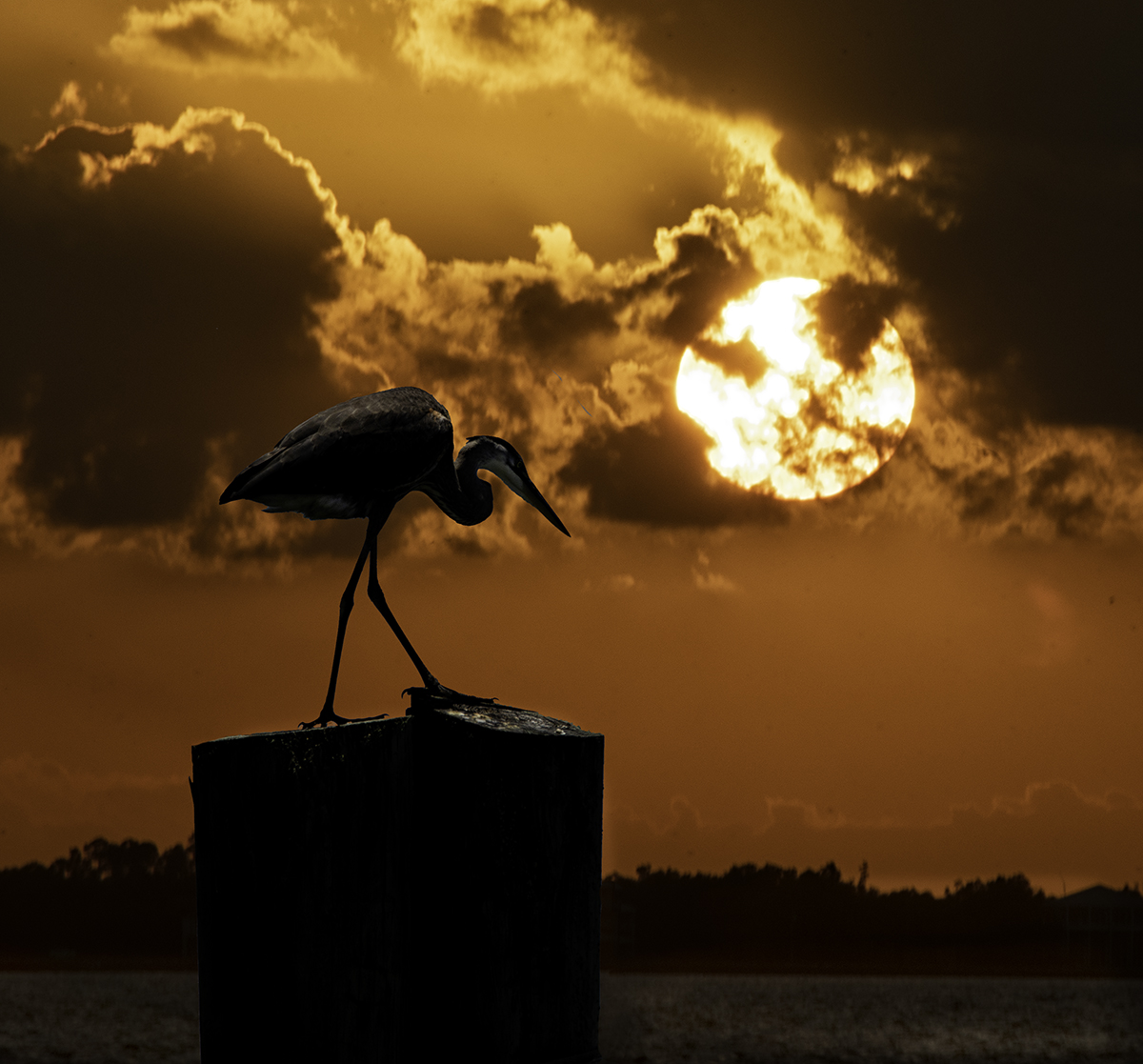
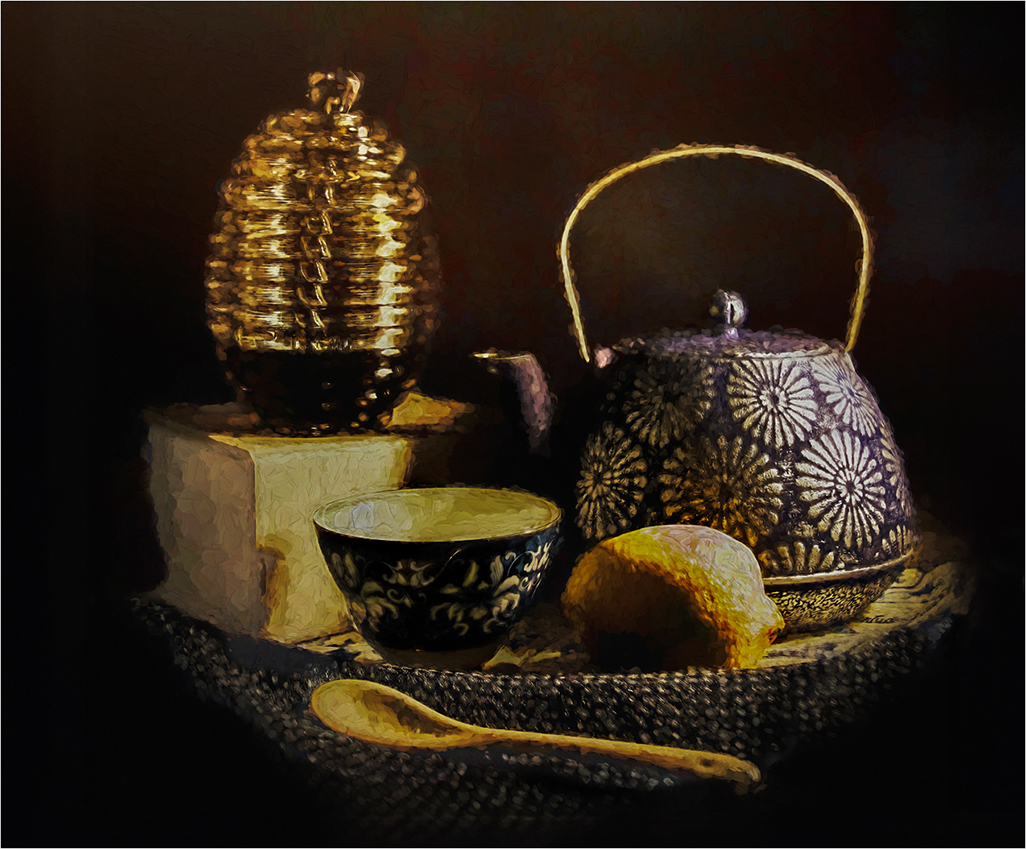
Georgianne, It is amazing being a photographers we can see things in a different way from others. I feel like you have a winner. This would be a beautiful piece to print and put on your wall. I agree with your husband on the highlights on the lemon, bowl and whatever the light is standing on. I made the image larger to give the image more room. I used Photoshop and Camera Raw. I darken the background. I see lots of noise artifacts in the background. I selected the objects and inverted the selection and got just the background and darkened the background. I did the same thing with the objects and brought down the highlights and brought up the shadows. |
Mar 8th |
 |
| 77 |
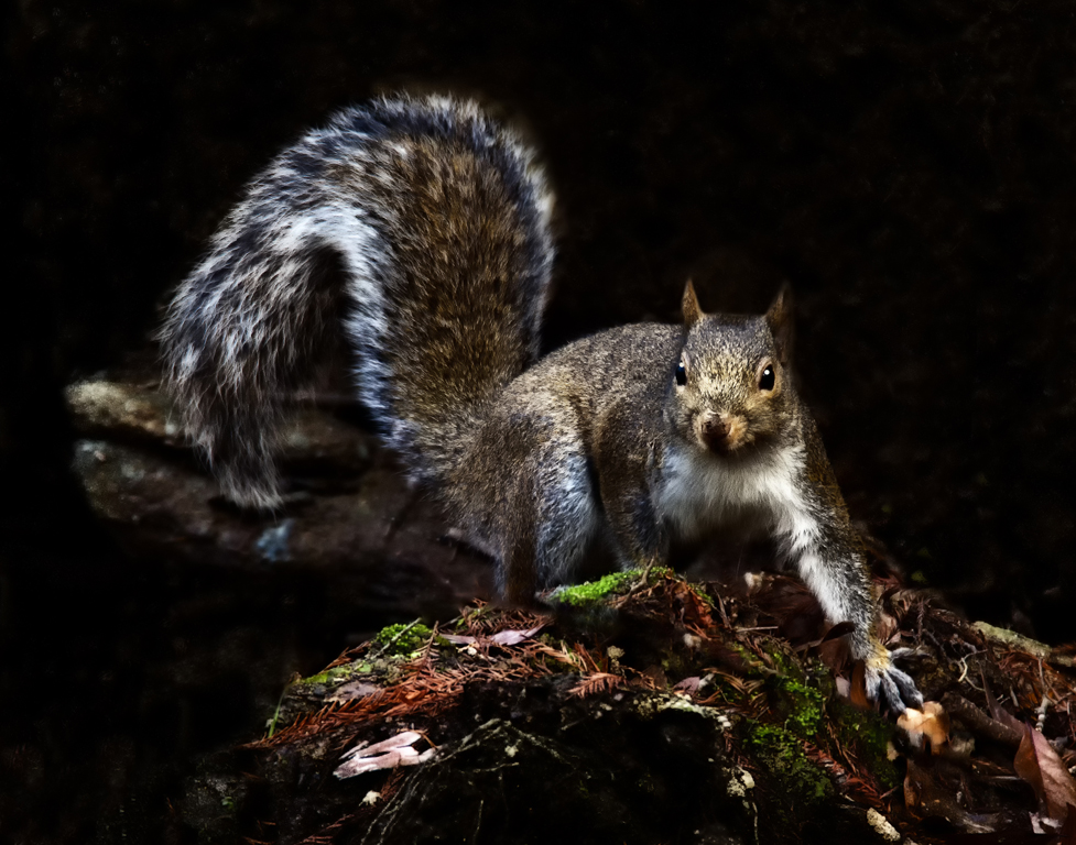
Mar 24 |
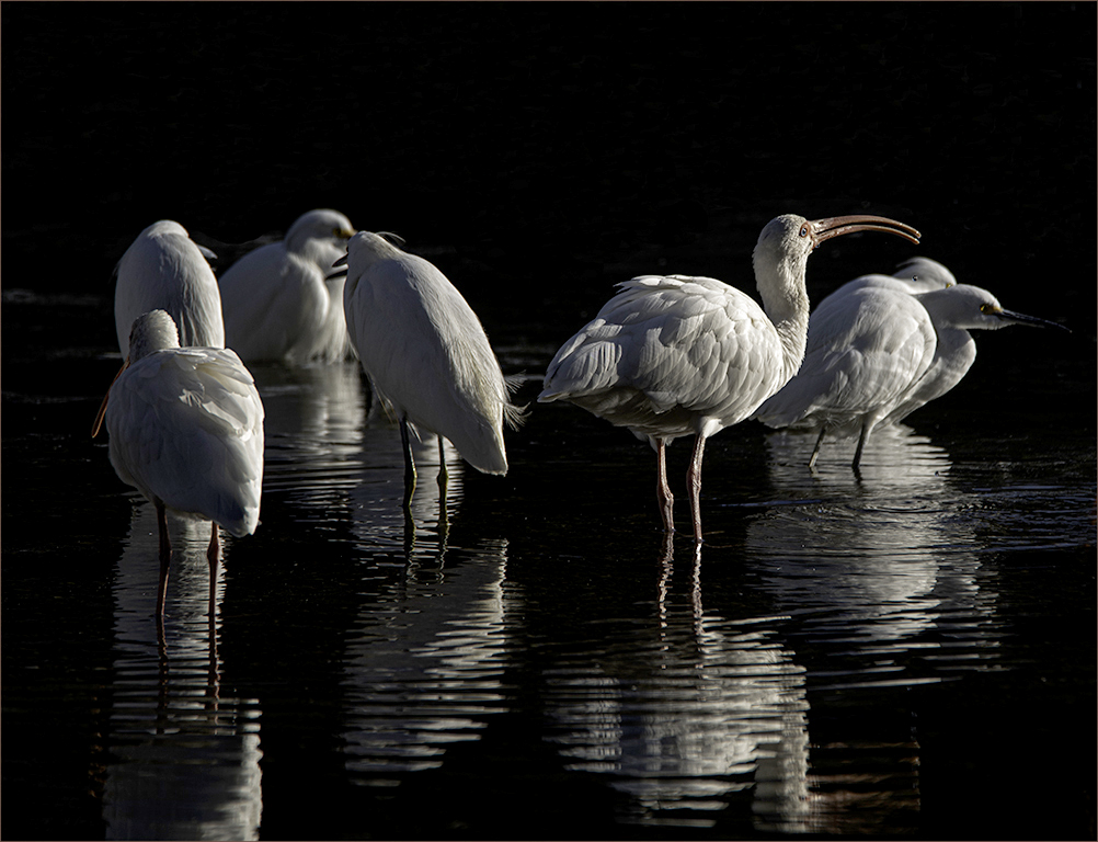
Comment |
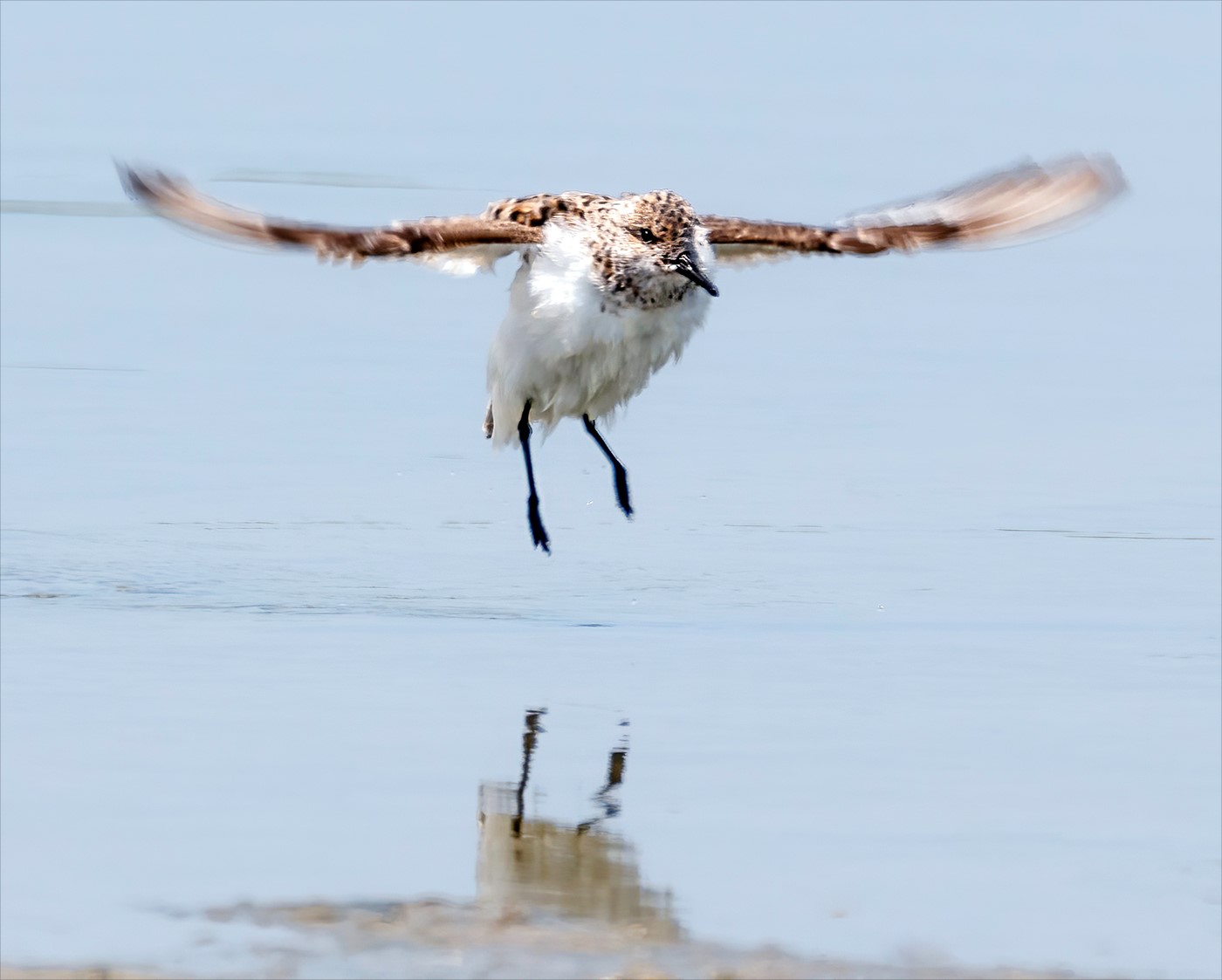
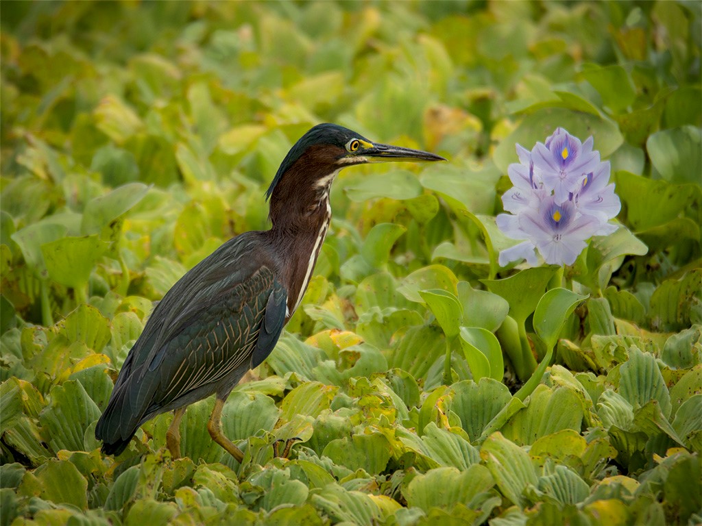
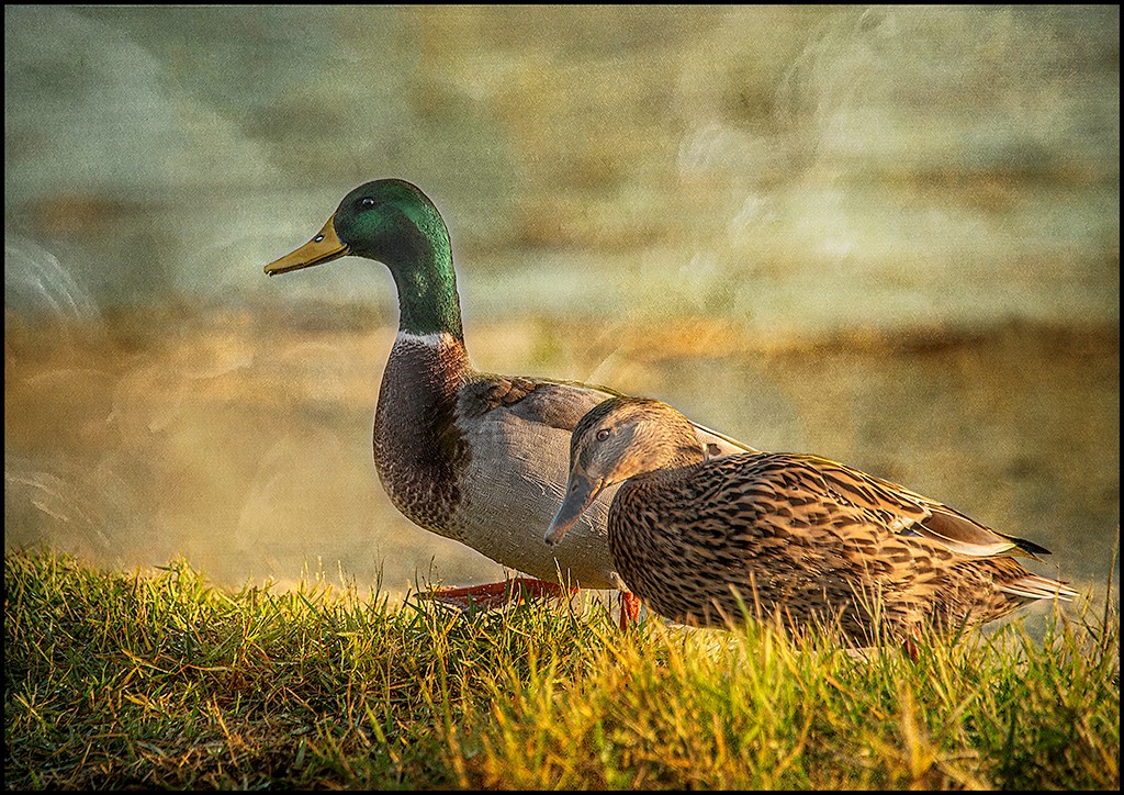
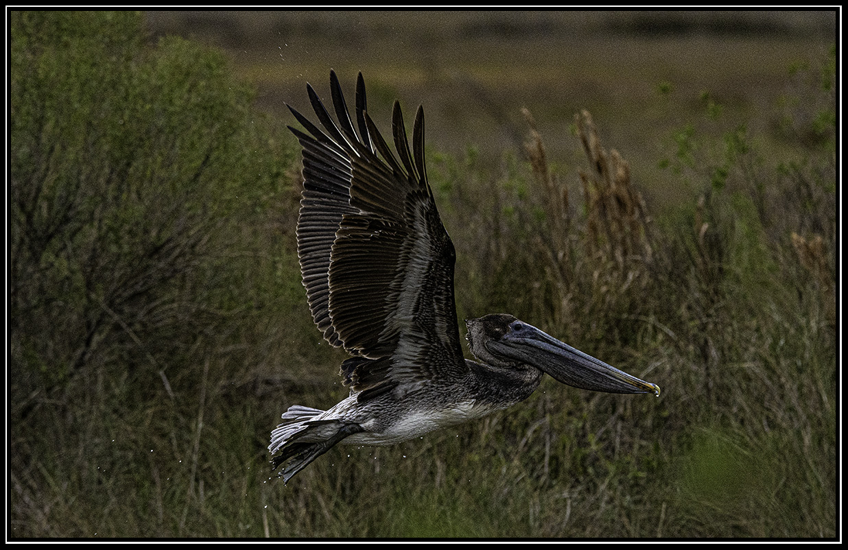
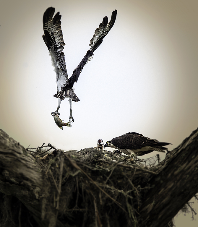
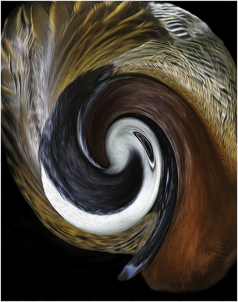
Connie, I use Lightroom and Photoshop. I use more Photoshop in Camera Raw. I really like having that control. I love using the masking part of camera raw. So, I worked on one part of the image at a time. I worked on the background first. I wanted the background black. Then I worked on the pelican. I used Curves - the yellow part of curves to warm up the pelican. I also use Saturation and Vibrance in camera raw. I try not to over do it. I hope this will help. |
Mar 8th |
6 comments - 0 replies for Group 77
|
| 99 |
Mar 24 |
Comment |
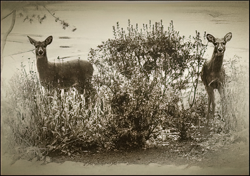
Barbara, What an amazing transition. I love the tones you chose. It gives the image a warm feeling. I have a visual feedback. I put a black 4 pixel border. I feel the white is distracting. I used curves to pull out more tones. I used camera raw and pulled out some shadows in the shrubs. I also put a black vignette. |
Mar 17th |
 |
| 99 |
Mar 24 |
Comment |
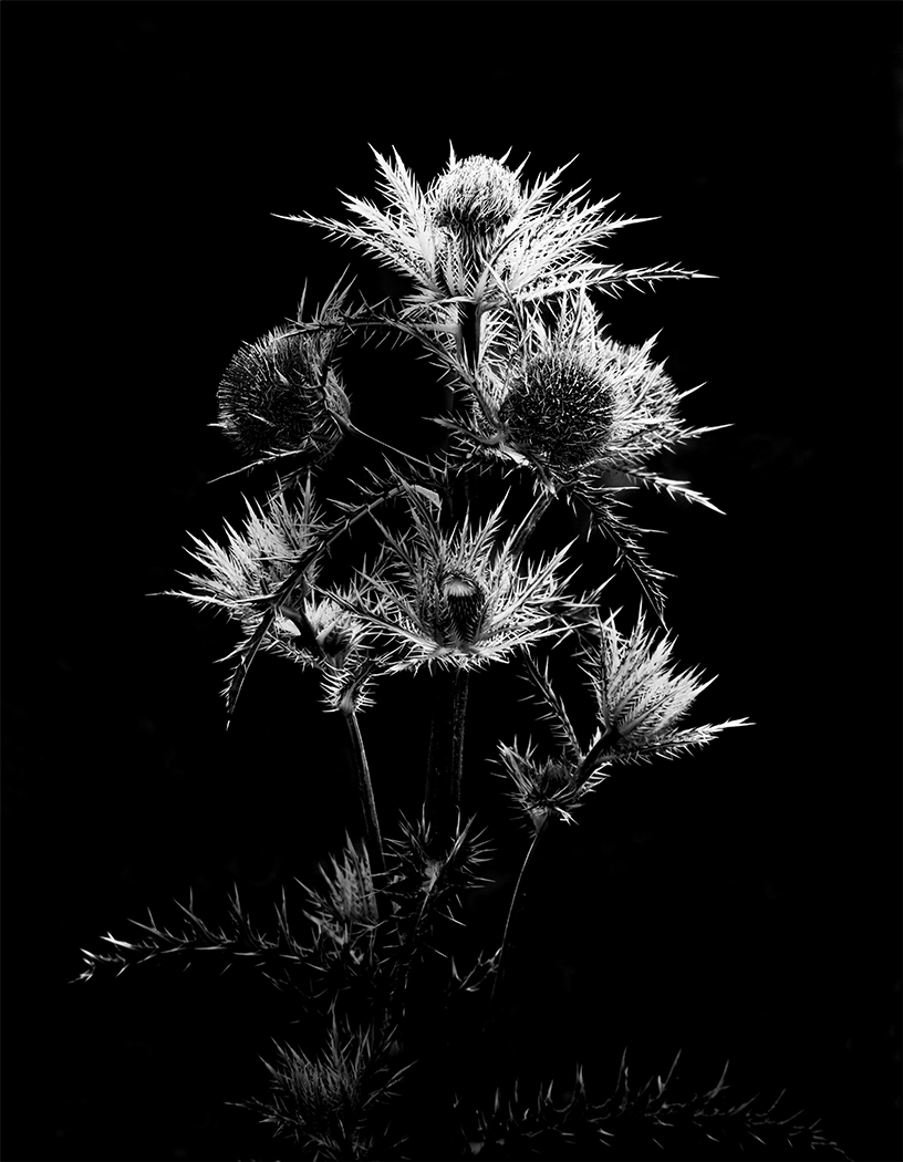
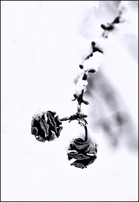
Hi Gerard, This is a very elegant image. I can see this image being used on a greeting card. All I did was to crop it and had the cone come out at an angle. I have a visual feedback. What do you think. |
Mar 15th |
 |
| 99 |
Mar 24 |
Comment |
Hi John, Very creative. The only thing I would do is to put a 2-4 pixels white boarder around the image. The background just keeps going. |
Mar 15th |
 |
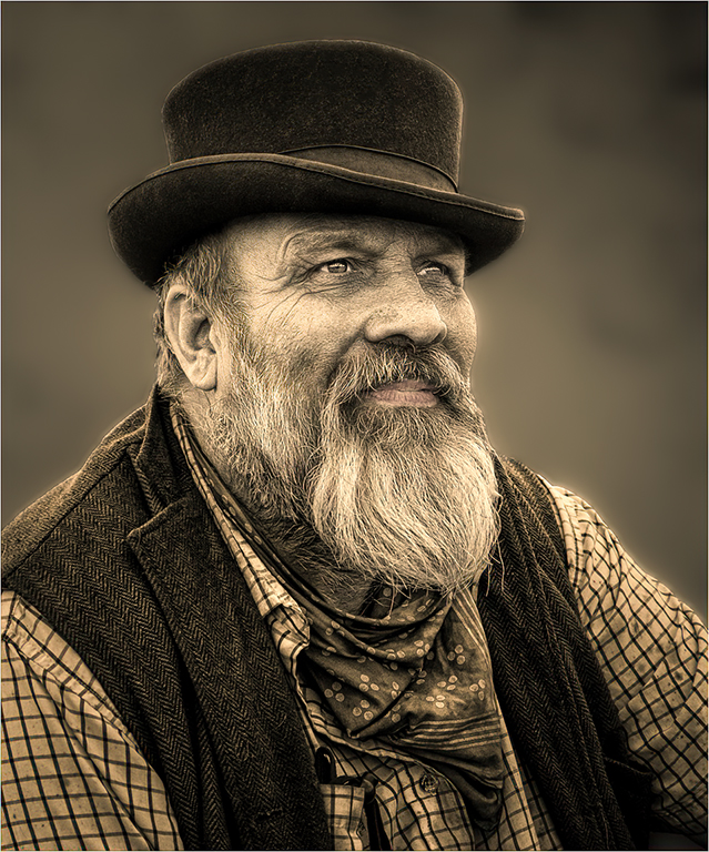
| 99 |
Mar 24 |
Comment |
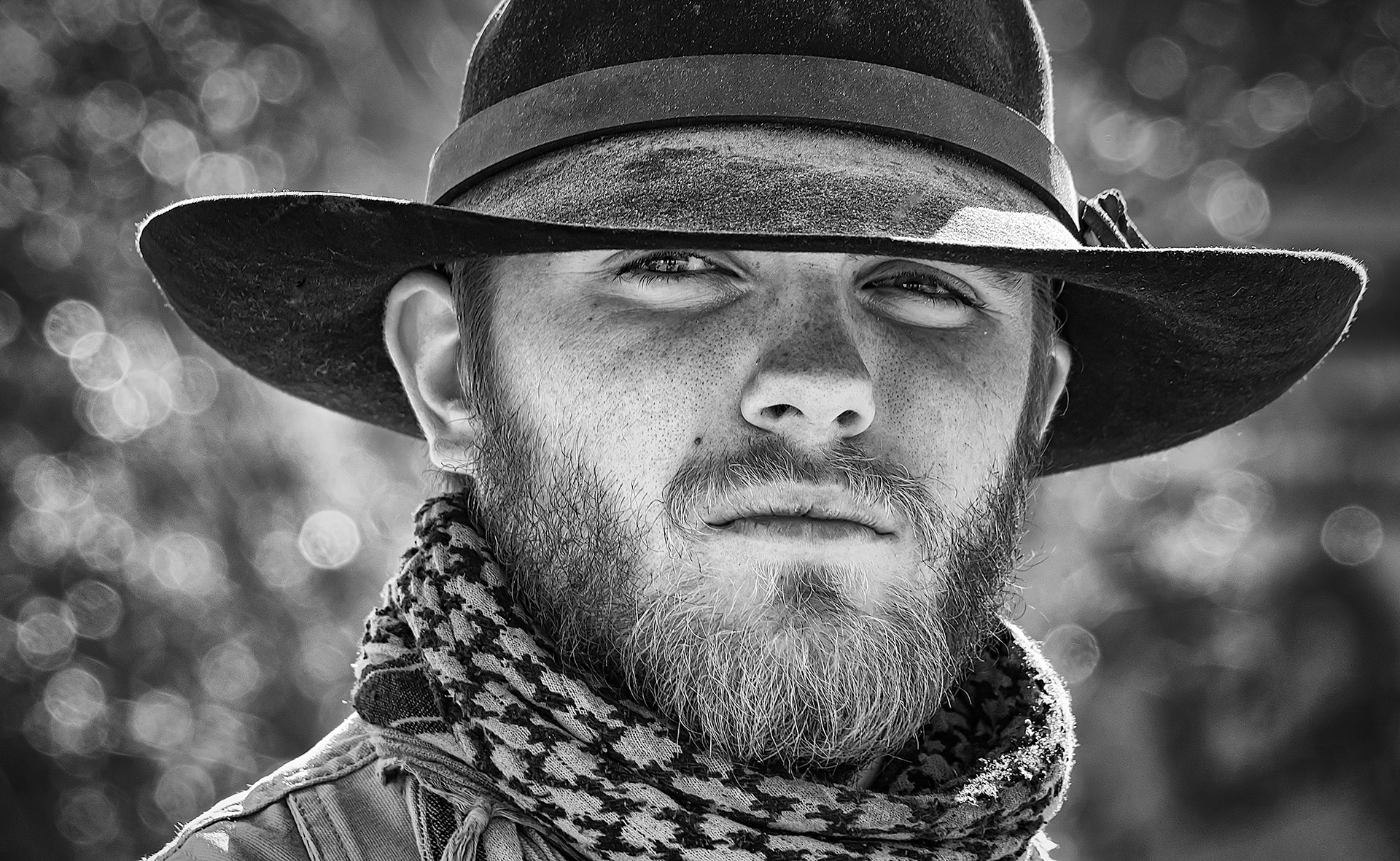
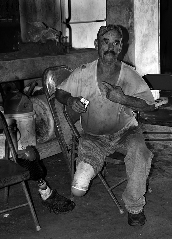
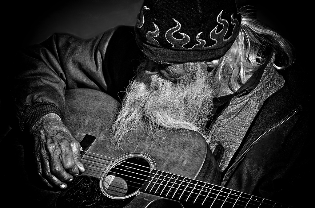
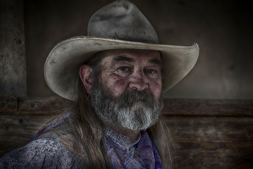
Hi Peter, I love this image. I really like taking images of older people. Especially people that does not look like everyone else. Great eye! I changed the background to a warmer color. It looks a little cold to me. I cleaned up his hat of white fuzz and spots. I took a white brush and made his eyes a little whiter. I used a white brush to make his beard look a little whiter. I sharpen this eyes and sharpened the image too. |
Mar 15th |
 |
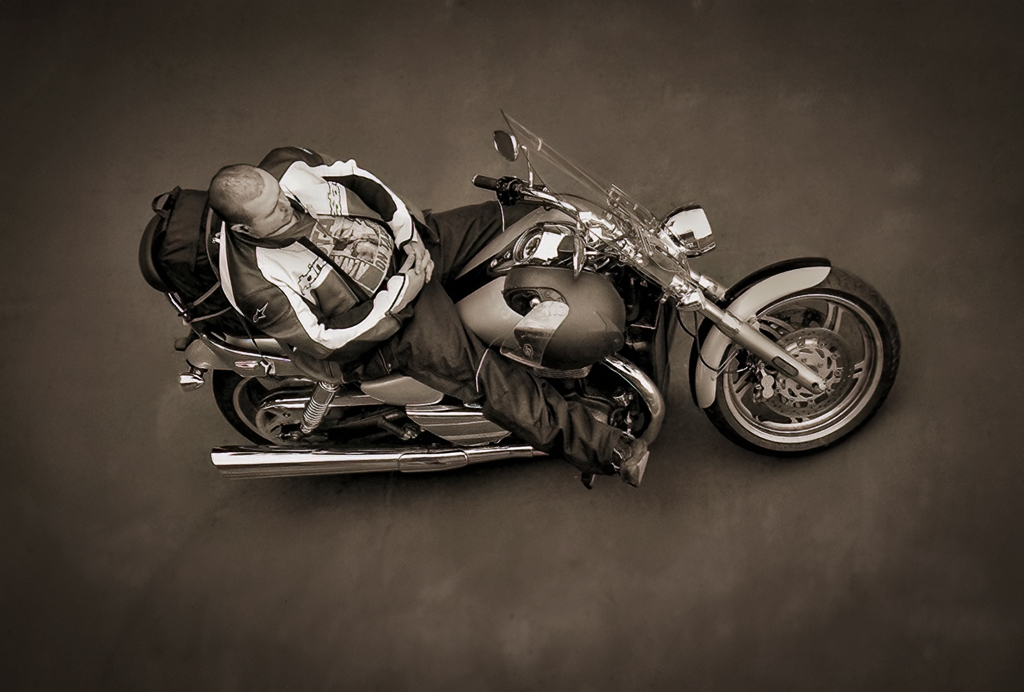
| 99 |
Mar 24 |
Comment |
Hi Kathleen, Wow, what a neat image. I bet he would love to have a copy of this image. You have a great eye. You always come up with some really unique images. I worked it more like a portrait than a photojournalist image. I cleaned up the background and put a vignette around the image. I brought down the high lights. I have a visual feedback. |
Mar 15th |
 |
5 comments - 0 replies for Group 99
|
11 comments - 0 replies Total
|