|
| Group |
Round |
C/R |
Comment |
Date |
Image |
| 43 |
Sep 22 |
Reply |
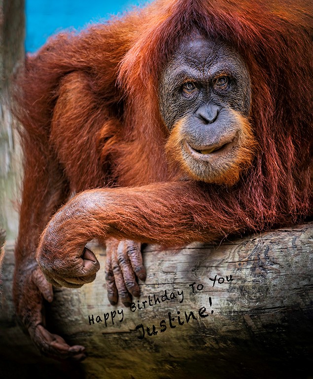
Thank you. This is a beautiful image Leo.
|
Sep 15th |
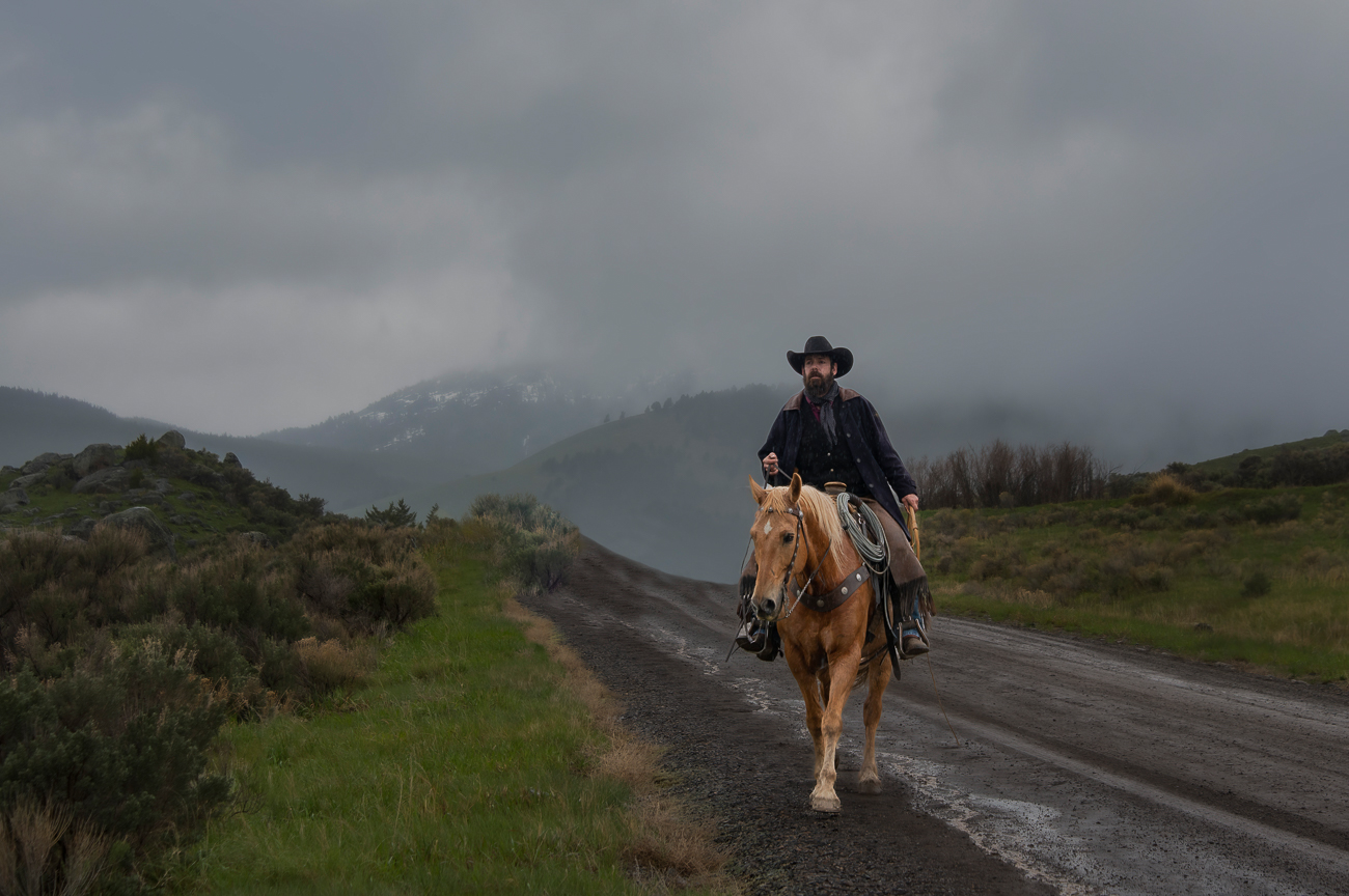
| 43 |
Sep 22 |
Comment |
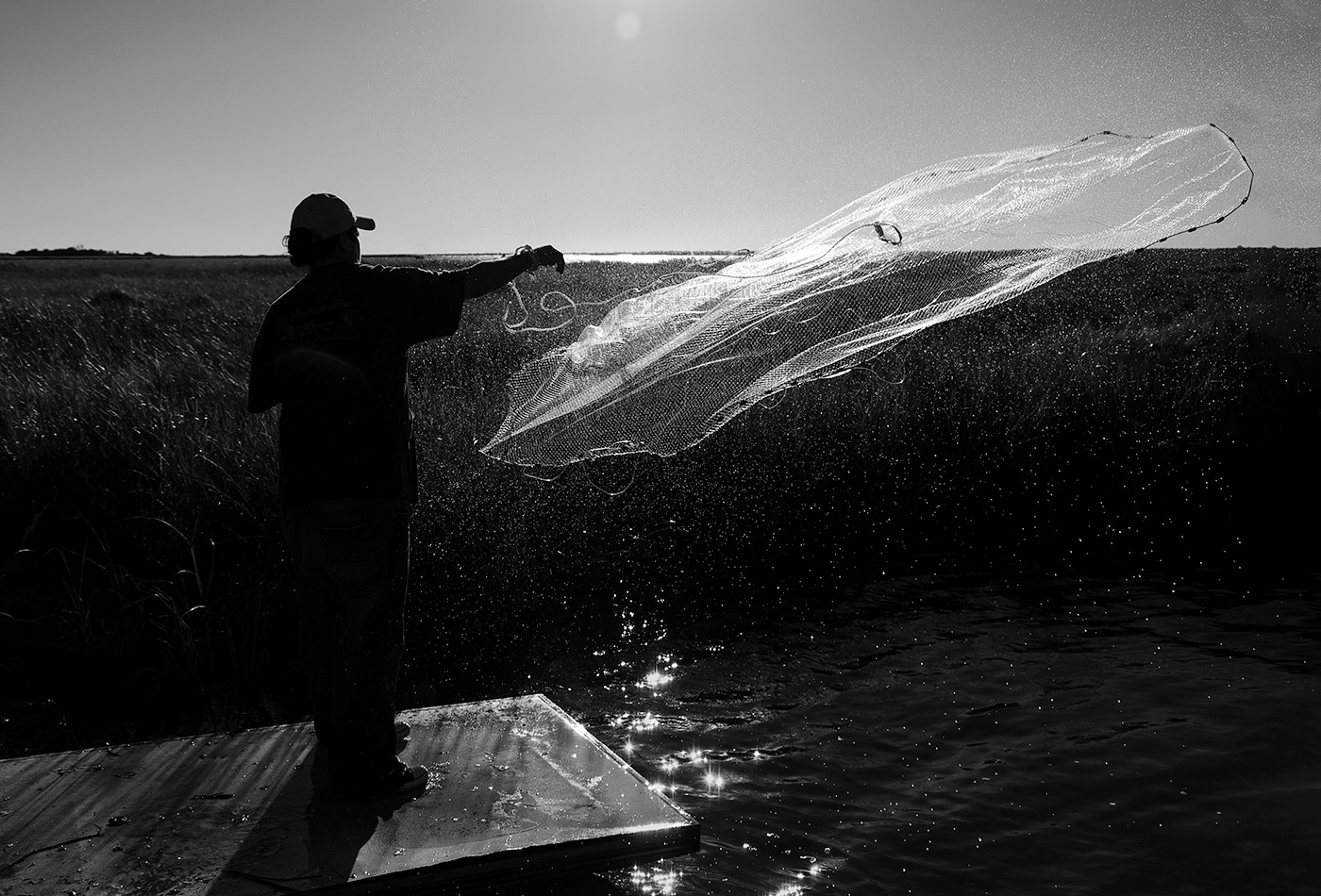
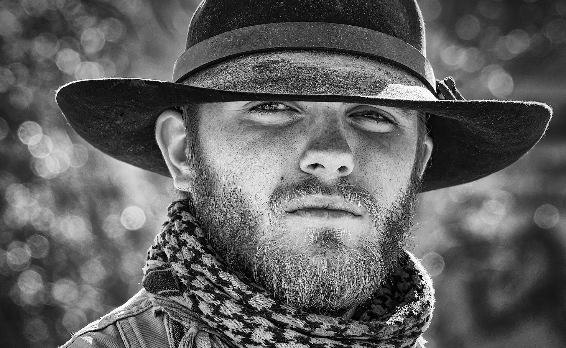
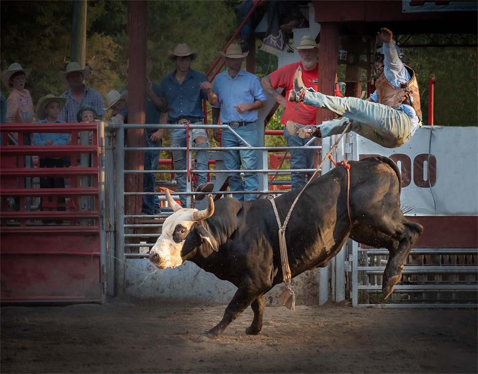
Lane, Love the action and center of interest. I just gave the cowboy more room on the right side in photoshop with content aware. I used a radial filter in camera raw around the action and inverted it to make the background darker. Great catch. |
Sep 13th |
 |
| 43 |
Sep 22 |
Comment |
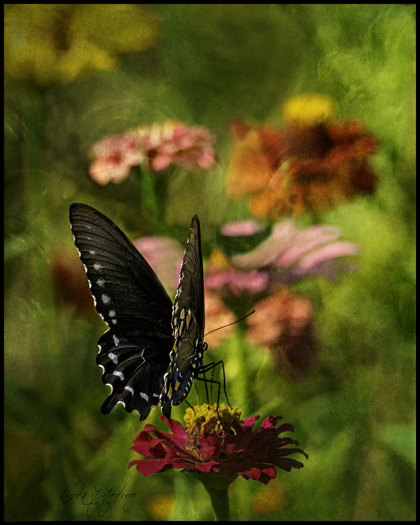
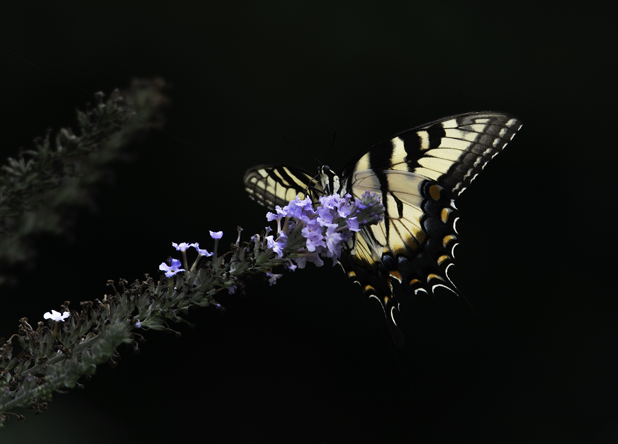
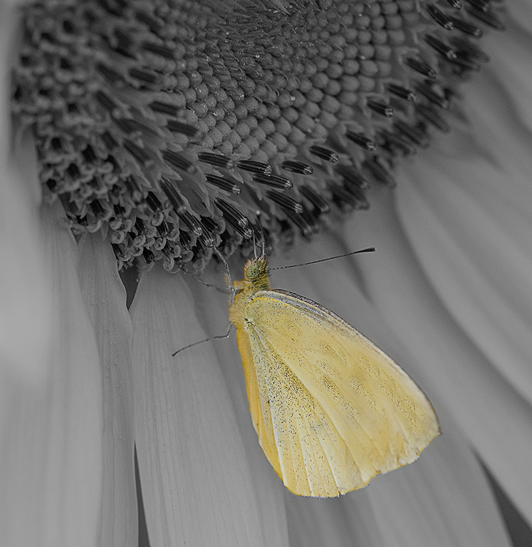
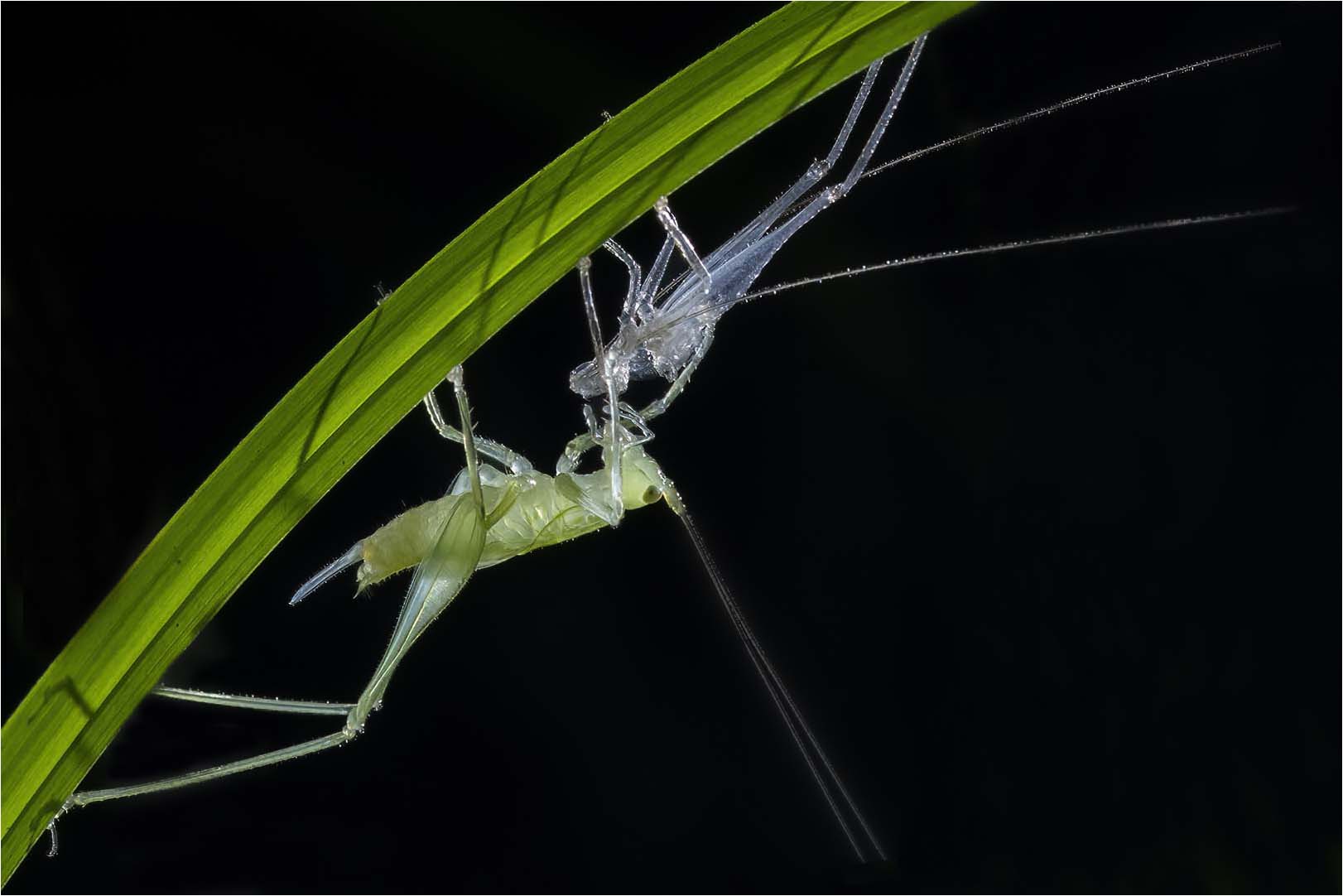
I love the contrast and the colors and the action. I have a visual feedback. I duplicated the image in photoshop and went into camera raw and selected the subject and inverted the subject and it did a great job of doing that. I darkened the background. I went in and cloned out what was left from the background. I cloned out some of the antennaes on the subject where they don't go off the page. |
Sep 13th |
 |
| 43 |
Sep 22 |
Comment |
Love it. Impact, Technical Excellence, Color Balance and Story Telling. You got it all. You was at the right place at the right time. I feel like the other comments have some great suggestions. Great catch. |
Sep 13th |
| 43 |
Sep 22 |
Comment |
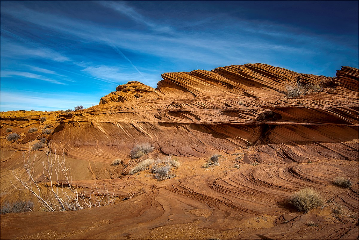
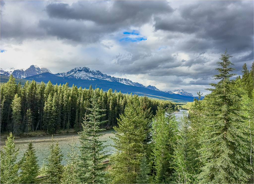
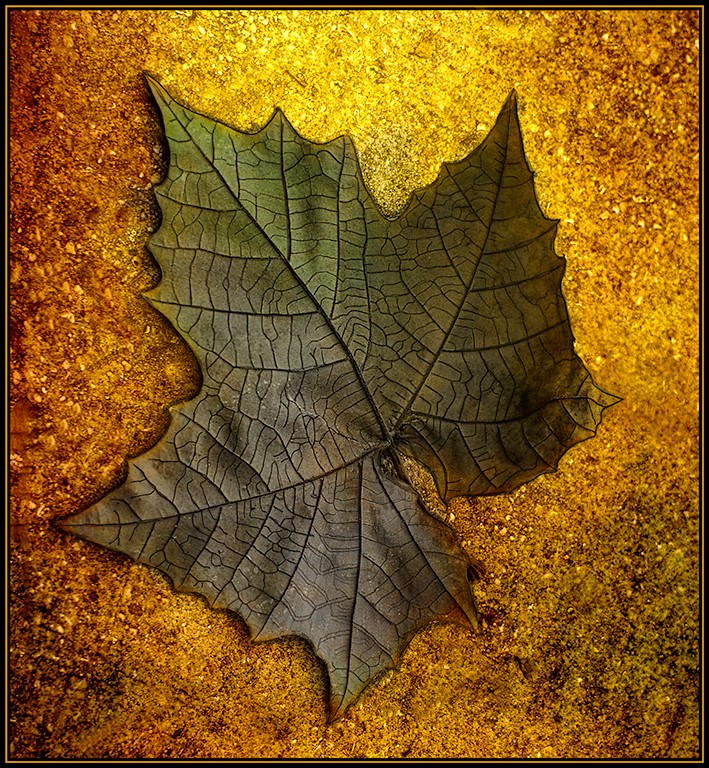
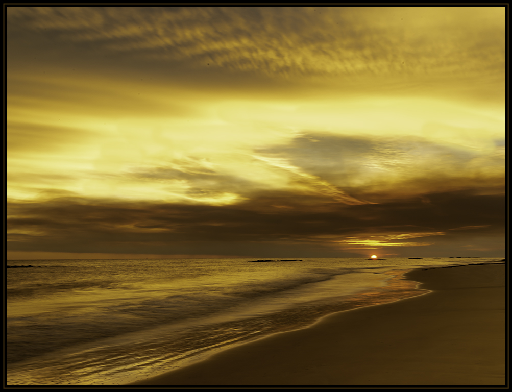
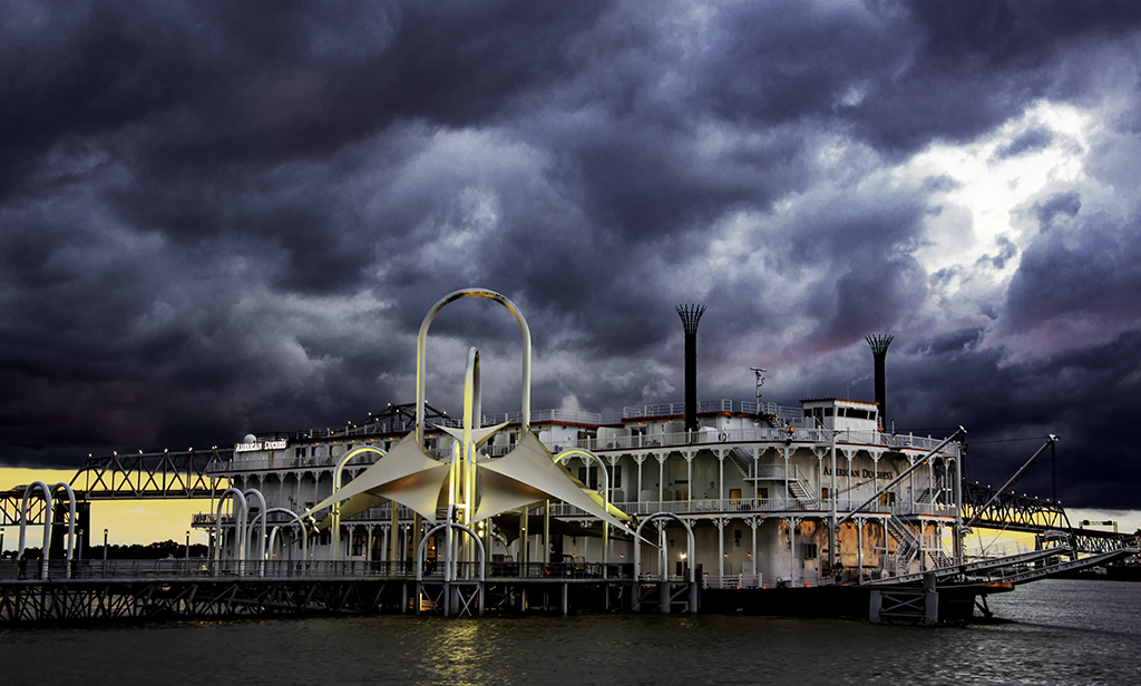
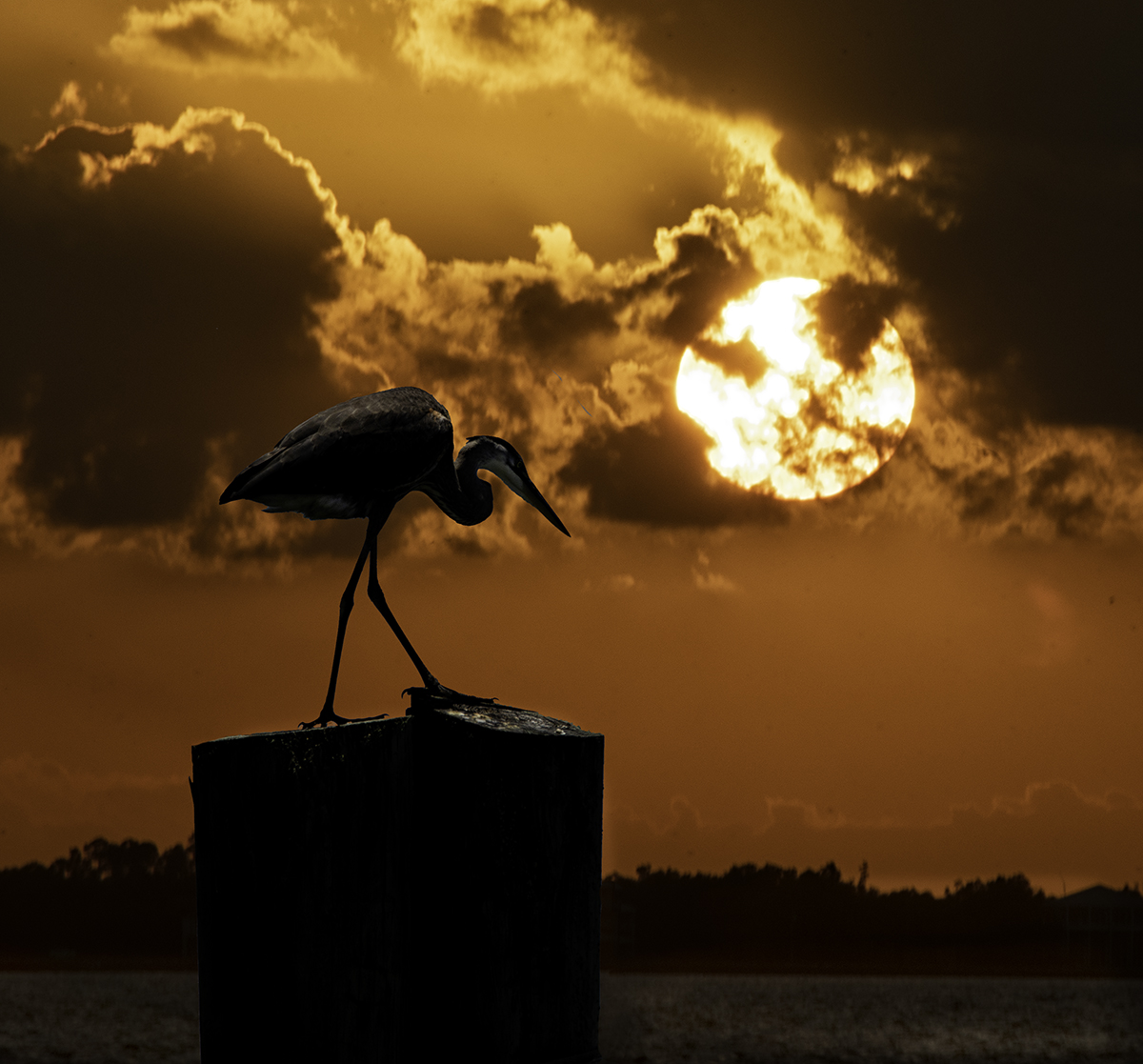
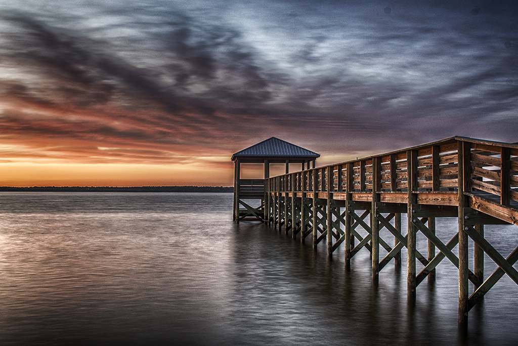
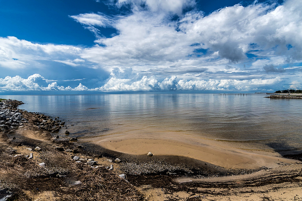
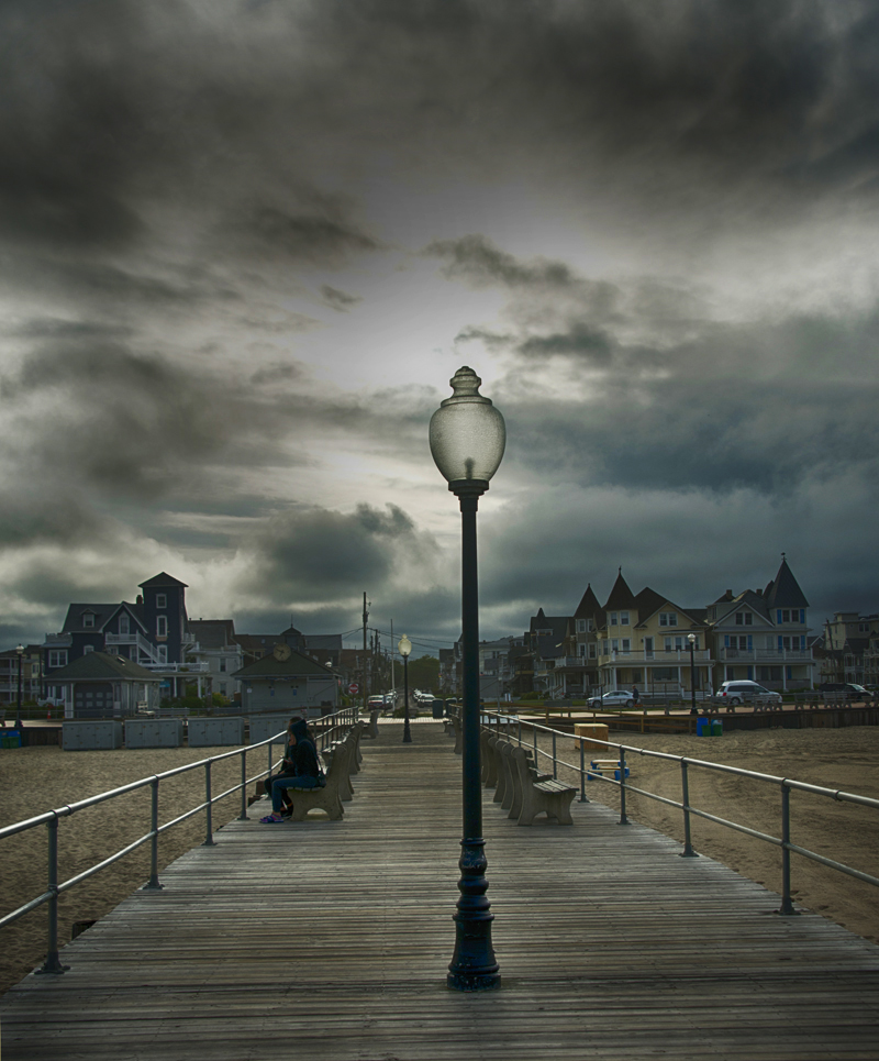
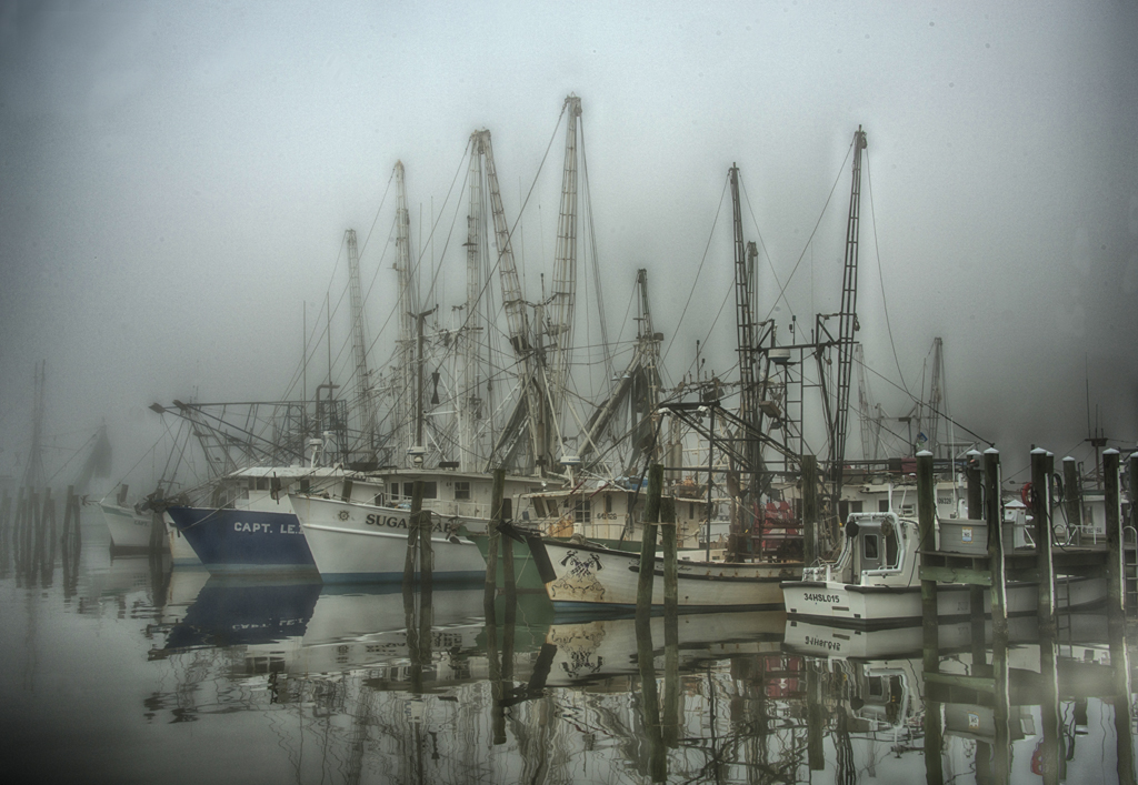
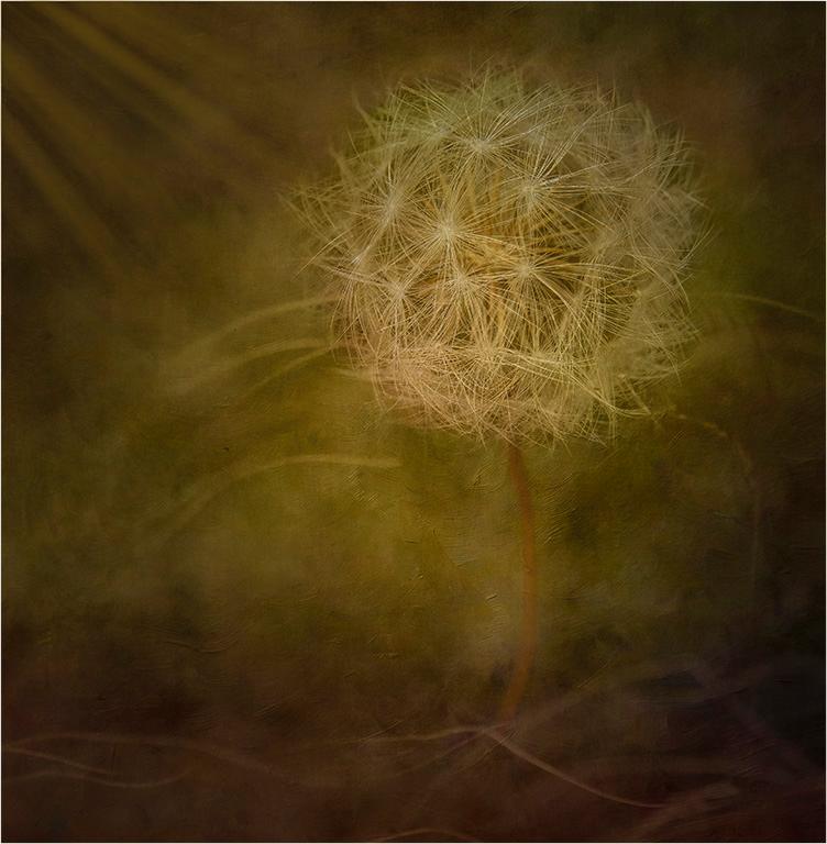
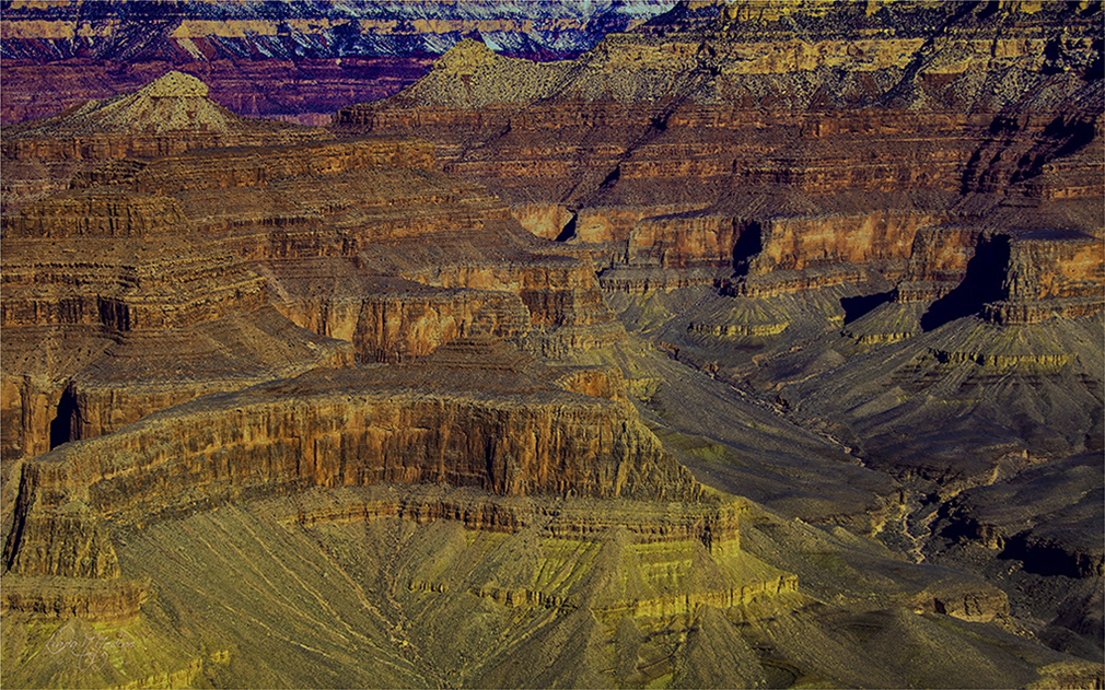
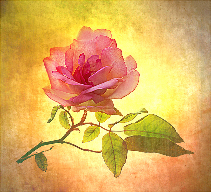
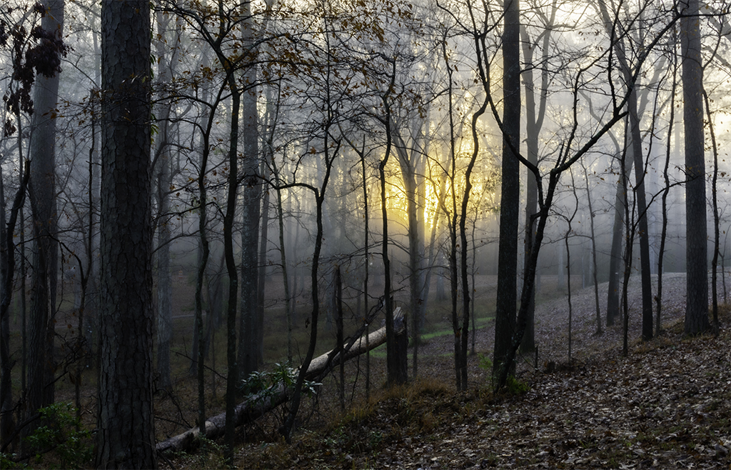
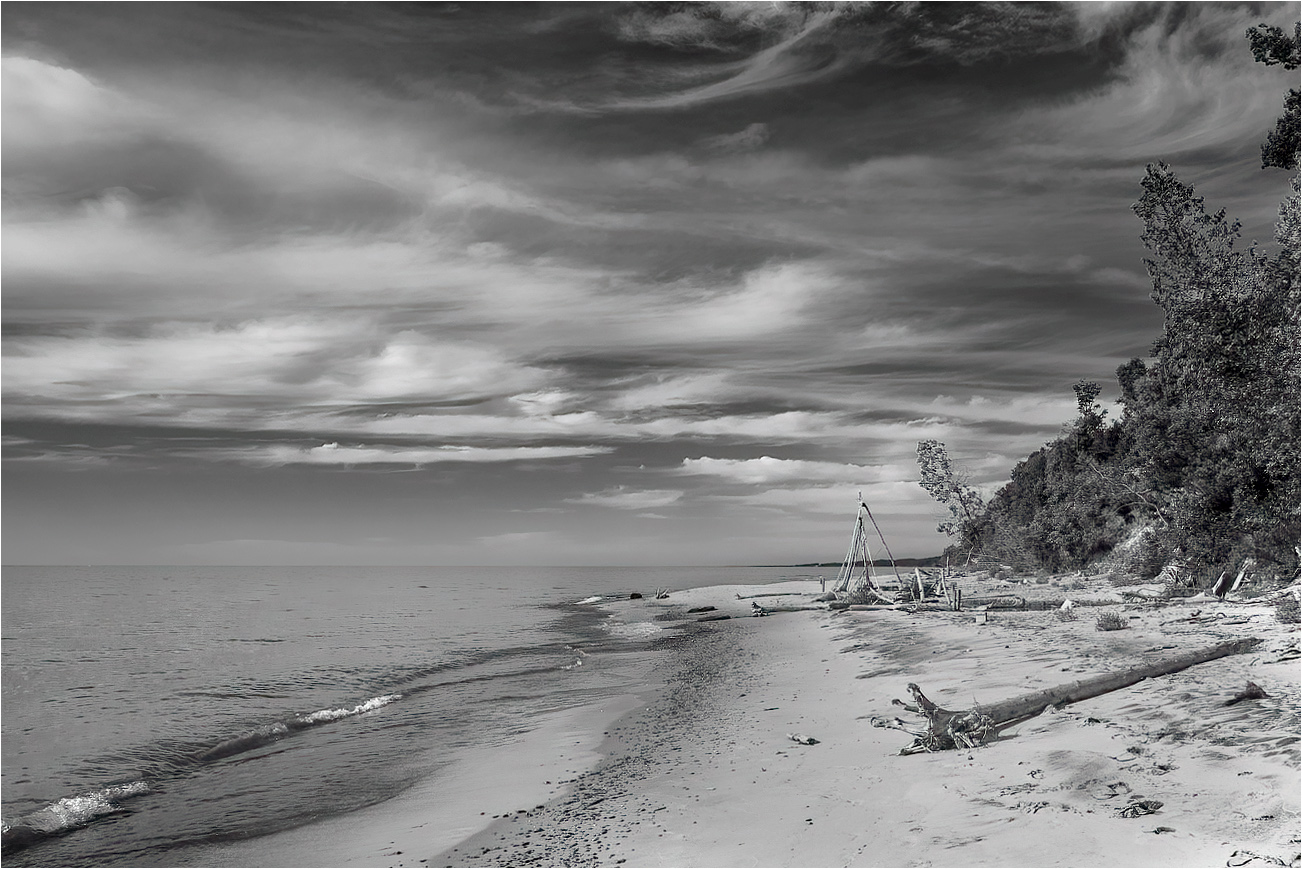
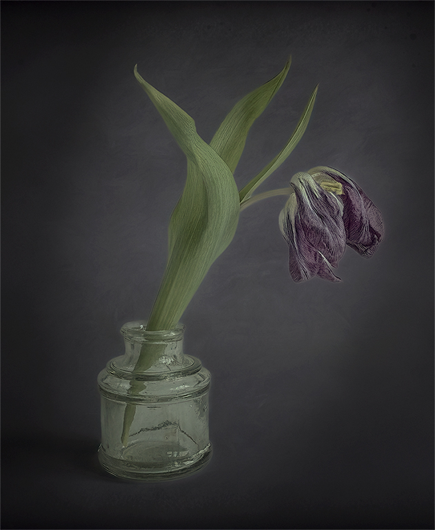
This is a beautiful and soothing image. You mention the clouds and the moody feeling. I darkened the clouds a little. I love the way they are swirling around. Love the tones. They are so beautiful. I darkened the sand on the right to have my eye go to the clouds first. I feel like you have great composition. The leading lines from the wave to the clouds then the sandy beach with the structures. I think this maybe the Golden Spiral composition. What do you think? |
Sep 2nd |
 |
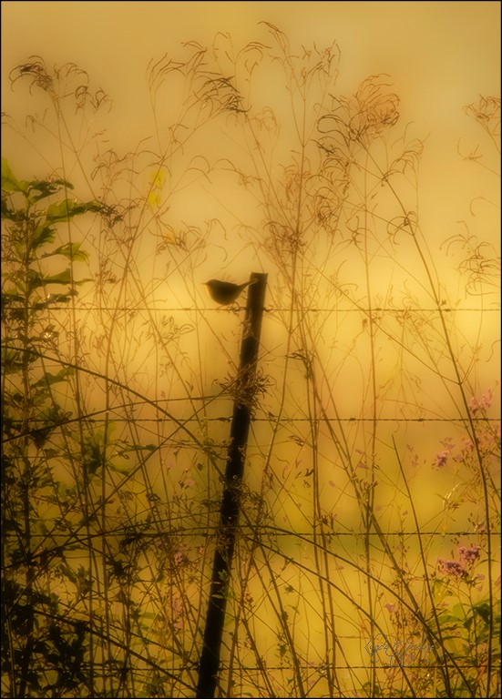
| 43 |
Sep 22 |
Comment |
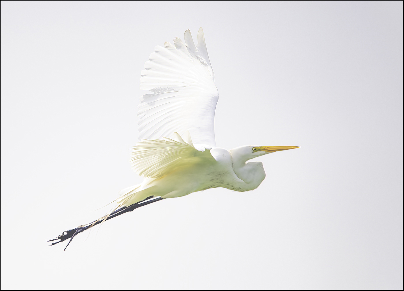
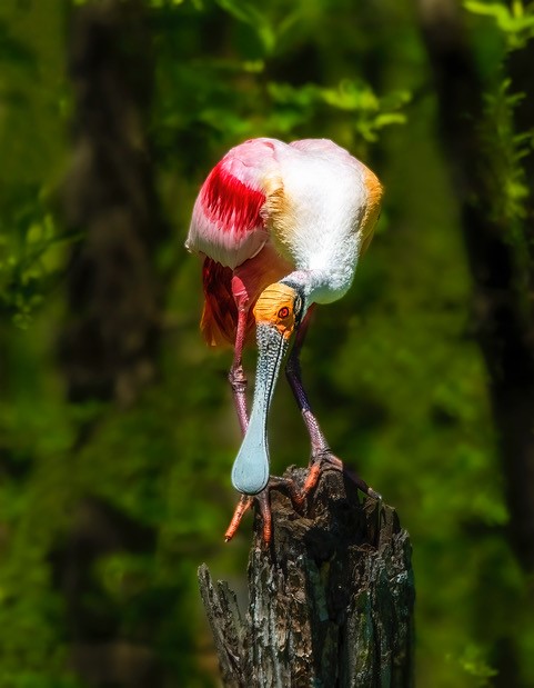
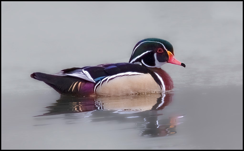
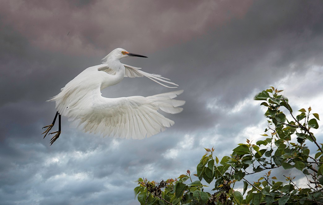
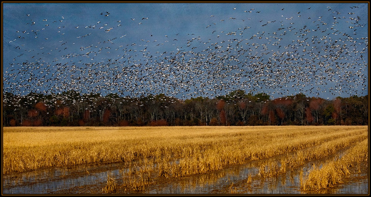
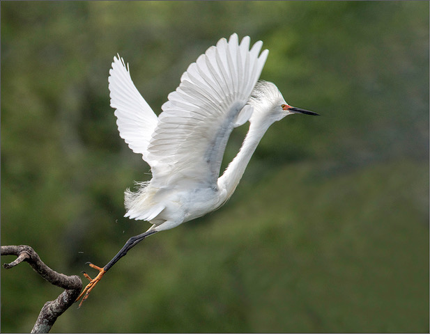
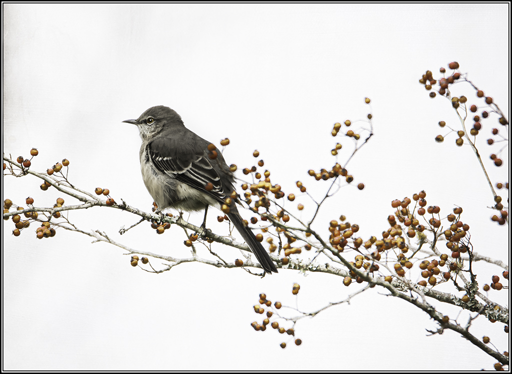
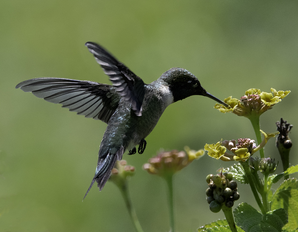
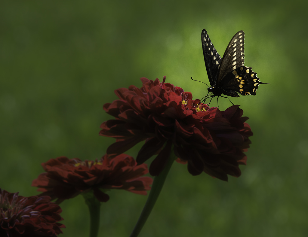
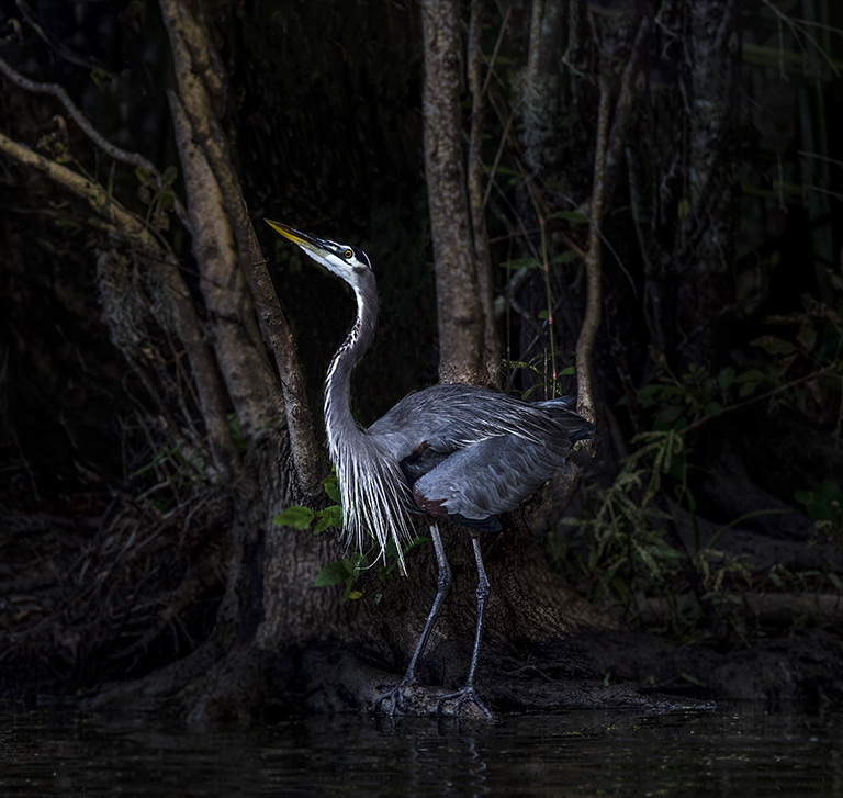
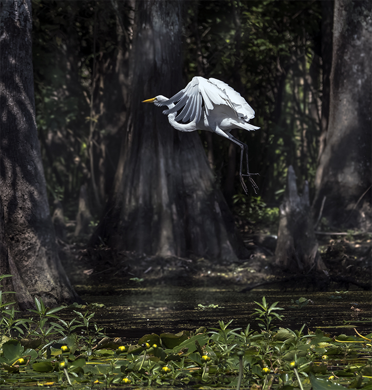
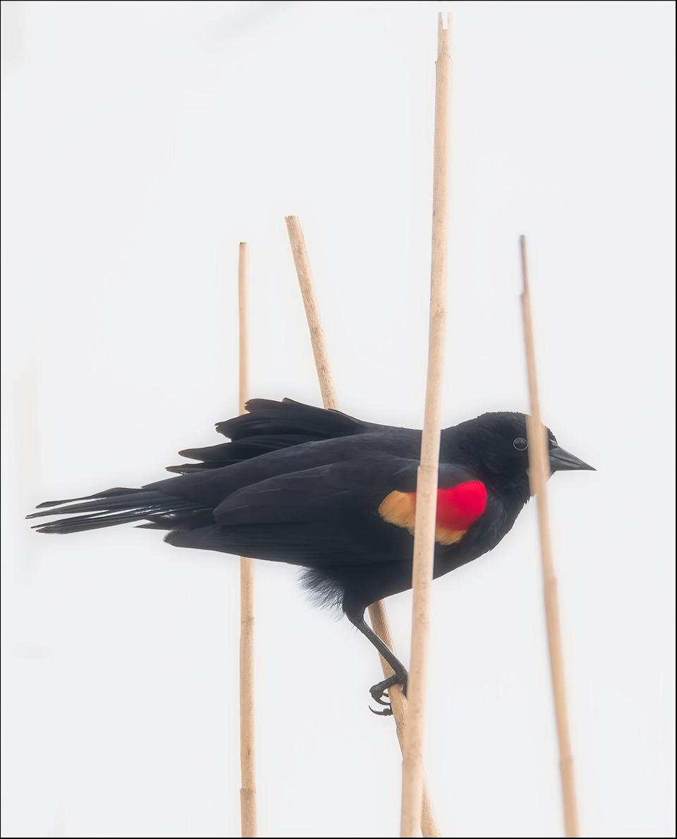
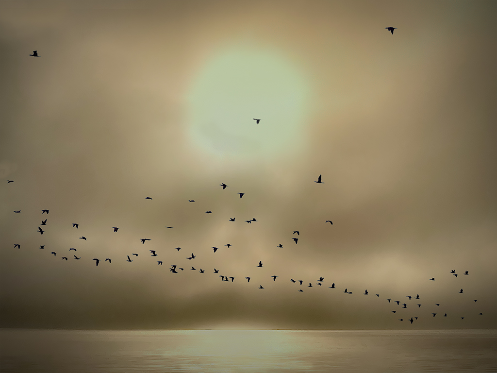
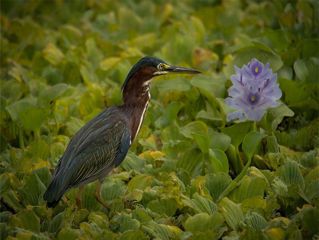
I went into camera raw and selected the bird and inverted it and darkened the background and it makes a big difference. |
Sep 2nd |
 |
| 43 |
Sep 22 |
Comment |
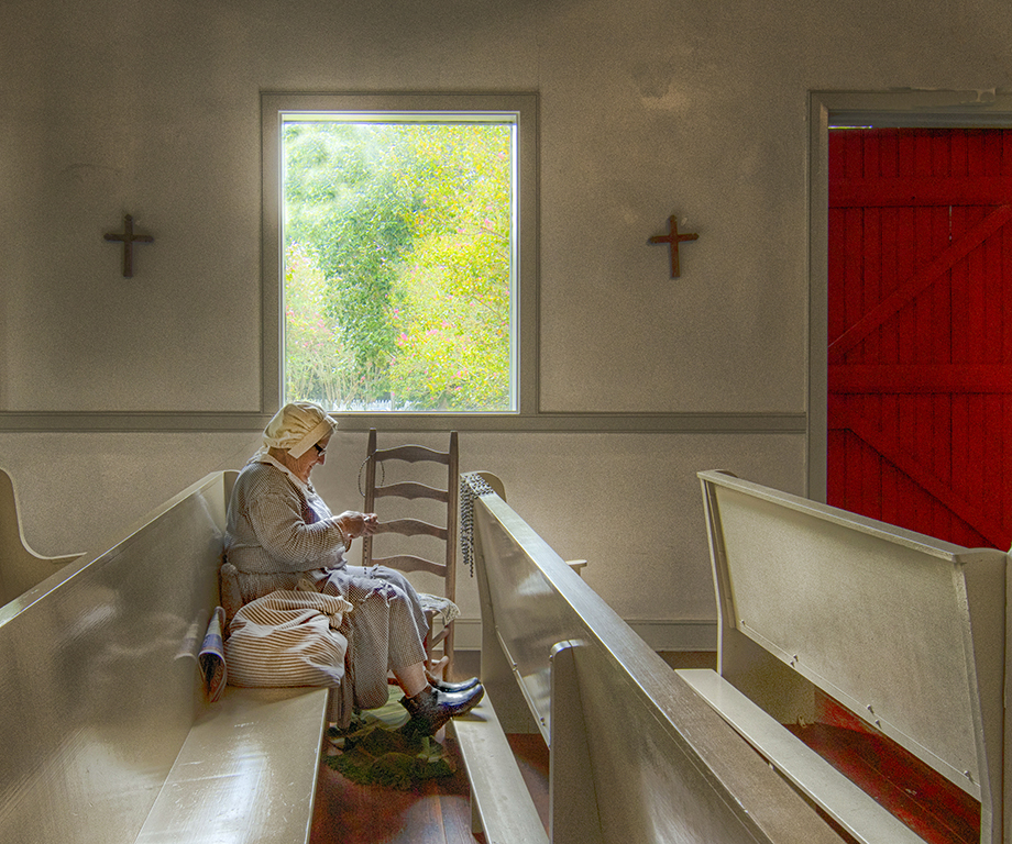
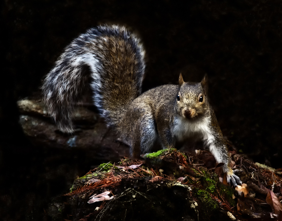
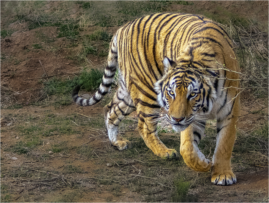
Good Morning Mark. The eyes, he has my attention. I really like the paw is ed up and his tail is also ed. Good use of the rules of thirds. I like the negative space on the left side. I used Photoshop, camera raw, to select the subject and darkened the background just a little. I used content-aware to add some space to the top of the image. Beautiful image Mark. |
Sep 2nd |
 |
6 comments - 1 reply for Group 43
|
| 61 |
Sep 22 |
Comment |
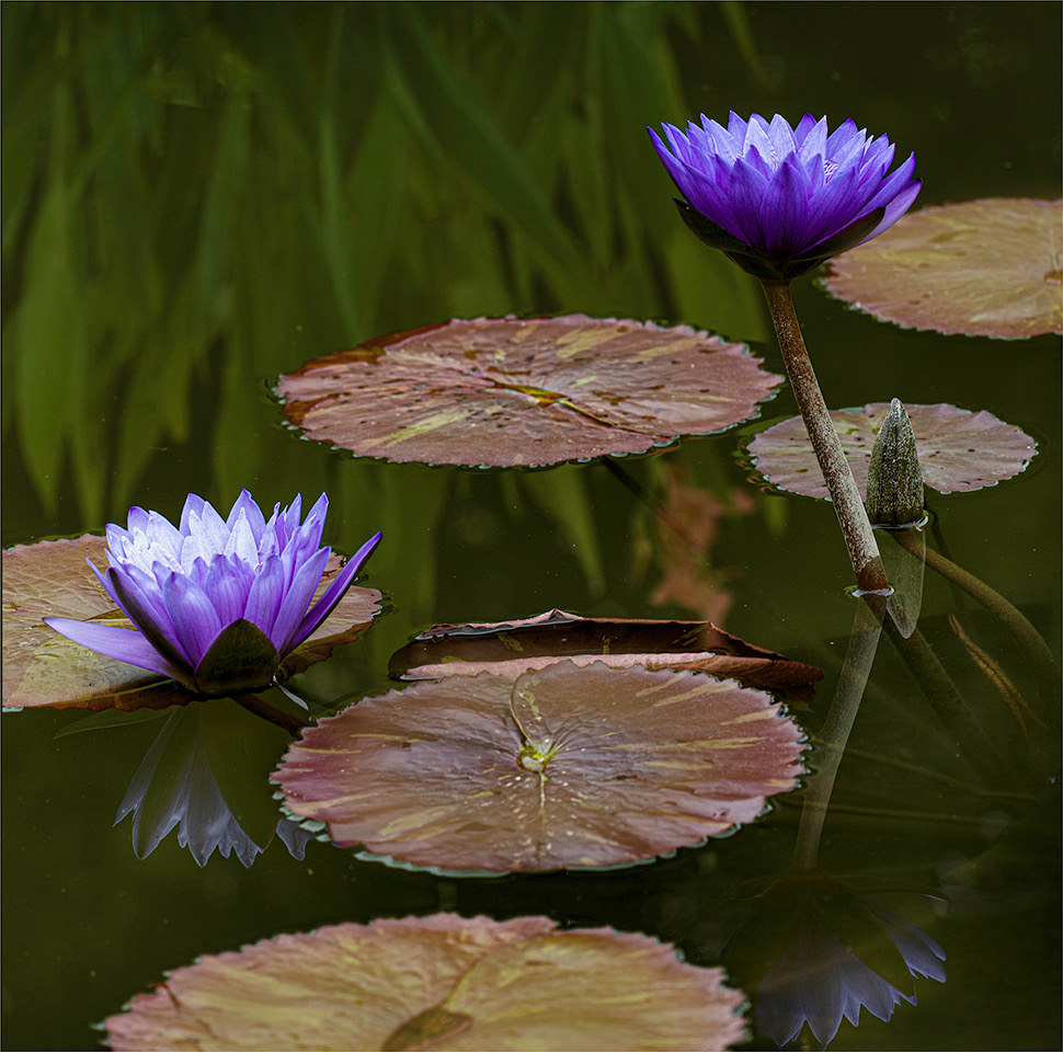
I like the Lilly Pad in the right hand side because it give the image balance. But, Shirley thank you for the thoughts. |
Sep 16th |
| 61 |
Sep 22 |
Comment |
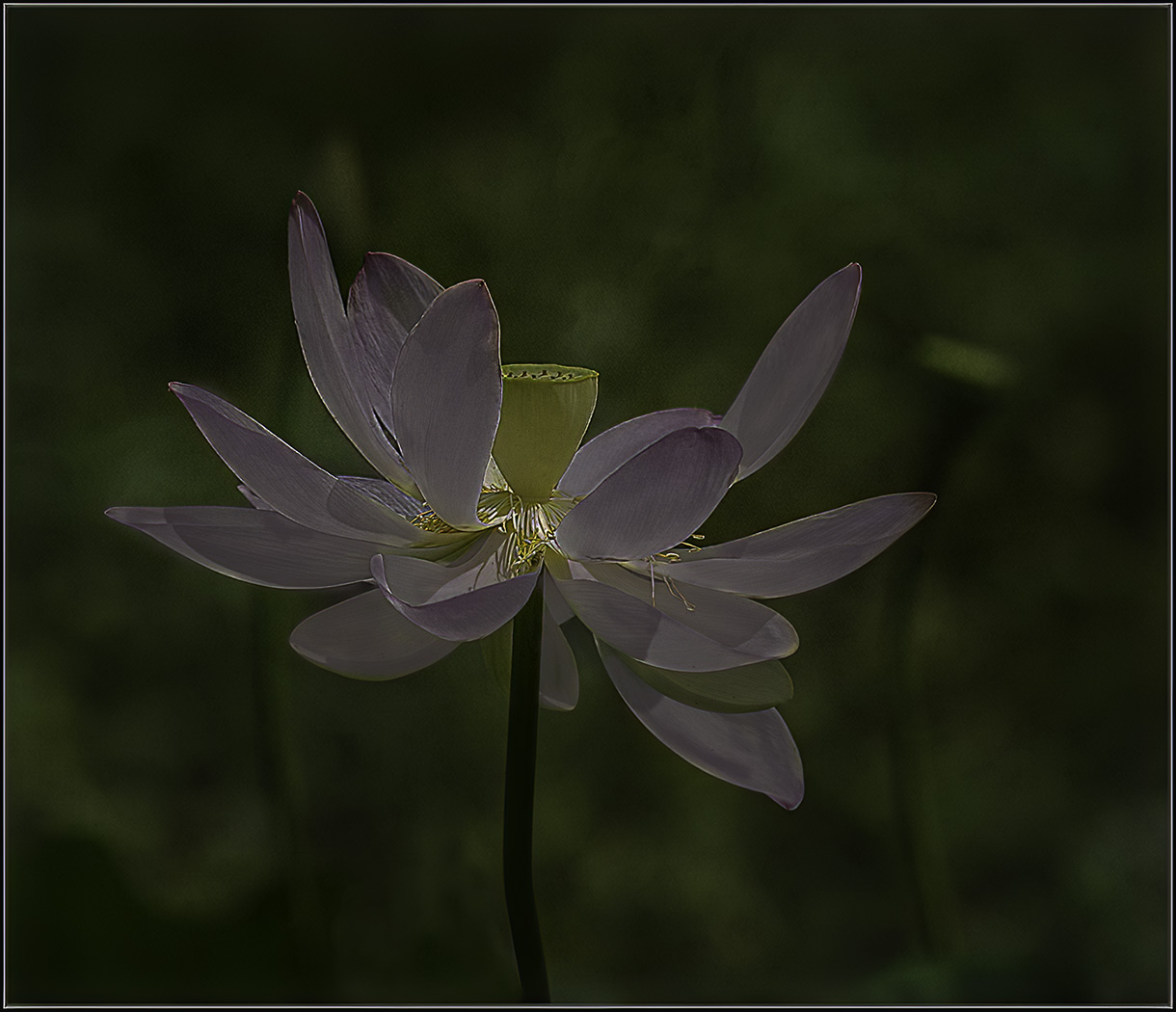
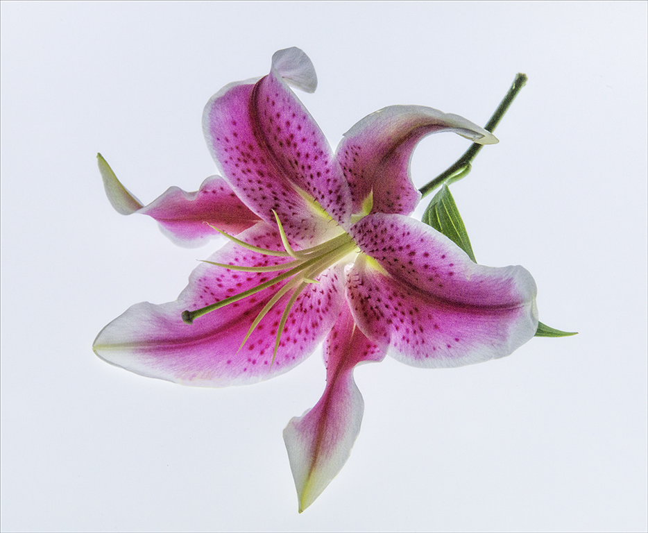
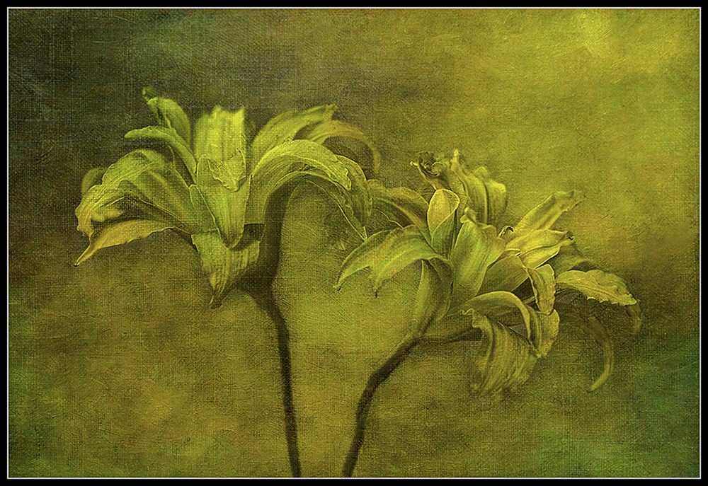
Ingrid, This is a beautiful image of the lily in your yard. The only thing I would do is to darken the background of the image. When I darkened the image in camera raw (masking) it made this beautiful flower pop and It also covered the editing that was done to the image. Good catch. |
Sep 13th |
 |
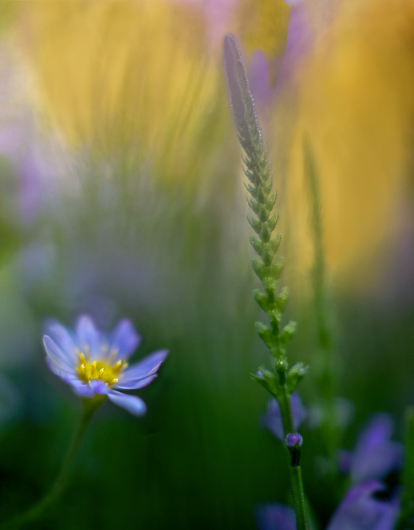
| 61 |
Sep 22 |
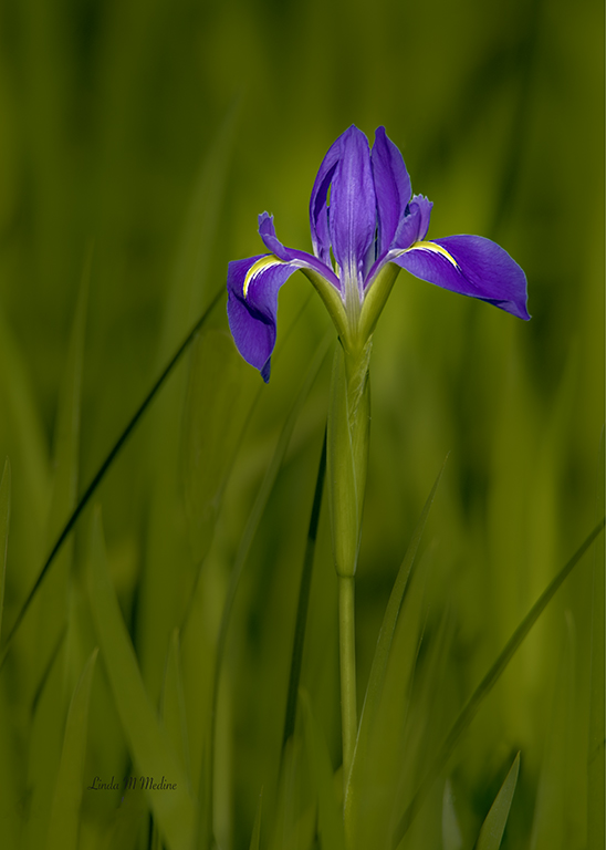
Comment |
Yes, this is a beautiful image. Good contrasting colors. I find the background is drawing my eye that way instead of the beautiful purple flowers. Used Photoshop and took the eye dropper and got a color of the yellow and painted in the colors yellow that is not too bright. |
Sep 1st |
 |
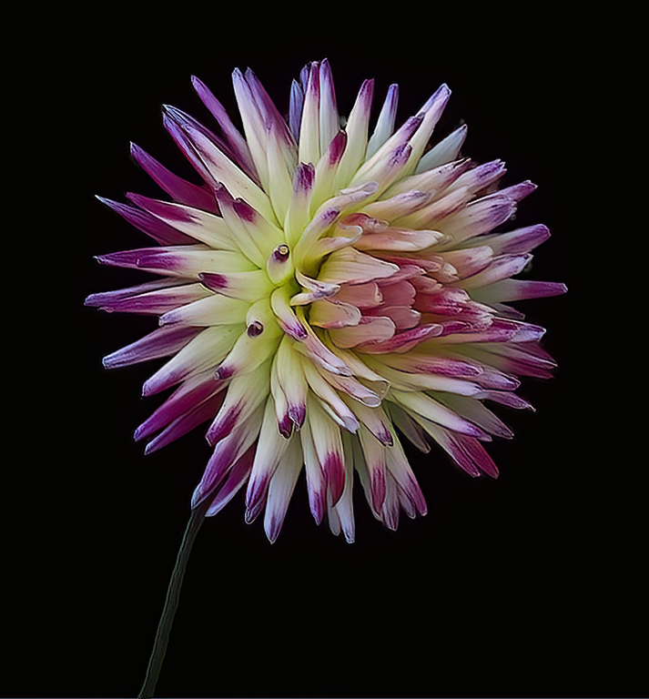
| 61 |
Sep 22 |
Comment |
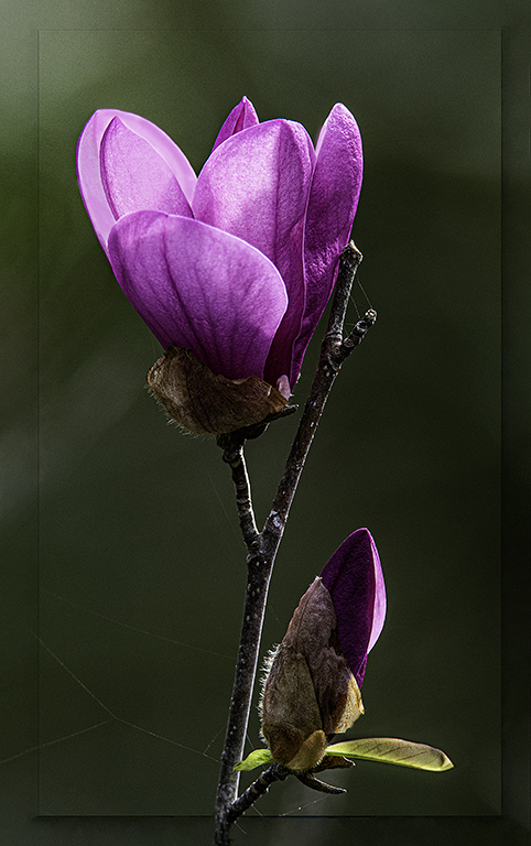
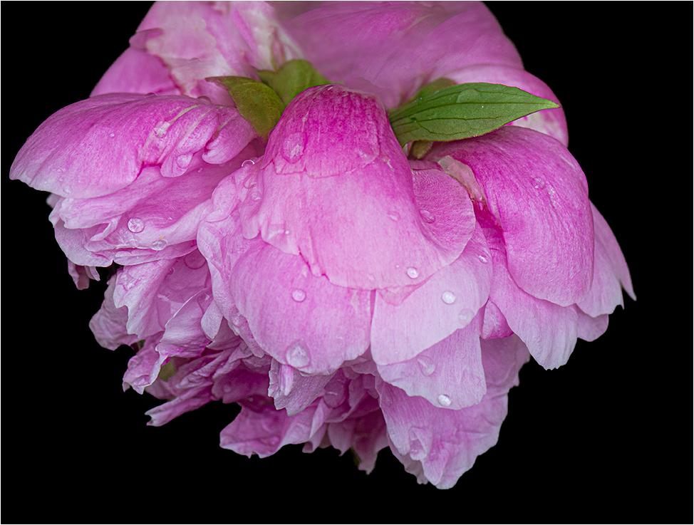
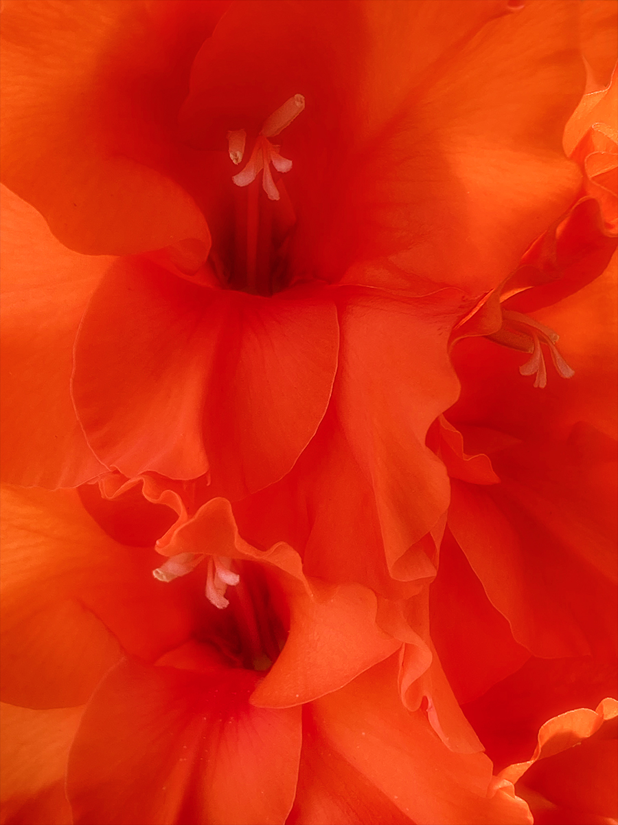
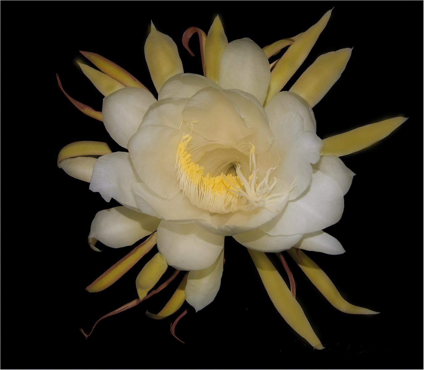
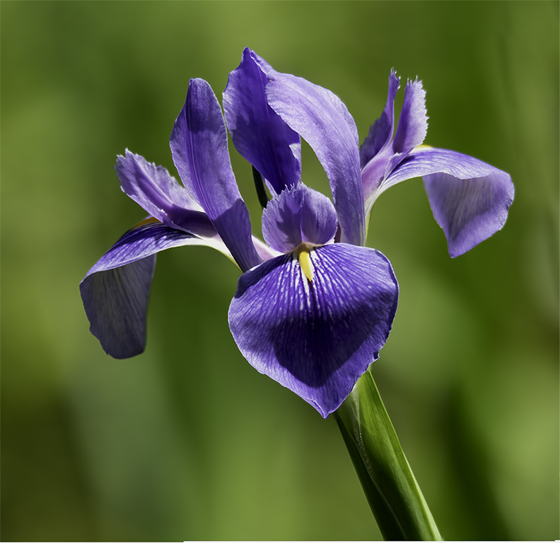
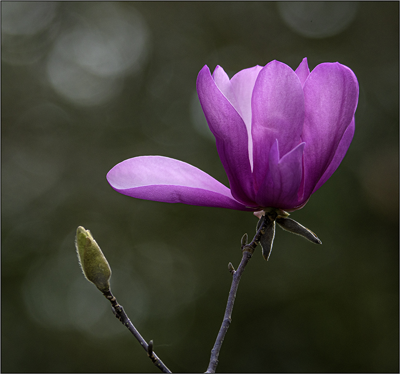
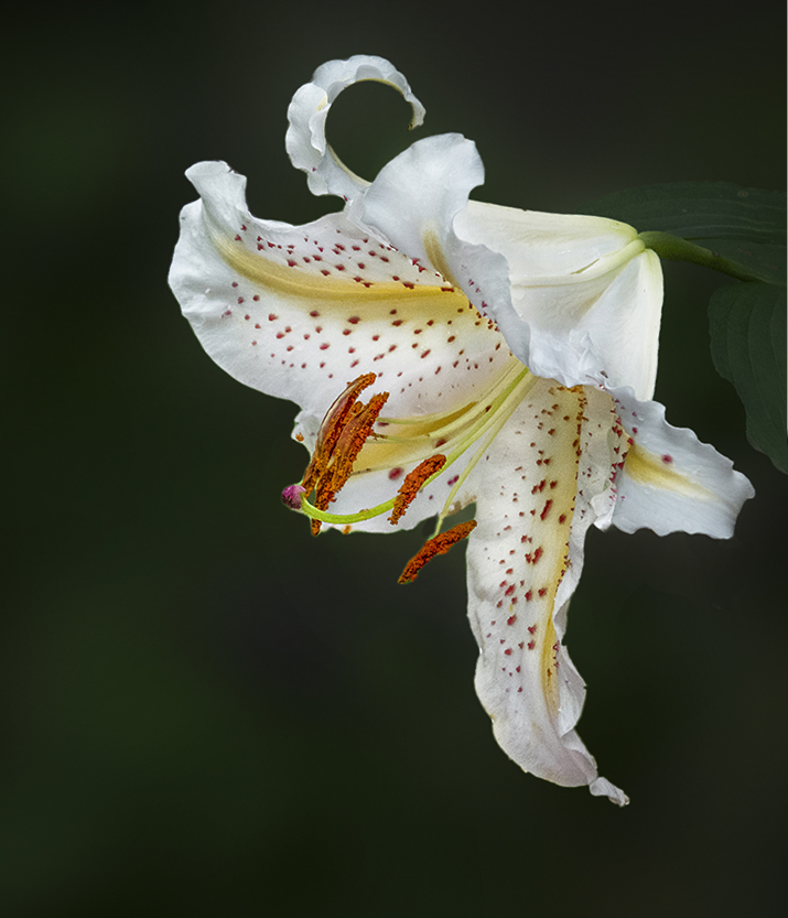
Congratulations on your awards you won on this image. Beautiful color contrast and I like the way the three flowers is leading up the the main subject the big flower. I hope you don't mine if I work on this image just a little. I love these flowers. Everyone has their ideas. I added more room on the image and remove the border. I ran it throught Topaz sharpen and I used Photoshop Camera Raw and used a mask to darken the background just a little to have the flower pop more. |
Sep 1st |
 |
| 61 |
Sep 22 |
Comment |
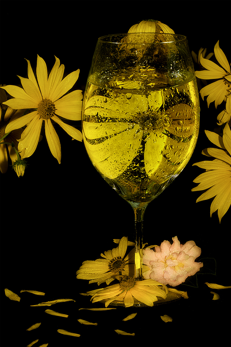
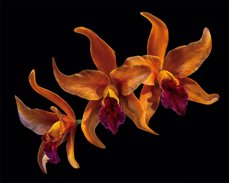
Marti, Beautiful image. Love the colors. Like the black background it makes the flower pop. I did give the flower a little more room. I went in Photoshop and used the content aware tool and I also ran it though DeNoise. I brought it into camera raw and gave it a Little more saturation to pull out more yellow. |
Sep 1st |
 |
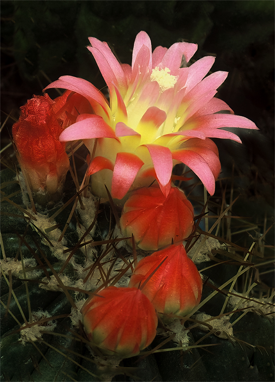
| 61 |
Sep 22 |
Comment |
Beautiful flower. Love the purple and green background. I did the same thing that I did with Donna's Image. I add to Marti's Suggestions. I used Photoshop and I used the eyedrops tool and got the color of green and tone down the opacity to about 25 on the brush and painted the white lines on the limbs and I tone down the bright light not he bottom leaf with green. |
Sep 1st |
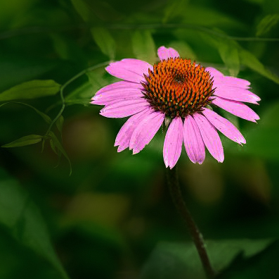 |
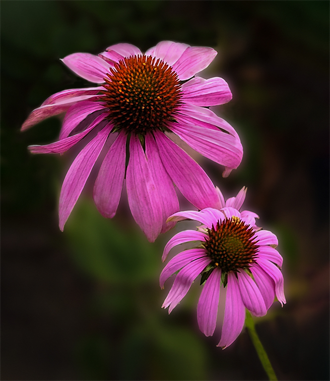
| 61 |
Sep 22 |
Comment |
I love taking image of the coneflower. Great contrast flower to background. I agree with Randall, David and Marti. I took Marti's Visual Feedback and added to it. I painted out some of the hi lights on the back side of the top flower. In Photoshop I added more to the image to not have the flower petal cut off on the left side. I used the clone tool to get some the blemish off the flower. |
Sep 1st |
 |
7 comments - 0 replies for Group 61
|
| 77 |
Sep 22 |
Comment |
Yes, Congratulations on your retirement. I love this image. I do like what Witta did with the image. I like the least amount of water drops at the bottom. |
Sep 13th |
| 77 |
Sep 22 |
Comment |
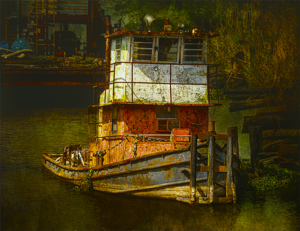
Michael, You did an excellent job on bring this image up to a fine art piece. I would really like to see more of the image. I feel like you cropped out too much on the sides. I would try to give it a little more contrast. But, it is great the way it is. |
Sep 13th |
| 77 |
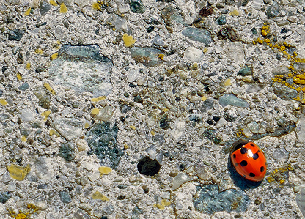
Sep 22 |
Comment |
Hi Mary, This is a great catch. Love the contrast. Really like all the colors in the concrete path. The Ladybug really stands out. I do have a visual feedback. I cropped the image to make the ladybug larger. I took a brush and painted in more yellow and blue. I used photoshop and camera raw to darken the background and bring out more contrast in the image. |
Sep 13th |
 |
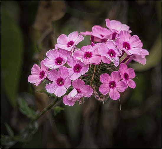
| 77 |
Sep 22 |
Comment |
Hi Connie, That is so nice of you to made a book for your neighbor of her flowers. What a nice gift. I love the flowers and the treatment you used on the image. Great contrast and color balance. I have a visual feedback of the beautiful flowers. I used photoshop and camera raw. I used the masking tool on the flower to darken the background and then I used the same tool to give the flowers more pop and contrast. Very nice image. |
Sep 13th |
 |
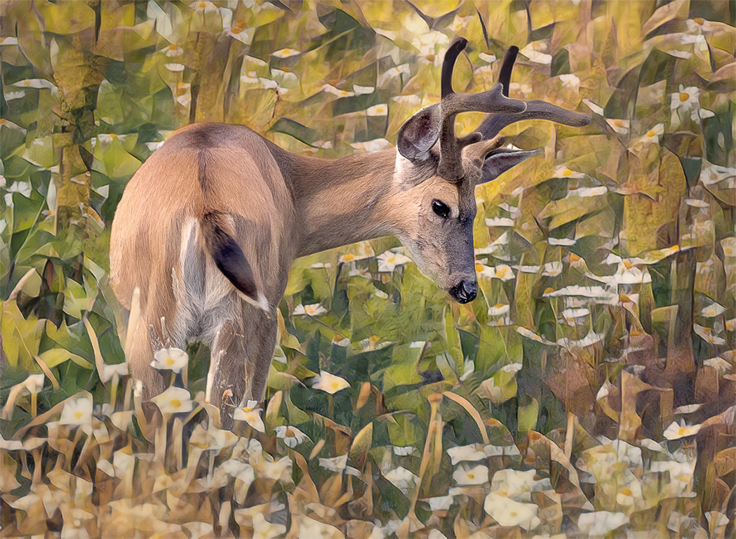
| 77 |
Sep 22 |
Comment |
Witta, I think this image looks like a fine art piece to me. I feel like the colors really go together. I went into Camera Raw and darkened the background to have the deer pop more. I can see painting or cloning next to the back legs of the deer and on the left side by the deers belly near his leg there is a light spot that looks different than the rest of the image. |
Sep 2nd |
 |
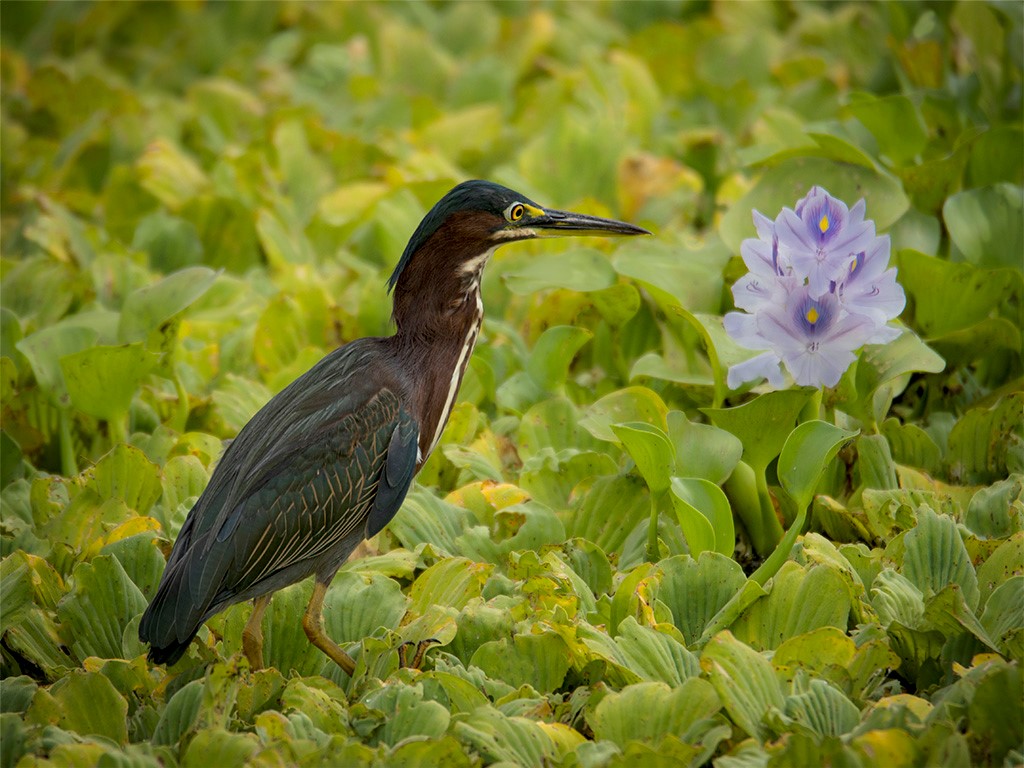
| 77 |
Sep 22 |
Comment |
Carol, Great image to work with. So much could be done with this beautiful flower. It could be a great black and white because of the textures. I feel like the way you processed is outstanding. Everyone sees the image different. I have a visual feedback. Thank you for sharing this image. |
Sep 2nd |
 |
6 comments - 0 replies for Group 77
|
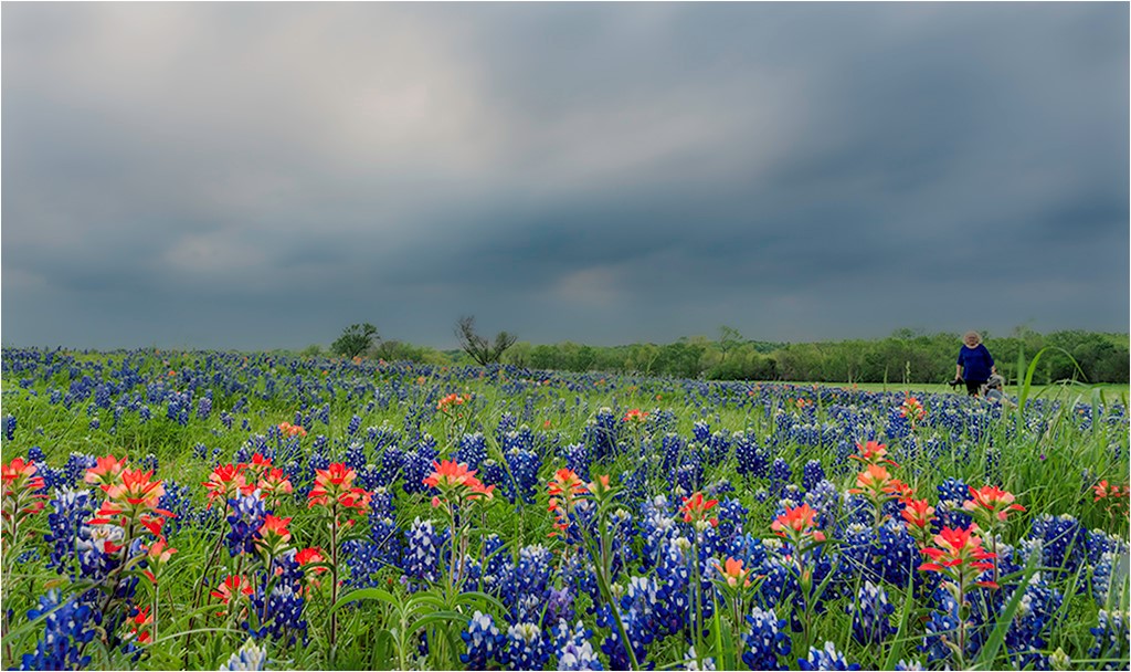
| 99 |
Sep 22 |
Comment |
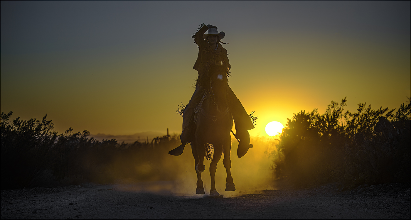
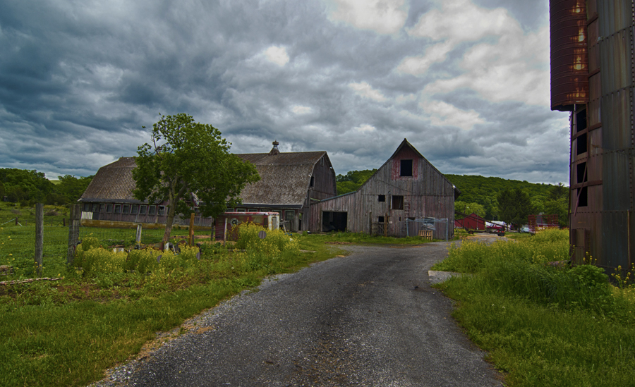
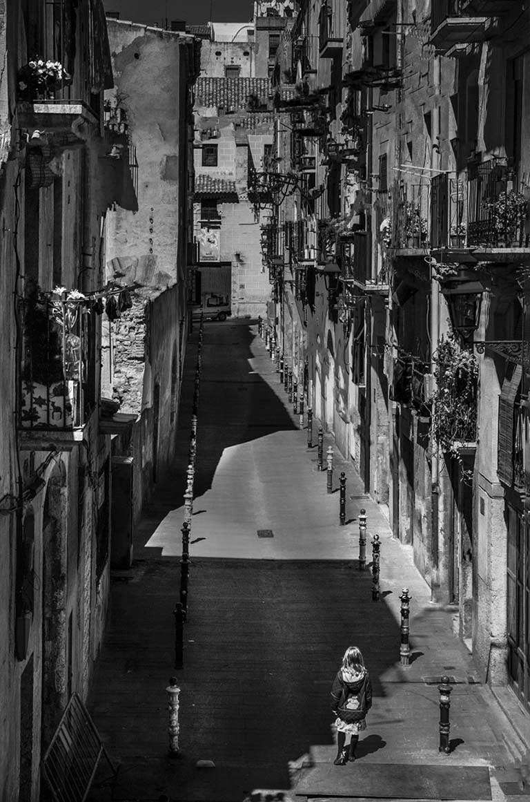
Hi Randy, Very interesting image. GREAT storytelling. Where is she going, does she live there, is she going to the vehicle down the end of the lane for. Is there a sign at the end of the lane that says one way or don't enter. I used photoshop and camera raw to pull out the shadows and radial tool to lighten the shadows. I really love this image. Also, flipped the image. You got everyone talking about this selection, good job. |
Sep 13th |
 |
| 99 |
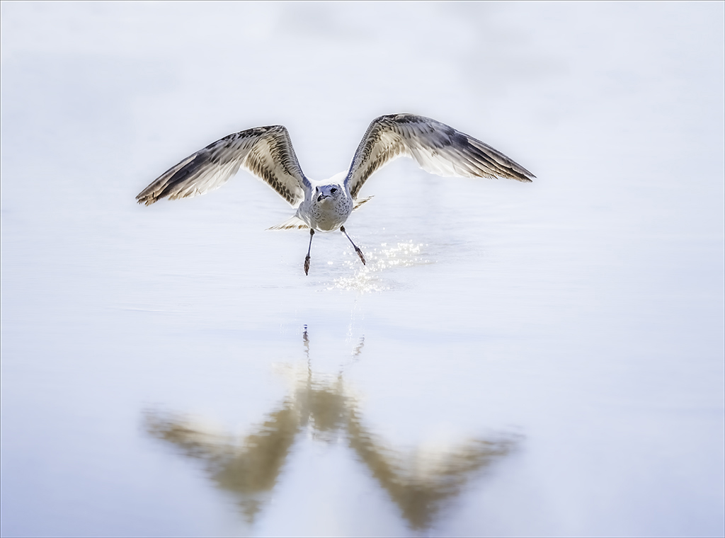
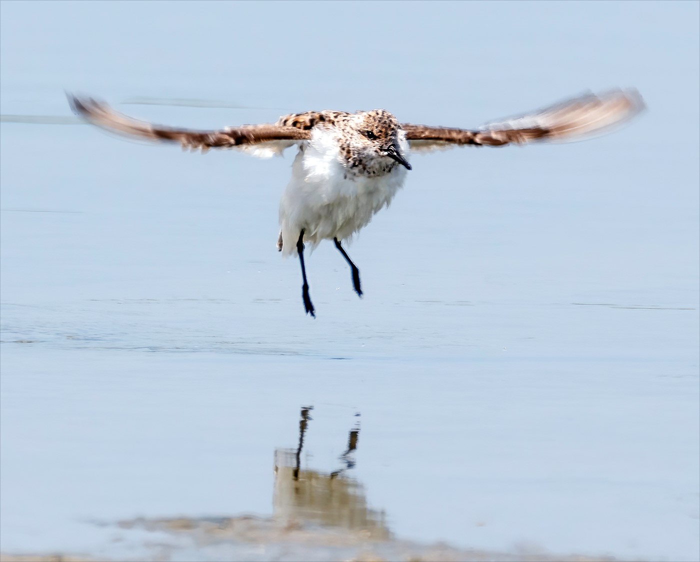
Sep 22 |
Comment |
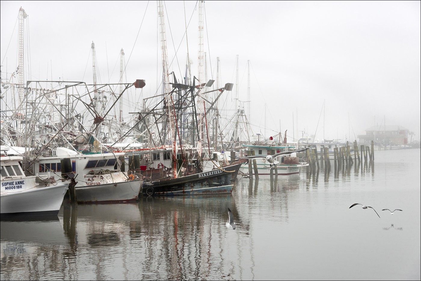
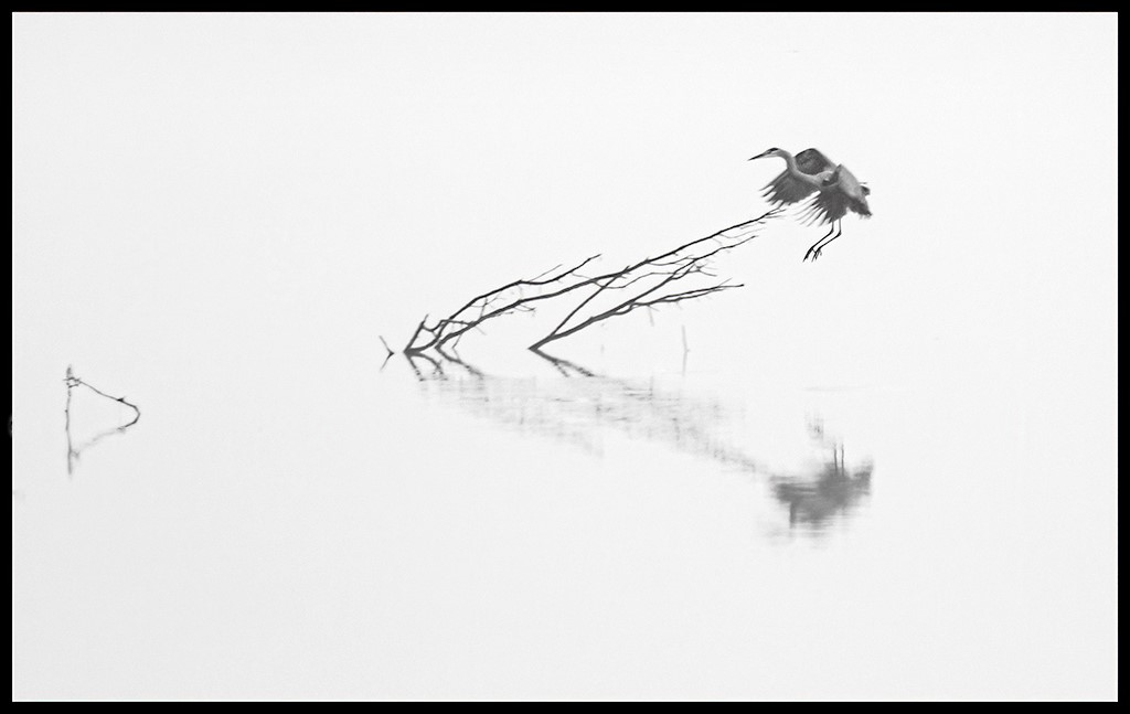
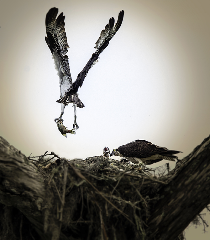
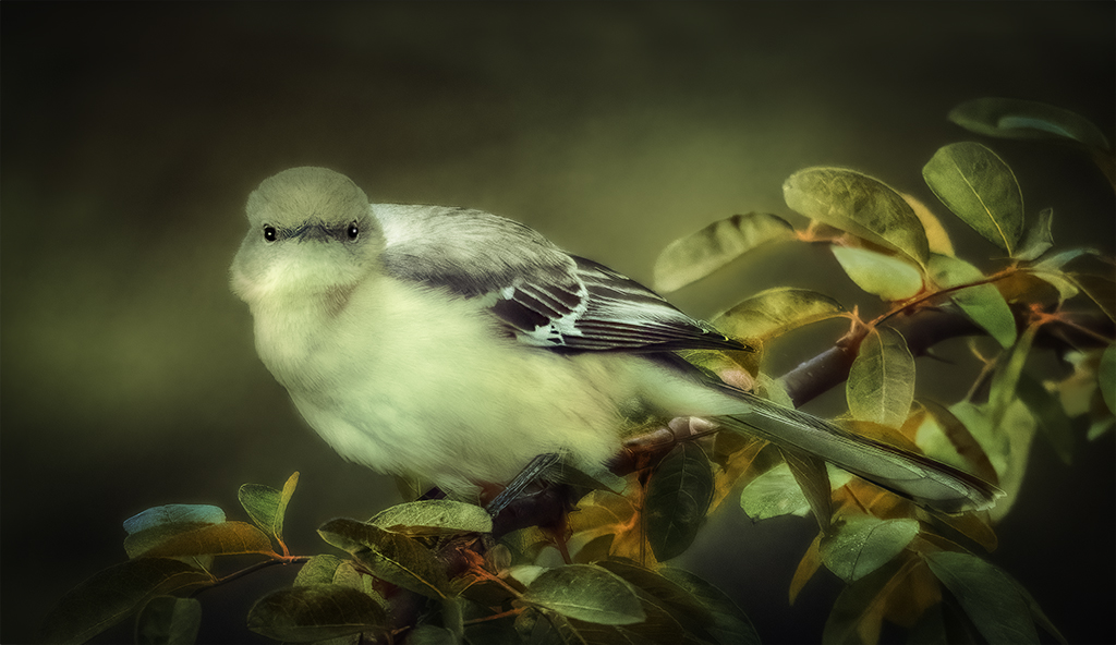
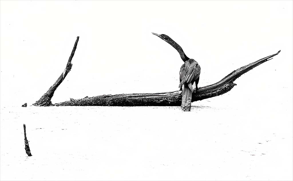
Michael, I really like this image. I really like the minimalist of this image. Good detail in the bird. Love the leading lines. I like the way the stick in the water is give me directions where to look. the the log leads to the beautiful bird. Yes, it does make a triangle. Good job. I hope you like the high key. |
Sep 13th |
 |
| 99 |
Sep 22 |
Reply |
Yes. I love what you did. I will make the change. Thank you for your feedback and Visual Feedback. |
Sep 13th |
| 99 |
Sep 22 |
Comment |
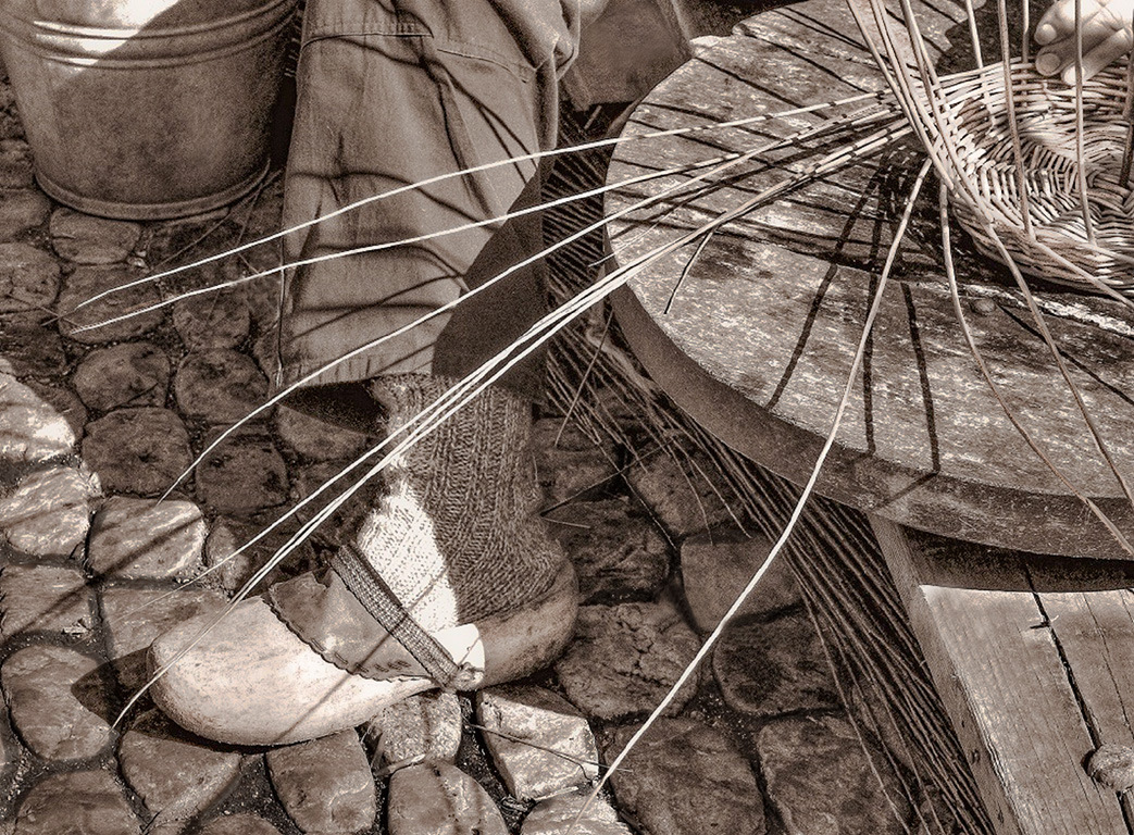
Kathleen, Beautiful image. I love the black and white tone. I gave the shoe a little light and I darkened the mortar and the stones. I have a visual feedback. This is a very interesting image. |
Sep 2nd |
 |
| 99 |
Sep 22 |
Comment |
Peter, Very Good. You are very creative. I don't do too many composites. But, before I read you details about the image to me I thought the couple should have some shadows under them to make it look more real. But that being said I really like what you have don. |
Sep 2nd |
| 99 |
Sep 22 |
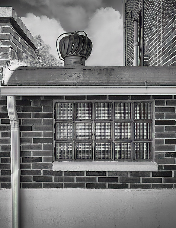
Comment |
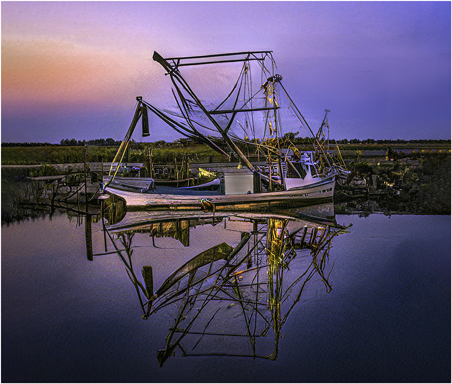
Gerard, This is a very interesting image. Love the lines and texture. I flipped the image to use the gutter as the leading line to the window and then to the roof. I removed the wires. If feel like the wires were distracting. This was a very good challenge. Good Job. |
Sep 2nd |
 |
| 99 |
Sep 22 |
Comment |
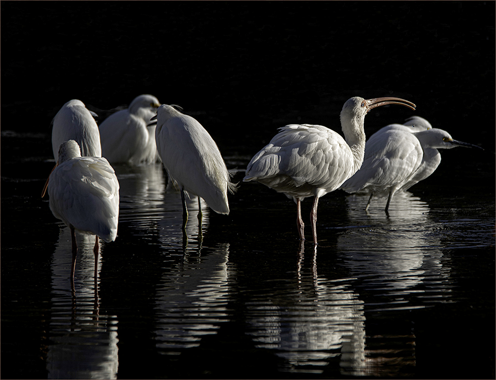
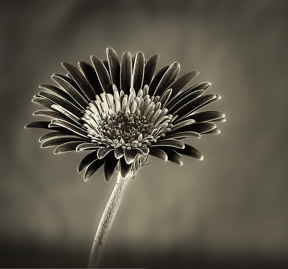
Barbara, I love what you started with and finished with a beautiful black and white. This image is very minimalist. Love the the tones. I have a visual feedback. I darkened the background to give the image a little more pop and cropped the image. |
Sep 2nd |
 |
6 comments - 1 reply for Group 99
|
25 comments - 2 replies Total
|