|
| Group |
Round |
C/R |
Comment |
Date |
Image |
| 43 |
Feb 22 |
Comment |
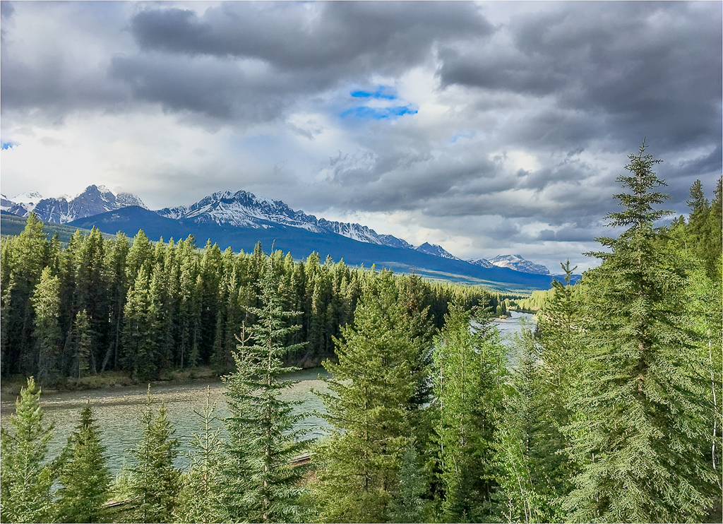
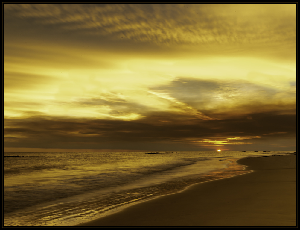
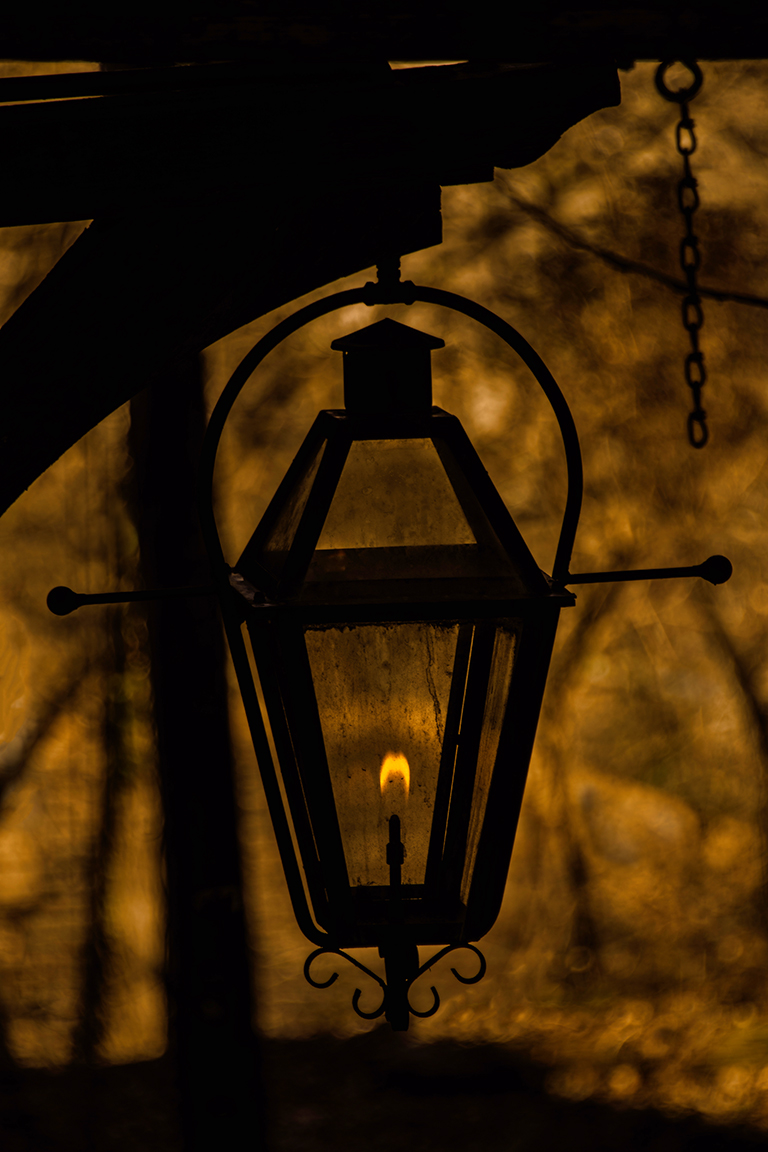
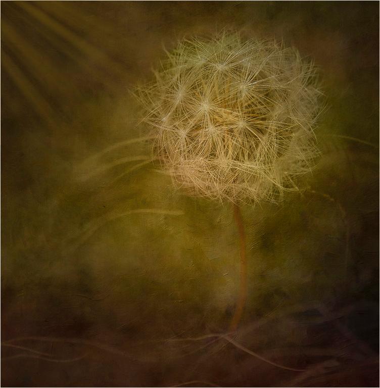
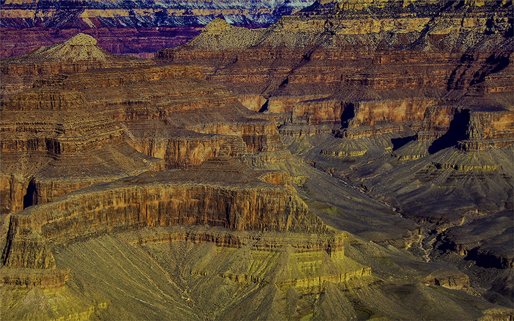
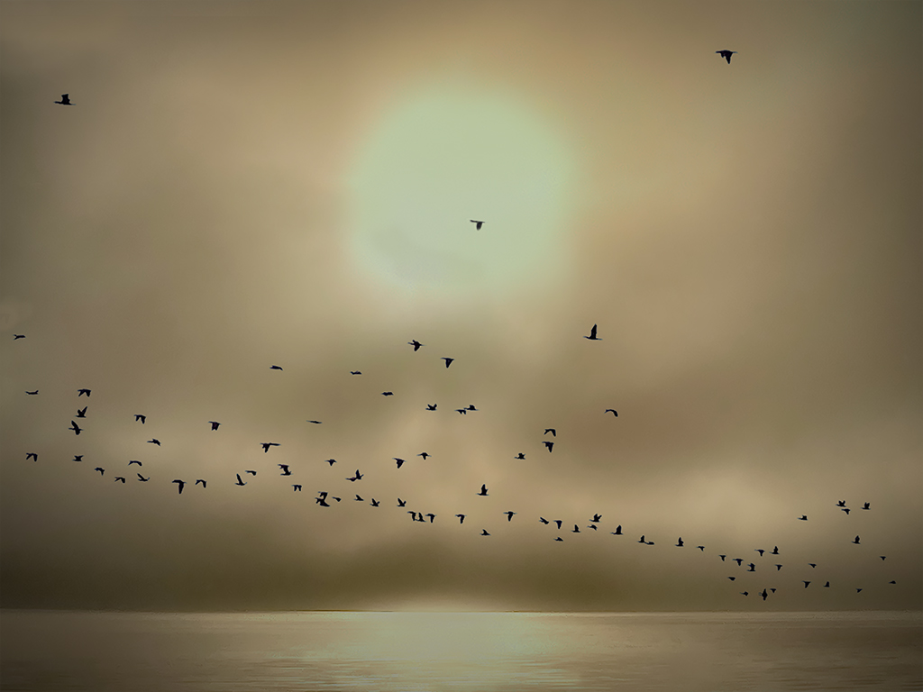
Andrew, I have always wanted to take the Milky Way. I understand it has to be taken at the certain time of the year and no light pollution to get a great image of the Milky Way. Beautiful image, it is just too noisy. I was just asking, would it be better to darken the harsh light hitting the ground
in the foreground a little? I really like the lights hitting the rocks.
|
Feb 11th |
| 43 |
Feb 22 |
Comment |
Hello Harley, I am the same way. I am not getting out too much because of the weather. I am going back and looking at images I took a few years back. It is fun doing that and to see what can be done with those images. I really like the color image better. Feel like the black and white is over processed. I think it looks too harsh. I worked the Color and made into Black and White. I have a Visual Feedback. |
Feb 11th |
 |
| 43 |
Feb 22 |
Comment |
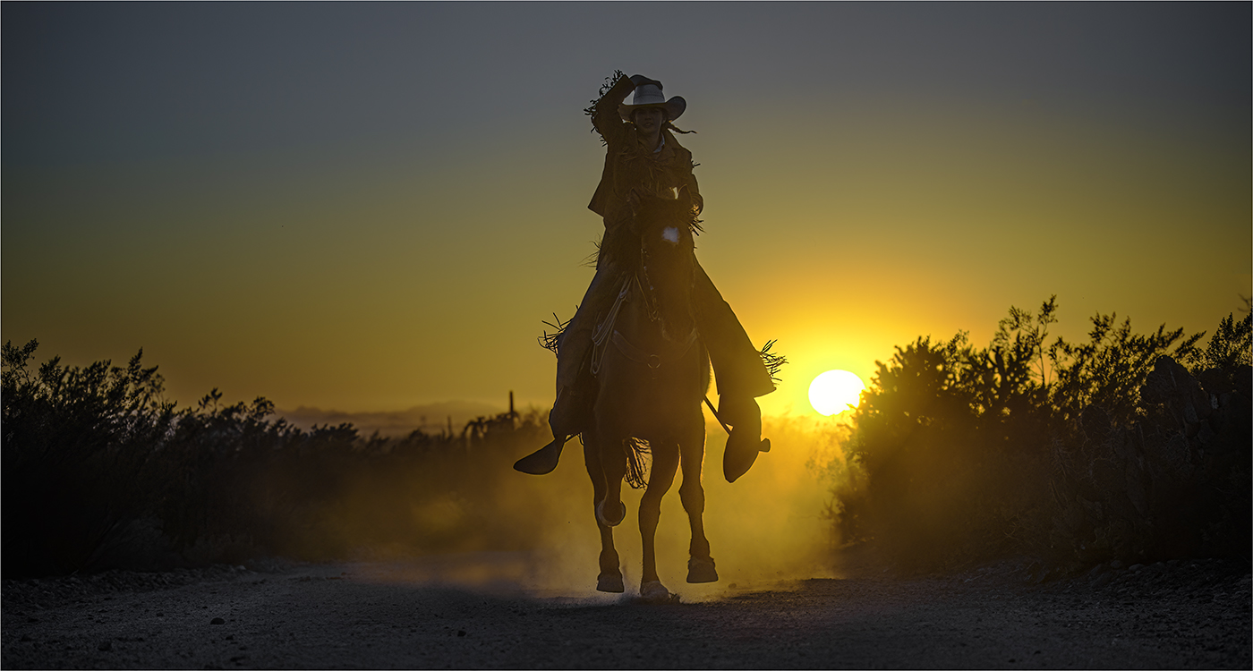
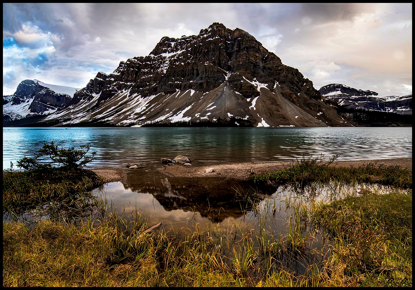
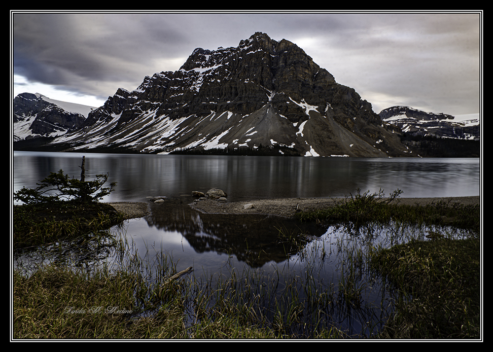
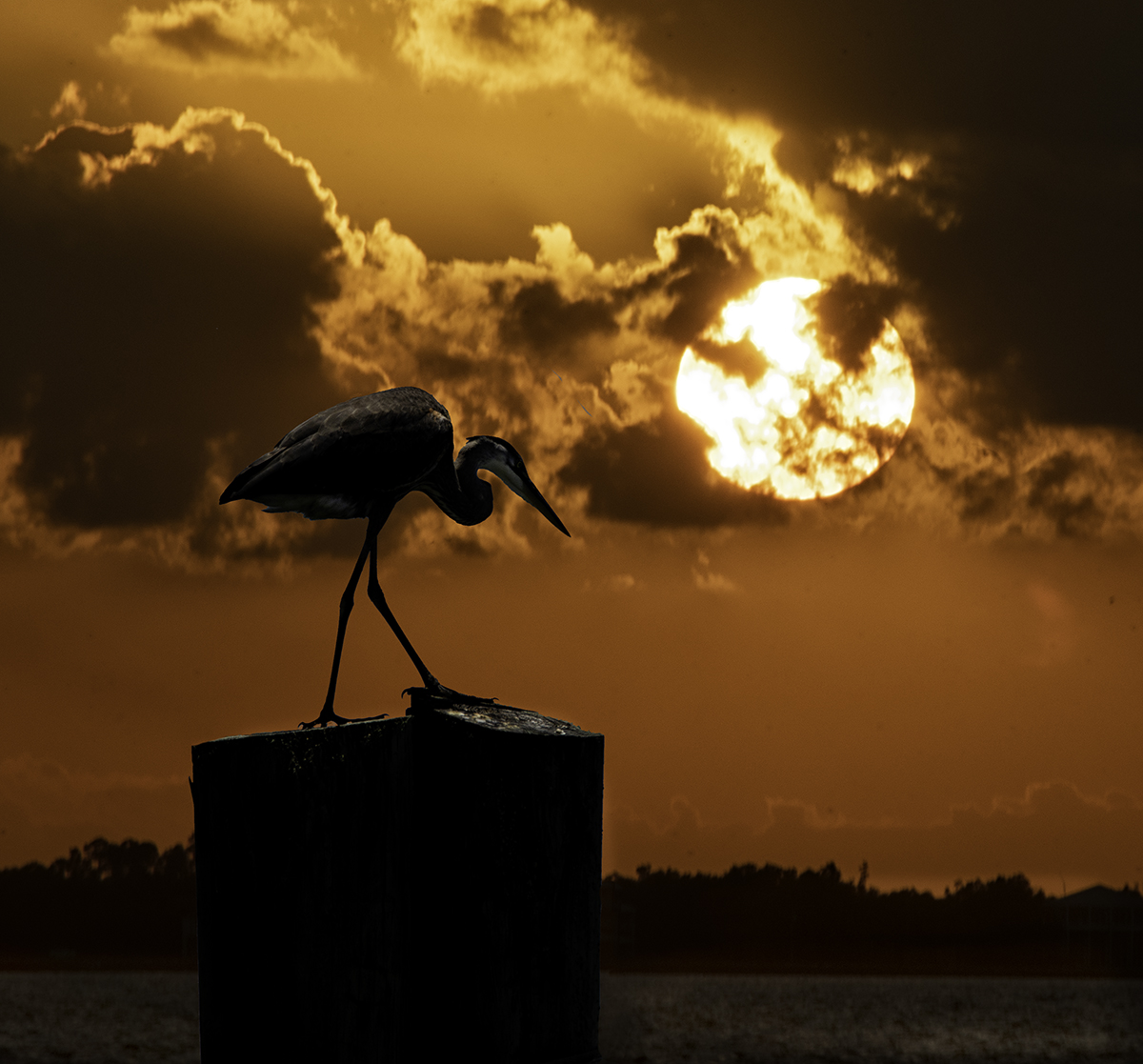
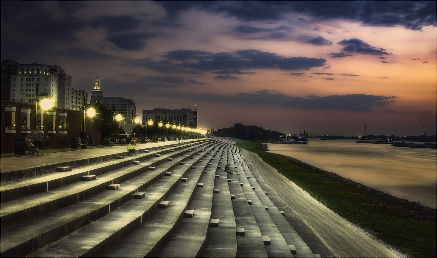
Wow, I really like this image. There is no question to the subject. Love the way my eyes is lead to the silhouette of the person. Love the way the rocks in the foreground are in focus and is in focus all the way to the end of the image. Beautiful Lighting. I feel like this is a winner.
|
Feb 10th |
| 43 |
Feb 22 |
Comment |
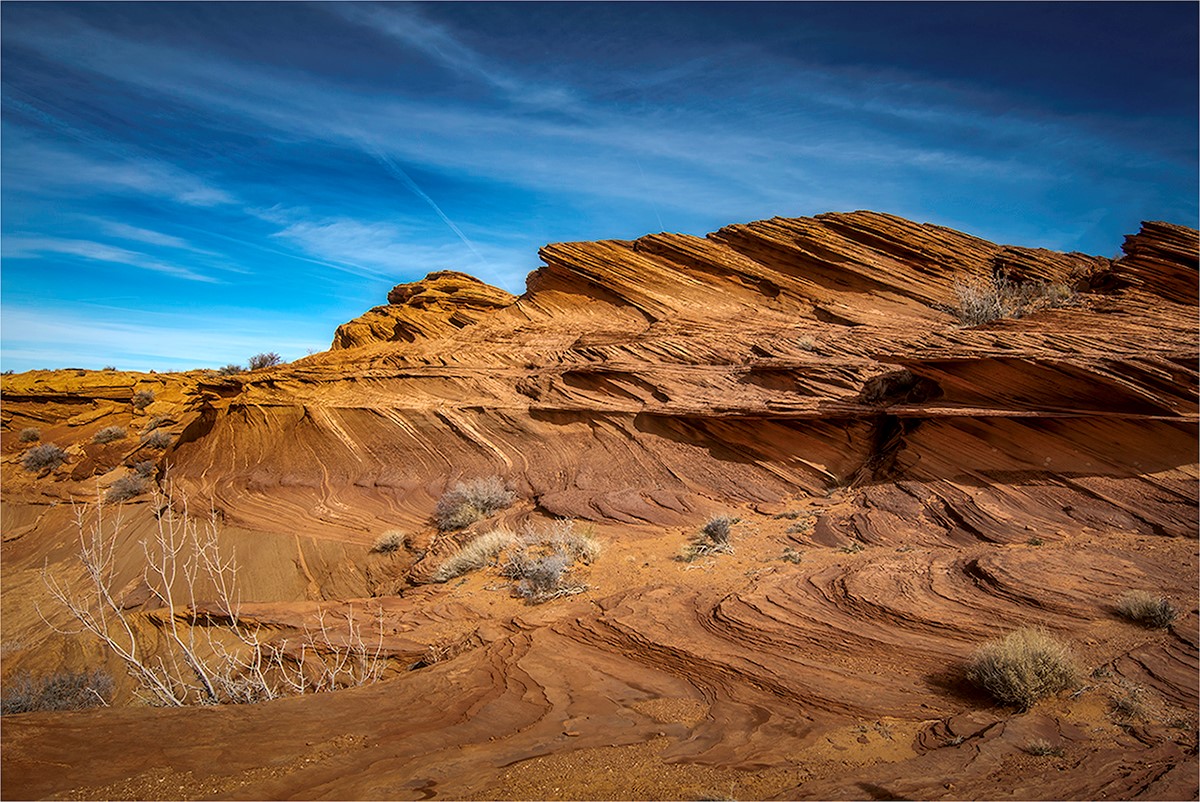
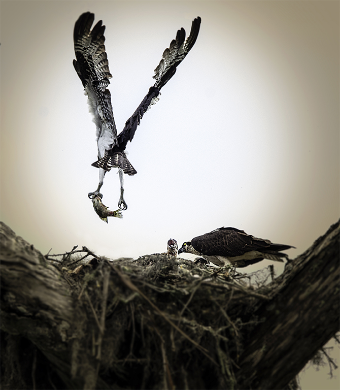
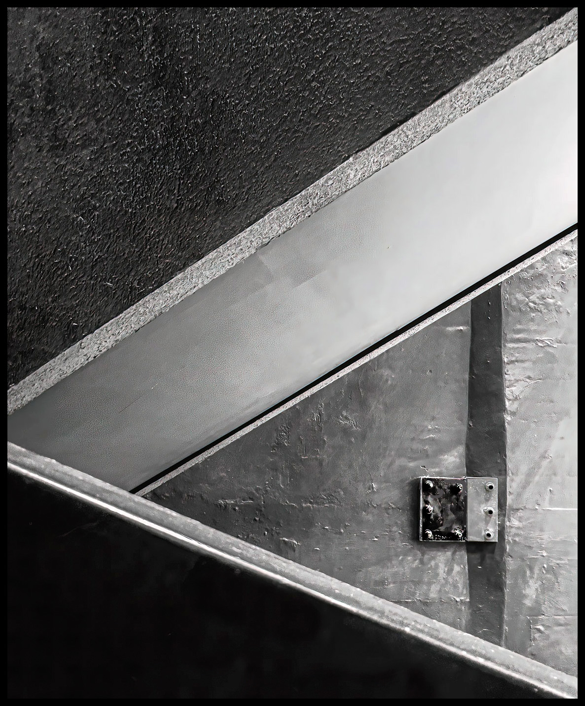
Mark, This image is really eye catching. Lots of impact. Like the textures. I would like to learn a little more about how you put this together and a little story behind it. |
Feb 2nd |
| 43 |
Feb 22 |
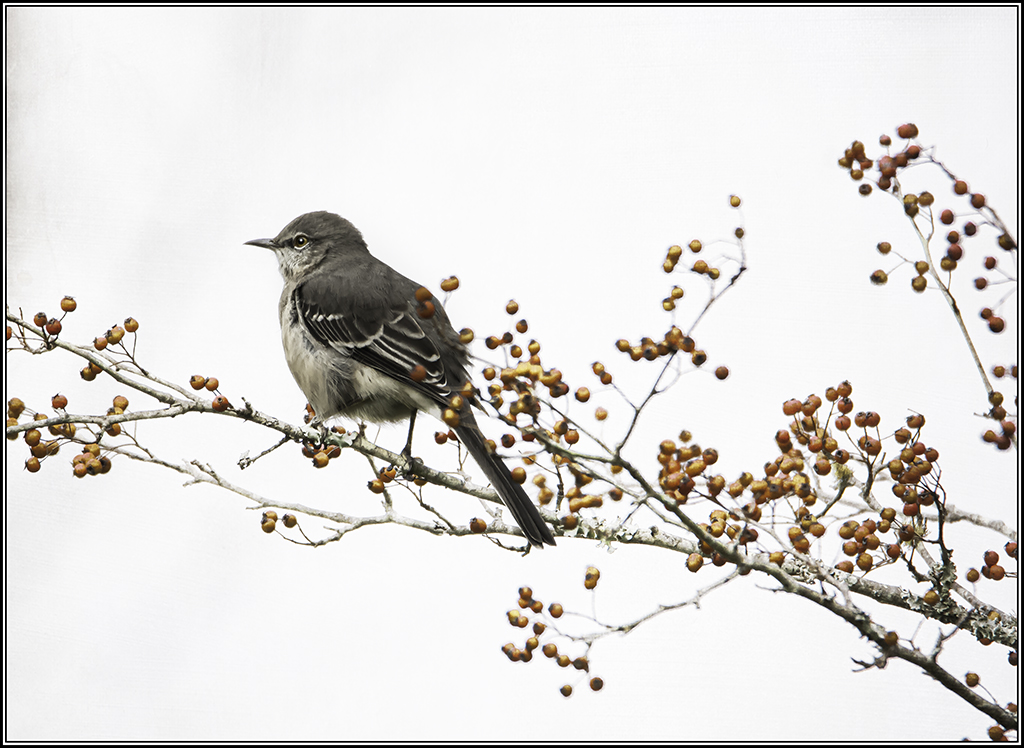
Comment |
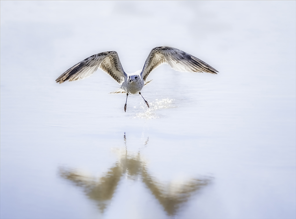
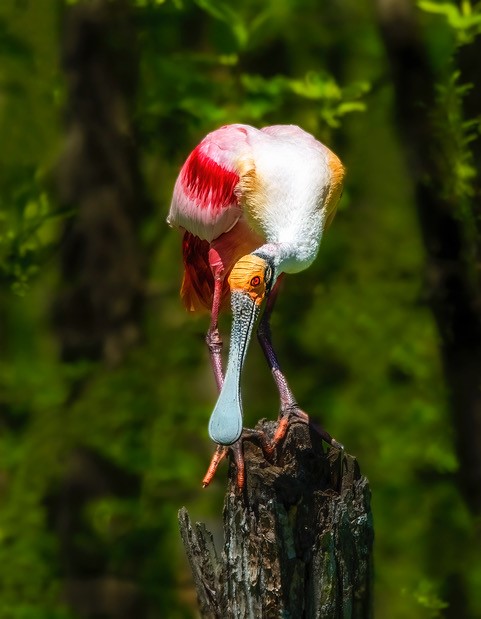
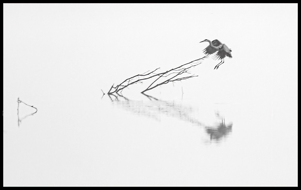
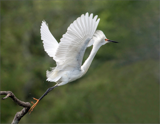
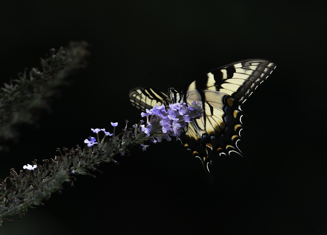
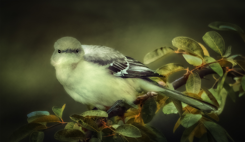
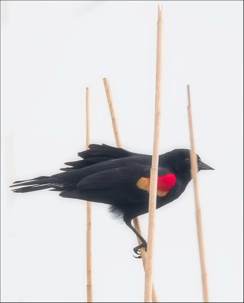
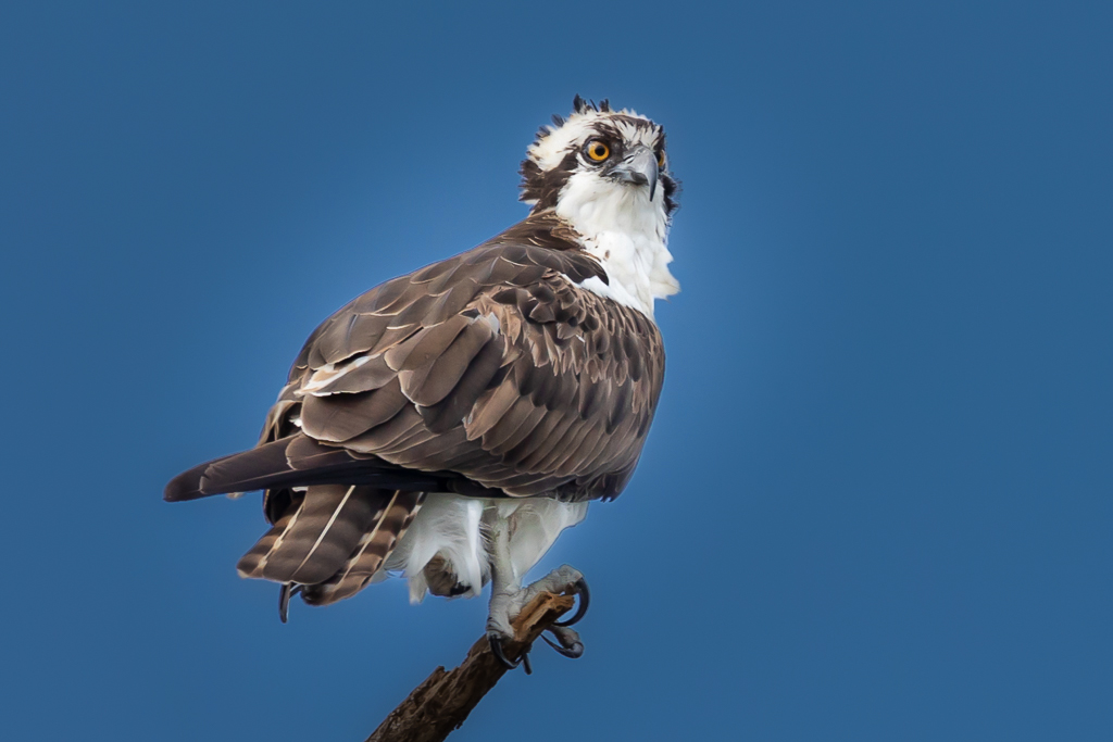
Bruce, Outstanding detail. I am glad I can see both of his eyes. Great catch. It looks like his may only have one leg. I love the textures of his feathers. I feel like I would make the sky a little bluer to make the bird stand out a little more. |
Feb 2nd |
 |
5 comments - 0 replies for Group 43
|
| 77 |
Feb 22 |
Comment |
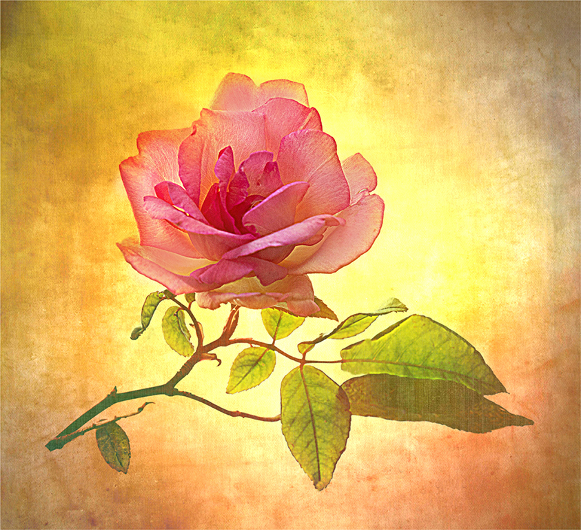
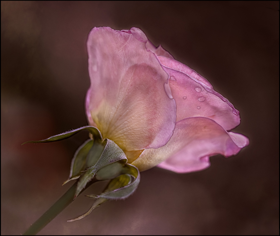
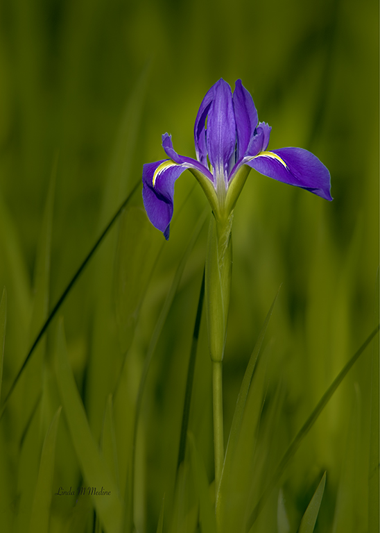
Denise, Love the contrast of this image. Very beautiful rose. I would give it a little more room around the rose. Other than that I would not change a thing. |
Feb 16th |
| 77 |
Feb 22 |
Comment |
Michael, I agree with Witta. Once you take care of those few things I feel like you have a beautiful image. I love that you chose the black background. These are some beautiful flowers. |
Feb 15th |
| 77 |
Feb 22 |
Comment |
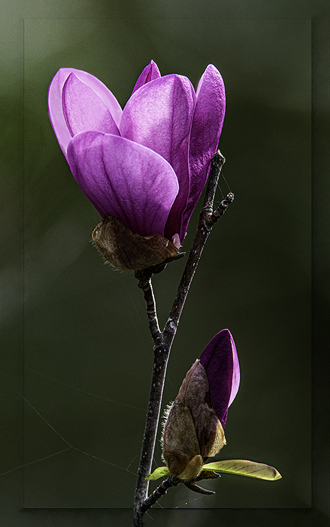
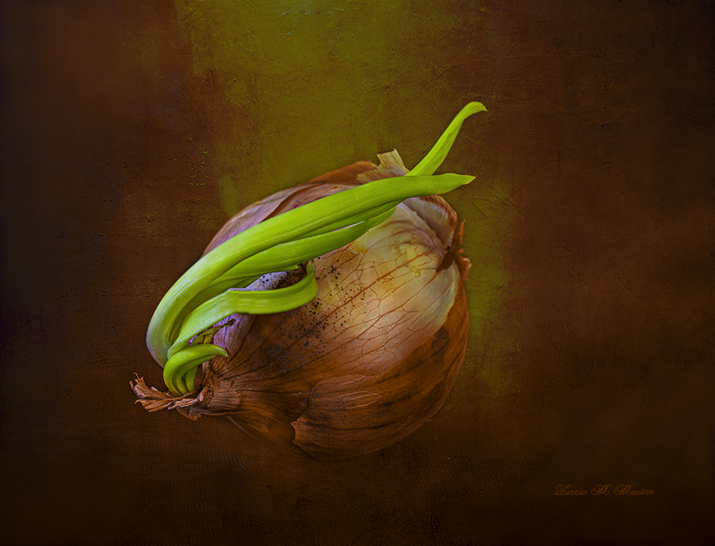
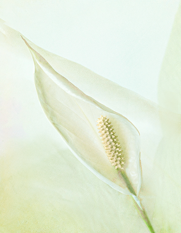
Hi Mary, You did a lot with this image already. I love what you did. I work with flowers and am always trying different things. One thing I love to do is to work with textures. This is the Fine Art Group so. This is what I did. I used three textures and I erased the texture from the stamen and some of the green stem. I gave the flower a little more room and angled the flower a little in content aware. I have a visual feedback. |
Feb 15th |
 |
| 77 |
Feb 22 |
Comment |
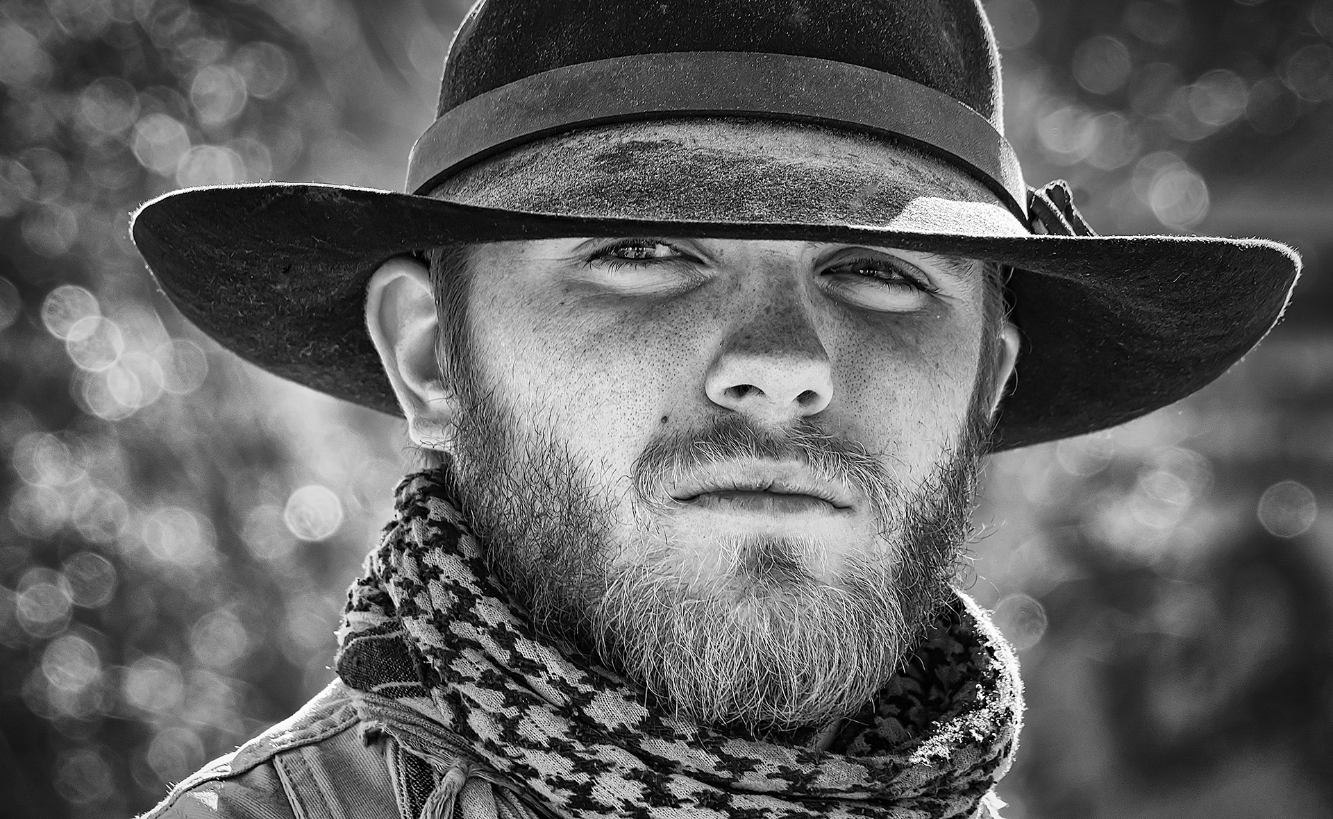
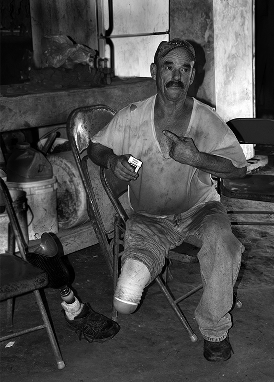
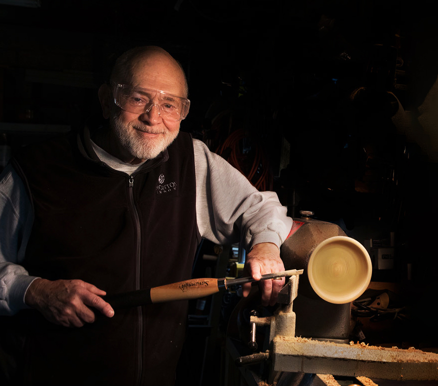
Hi Connie, First I want to congratulate you for such a wonderful and beautiful accomplishment. It look like he is having a good time working with his hands. I love this image and the expression on his face too. Love the contrast. I do think there is lot of distractions in the background. I catch myself looking around instead of looking at his face and what he is doing. I cropped the image a little on the right side and did a content aware to make the board longer. there is a black thing that is blocking the board. I darkened the hi lights in the background. I went into camera raw and used radial filter and darkened his shirt and lighten his face a little. I have a Visual Feedback. |
Feb 15th |
 |
| 77 |
Feb 22 |
Comment |
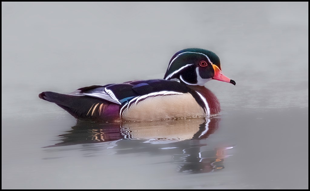
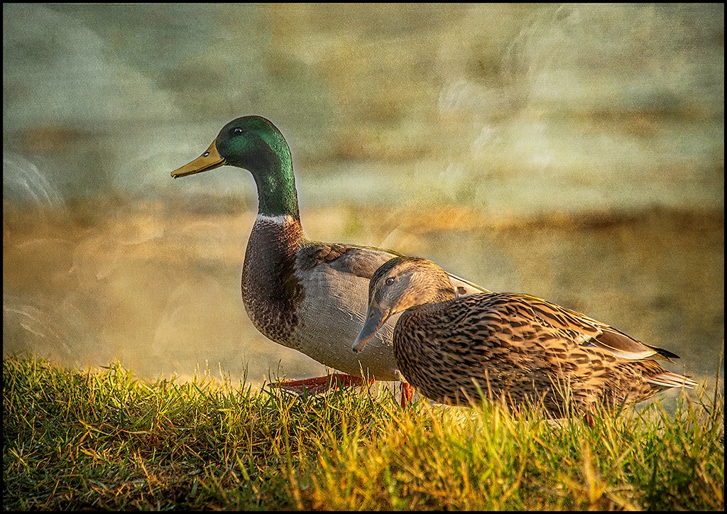
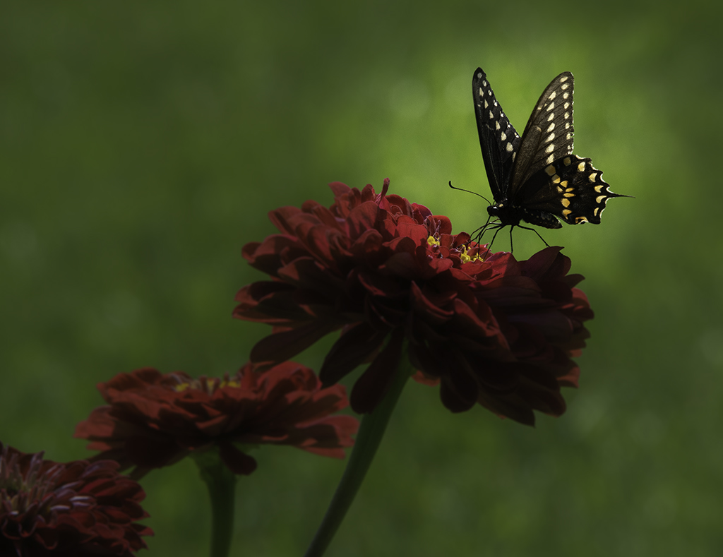
Witta, I would not change a thing. I love the rich colors and the contrast the bird to the background. You have changed the background but still made the image look like the background is the natural habitat for this bird. Beautiful texture. Good sharp eye. Yes, I would love this image in my home as a framed image. |
Feb 15th |
| 77 |
Feb 22 |
Comment |
Just asking? This is a Fine Art PID and I like the gold in this image. Like more pop in this image. |
Feb 11th |
| 77 |
Feb 22 |
Reply |
Thank you Witta for the feedback. |
Feb 10th |
| 77 |
Feb 22 |
Comment |
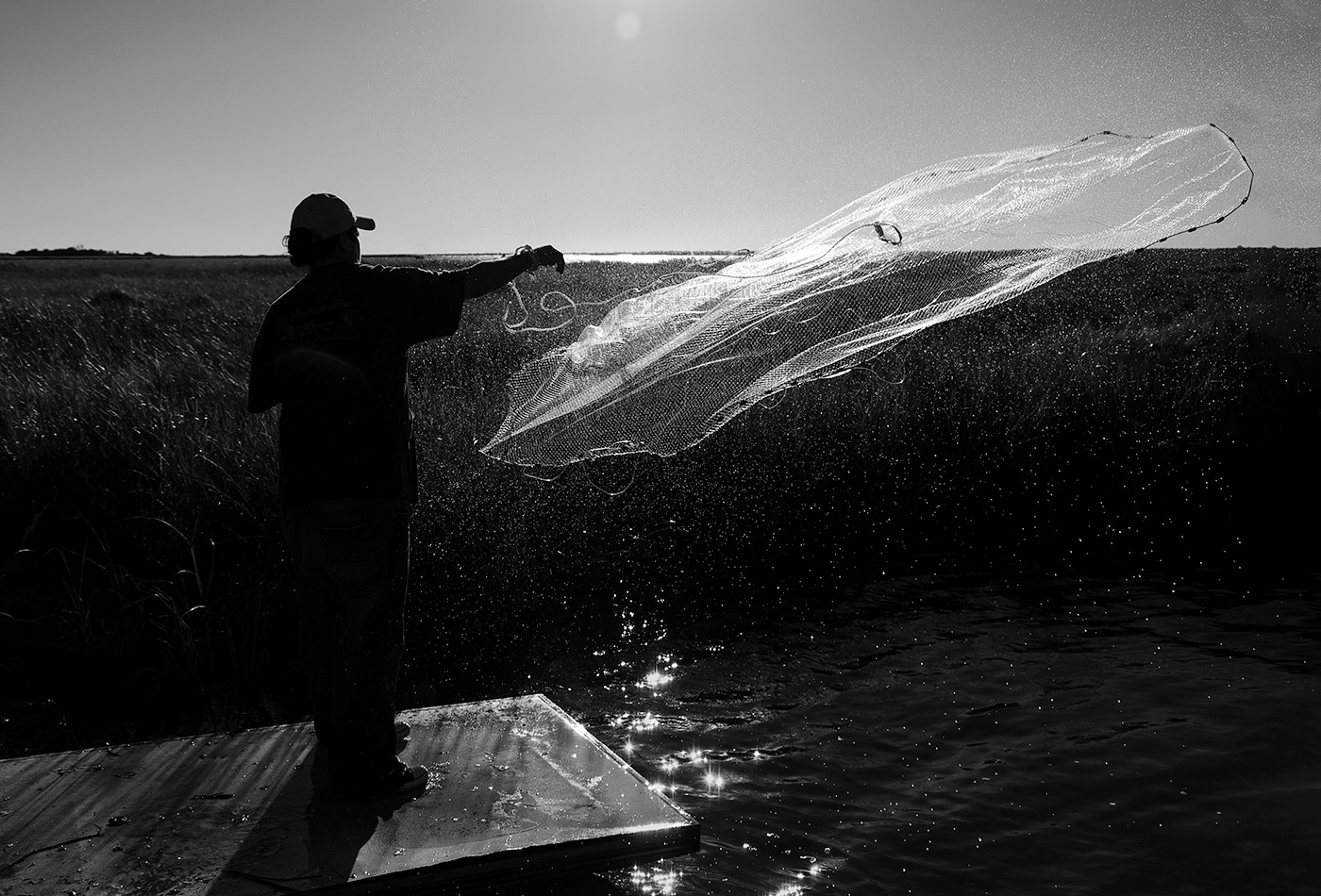
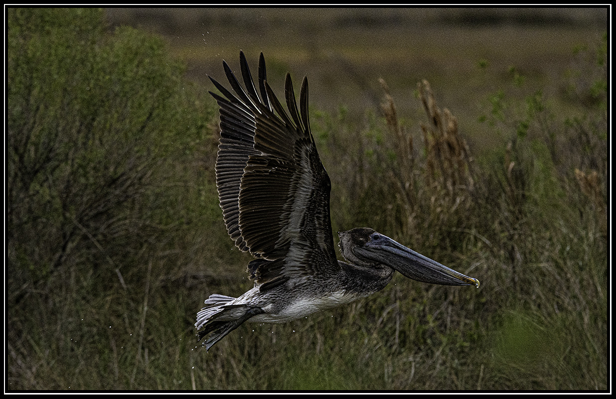
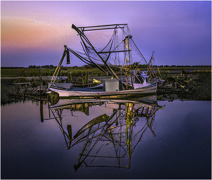
Very interesting image. Looks like he found something very intriguing. I like what you did to this image. Love the colors an the lines and the reflection of your husband. I bet that was a fun day. I put a visual feedback. I flipped the image to have the leading linings goin to your husband. I lighten the bottom to be able to see the Man O War better. I used a Neutral Density in the sky and made it a little darker. |
Feb 7th |
 |
7 comments - 1 reply for Group 77
|
| 99 |
Feb 22 |
Comment |
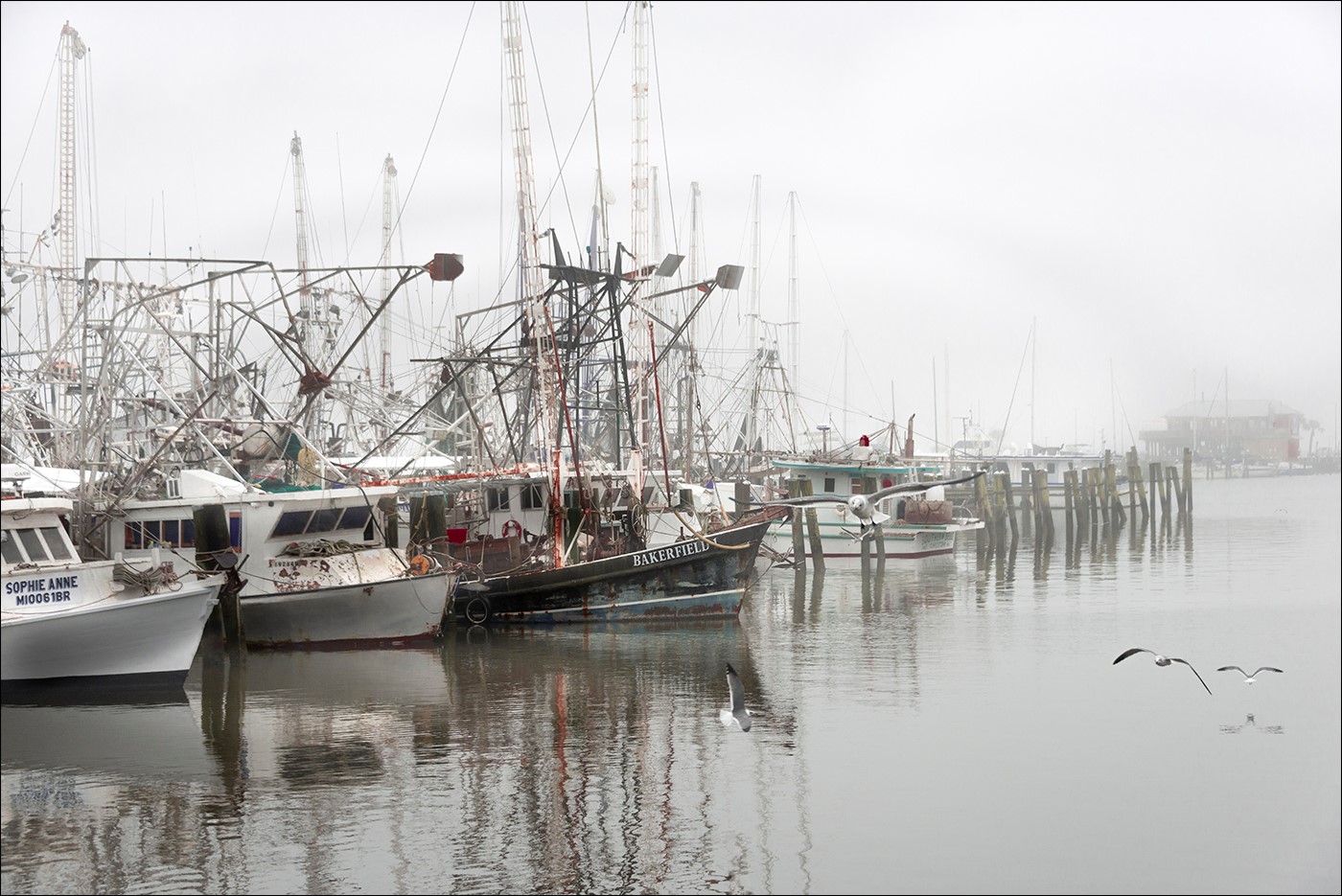
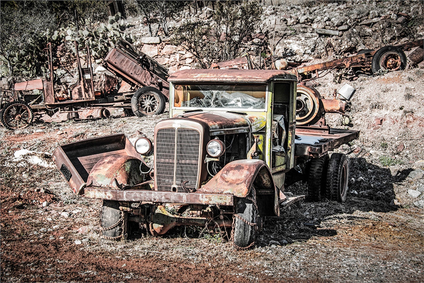
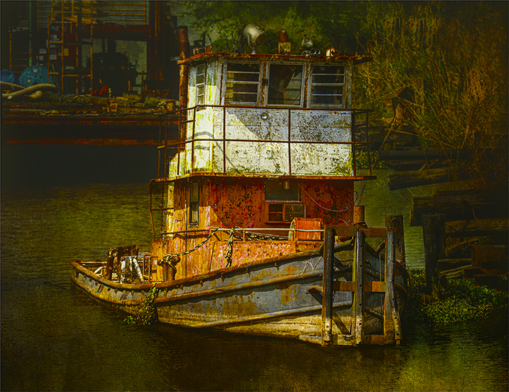
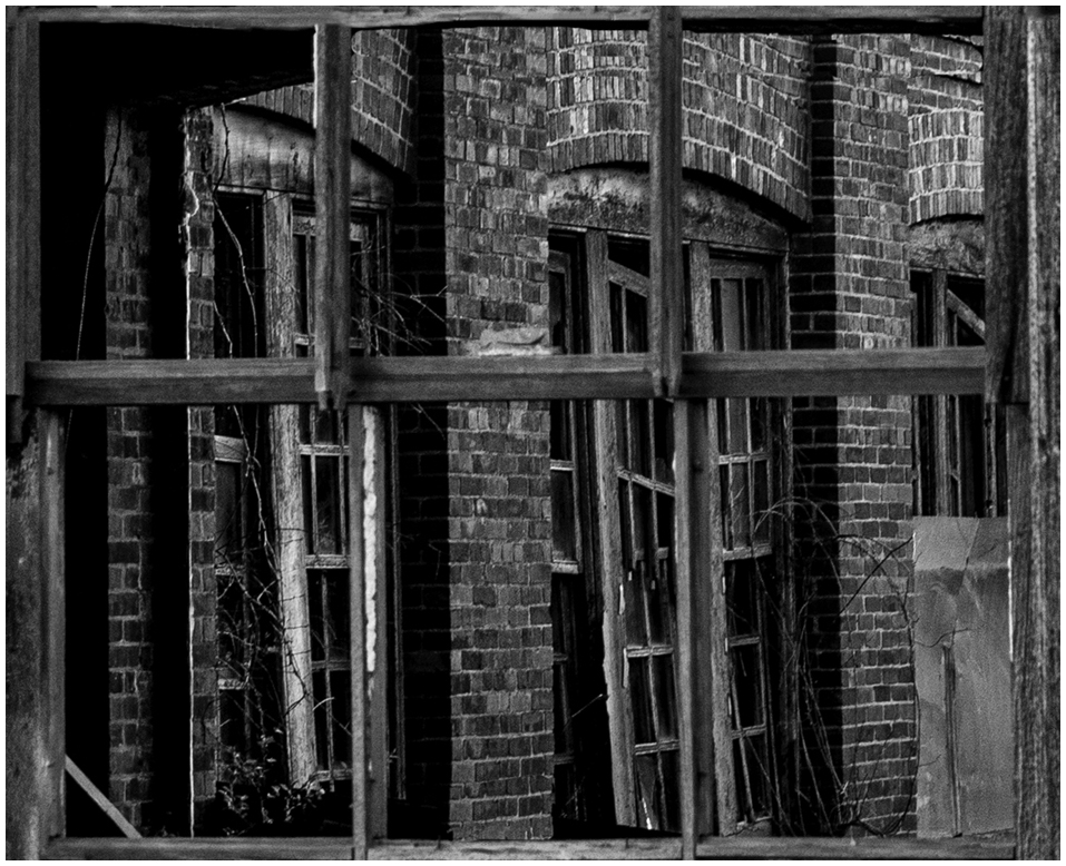
Hi Randy, I bet it was fun to be there to photograph this old building. I love all the great textures, lines, tones, and curves. My eye is roaming around this image looking at every thing. I really enjoyed this image. I just put a little white frame around it. |
Feb 16th |
 |
| 99 |
Feb 22 |
Comment |
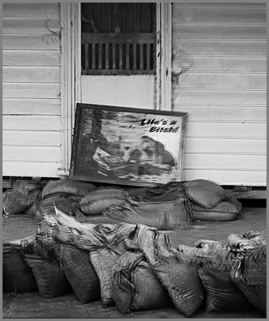
Hi Leanne, Great Photojournalism image. Boy, does this tell a story of loss, heartache and hardship. Seeing this image and having a moments to photograph it good catch. I feel like you did a great job with the way you processed this image other then the vignetting. I even like the color image too. I like the tones of the sand bags. There is so much one can do with this image. I cropped it at the top a little because I think the sign and the sand bags says a lot about the people whom lived here feels. |
Feb 16th |
 |
| 99 |
Feb 22 |
Reply |
Yes, I like it in color too. But this is BW PSA PID so. I love Black and White. |
Feb 7th |
| 99 |
Feb 22 |
Reply |
Yes, I like it in color too. But this is BW PSA PID so. I love Black and White. |
Feb 7th |
| 99 |
Feb 22 |
Reply |
Randy, Me too, always use another cut of coffee.
|
Feb 7th |
| 99 |
Feb 22 |
Reply |
Thank you Peter, good constructive advice. Will try that. |
Feb 6th |
| 99 |
Feb 22 |
Comment |
Michael, I enjoyed working with this image. Love the shadows, tones, textures and lines in this image. Very interested. Good eye. I have visual feed back. |
Feb 2nd |
 |
| 99 |
Feb 22 |
Comment |
Peter, This is a lovely image. Great shadows. So clean and somewhat emotional. It has good balance. I like that there is a opening near their waist. Like the opening on the mans legs. You can see the background. I would not change a thing. I like the Black and White Better. |
Feb 2nd |
| 99 |
Feb 22 |
Comment |
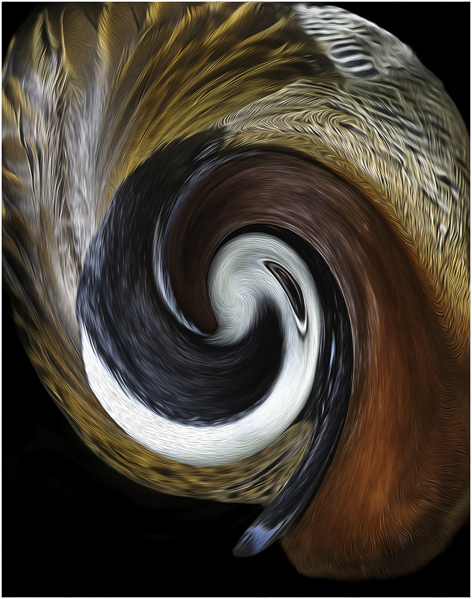
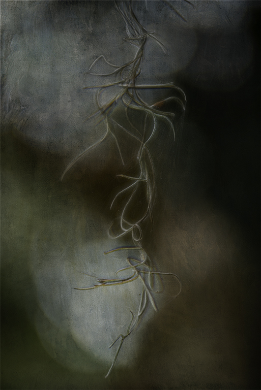
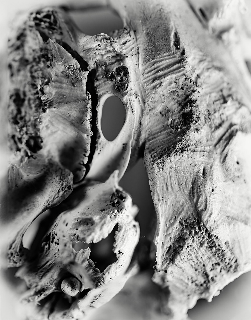
Gerard, I don't have any idea what this could be. It kind of looks like Fungus. I took this image into Photoshop and turned it around and around to make sense of it. What I did find is that when I flipped it, my eyes felt more comfortable looking around with a leading line starting at the bottom left corner. I like the tones and the openings in the abstract image. I have a visual feed back. This was fun. Thanks. |
Feb 2nd |
 |
| 99 |
Feb 22 |
Comment |
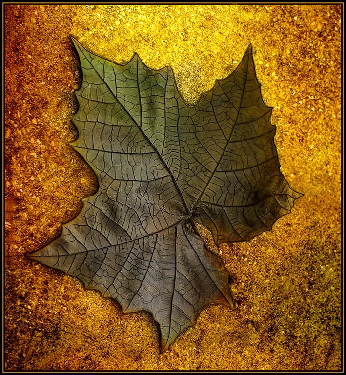
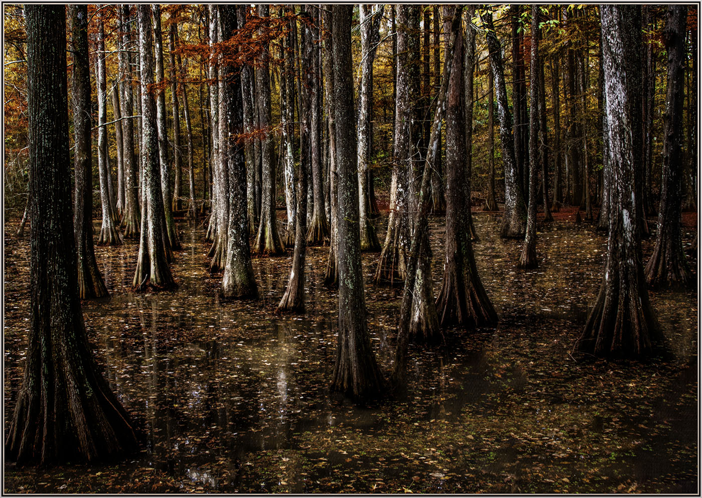
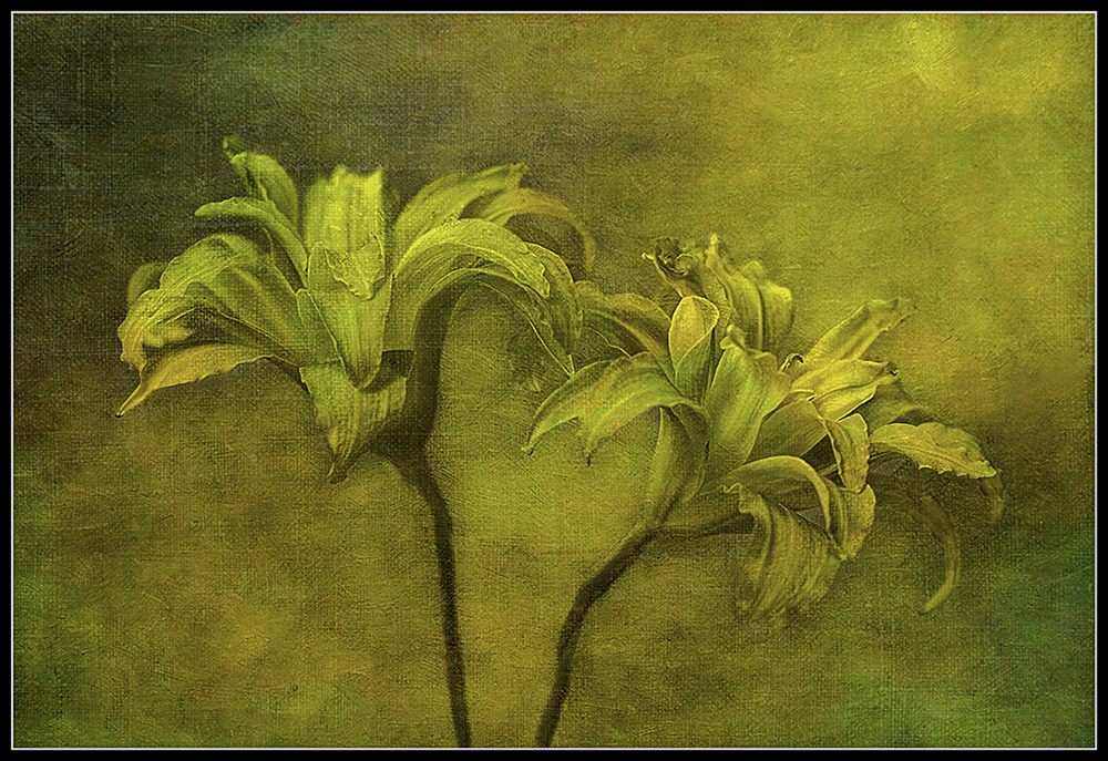
Barbara, I feel like this is a Fine Art Piece. I love the textures and the way the leaves are ing around. It is like each leaf has it's own story to tell. Each has their on personality. Like the way you have it coming from the left side. Just the right amount of space around the image. Great background no distractions. |
Feb 2nd |
6 comments - 4 replies for Group 99
|
18 comments - 5 replies Total
|