|
| Group |
Round |
C/R |
Comment |
Date |
Image |
| 43 |
Apr 21 |
Comment |
It is a great image. I like the original one too. |
Apr 12th |
| 43 |
Apr 21 |
Comment |
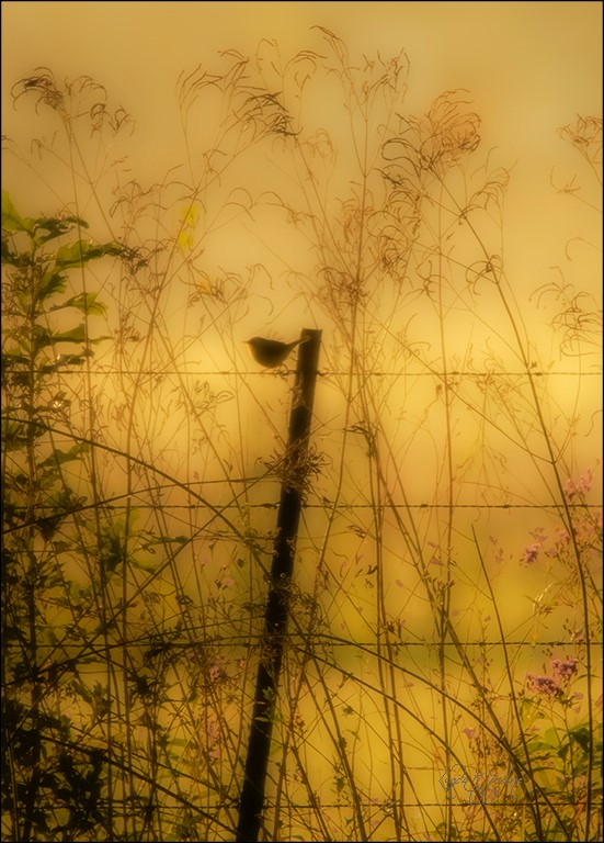
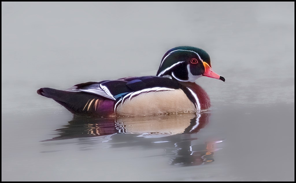
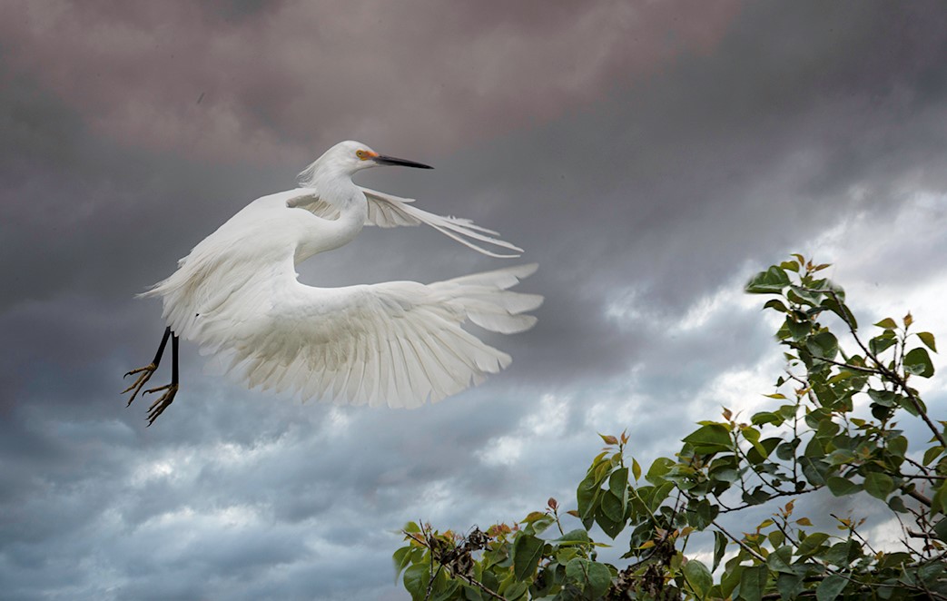
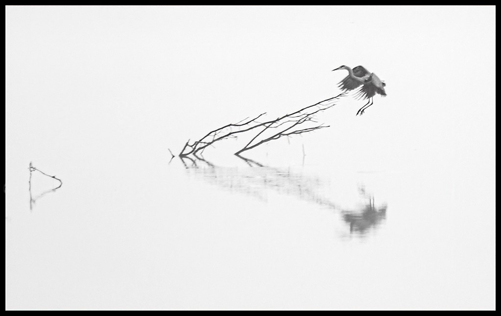
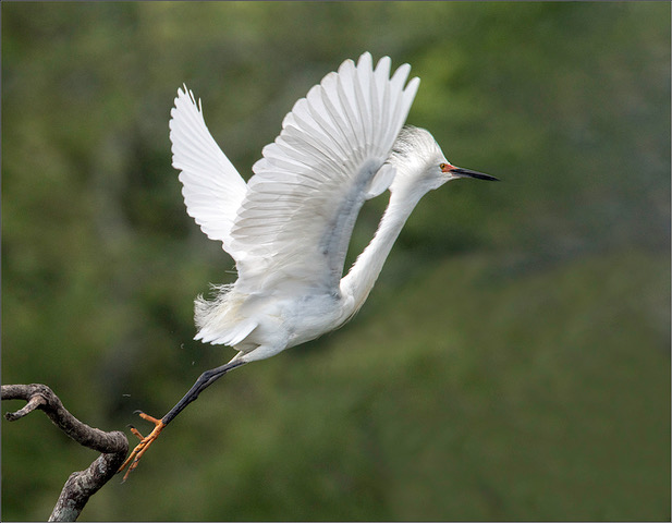
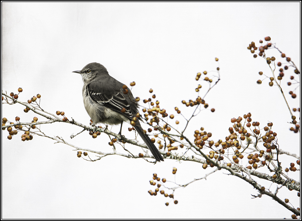
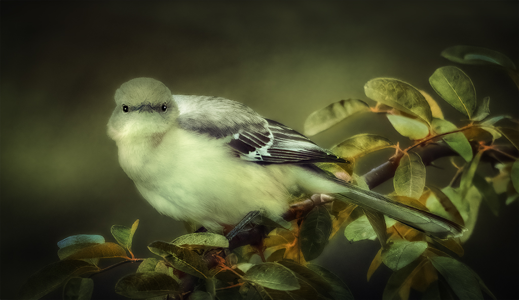
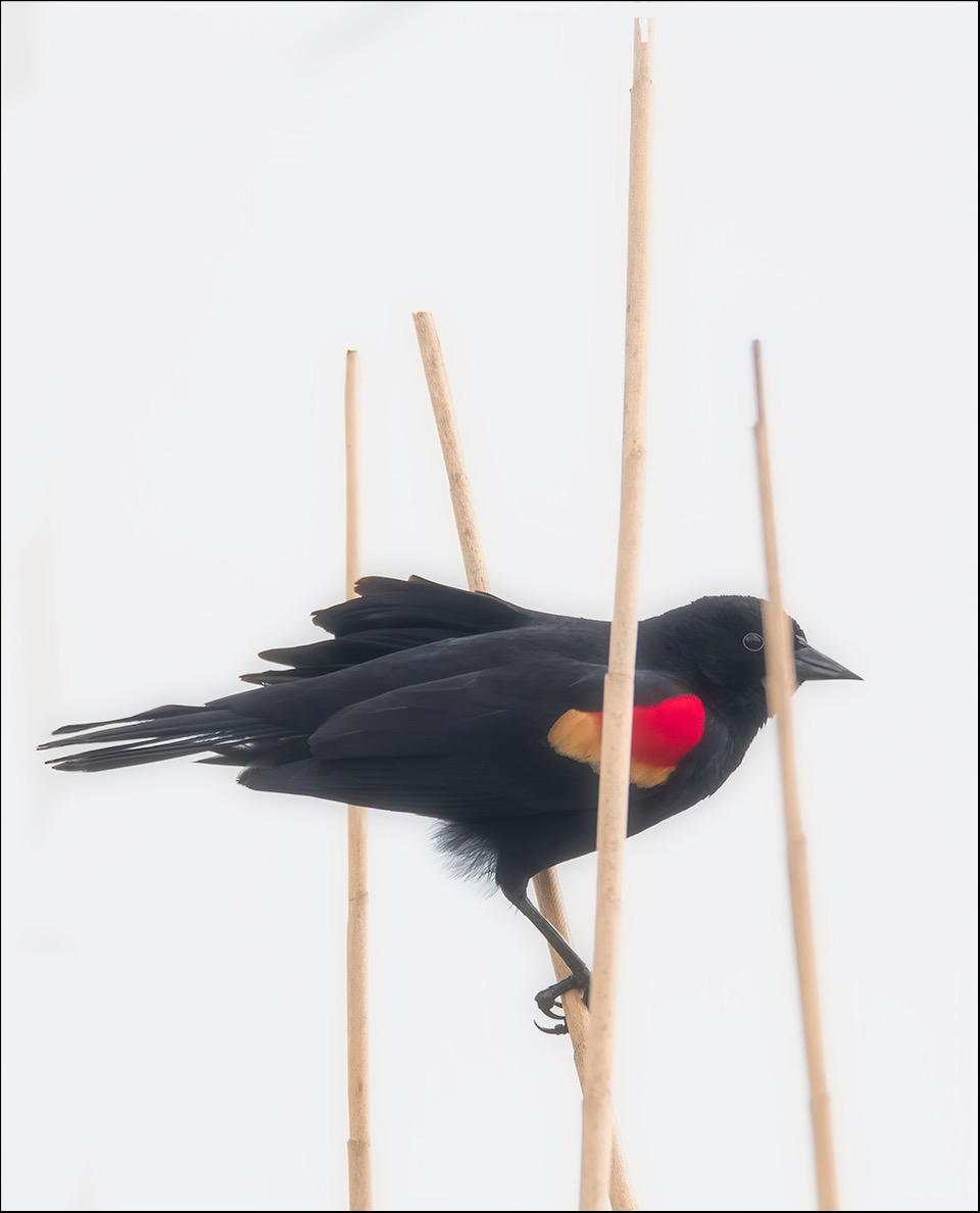
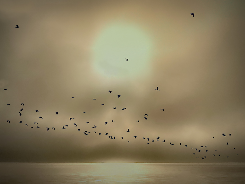
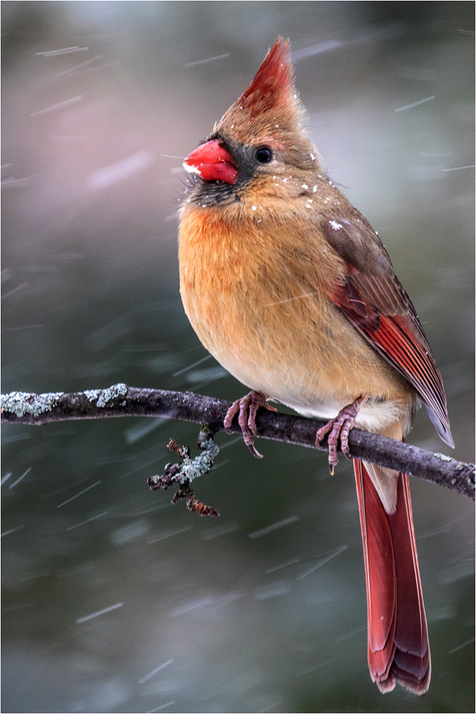
I feel like the stick is a leading line to the bird and it is giving the bird more room. When you read left to right the bird is in your way the bird is blocking yourview. It is like you stop right there. With the bird to the right you have room in front of the bird. That is just my thinking. |
Apr 11th |
| 43 |
Apr 21 |
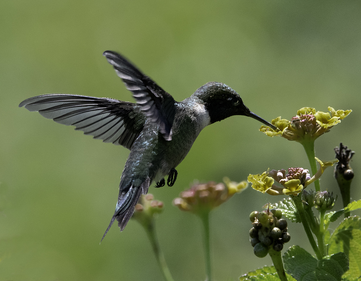
Comment |
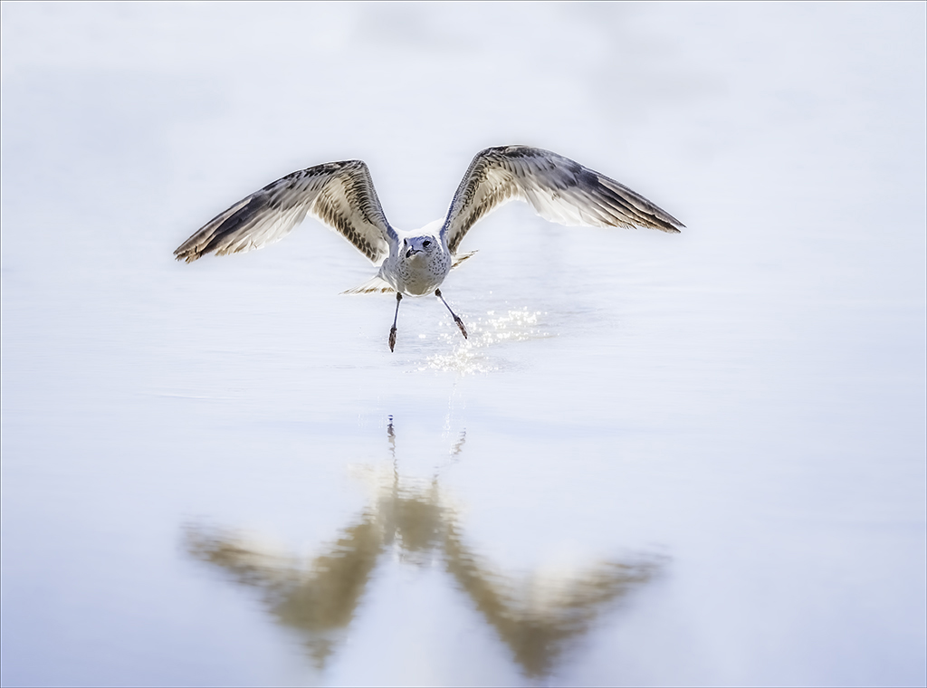
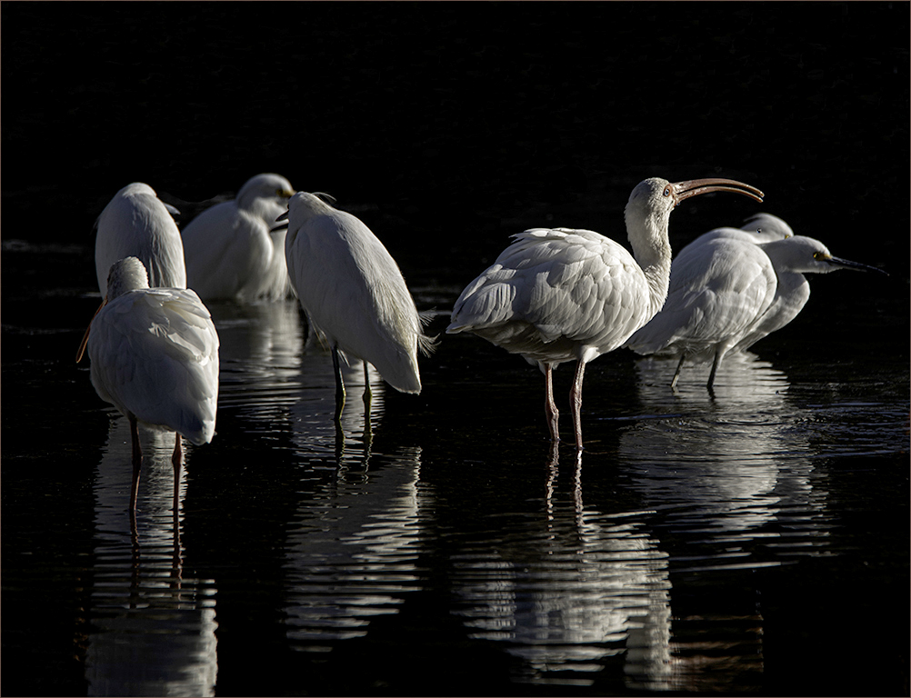
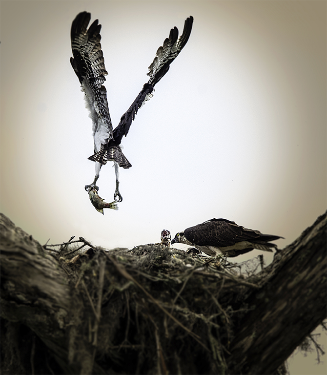
I like the one you are showing. Looks like he is holding on for dear life. Really like the movement. The only thing I would change is to flip the image and lighten around the birds eye a little. |
Apr 9th |
 |
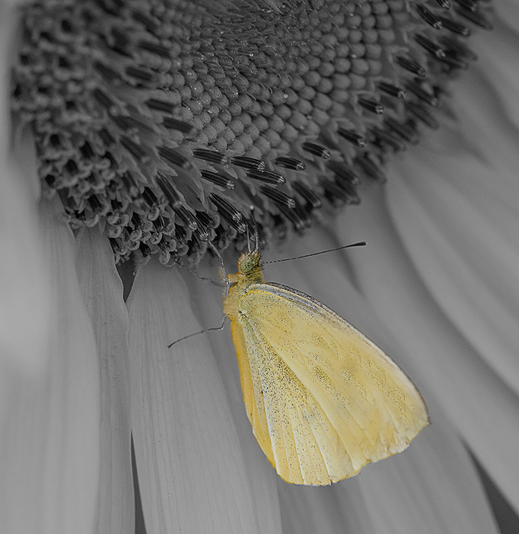
| 43 |
Apr 21 |
Comment |
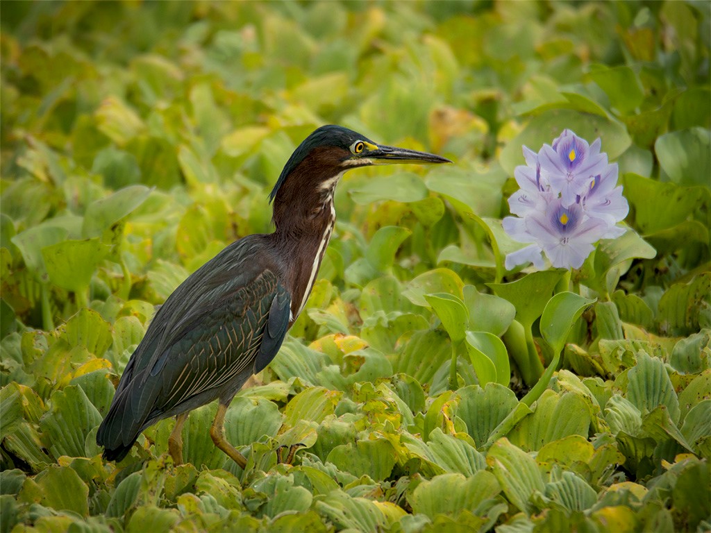
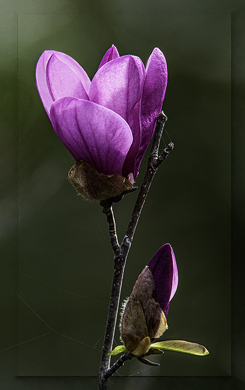
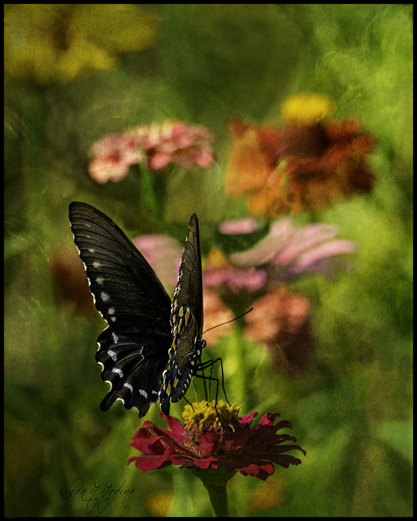
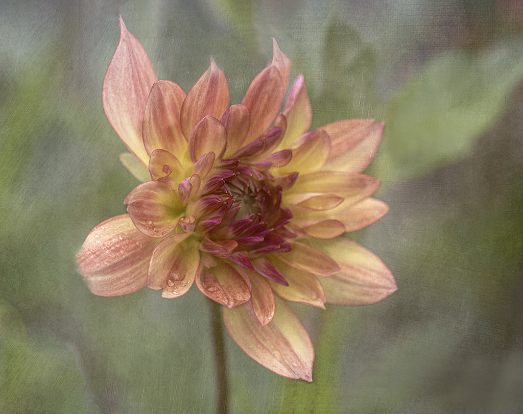
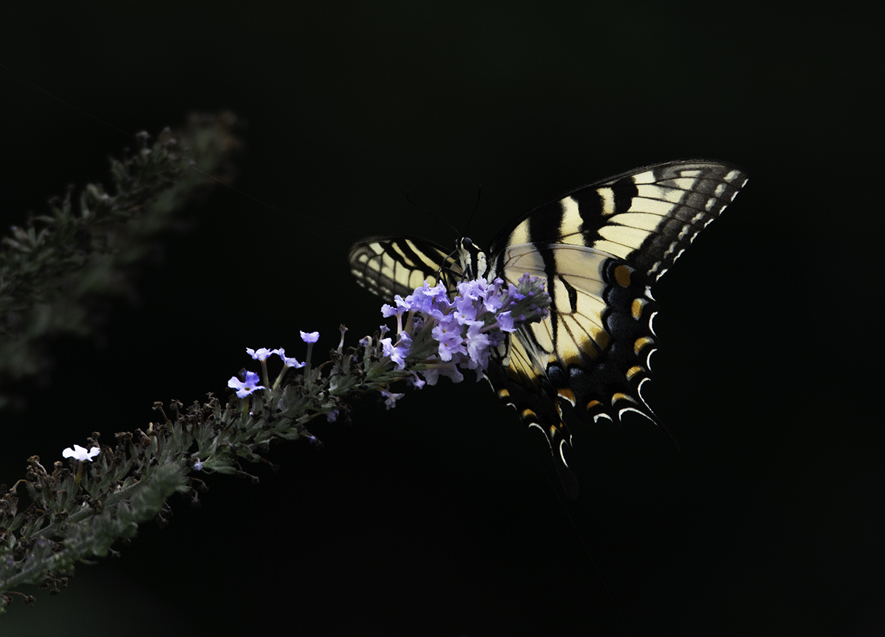
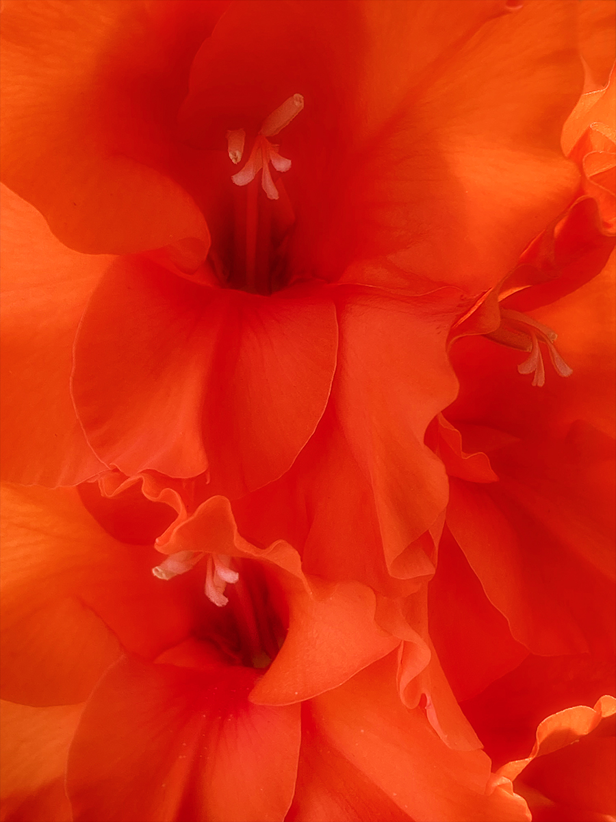
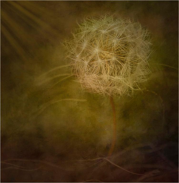
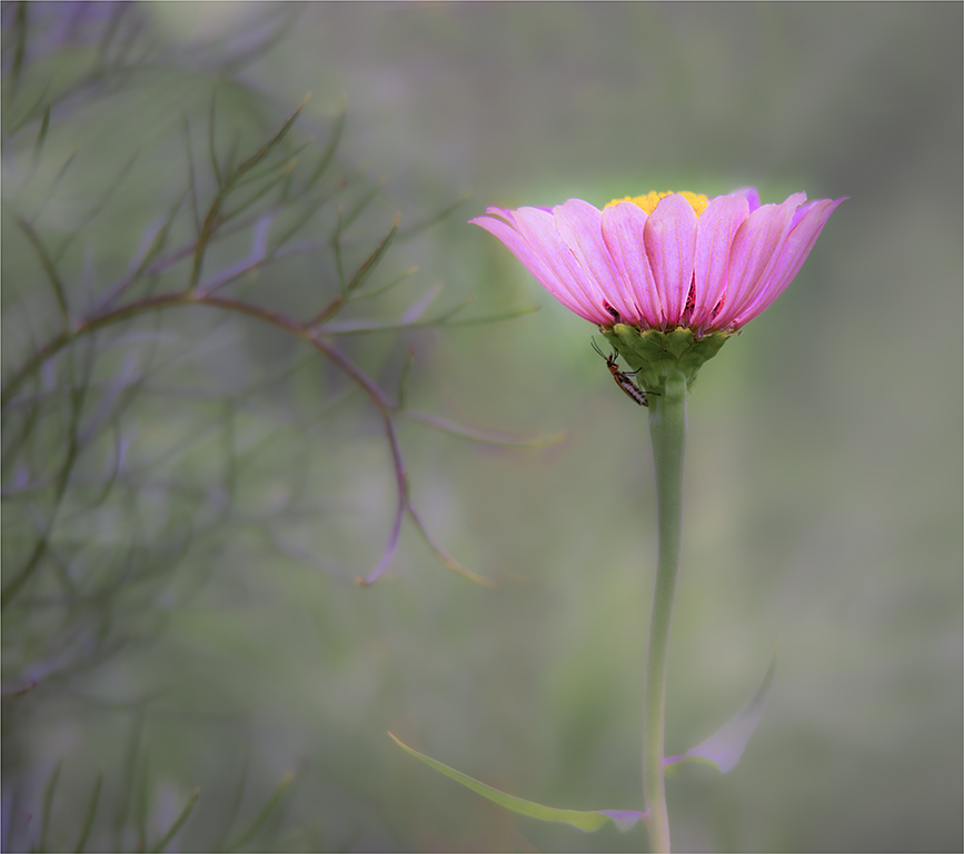
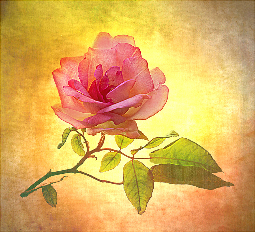
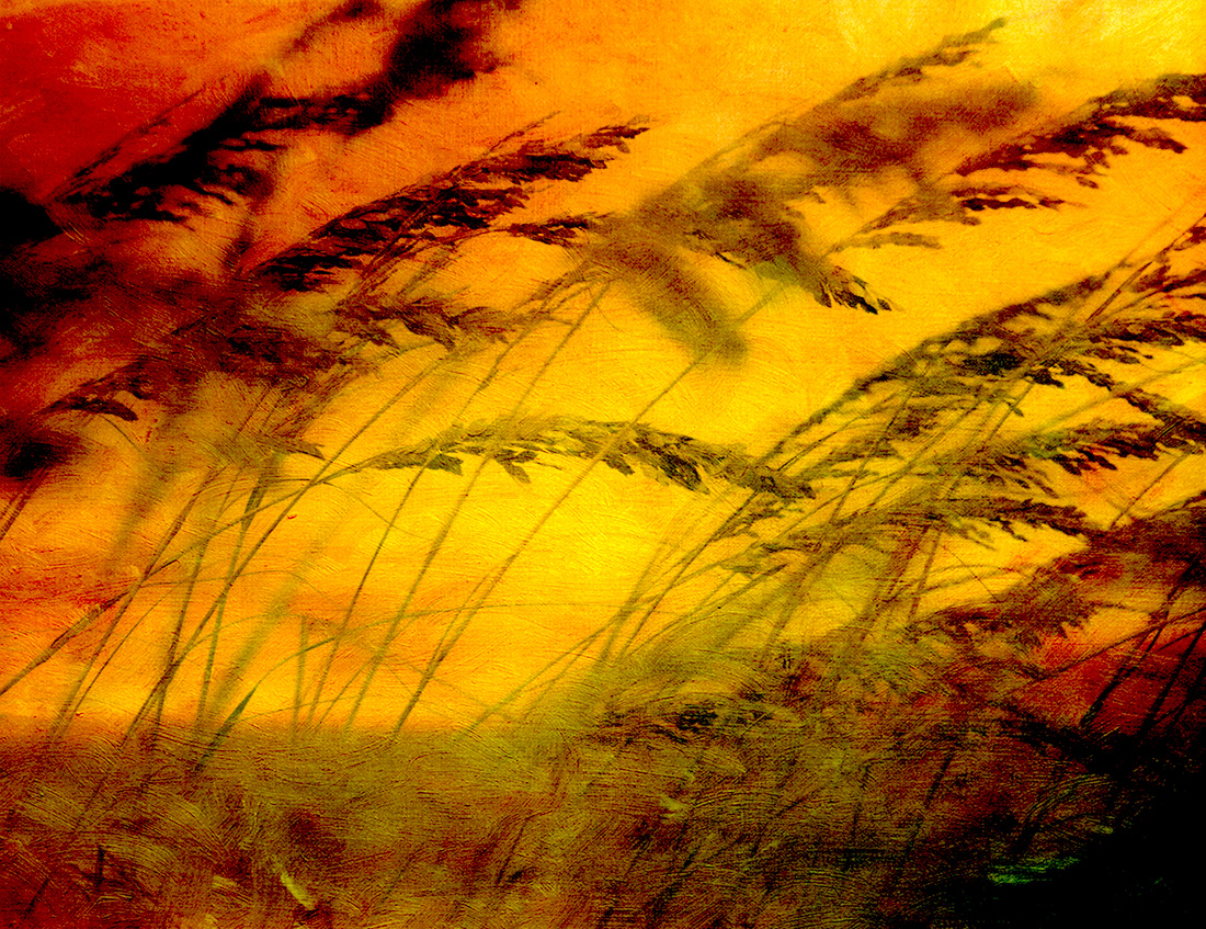
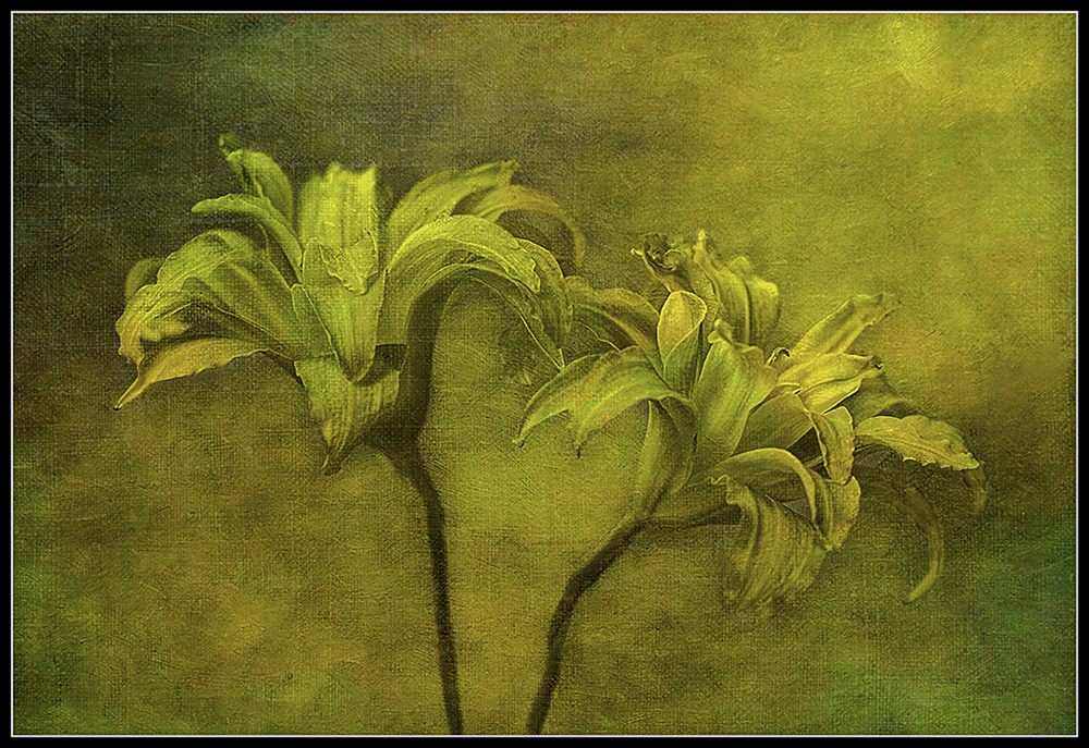
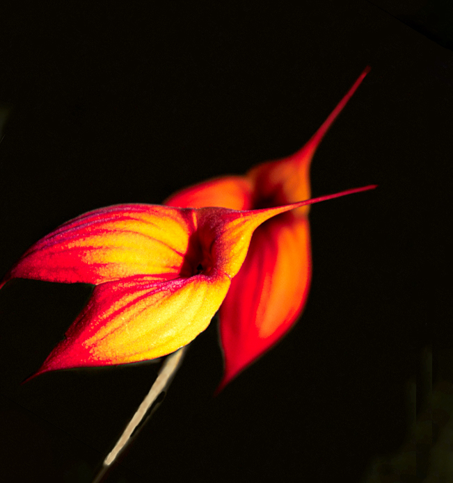
Beautiful image. Looks like the flower is moving and talking to me. What a dramatic image. Great colors and really like the background. Good leading lines into the flower. Lots of impact. I don't think I would change a thing. LOVE it. |
Apr 9th |
| 43 |
Apr 21 |
Comment |
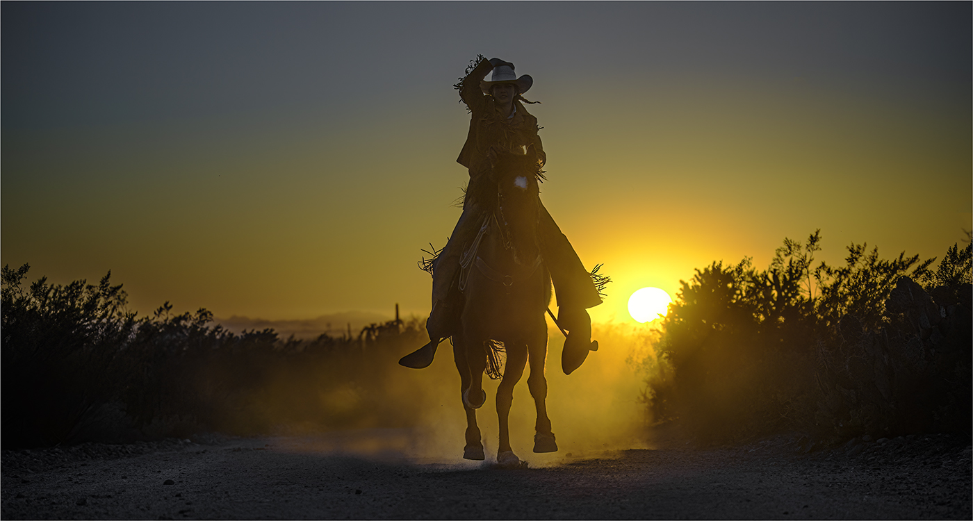
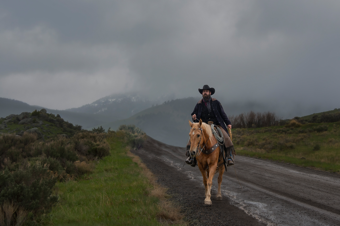
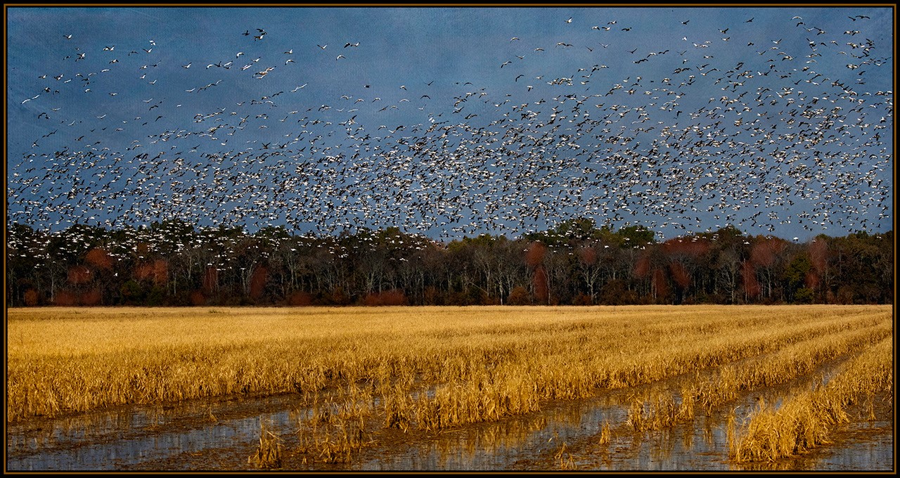
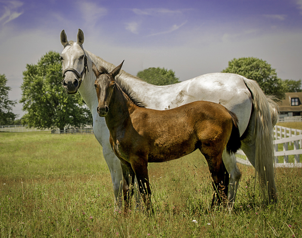
Beautiful Image. I love horses. Love the colors and the peaceful setting. I cropped out the horse in the background. All you can see is the two legs coming out of the stomach of the other horses and the head coming out of the top of larger horse. This is just a suggestion. I darkened just a little to bring out the blue sky just a little. |
Apr 8th |
 |
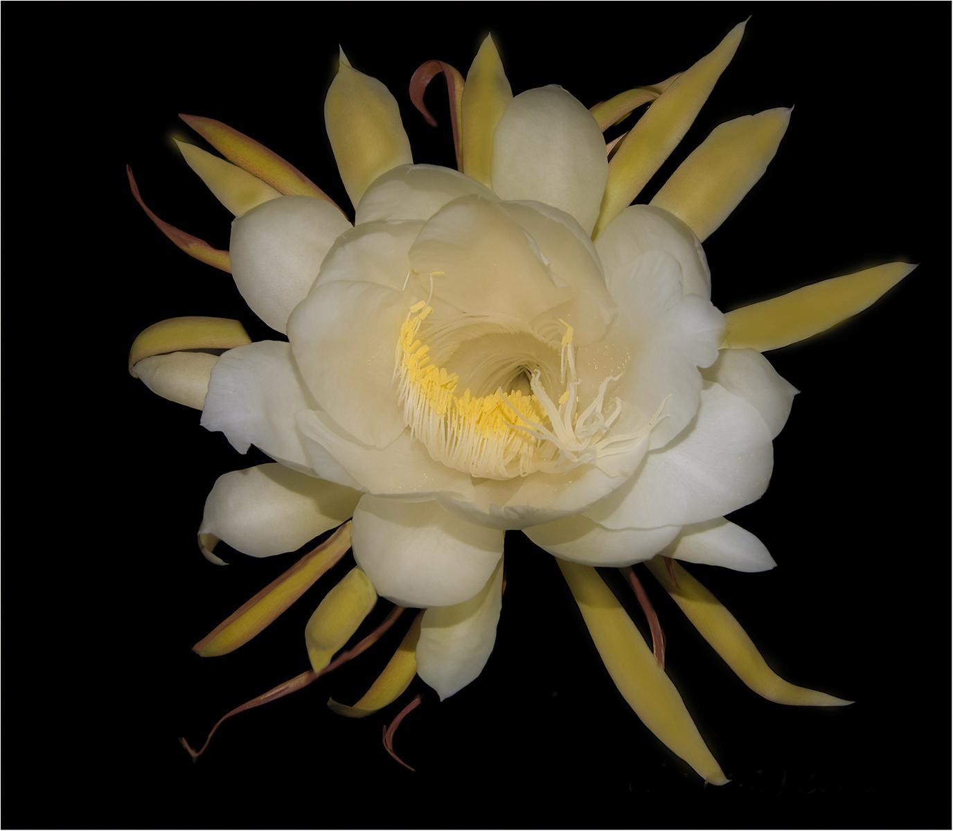
| 43 |
Apr 21 |
Comment |
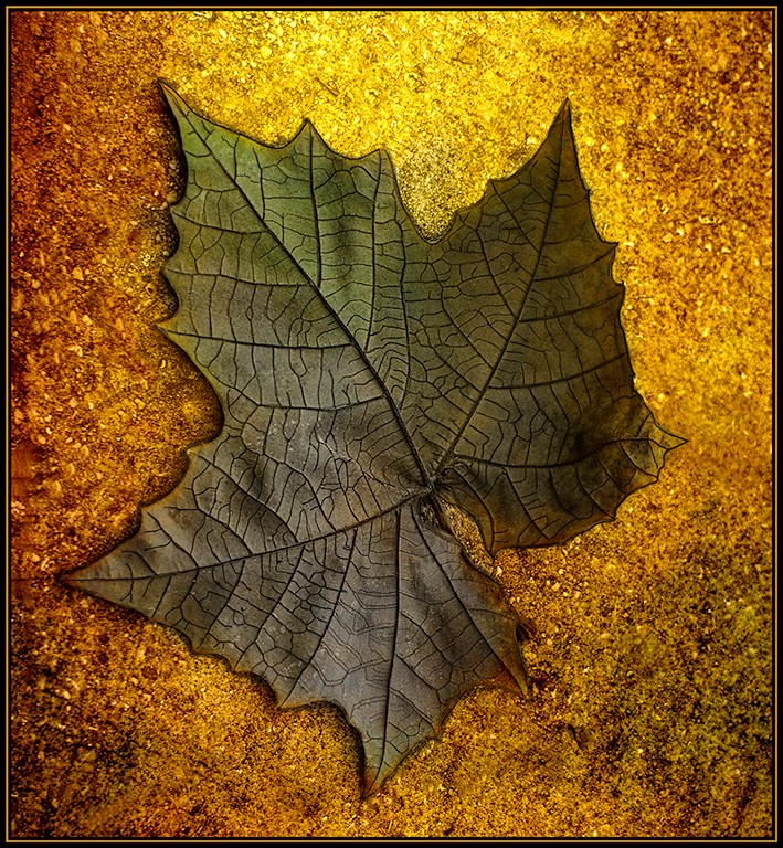
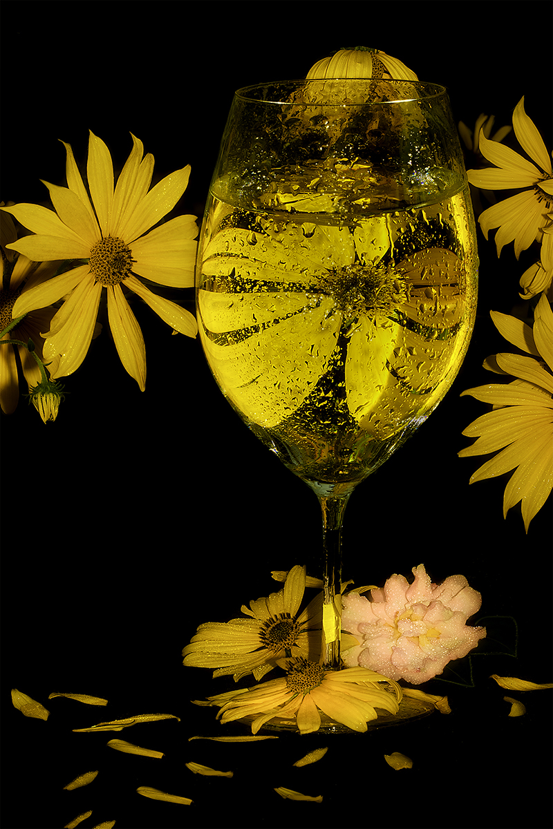
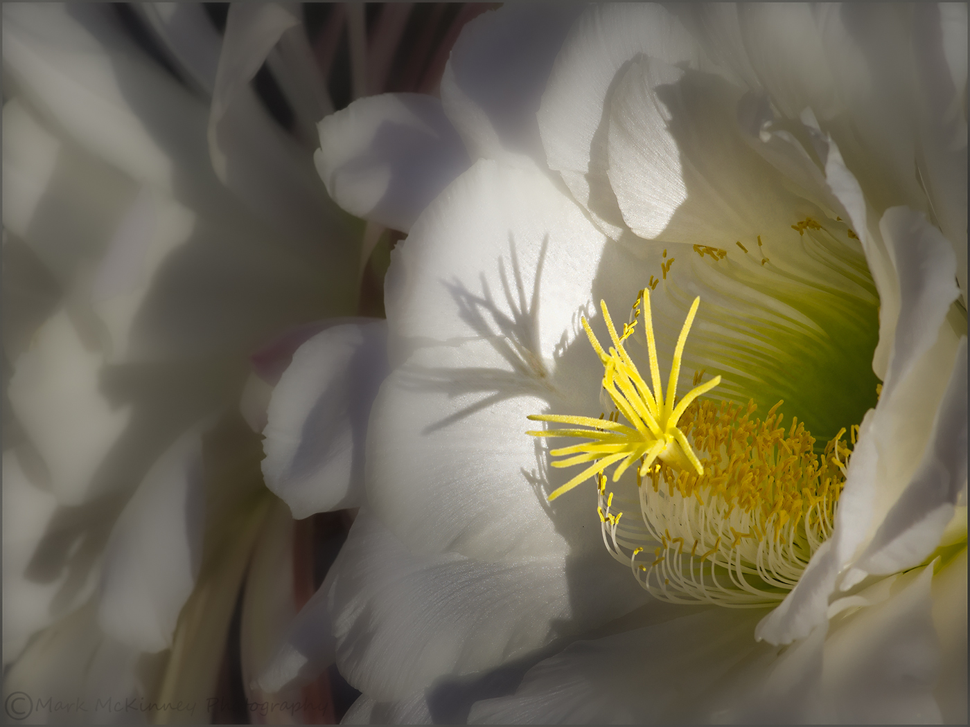
I love taking images of flowers. This is a beautiful Cactus Flower. I like the placement of the center of the flower and the detail. Great job on getting the inside of the flower too. In camera raw I used a radial filter to have my eye go the the center of the flower. I used a adjustment brush to blur the petals to the left. |
Apr 8th |
 |
| 43 |
Apr 21 |
Comment |
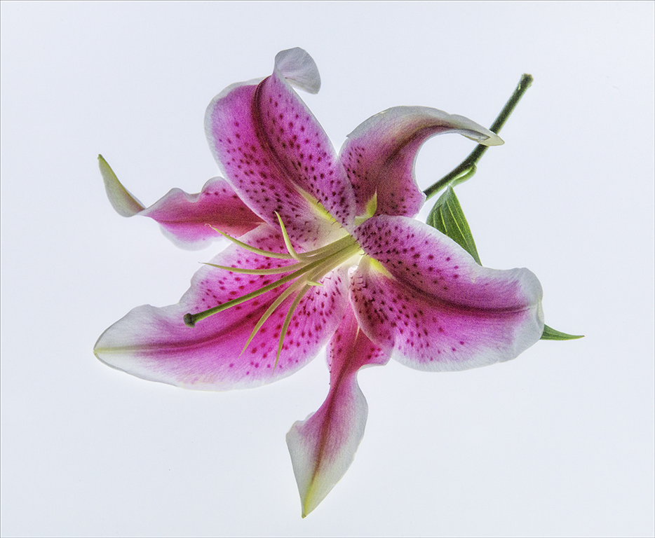
I agree with Bruce. One thing I would do is to flip the image. |
Apr 8th |
 |
7 comments - 0 replies for Group 43
|
| 77 |
Apr 21 |
Comment |
Thank you. I will look back. If I do not use something all the time I forget. |
Apr 17th |
| 77 |
Apr 21 |
Reply |
Thank you so much.... will look them up. |
Apr 14th |
| 77 |
Apr 21 |
Reply |
Is there a YouTube lesson to help learn how to do that. Can you send me a link. I know somethings about textures but not too much about masking. I know opacity, textures and select subject. Thank you so much for your help. I want to learn. |
Apr 14th |
| 77 |
Apr 21 |
Reply |
Good Thanks. Looks Great. |
Apr 12th |
| 77 |
Apr 21 |
Comment |
I did lighten around the subject with an adjustment brush with white at 2% and went to Level and lighten a little. If there is a another way I would like to learn. Please let me know. Thank you for sharing. |
Apr 9th |
 |
| 77 |
Apr 21 |
Reply |
Welcome aboard!
|
Apr 8th |
| 77 |
Apr 21 |
Comment |
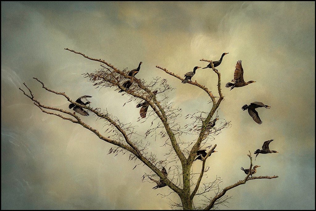
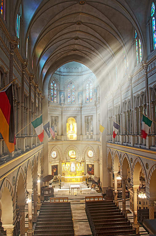
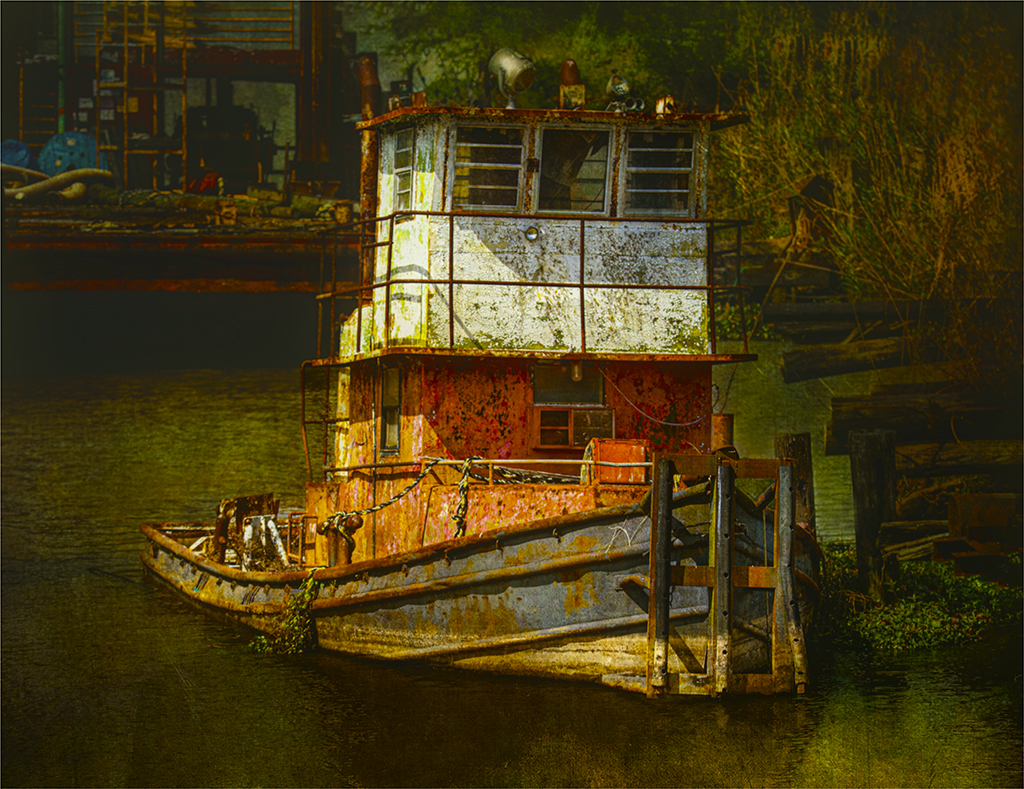
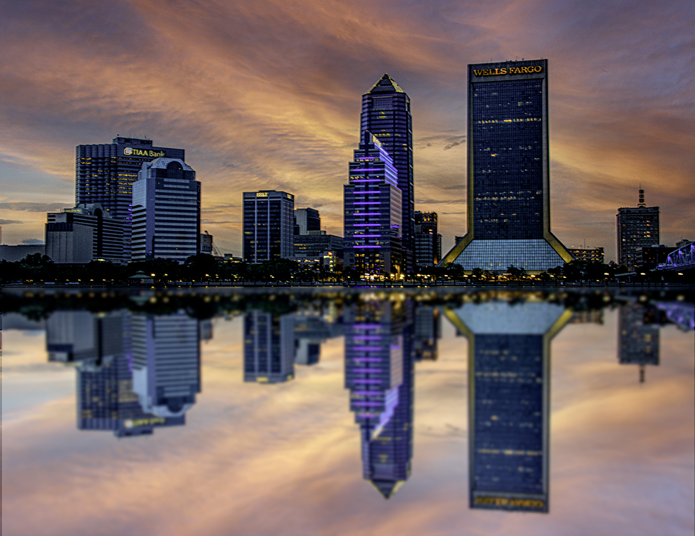
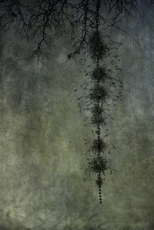
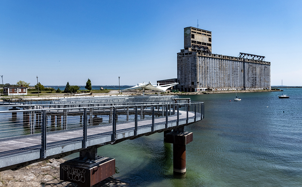
Beautiful Job. To me it looks a little like a carving of buildings in a large city and the sky at the top. It looks three dimensional. Love the texture and the colors and tones you added to the final image. |
Apr 7th |
| 77 |
Apr 21 |
Comment |
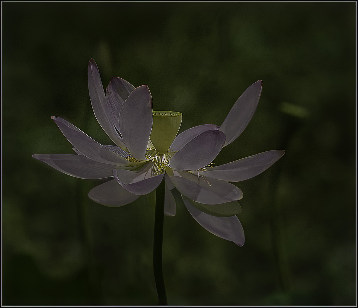
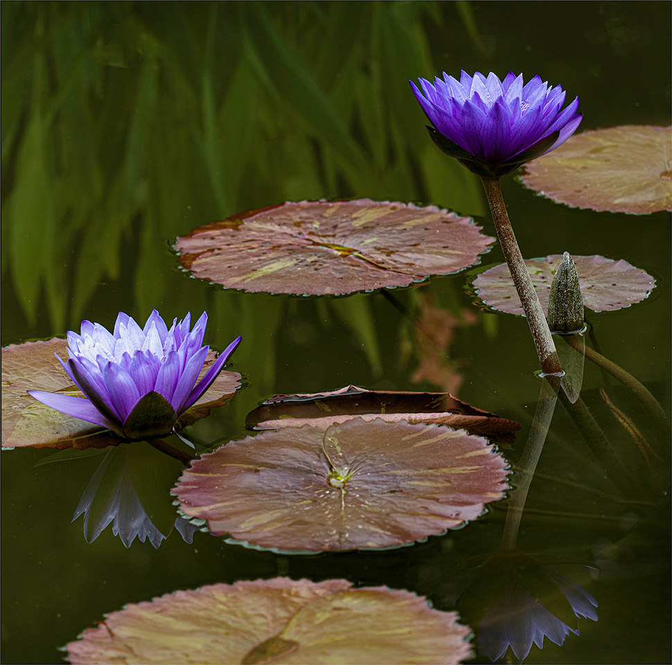
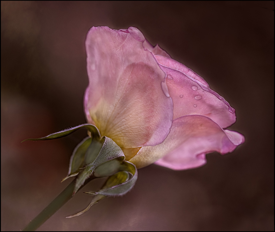
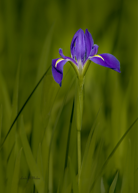
The virtual image is just a suggestion. I tilted the flower a little and worked on the stem. This is a beautiful image. good job.
|
Apr 7th |
 |
| 77 |
Apr 21 |
Comment |
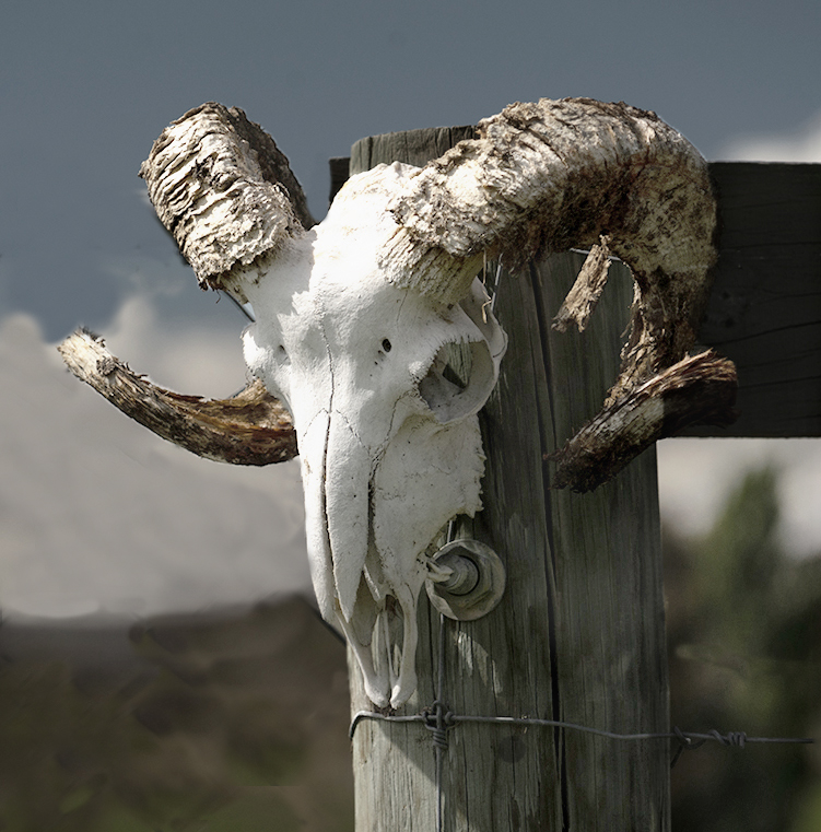
I hope you don't think I did too much. I feel like the fence on the left was distracting. It was a new fence and the fence on the right was old and rustic. The Skull looked old and weathered. I just cloned out the new fence and tried to make it blend. Nice image. |
Apr 7th |
 |
| 77 |
Apr 21 |
Comment |
You worked on this a long time. There's lots going on. That was a good idea to take parts from each image to come up with a completed image. There are so many possibilities. Let your mind go wild. Nice image.
|
Apr 7th |
| 77 |
Apr 21 |
Comment |
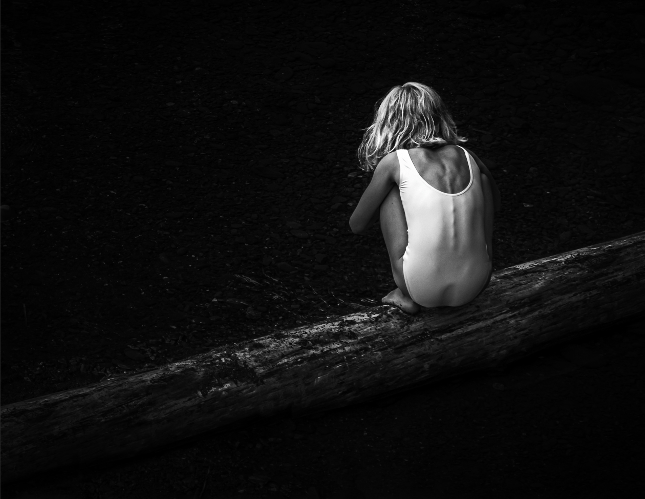
Witta, Great image. Love the Black and White. I cropped it a little to have the girl in the intersections of the rules of thirds. Very good composition with the log as the leading line. I used a black brush to darken the log just a little to keep my eye on the girl. She has great detail. I used curves to get more detail and contrast in her hair. Beautiful image. |
Apr 7th |
 |
| 77 |
Apr 21 |
Comment |
Wow, you did a lot. I don't know how to do all that yet. Good detail at the top where you see the kernels of corn and the corn silk and I really like the background texture. I love the rustic look. I do see a little white spot on the left side of the corn at the top. I feel the bottom half of the corn looks a little distracting and the corn at the bottom is going off the page. I know lots of hard work went into this image. |
Apr 7th |
| 77 |
Apr 21 |
Comment |
Witta, Thank you and that is a good idea to lighten the multiple blend. I just started using that blend mode and it is too dark, but I like using it, but will make it lighter. |
Apr 7th |
9 comments - 4 replies for Group 77
|
16 comments - 4 replies Total
|