|
| Group |
Round |
C/R |
Comment |
Date |
Image |
| 14 |
May 17 |
Comment |
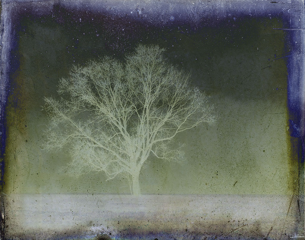
Thank you Eleanor. I wish I could remember the filter, too, since I would like to use it again. I will keep looking and will let you all know if I find it. It was a long time ago. I seem to be rediscovering many of my older shots these days, since I am in a real slump. |
May 22nd |
| 14 |
May 17 |
Comment |
Thank you, Larry. I like the increased contrast and will make some adjustments with my original. Not sure about the scratches and dust, since they are part of the filter effect. Not sure I am even in the mood to tackle a huge clone job. : ) |
May 20th |
| 14 |
May 17 |
Reply |
I thought that at first, too, but then noticed that it kept my eye from leaving the photo and decided that was a good reason to leave it be. |
May 11th |
| 14 |
May 17 |
Comment |
Thank you, Charissa, I am so glad to have accomplished something good with this image and really appreciate your thoughts. |
May 11th |
| 14 |
May 17 |
Comment |
The color of the door does not bother me in the least. |
May 10th |
| 14 |
May 17 |
Comment |
Oh, yes, pulled mine, too. I like the way the bg is nicely blurred and also that the B&W seems to focus attention on the relationship and not the surroundings. I went back and forth about cropping out the right side clothes, but decided in the end, that I like this very much. It gave a sense of balance and also mystery! |
May 10th |
| 14 |
May 17 |
Comment |
Oh, my, I think this is just phenomenal. Did you do something special to get that graphic look to the top two railings? |
May 10th |
| 14 |
May 17 |
Comment |
Thanks Arun, for both your kudos and critique. I personally like the mix of borders, since I think it keeps things dynamic and interesting. You are welcome to disagree, of course! |
May 10th |
| 14 |
May 17 |
Comment |
Thanks, Stuart. |
May 7th |
| 14 |
May 17 |
Comment |
I see what you've done, Larry, and the play of shadow on light is wonderful. And yes, I want to enter! Pull that doorknob and see what's beyond. Did you try to flatten out the perspective or did you want you photo to be sideways. I like the way you did not put a vignette or shadow on the lower right, or at least not much, so I could see the contrast in the light going up the side of the door. I like it |
May 6th |
| 14 |
May 17 |
Comment |
Wonderful still life, Pat. The colors really stand out against the black bg, and like Larry mentioned, the stroke sets off the image well. I think you did a great job of eliminating glare or any other distracting elements, except that I agree, the dead parts should be removed. Well done, Pat. |
May 6th |
| 14 |
May 17 |
Comment |
This is a good subject to tackle, and I like the way the light hits the mushroom. If you blurred the bottom, I can see a clear demarcation from the top. Perhaps shooting at 2.8 or lower and focusing in more on the mushroom might help? |
May 6th |
| 14 |
May 17 |
Comment |
Not sure what appealed to me, but when I saw it, I knew I had to have it meshed with my image. Thank you for your comments. |
May 6th |
12 comments - 1 reply for Group 14
|
12 comments - 1 reply Total
|