|
| Group |
Round |
C/R |
Comment |
Date |
Image |
| 14 |
Apr 17 |
Comment |
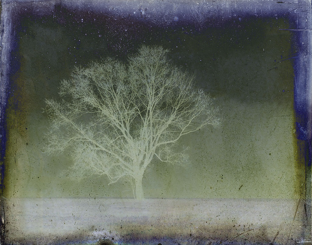
Yes, the thumbnail looks much sharper. I understand your concerns for the "nature" photo, but I sometimes find that when I have a lovely image that is just a big too soft I can salvage it by giving it painterly look. You'd have to play to find the right one or combo that would work. Of course, as you say, not a solution for nature shots. |
Apr 26th |
| 14 |
Apr 17 |
Comment |
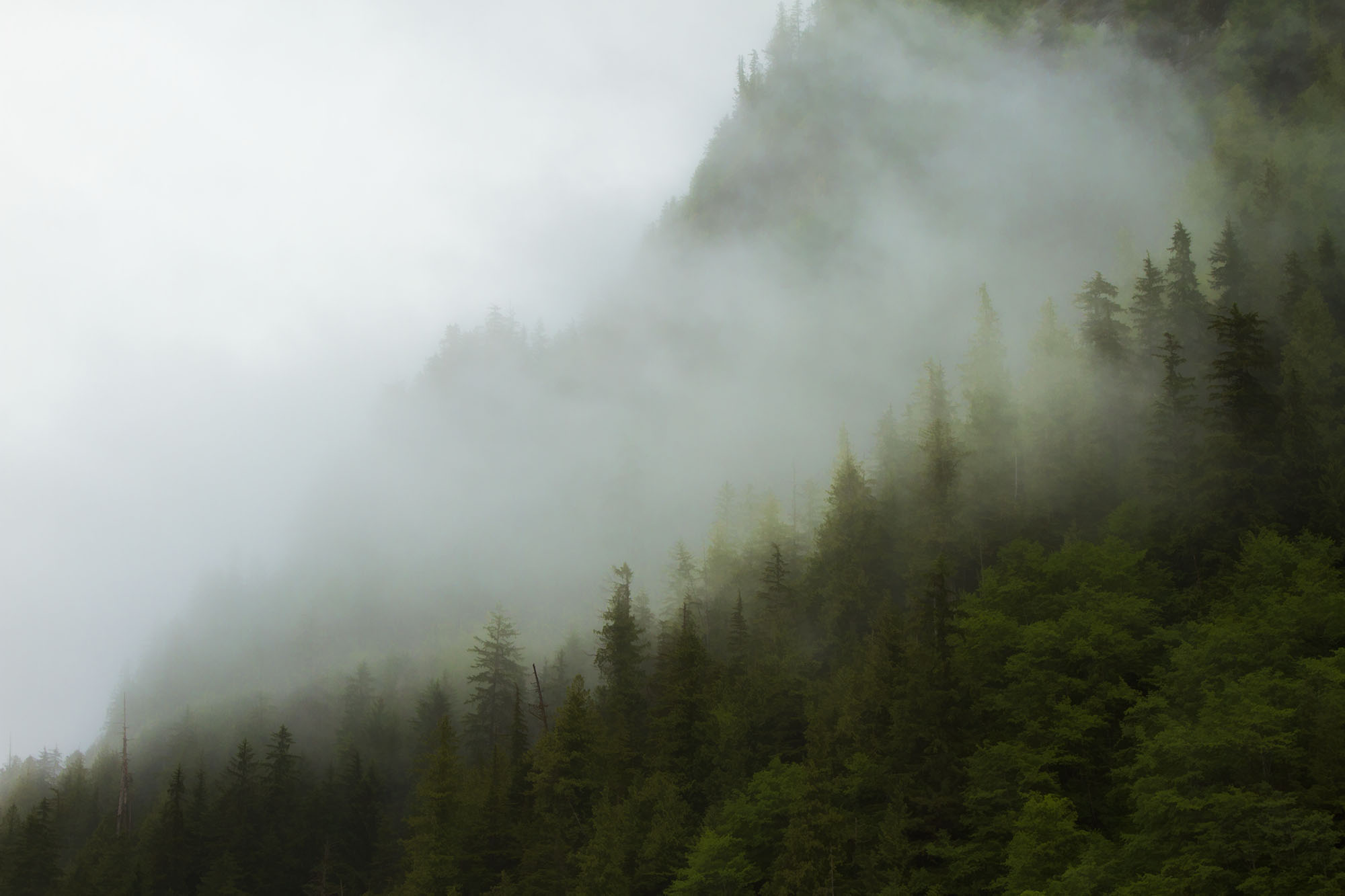
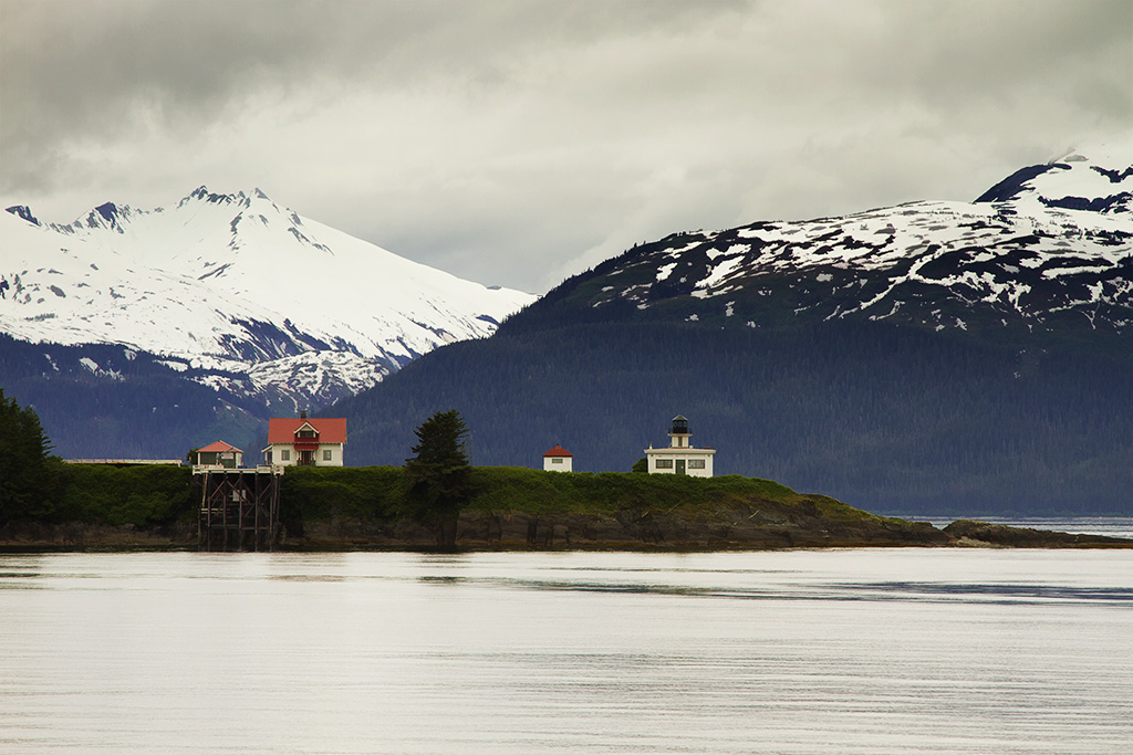
Thank you all. Larry, we disagree, again, but hey, that's life. Your composition cuts my eye a bit much and doesn't show the expanse of the photo that I found most compelling. I do prefer mine although I am looking to see why the fog was so bright here and not on my monitor or print. |
Apr 26th |
| 14 |
Apr 17 |
Comment |
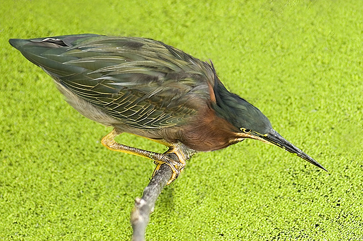
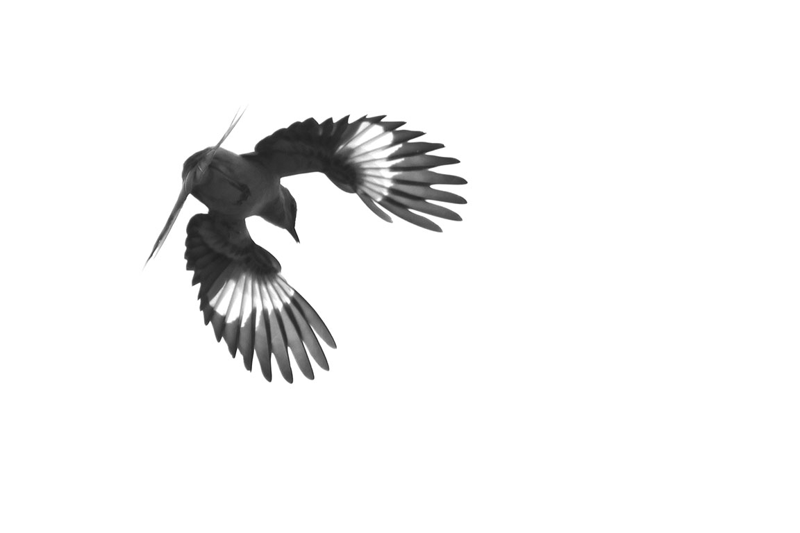
Larry, this is a wonderful capture, especially in these conditions, but why do I keep looking for either more sharpness or a more artistic processing? I have no problem with the direction s/he is moving in and the composition is spot on. I would LOVE to turn this into a painting photo. |
Apr 21st |
| 14 |
Apr 17 |
Comment |
Oh, my, this is a wonderful composition and great color scene. I might crop a bit more from the less colorful left side of the photo, moving the child's face a bit more off-center and maybe turn it all around 180 degrees. I would like to see some of the light on her face and hand reduced, but this is so precious, it a keeper regardless. Nice eye. |
Apr 21st |
| 14 |
Apr 17 |
Comment |
Like, Stuart, I would like to see the perspective or warp straightened. Then it will be easier to see where the crop should be. I wouldn't, however, remove parts of the frame. The simple structure requires the completeness of all. You could maybe clone the black on top, so it fits in with the rest. The light falling on the stone seat is lovely. |
Apr 21st |
| 14 |
Apr 17 |
Comment |
Love the colors and the drama. I would like to see some cropping on the left to remove the lines that are at the edge. You could show more on the right, if you didn't want to crop overall. I agree with Eleanor. I think this is one of those times when the full reflection adds a symmetry to the photo. If you have more sky to break the 50/50 look, I would include it in the crop. Love it. |
Apr 21st |
| 14 |
Apr 17 |
Comment |
I, too, like the colored version best, likely because I can see more depth and texture. For the same reason I wouldn't darken the right side, however, I understand what Larry was trying to do: focus on the hammer. The slight vignette is a good addition, something I am trying to do myself (if I remember!). |
Apr 21st |
| 14 |
Apr 17 |
Comment |
I love the blue coloring and the diagonal line with the bee is a great composition statement. I can't help but wish the bg was a bit more out of focus, so that only the blended colors would be seen. I think this would really make the flowers and bee stand out. |
Apr 21st |
| 14 |
Apr 17 |
Comment |
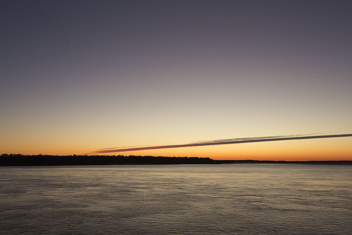
Thank you, Arun,Stuart and Pat. Arun, I thought about cropping more, but the result didn't have the same dreamy aspect of fading off into the fog. Stuart, no burning in the photo. I took another look at the original and the fog appears denser, with no blown highlights or shadows. Will have to see what happened to the jpg. |
Apr 13th |
9 comments - 0 replies for Group 14
|
9 comments - 0 replies Total
|