|
| Group |
Round |
C/R |
Comment |
Date |
Image |
| 56 |
Feb 24 |
Reply |
I love the way you reduced the harshness of the skin tones. Nicely done!! I like this version the best. |
Feb 25th |
| 56 |
Feb 24 |
Reply |
That is such a nice note Martha. Thank you so much. I appreciate it and I know that Michelle at BTB will appreciate it as well. |
Feb 14th |
| 56 |
Feb 24 |
Comment |
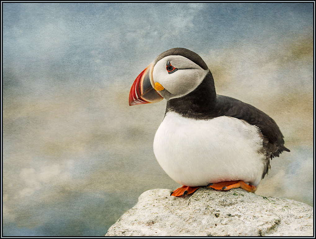
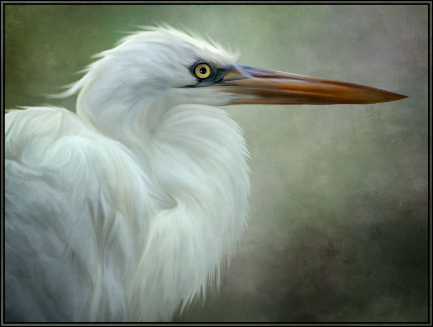
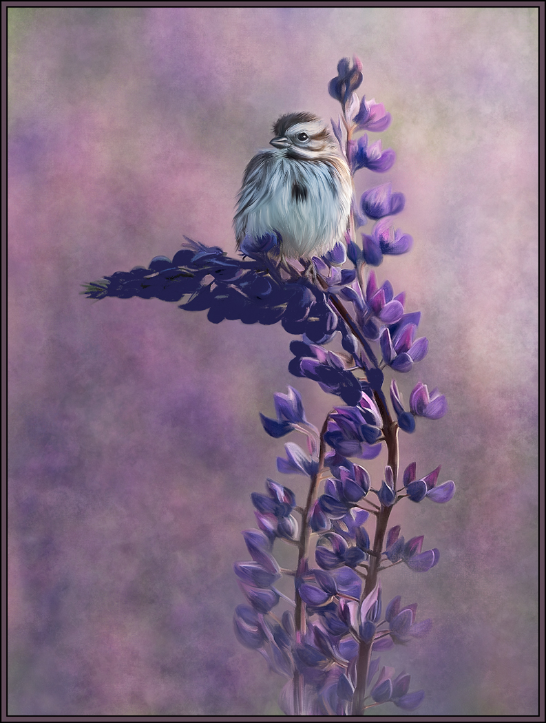
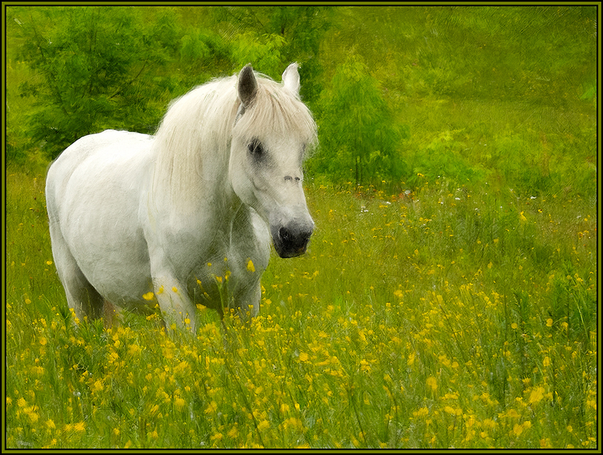
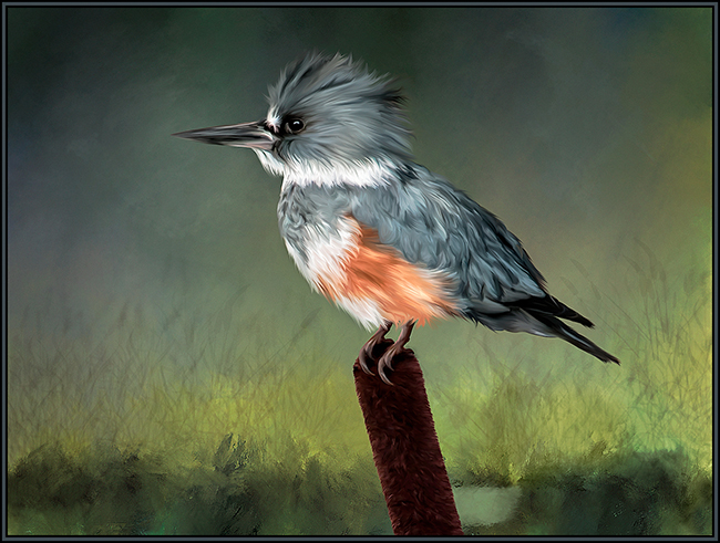
I love this painting, and I love that you eliminated some of the background clutter to draw attention to the bird and main flower. I agree with Nancy on cropping out the right stem to really add drama and impact to just the main two subjects. This is a wonderful rendition. |
Feb 13th |
| 56 |
Feb 24 |
Comment |
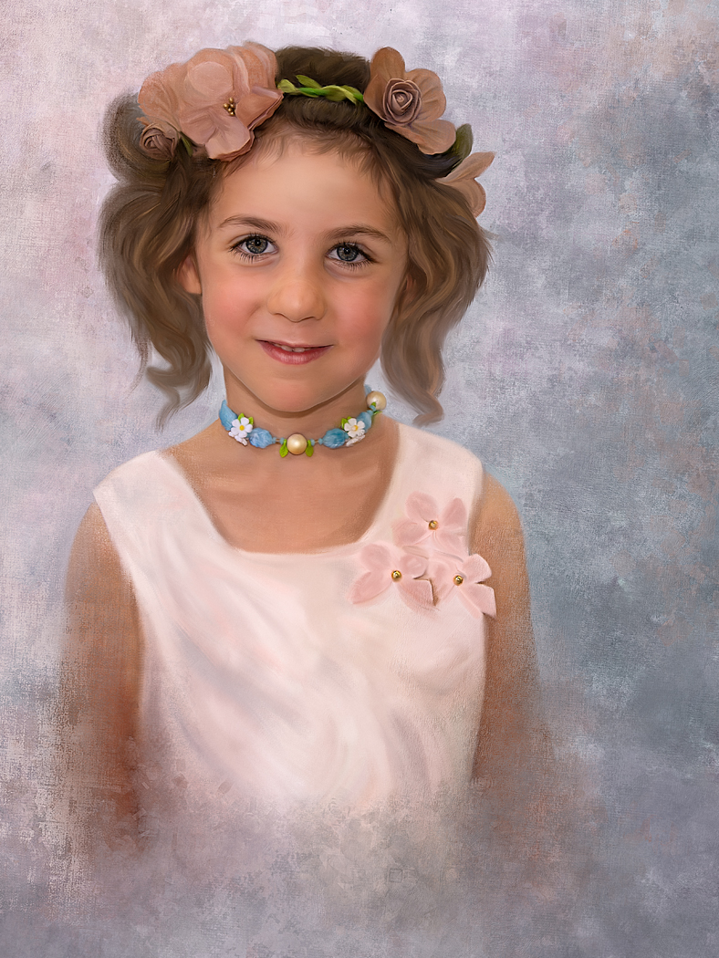
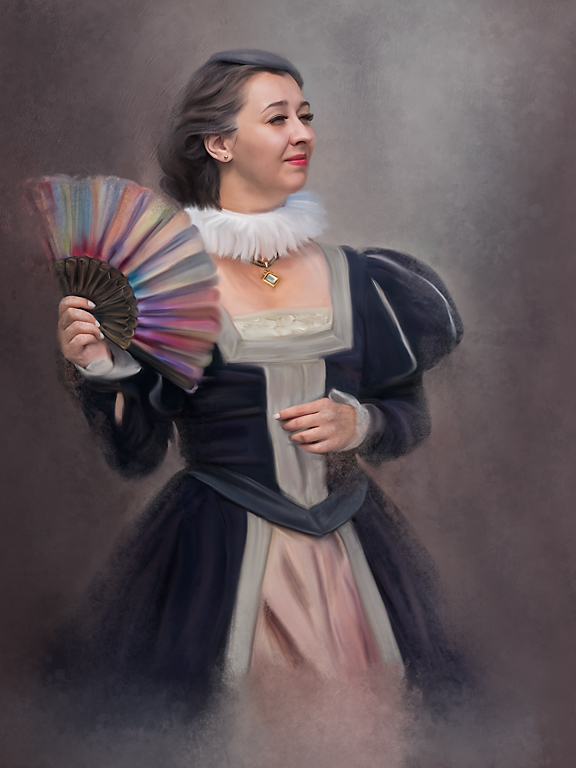
This is excellent. I would do a print and give it to your granddaughter. I prefer the image with the black background as it gives your granddaughter the center of attention she deserves. I think the texture on the skin of her arms is a little bit heavy; and perhaps the skin on her face and neck as well (although not as much as her arms). See if a separate layer with a masked subtle Gaussian blur reduces some of that harshness in those areas a bit. I would be proud to call this mine; and you should be proud to have such a great granddaughter. |
Feb 13th |
| 56 |
Feb 24 |
Comment |
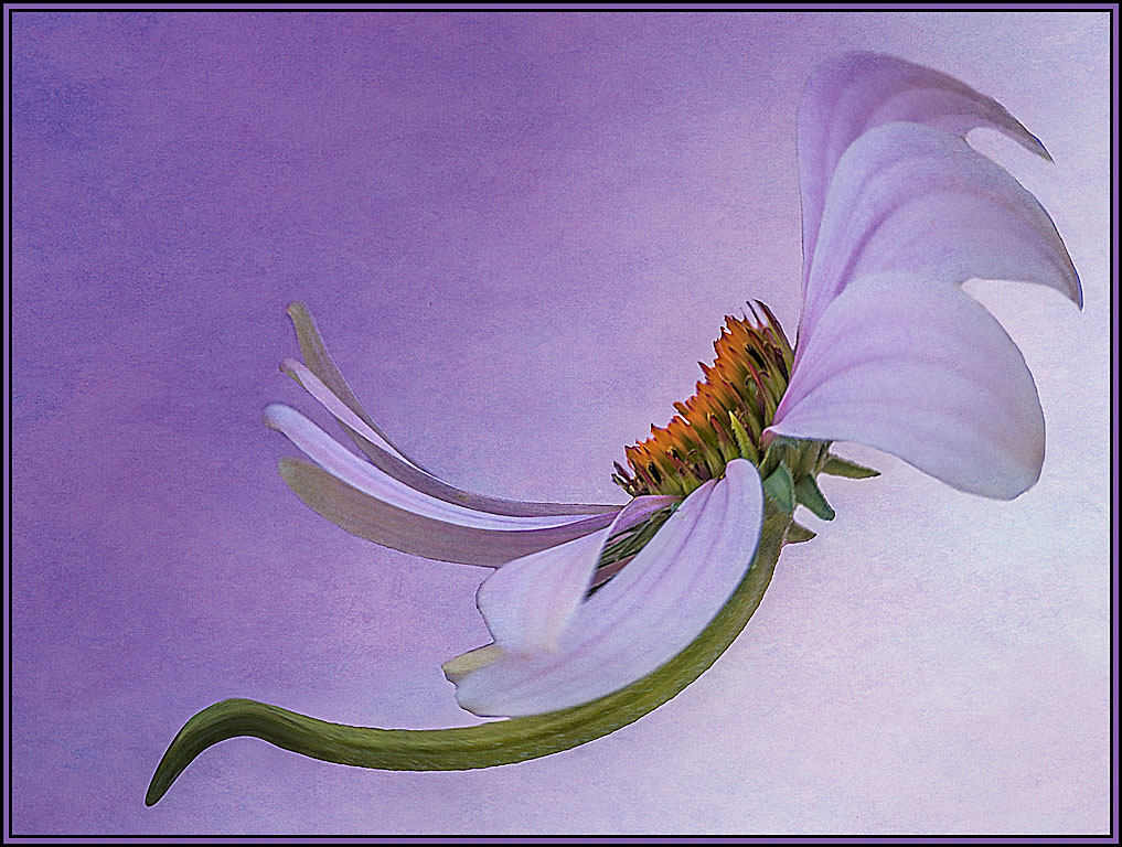
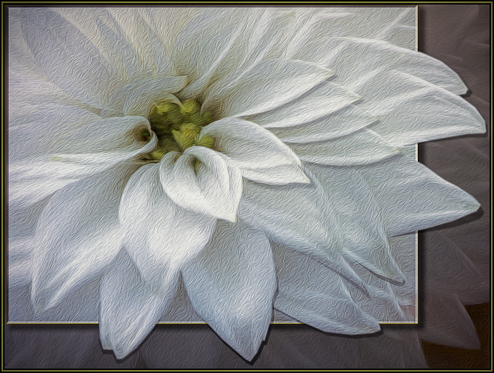
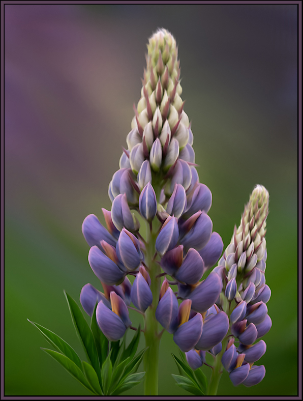
This is excellent. The background is wonderful and I like that you put some purple and orange coloration into the background to complement the colors in the flowers. It looks like there is now a full field of flowers just beyond your eye's reach. Your brush strokes on the flowers are great; and the addition of an extra purple flower was inspired. The only thing I would "maybe" change would be to make the stem on the main flower just a bit longer. |
Feb 13th |
| 56 |
Feb 24 |
Comment |
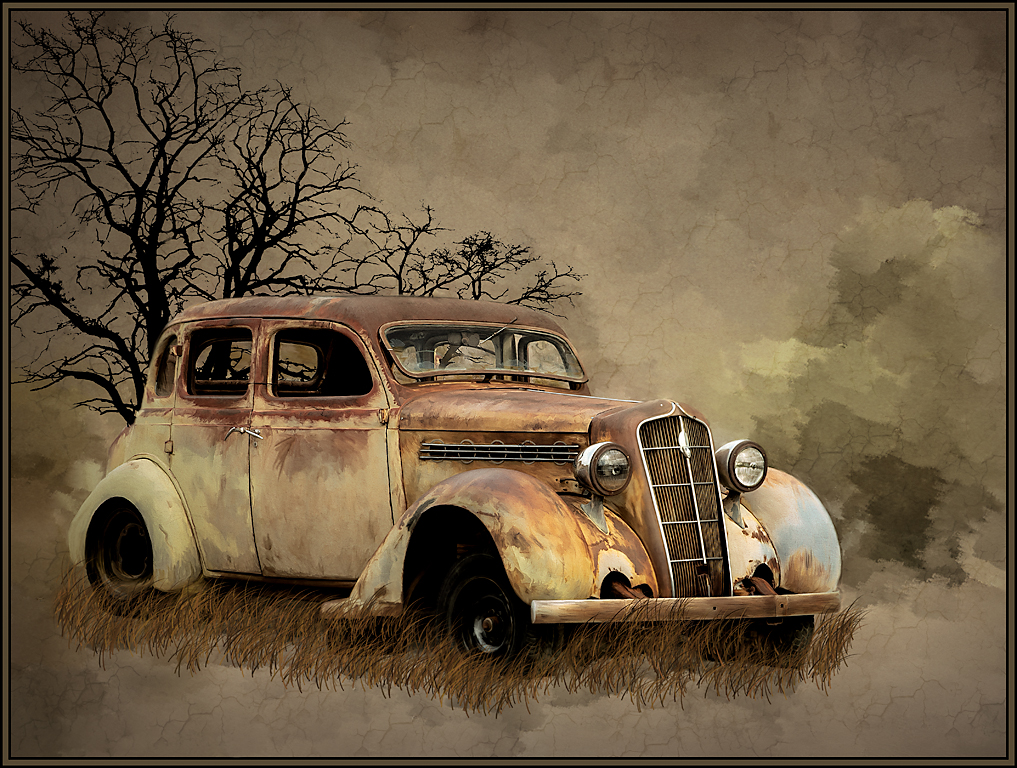
I disagree....it IS talent; and you have so much of it. This rendition is awesome!!!! Your drawing is even better than the original. I can read the "Plymouth" logo on the hood of your drawing... it is not entirely visible in the original image. Wow, I can't say enough about this... the tonalities are fantastic, all your "scratches" work. I wouldn't change a thing. |
Feb 13th |
| 56 |
Feb 24 |
Comment |
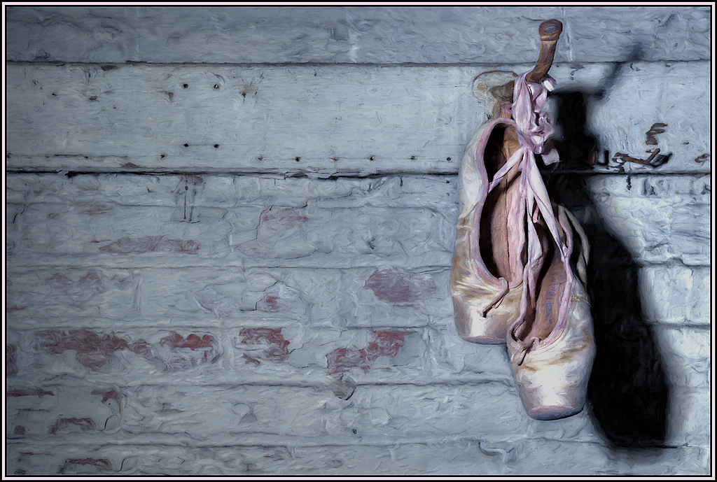
You did a great job extending the background, and eliminating the stonework to give it a sky appearance. The flower sets nicely against this sky.
In my opinion though, the shadows don't work here. And this is just my opinion. I can tell that there ARE shadows present in your rendition. But shadows would not be present in an image set against an actual sky. The shadows would need to be projected onto something. In the original image the shadows were projected onto the wall, since that was in close proximity. The presentation of an actual sky in this rendition would not be in close proximity to the iris.
So, perhaps try to remove the shadows. The remaining image would be of a great iris against a blue sky. Or, an alternate might be to add some sort of texture to the sky in order to give the appearance of a sky "paper" background rather than an actual sky.... where, then, the shadows would be needed. |
Feb 13th |
5 comments - 2 replies for Group 56
|
5 comments - 2 replies Total
|