|
| Group |
Round |
C/R |
Comment |
Date |
Image |
| 56 |
Apr 23 |
Comment |
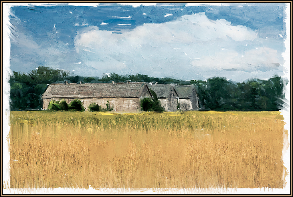
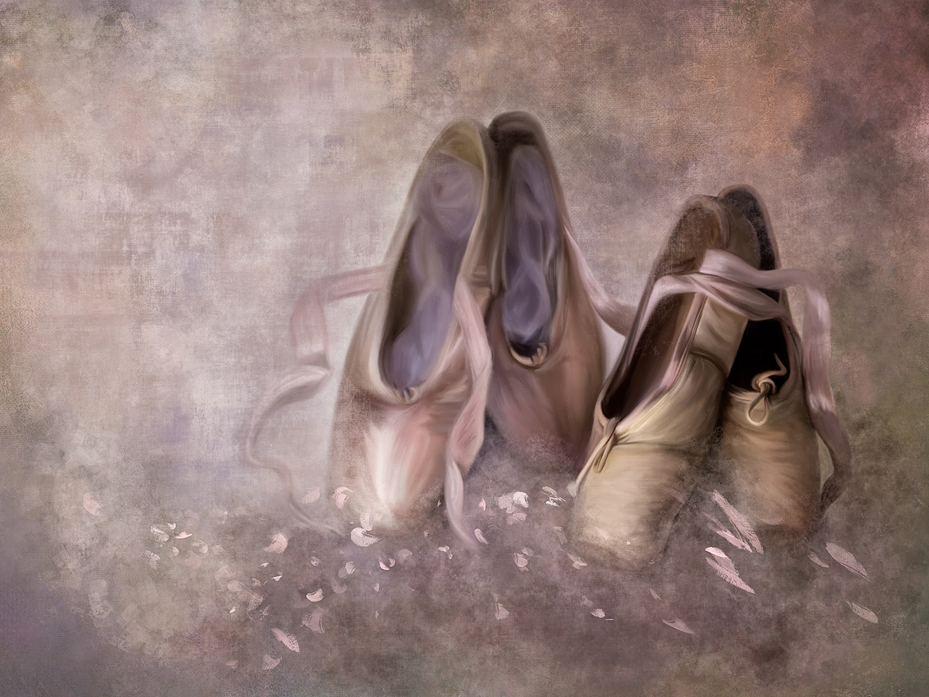
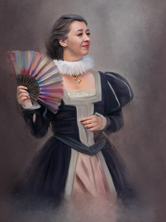
What a great composite. I love that you considered the quality of the light and matched that lighting in each of the composite layers- especially on your "selfie". You did exceptionally well with the mixer brush - using it on skin is not easy. The skin tonalities, both shadow and highlight, are blended well. This is a wonderful resultant painting. AND - I'm definitely going to use Nancy's tip on using "liquify" in the future.
|
Apr 12th |
| 56 |
Apr 23 |
Comment |
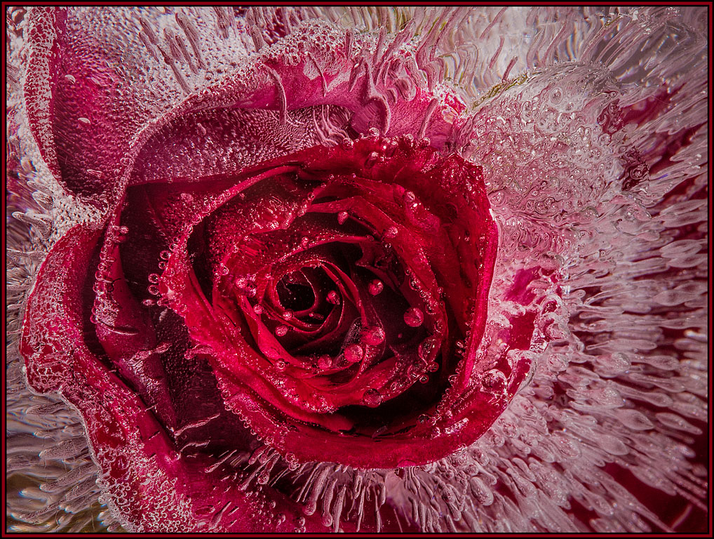
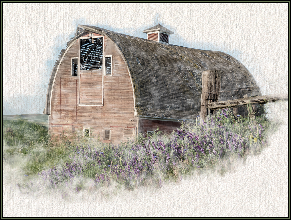
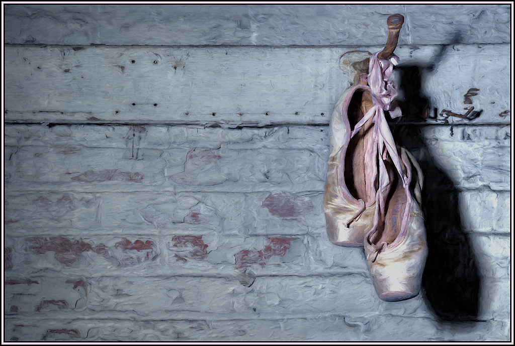
I am so glad that Trey was able to post the originals. What a great transformation! First, I have to congratulate you on your background. It took me so long to get that textured, mottled, chunky look. You've already well on the way to creating and mastering these great backgrounds.
Your color choice of the background works well with this flower and I do love the background with the touch of burgundy. Your brush strokes on the flower are wonderful.
My only suggestion would be to reduce/eliminate ONE of the highlights on the flower's stem. Keep the direction of lighting in mind - both for the painting and the background. For this image, the light seems to be coming in from the left. So that would mean that there would not be a highlight on the stems right side. I hope this makes sense.
It is truly a wonderful painting. |
Apr 12th |
| 56 |
Apr 23 |
Reply |
Thanks to both Nancy and Martha. So I guess "failure" was not the correct phrase. I was just disappointed that it did not turn out as painterly as I had envisioned. Thank you both for your positive comments. |
Apr 12th |
| 56 |
Apr 23 |
Reply |
Thanks to both Nancy and Martha. So I guess "failure" was not the correct phrase. I was just disappointed that it did not turn out as painterly as I had envisioned. Thank you both for your positive comments. |
Apr 12th |
| 56 |
Apr 23 |
Comment |
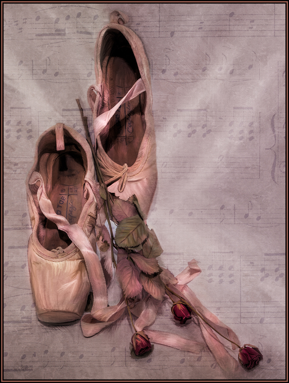
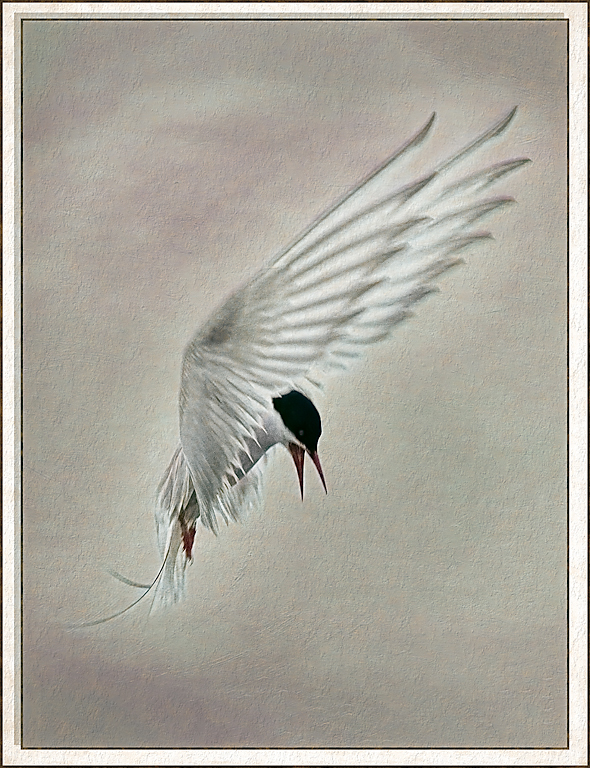
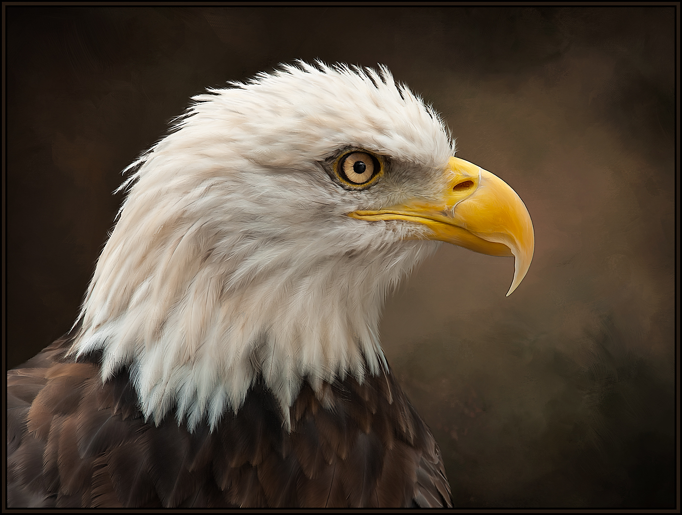
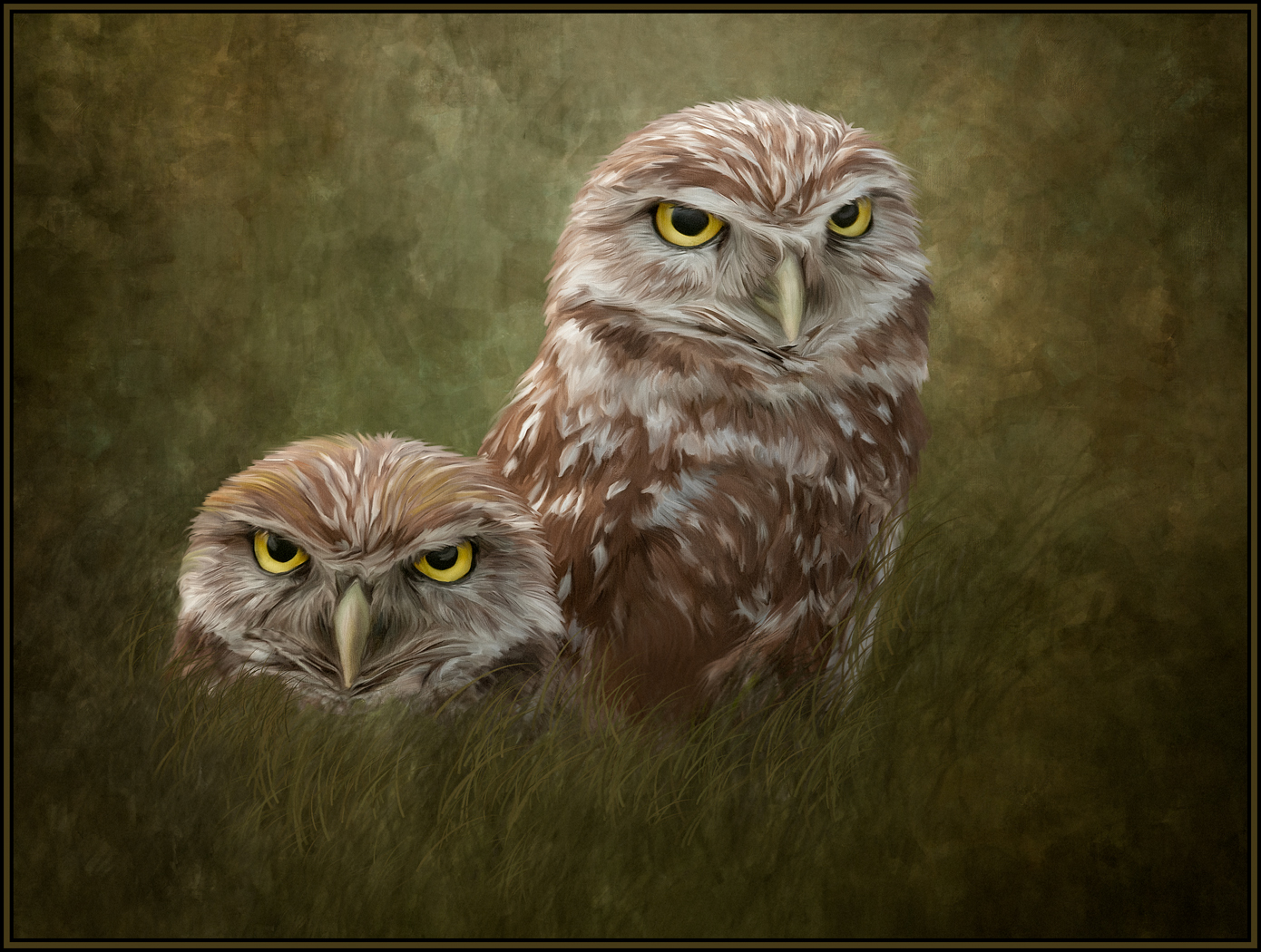
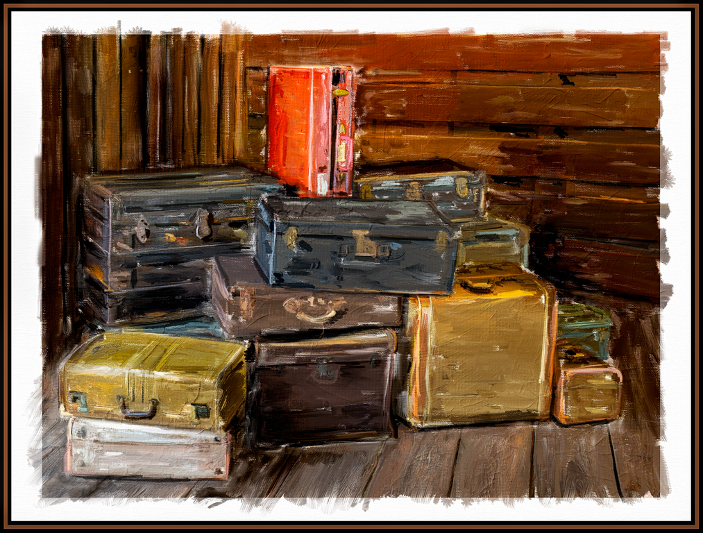
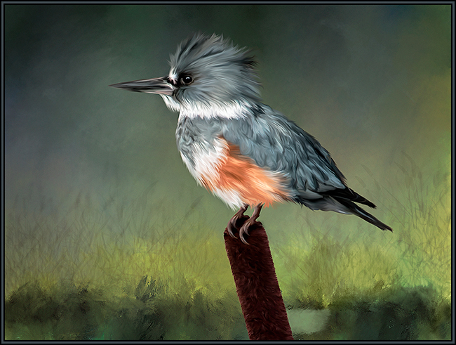
You've done great with your mixer brush strokes. And, yes, it is absolutely completely addictive. Your brush strokes on the bird are especially wonderful. A minor suggestion: One positive aspect of using the mixer brushes is that it can be used to blend away distractions as you paint. So, I would try the mixer brush again on the Protea to blend away the darker tips of the two red fronds in the front. You're well on your way to mixer brush mastery!! Well done. |
Apr 12th |
| 56 |
Apr 23 |
Comment |
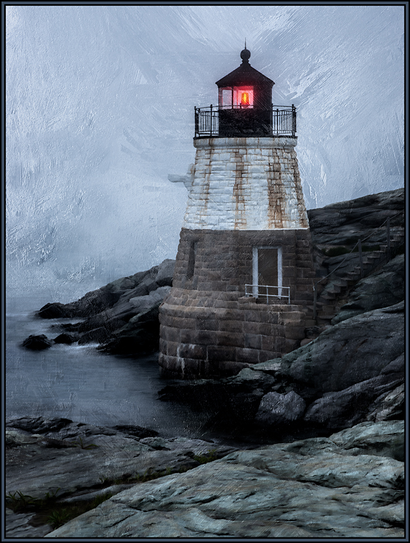
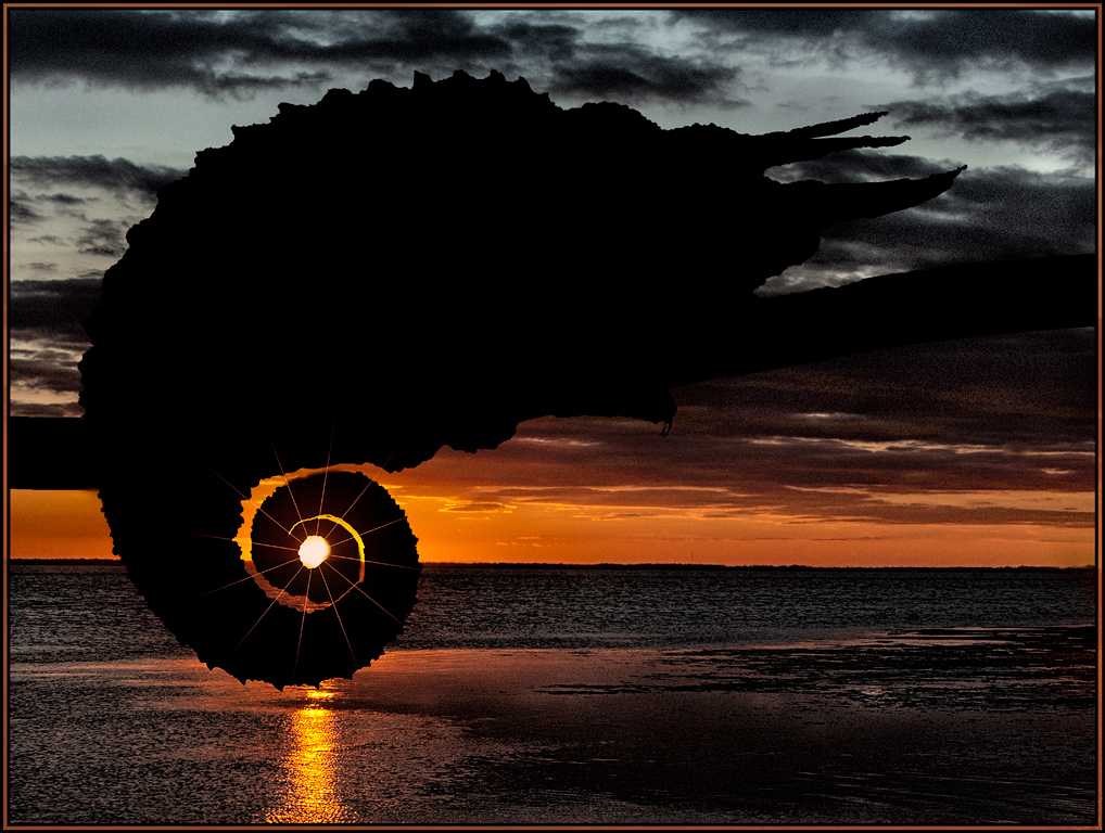
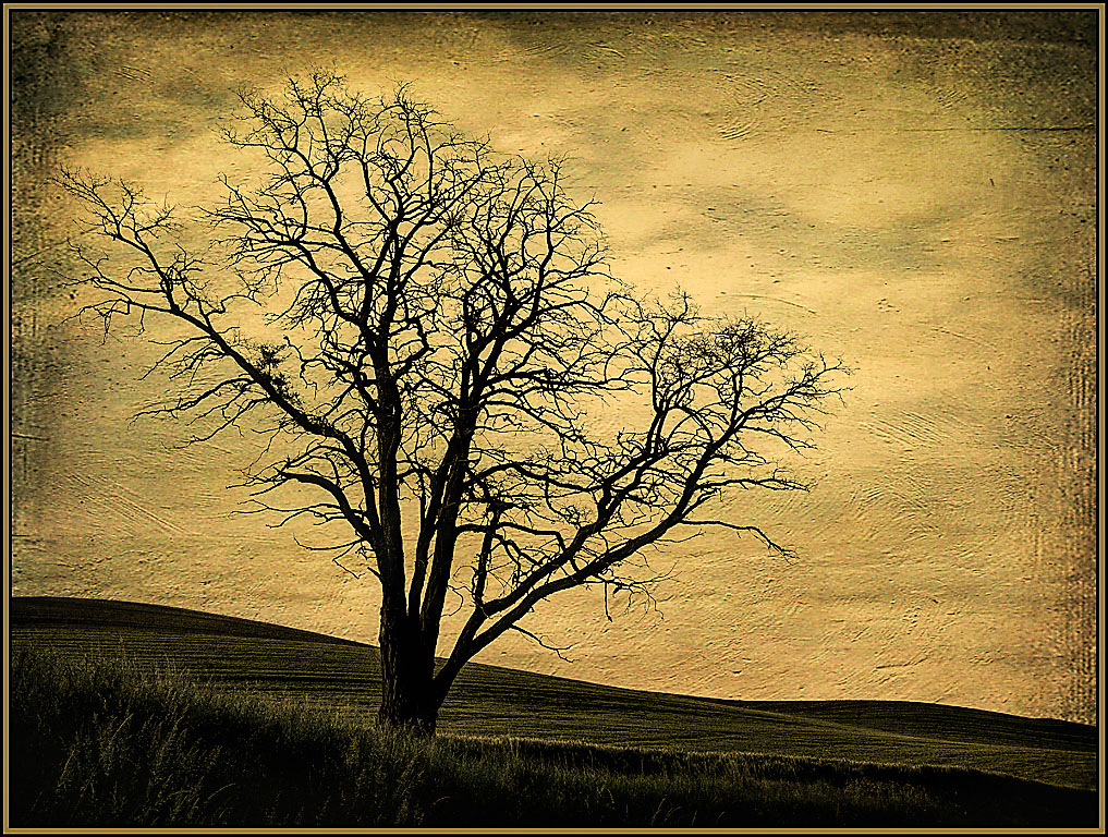
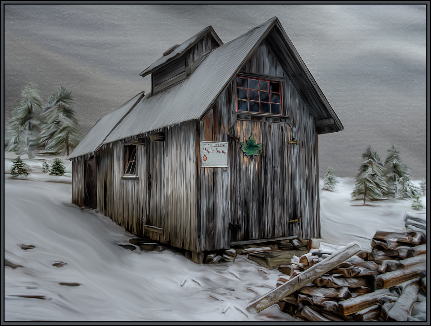
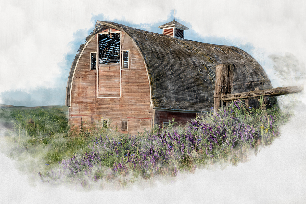
The crop you chose is perfect. It looks like a more peaceful scene without the city lights on the right. Your sky replacement is exceptional. (That's one thing I never learned to do - did you do this is PS?) I love that the oil paint filter seemed to give movement to the trees and yet kept all the permanent structures fairly solid. I perhaps would have cloned out the flagpole on the left and the two or three bright structures on the bottom right. Very nice painting. |
Apr 11th |
| 56 |
Apr 23 |
Comment |
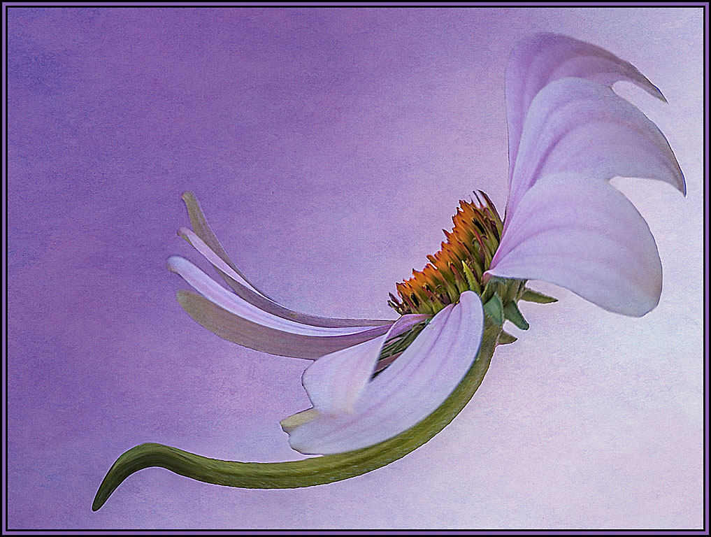
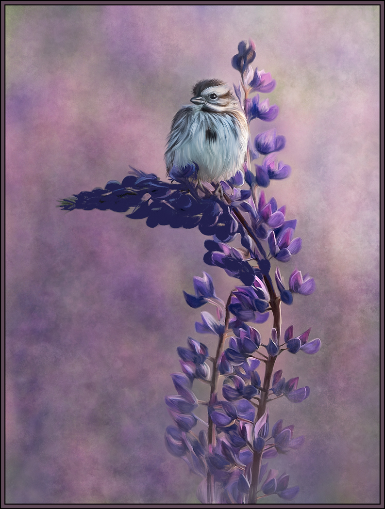
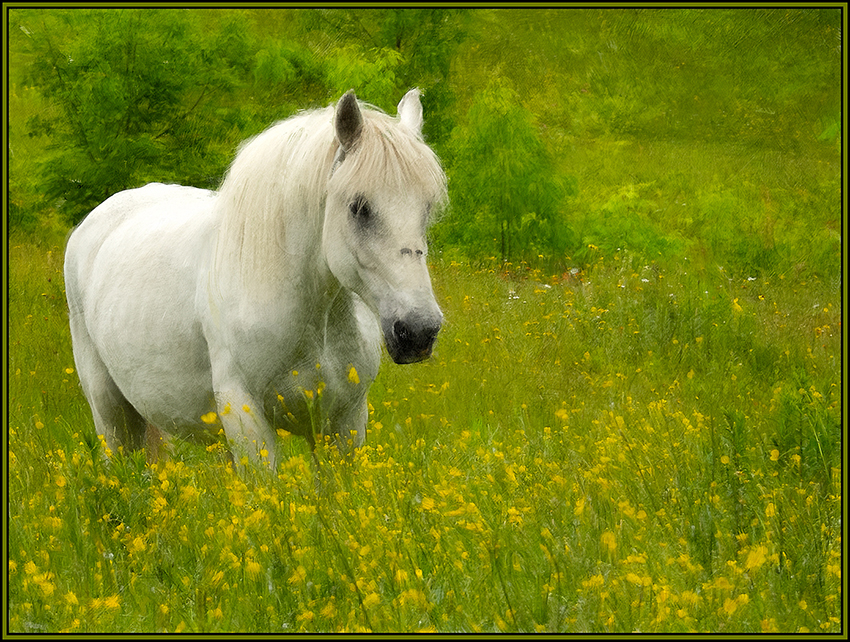
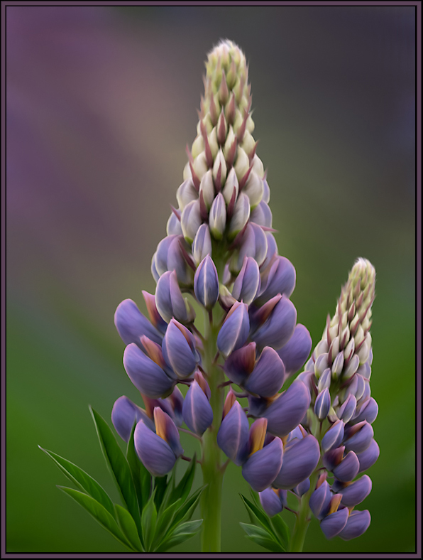
I always love the complementary colors of purple and green, and this image lets them shine. I appreciate that your final rendition is cropped as more of a square, as opposed to the original vertical presentation. To me, the textured background has movement and character; it does not detract from the flowers but sets them off perfectly. Well done. |
Apr 11th |
5 comments - 2 replies for Group 56
|
5 comments - 2 replies Total
|