|
| Group |
Round |
C/R |
Comment |
Date |
Image |
| 56 |
Nov 20 |
Reply |
Hi Trey. There is no building at the top left !! Spooky indeed that you see one. I added a moon on top left to "shine" through the trees. |
Nov 21st |
| 56 |
Nov 20 |
Reply |
Thank you Nancy, I agree with your changes. Those details are very important, and I'm glad you noticed them. |
Nov 20th |
| 56 |
Nov 20 |
Comment |
I wish I had found this beautiful scenic backroad. The original help promise; it's your enhancements that brought this image to its full potential. The colors have really been given a "pop" and the brush strokes give the trees and clouds a sense of life and motion. And I absolutely love how the receding "V" in the images leads directly to that red tree and its reflection. The image is also very symmetrical; from both top to bottom and side to side - excellent. Your resultant painting is striking. |
Nov 13th |
| 56 |
Nov 20 |
Comment |
A very unique transformation; and I love it. I love the duplicated racers; giving the image a sense of a packed raceway, dust and all. I love the look of the multicolored helmets as well. These colors and their impact work so well with all the other gray, black and white tones. I'm not quite sure how I feel about the top inch of the image, which is totally white. Try and see if you like it better with tones of gray or motion effects there as well. All in all, this was a great vision that you were able to successfully bring to completion. |
Nov 13th |
| 56 |
Nov 20 |
Comment |
Hi Nancy, For this image, I believe the B&W version is the painted version. The color image is the original, correct?
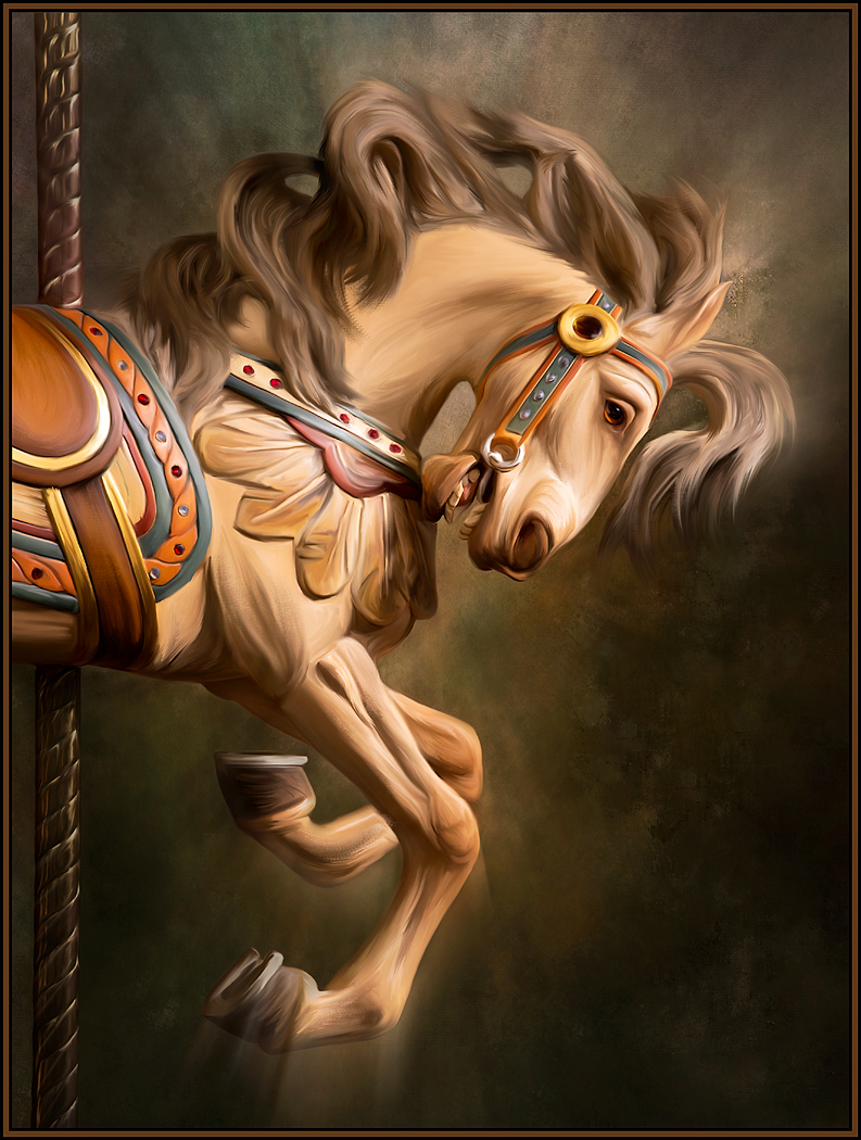
I never thought of turning my paintings into B&W; I love what it has done for this painting. The tonalities are great, and I now especially love the highlights and shadows on the saddle, saddle blanket and her hat. You can really see the angle of lighting. And, the flowing strokes of her clothing and the blanket are fantastic. Some of these smaller painting choices might not be as prominent in a colored painting. The B&W painted version really has so much depth and dimension now.... I love it! |
Nov 12th |
| 56 |
Nov 20 |
Comment |
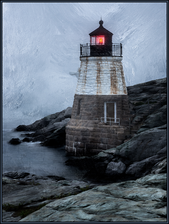
The oil paint filter can sometimes be "too much," with large, distracting, flowing strokes that won't fit the image. That is not the case here; I love the small delicate strokes, especially in the water and sky. "Flipping" the composition was also a great choice. The only thing I might change is to clone out the green grass on the lower left. Then, it might look like the shipwreck occurred on a rocky outcrop well at sea, rather than right offshore. This is a well executed painting - great job. |
Nov 12th |
| 56 |
Nov 20 |
Comment |
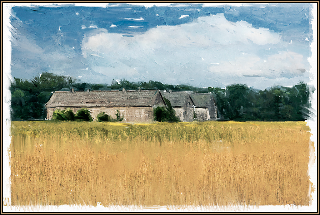
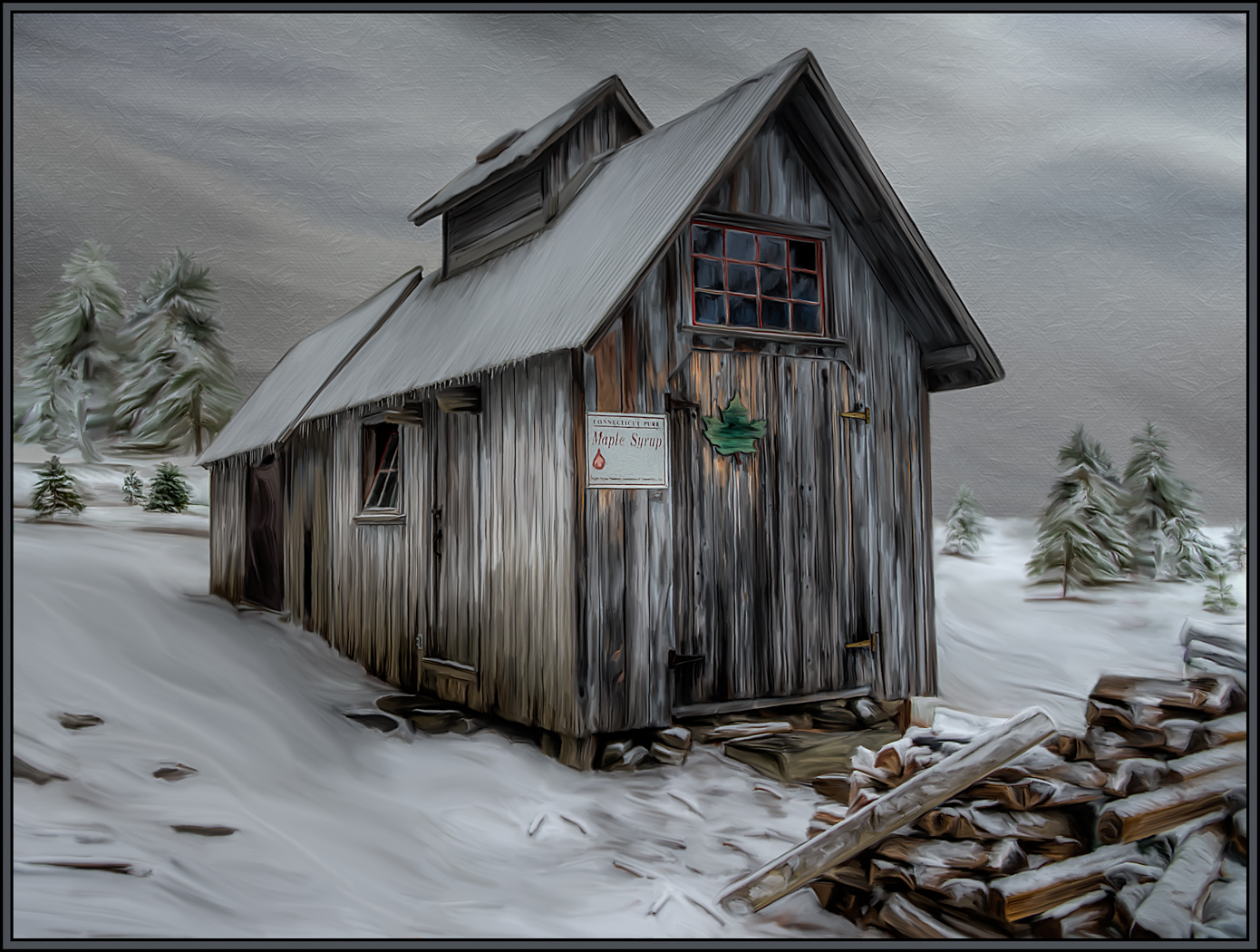
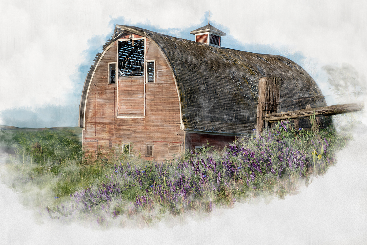
This is a scene where I also would have stopped - absolutely! I love the abandoned feeling of this farm shack. It was a great scene to begin with; and then the Cezanne treatment and your adjustments took it to another level. The enhanced textures, colors and painterly feel are fantastic. I honestly would not change a thing. Great, great transformation. |
Nov 12th |
5 comments - 2 replies for Group 56
|
5 comments - 2 replies Total
|