|
| Group |
Round |
C/R |
Comment |
Date |
Image |
| 56 |
Apr 20 |
Reply |
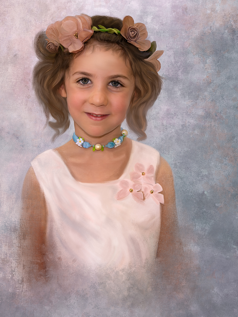
Wow Nancy, I like this so much better. Now it seems that the wreath goes around her head and gives it dimension. Before, the wreath just seemed to float near her head. It was just a little thing, but we're here to help each other. Good job.
And, I like it with both the branches added or omitted. Both are great compositions. (But, I know what you mean about not being able to find the correct layer :-)). |
Apr 10th |
| 56 |
Apr 20 |
Reply |
Thank you so much Mark. And thanks for visiting from Groups 8 and 18. |
Apr 10th |
| 56 |
Apr 20 |
Comment |
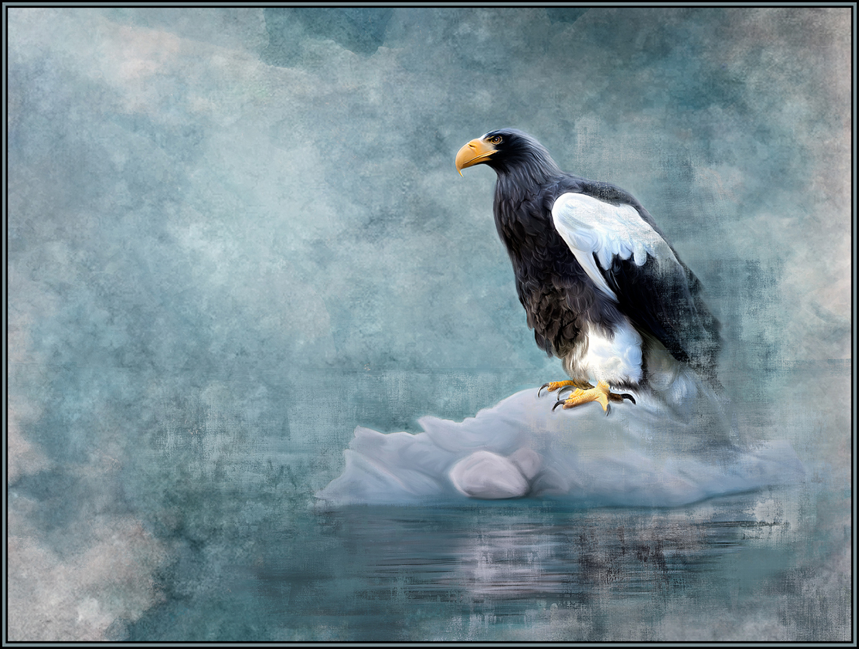
Wow, your lighting and color changes have really made this image impactful and amazing. It seems like this rabbit was caught in some lights in the middle of the night. HOPPER was a great choice. Excellent painting.
If there is a suggestion, it is this very small one. The rust frame must have used a bevel, emboss or drop shadow. I like the rust frame. However, where the frame is thin on the right and bottom, there are now very narrow areas of brighter foliage just inside the rust frame. My suggestion would be to darken down those thin areas of lighter foliage. |
Apr 9th |
| 56 |
Apr 20 |
Reply |
Hi Terry,
I first took a Jack Davis course on Creative Live. It was called "Painting with Adobe Photoshop". The course was very comprehensive (over 15 hours of instruction - although he does ramble a bit) and included many tools of the painting trade that he uses. This, however, was from 2013; so I needed to adapt many of his brushes (he used "tool presets") into today's Photoshop CC capabilities. I also just saw a listing for him on YouTube with the same title. On YouTube, I just searched "Jack Davis Photoshop Painting." I don't know if YouTube has the entire course but give it, and the Creative Live course, a look. |
Apr 8th |
| 56 |
Apr 20 |
Reply |
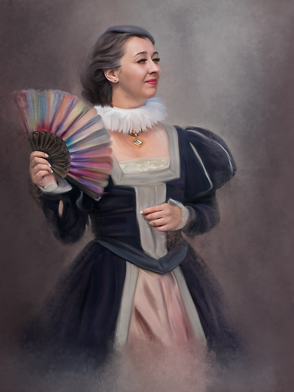
Hi Trey. I have files of backgrounds that I have created myself. And most of them have "pink" in them. I guess I'm drawn to pink. I thought this background had many of the same tonalities of the dress so it was chosen as the background. I also "added" colors FROM her dress and fan INTO the background as I painted. I think it helped to make the image more cohesive.
Thank you very much for your comments. They are appreciated. |
Apr 8th |
| 56 |
Apr 20 |
Comment |
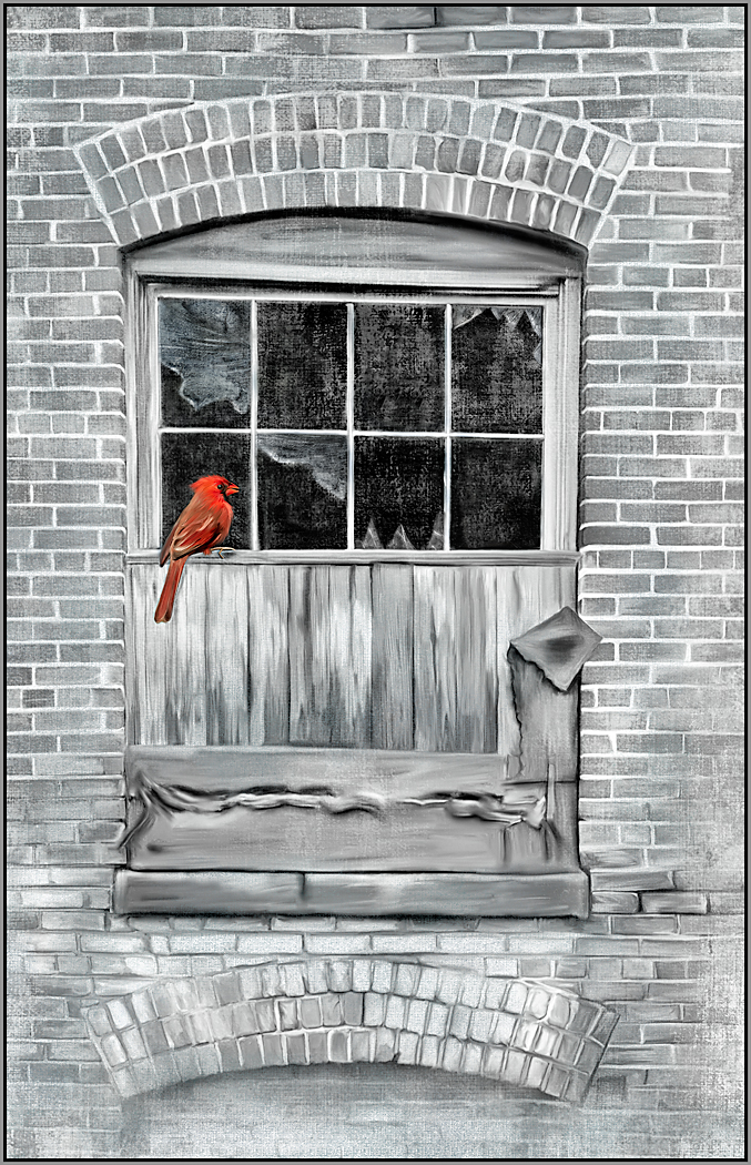
I have started learning, somewhat, the digital painting techniques that start from an underpainting and then build up. This is the way that Jack Davis paints his digital images. I did not know that DAP uses this and that it can actually be stopped at any stage. Excellent way to paint!!
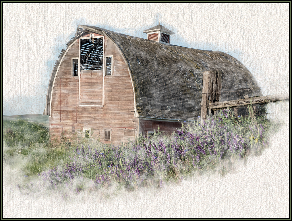
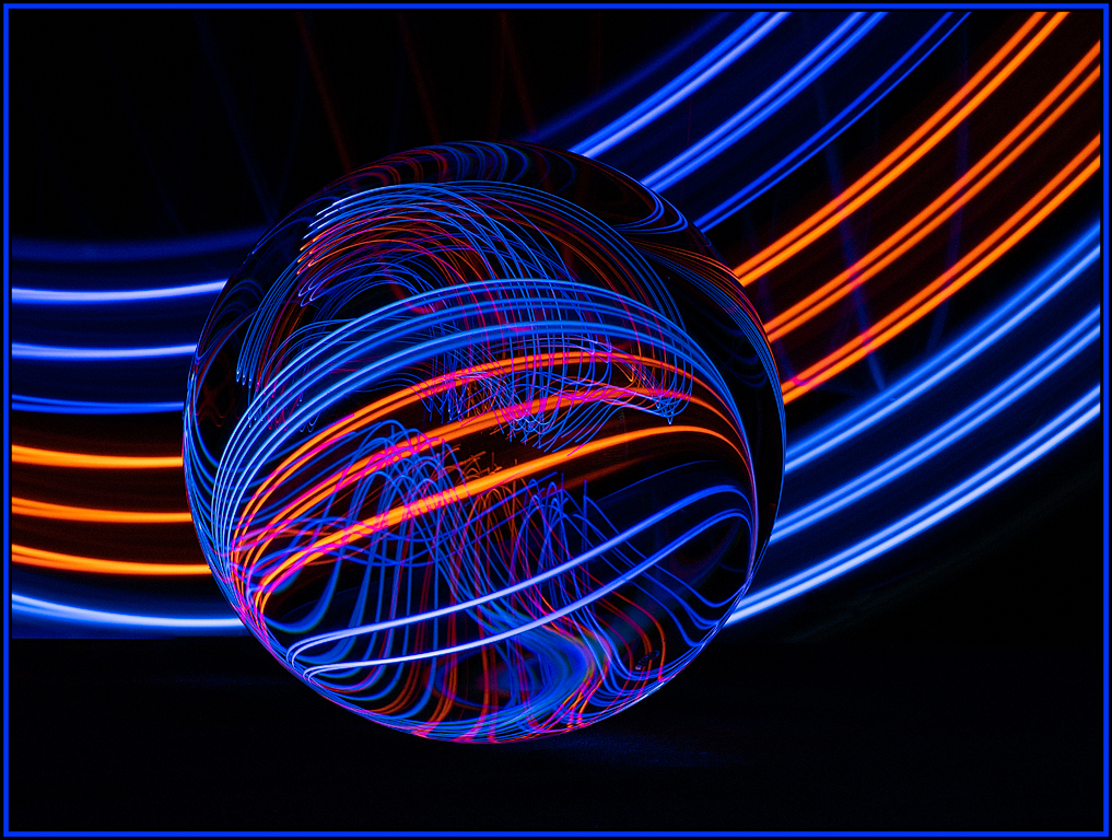
Related to your abstract - I applaud you for seeing this in the first place. And I love how you have rendered this as an abstract. The blue, red and orange colors are fantastic and so complementary. The browns, however, are not speaking to me. I don't mind the browns on the bottom as they seem to "ground" the image. My personal preference would be to clone out the two brown areas at the top of the image. Excellent result in this abstract... starting from a line of rust! |
Apr 8th |
| 56 |
Apr 20 |
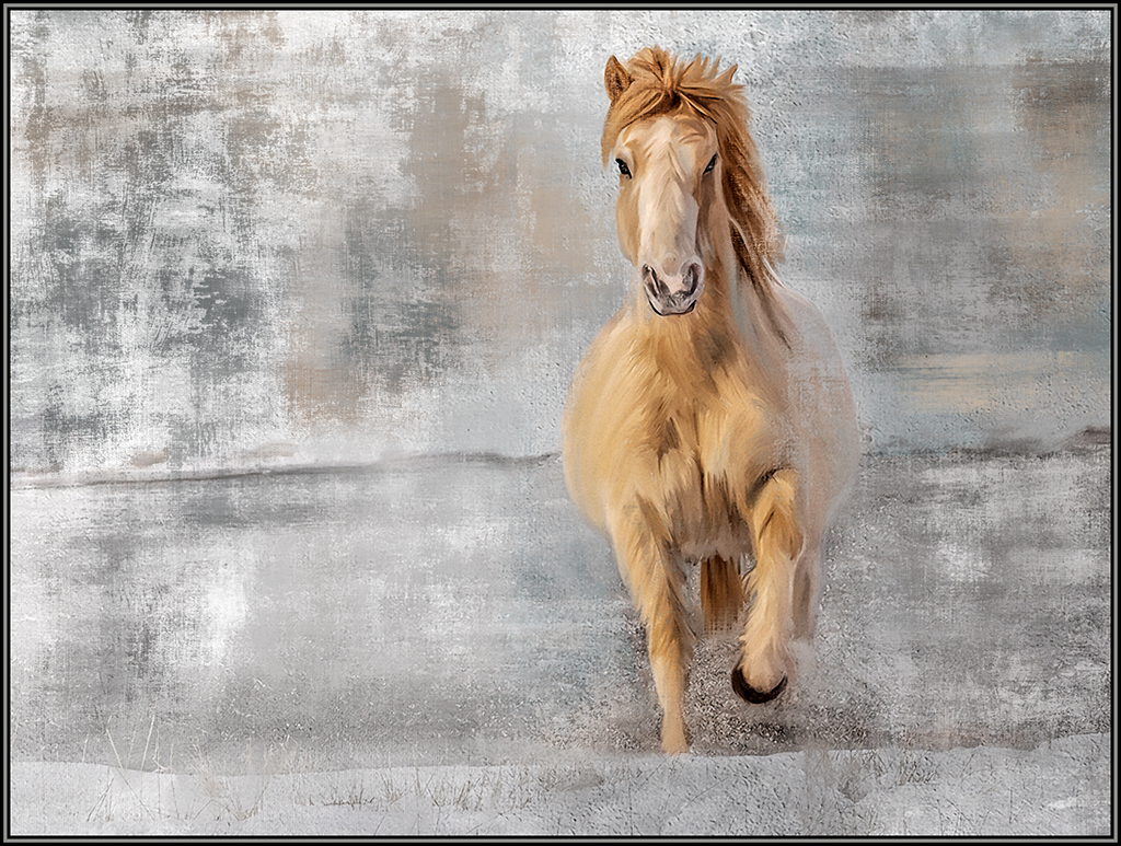
Comment |
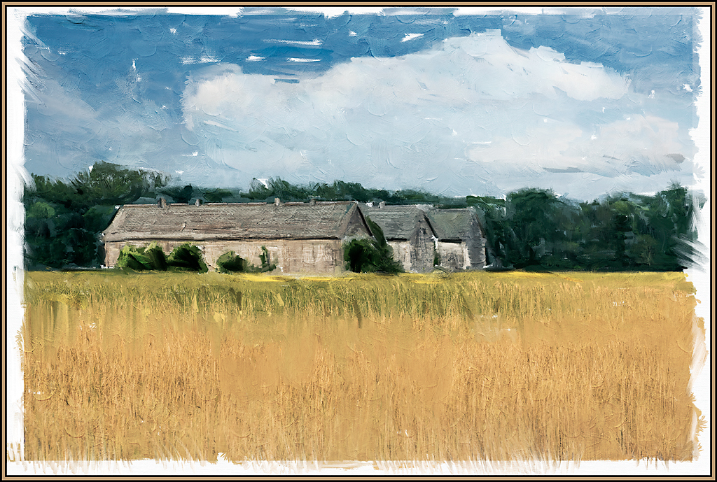
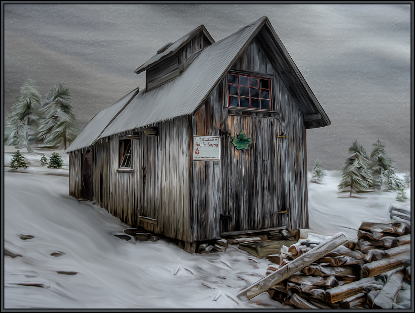
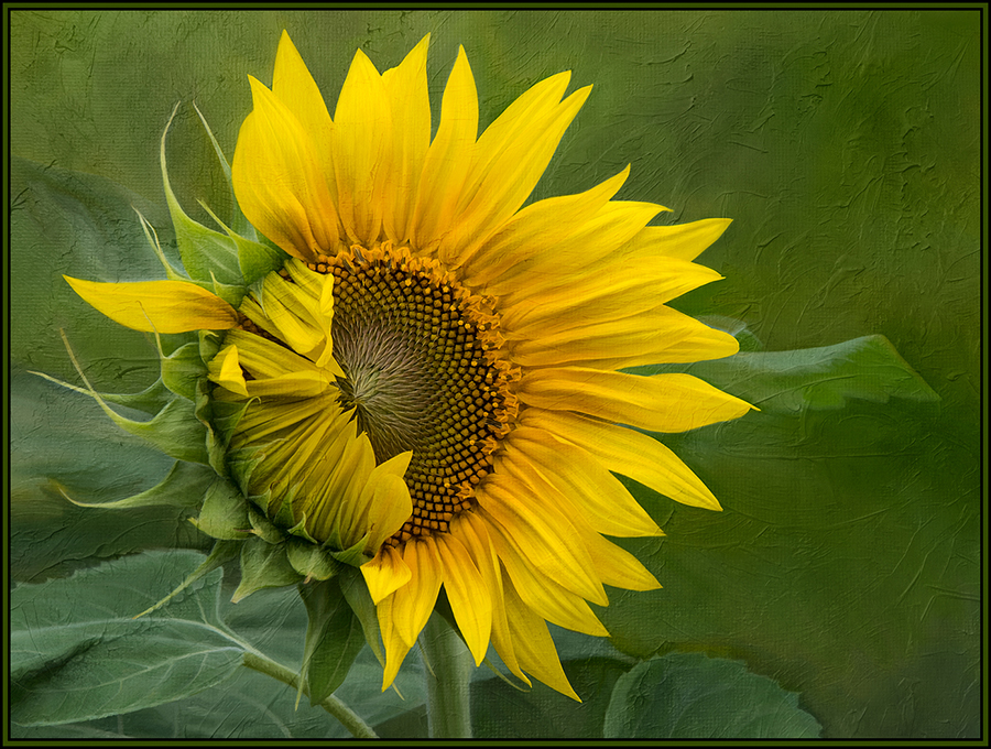
I love the shadows in this image. I love that the shadows in the foreground are left to right and the shadows on the snowbanks are diagonal. It's these shadows that really give movement to the image. Additionally, the warm tones that your processing has added are excellent. And cropping out the sky was a strong compositional decision. Great job. I give you kudos for seeing this as a painting. |
Apr 8th |
| 56 |
Apr 20 |
Reply |
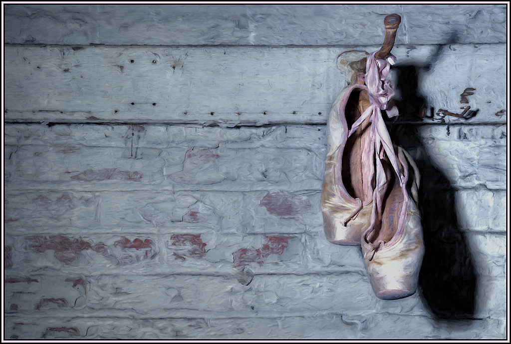
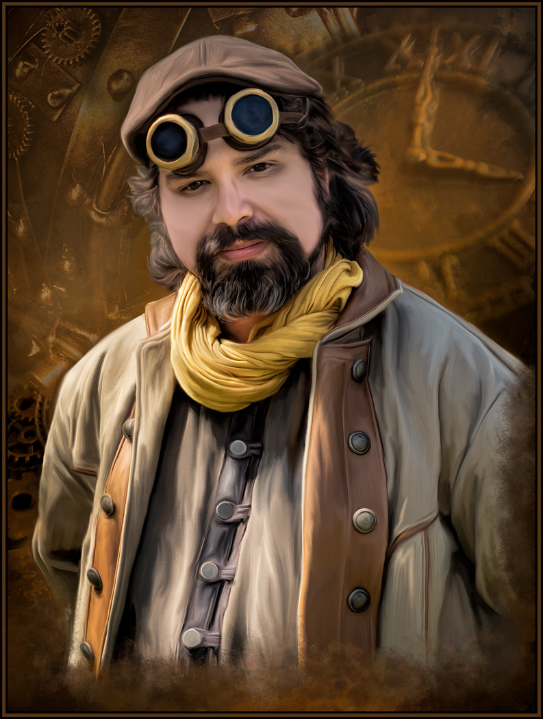
Thank you so much Nancy. All great suggestions; I appreciate and will take advantage of every one of them. I did not even notice the skin tone on the arm with the fan; I guess this is just where her gown has a gap! And using lighting to draw attention to her face will be done. Thanks for your screenshot. Most of the "broken edges" are on separate layers, so it will be easy to reduce some of those areas.
I now just hope we are able to get out this summer to visit more fairs. I need more subject matter for paintings. |
Apr 7th |
| 56 |
Apr 20 |
Comment |
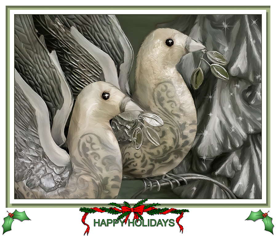
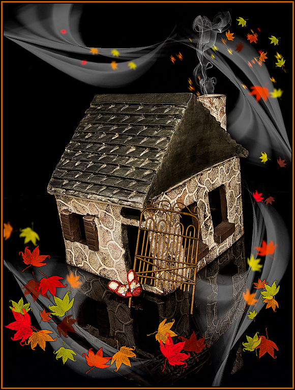
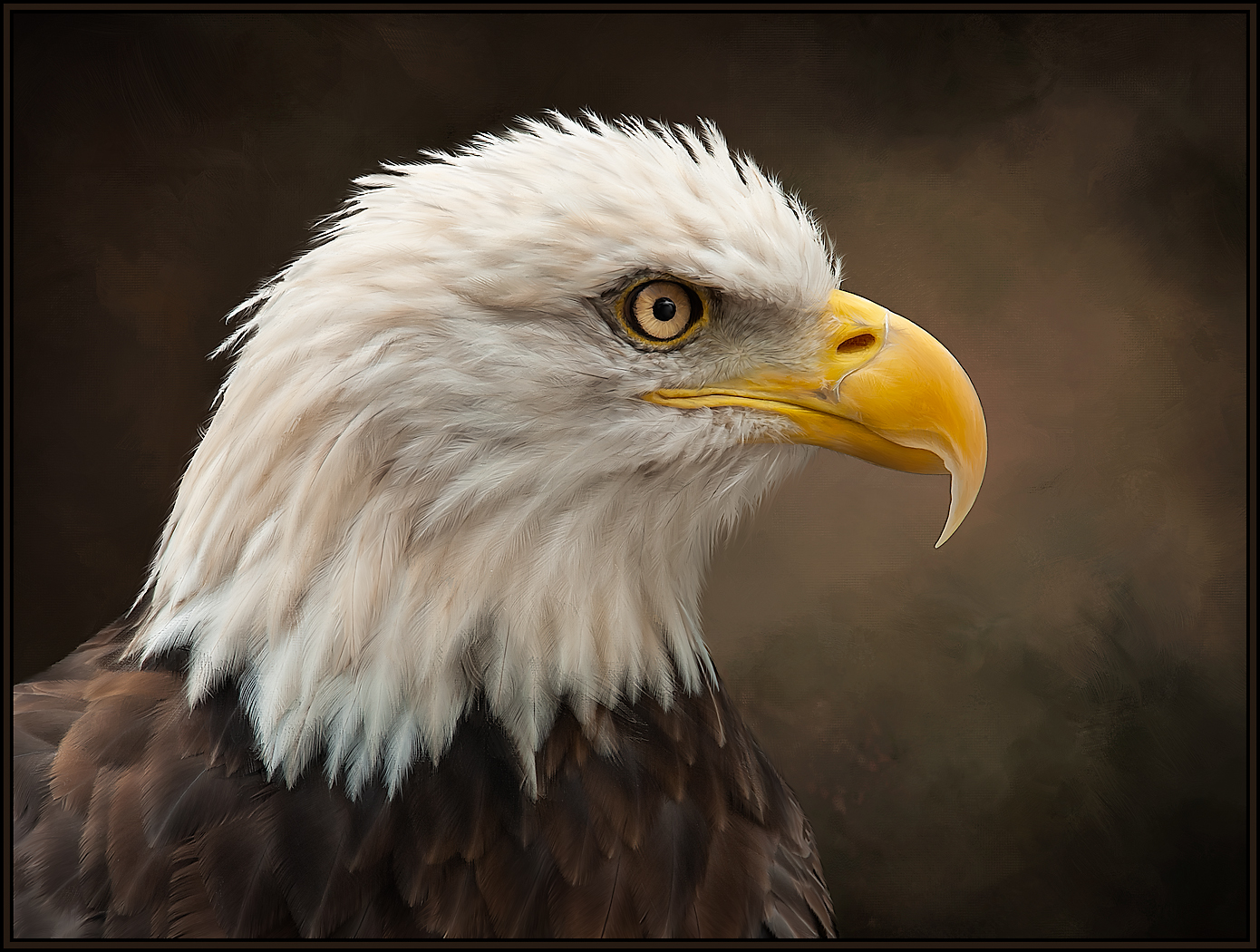
I love the creativity of this image. The oranges and greens work so well together. I also love the subtlety of the doves. Your painting of the woman is excellent; it does not look too stiff, as you feared.
I do have one minor suggestion. I like the idea of a wreath around her head. But I feel the leaves need to "disappear" as they go behind our field of view on the far side of her head. Right now, it seems like it's floating rather than being around her head. I am attaching an image of the rings of Saturn that conveys the concept I am suggesting. I hope this helps.
Excellent, excellent painting. |
Apr 7th |
 |
4 comments - 5 replies for Group 56
|
4 comments - 5 replies Total
|