|
| Group |
Round |
C/R |
Comment |
Date |
Image |
| 56 |
Feb 20 |
Comment |
In this collage, I might suggest removing the large "rock" on the right and have that filled with the stained glass layer. Even isolating the three main figures against the stained glass would work too. (I would personally clone out the smaller man as his perspective does not seem to match the rest of the scene.) Lastly, I do think that more detail is needed in faces of the left and right subjects. So my personal idea would be to use the three main figures; as they would set off nicely what you have done with the main figure. |
Feb 11th |
| 56 |
Feb 20 |
Reply |
Keep going with Corel. I envy you, getting to use this great program. Whenever I see a painted image that is truly exceptional in my eyes, it has been painted with Corel. For now though, it's just not in my future endeavors. So I'll learn from you and appreciate all you're doing.
And I agree with you on comments. I always appreciate constructive criticism; and it's important to realized that the criticism is in the eye of the beholder - we aren't obligated to take any suggestions. It just great to see how others view your work. |
Feb 10th |
| 56 |
Feb 20 |
Comment |
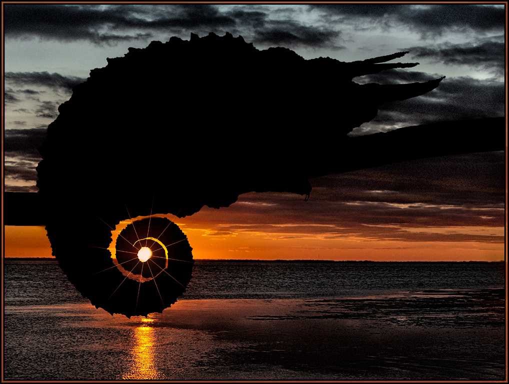
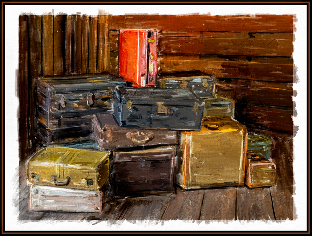
What an excellent subject to use in a painting. The result looks fantastic. I do wish, however, I could see a larger version in order to see the brushstrokes; which are a great attribute in a PS painting using the mixer brush. I agree with keeping the orange; it adds drama and impact. |
Feb 10th |
| 56 |
Feb 20 |
Comment |
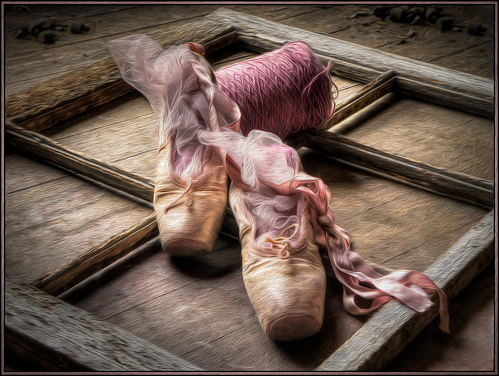
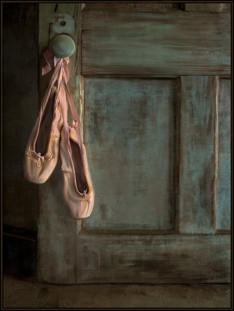
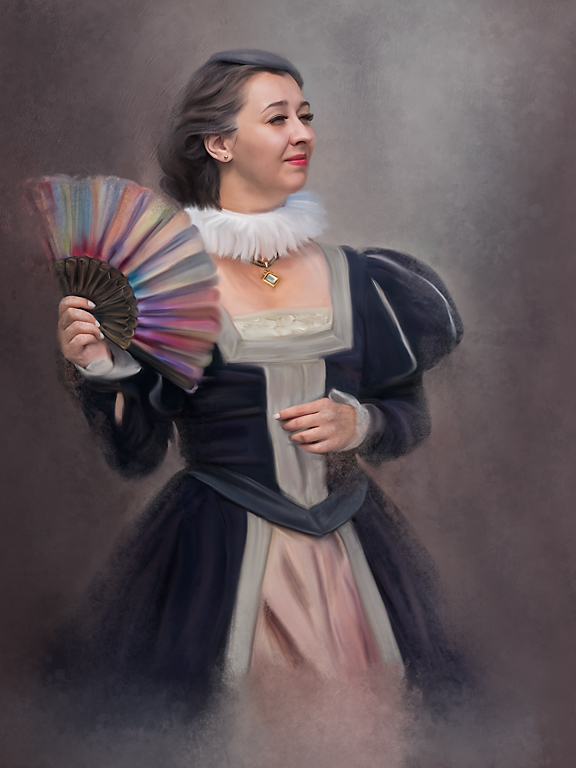
The setting you chose as a backdrop is excellent. And now her repainted costume really gives it that pop of color. Did you paint the background as well? Giving her a "hidden foot" and a drop shadow really established her in the scene. I only have one suggestion. As you refine your skills in Corel, try to eliminate the hard edges from a cutout. For me, there are halos wherever this figure is against the black background: her left arm and head especially. I hope you don't view this as a harsh criticism on my part; I could not do 1/10 of what you've been accomplishing in Corel. I love looking at each and every one of you Corel images. Hats off to you! |
Feb 9th |
| 56 |
Feb 20 |
Comment |
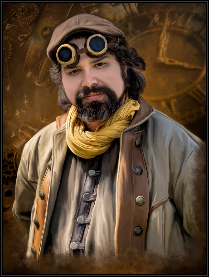
This image is so poignant and thought provoking; whether painted or not. Your capture and description of him does him justice. I like the crop you chose, highlighting the man's eyes, looking at you. I like that you also gave this a somewhat hazy or blurred appearance; it makes you really stop and look at what is being portrayed. I'll be thinking of this image for quite some time. Well done! |
Feb 9th |
| 56 |
Feb 20 |
Comment |
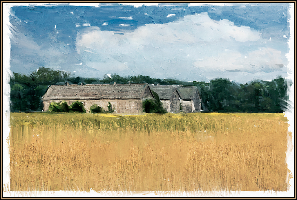
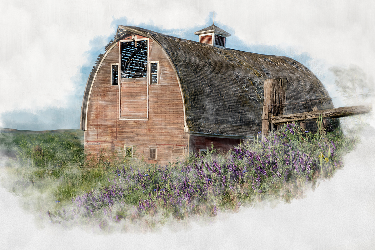
Hi Trey, and welcome.
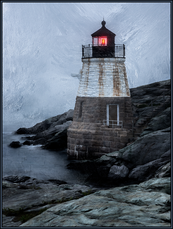
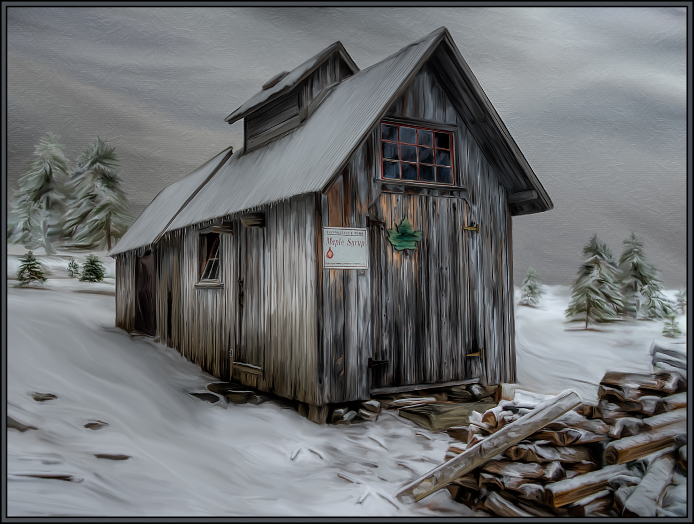
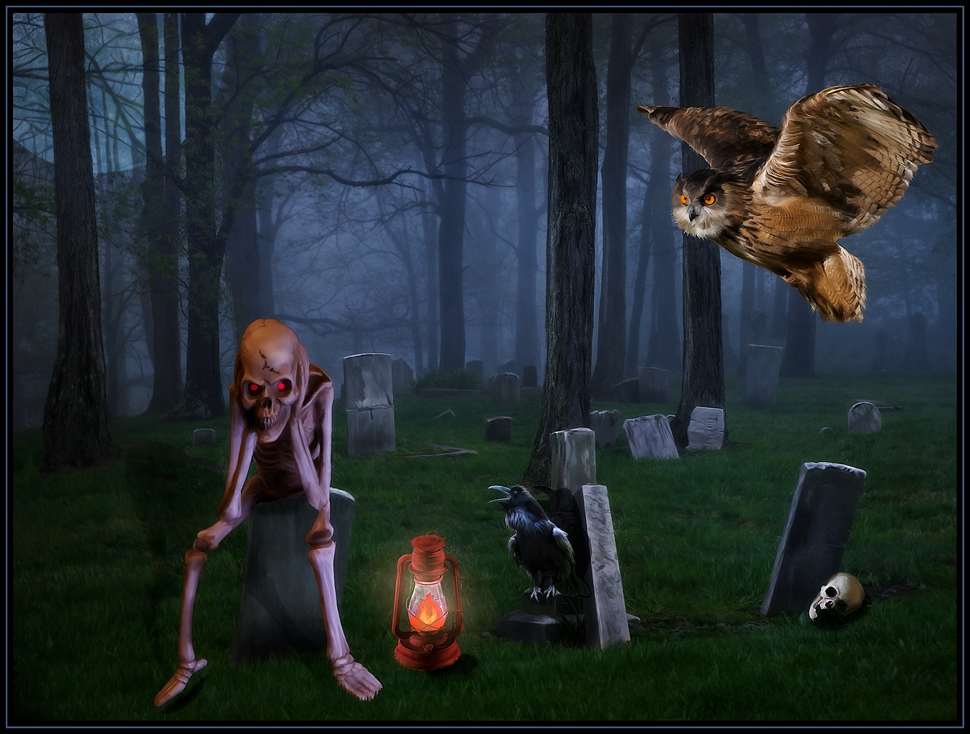
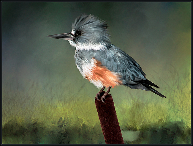
I have always loved the mood of foggy images. And then you took THIS foggy image to the next level with your painting improvements. I love how Topaz rendered every aspect of this image. The trees (even the background trees) now have so much more personality. Same for the sky. And, as Pat notes, the foreground crops have also seemed to come alive on this foggy day. I wouldn't change a thing. Well done. |
Feb 8th |
5 comments - 1 reply for Group 56
|
5 comments - 1 reply Total
|