|
| Group |
Round |
C/R |
Comment |
Date |
Image |
| 20 |
Oct 19 |
Reply |
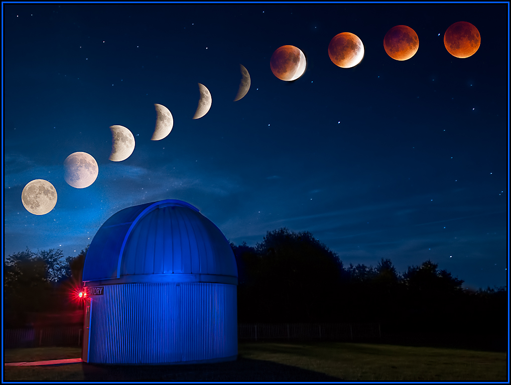
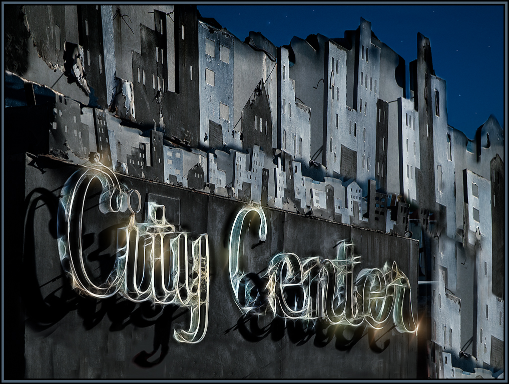
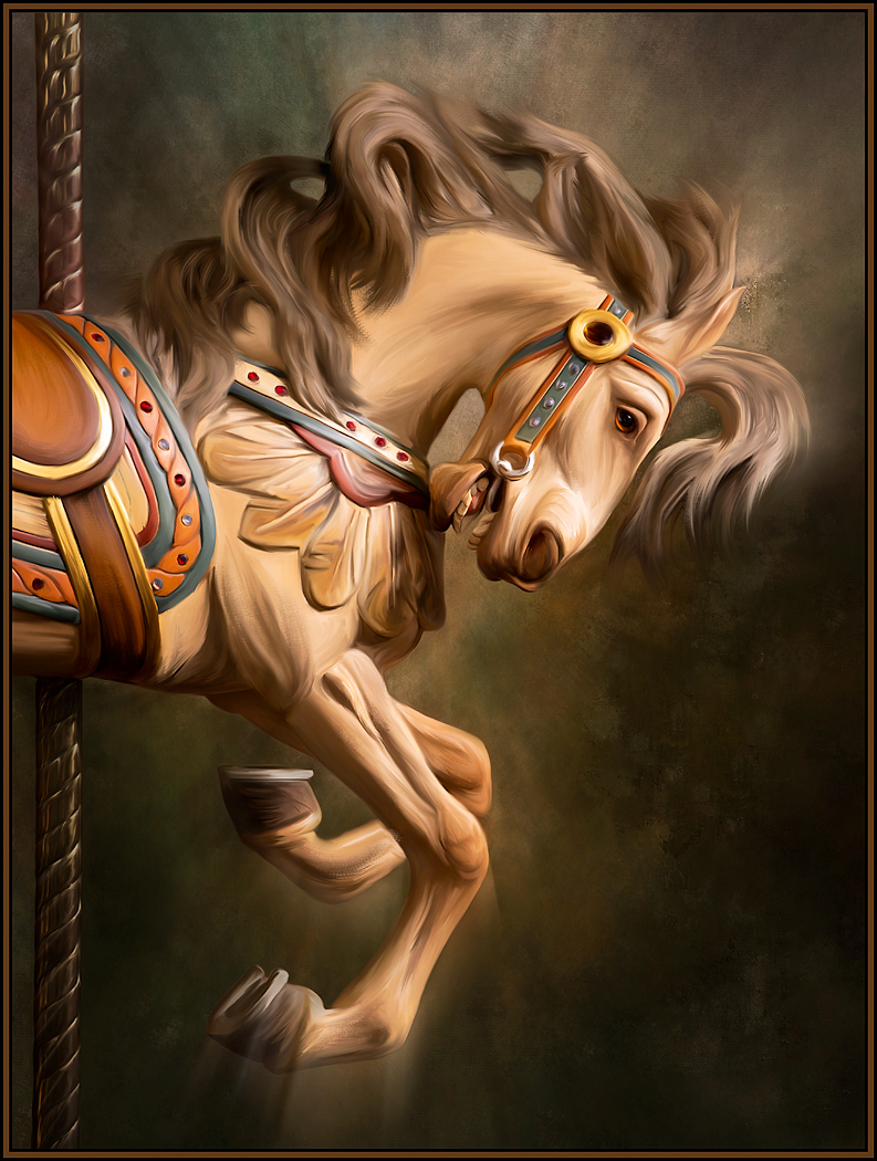
Thank you Pat. It was SO much fun. It took about 5 days or so to find and "extract" the parts. I even have leftover parts that I did not use. Once I put it together, I then added shadows etc. I would love to do more of these. It's difficult though, as my competition club does not allow the use of any "part" that is not yours. So, coming up with concepts can be difficult. I am working on one with "Birds" though.... I have bird images in the "thousands." |
Oct 3rd |
| 20 |
Oct 19 |
Comment |
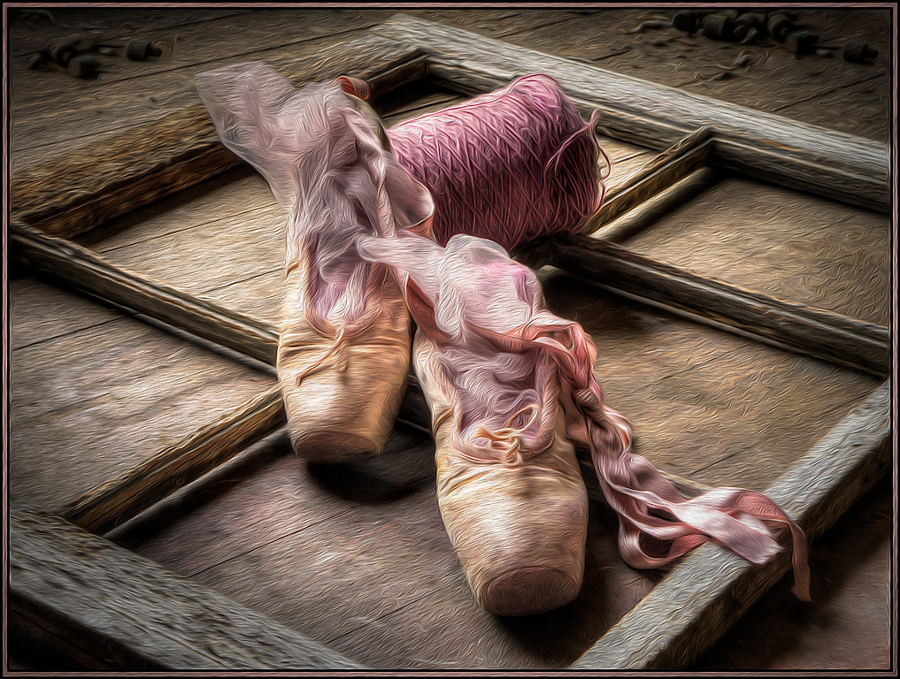
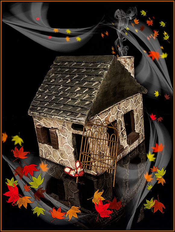
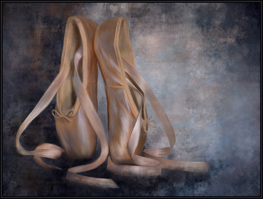
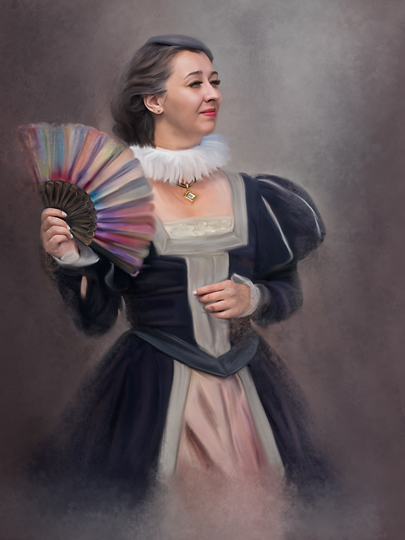
Great composited rendition. And a great way to revisit images from the past. If possible, I would tone down Mom's dress a bit.
I did find all 9 of the creatures.... even that elusive scorpion in the lower right. (I guess that should qualify as another spoiler alert!). |
Oct 3rd |
| 20 |
Oct 19 |
Comment |
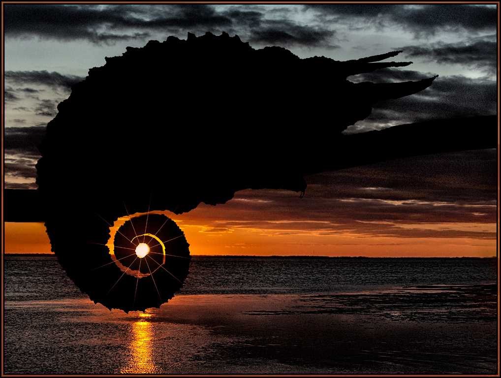
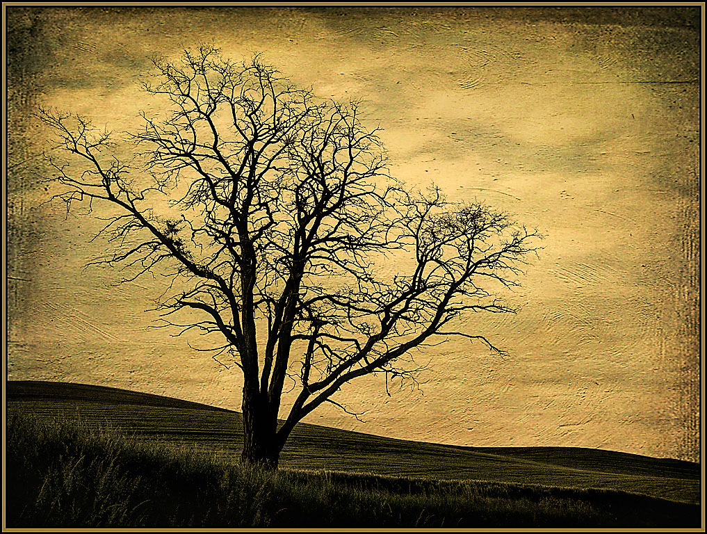
What makes this abstract for me is the branch that is sticking up. It adds dimension and keeps my eyes wandering around the image. For me, that is what makes an excellent abstract; looking around and finding interesting shapes and colors throughout. And Media-chance Reactor absolutely enhanced this feeling and mood. You had excellent vision to find this and create an art piece from it. |
Oct 3rd |
| 20 |
Oct 19 |
Comment |
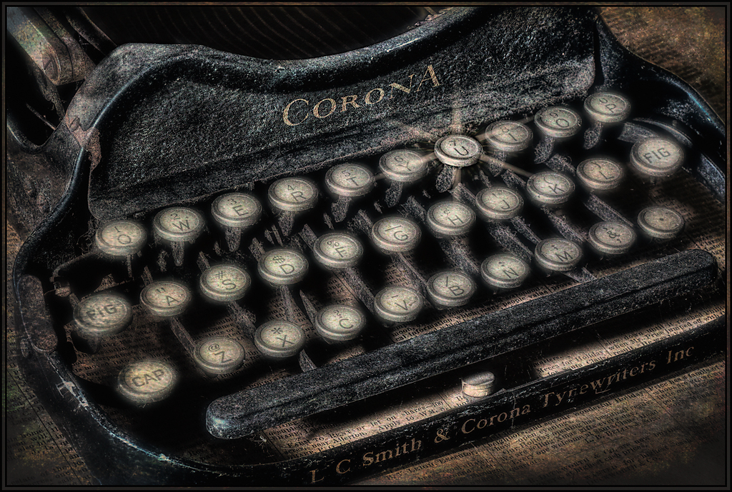
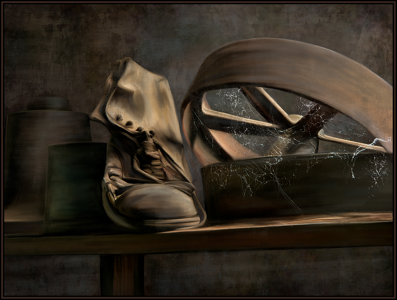
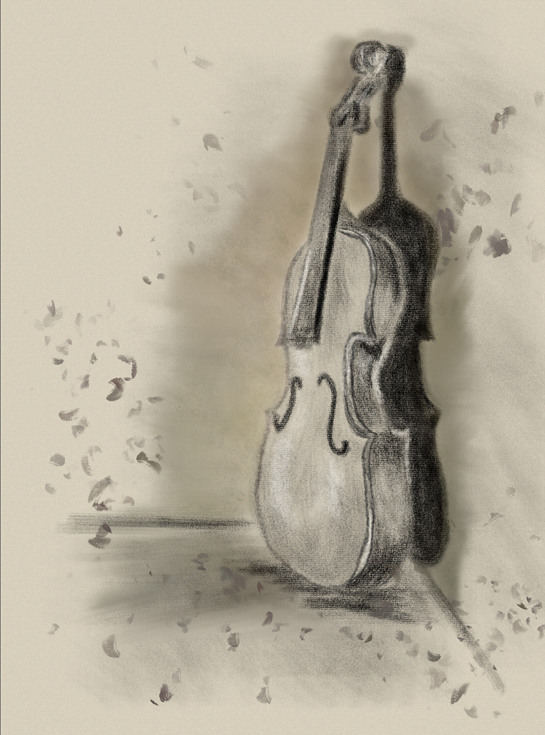
I love the added textures and colors that your application processes brought out. I especially like how the "detail" applications really allowed us to better see the etchings and drawings. Great job! |
Oct 2nd |
| 20 |
Oct 19 |
Comment |
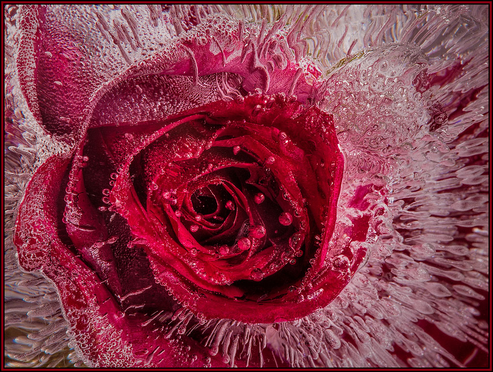
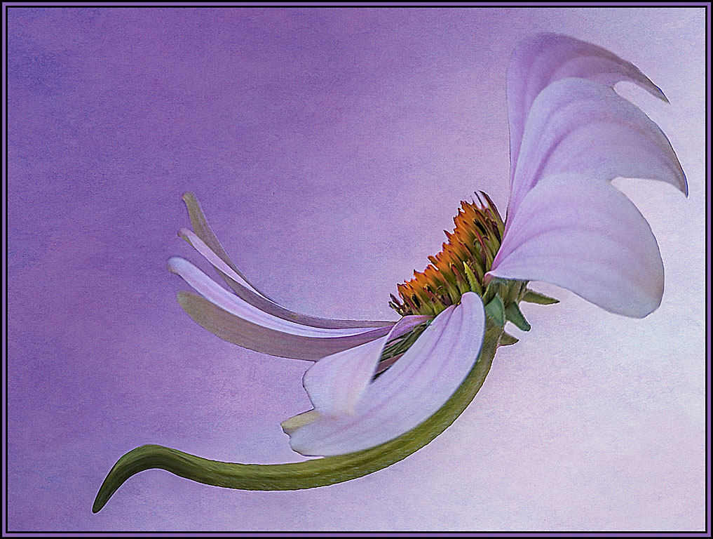
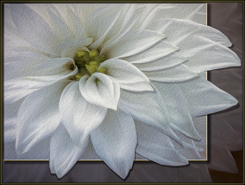
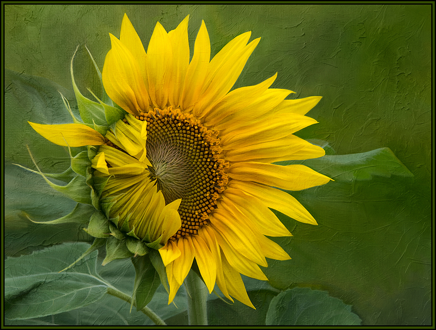
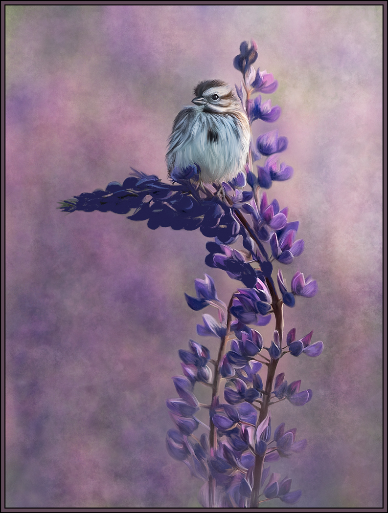
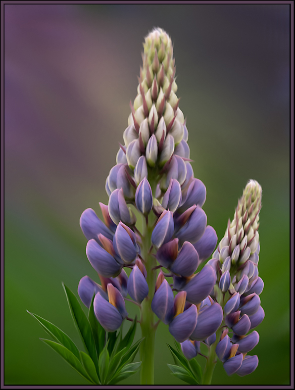
This image does work for me. I love the softness and seemingly transparency of the purple flower. For me, the image would not be the same without the purple flower or muted background. And the resultant removal of the greenery really simplifies the image to it's most important components. |
Oct 2nd |
| 20 |
Oct 19 |
Comment |
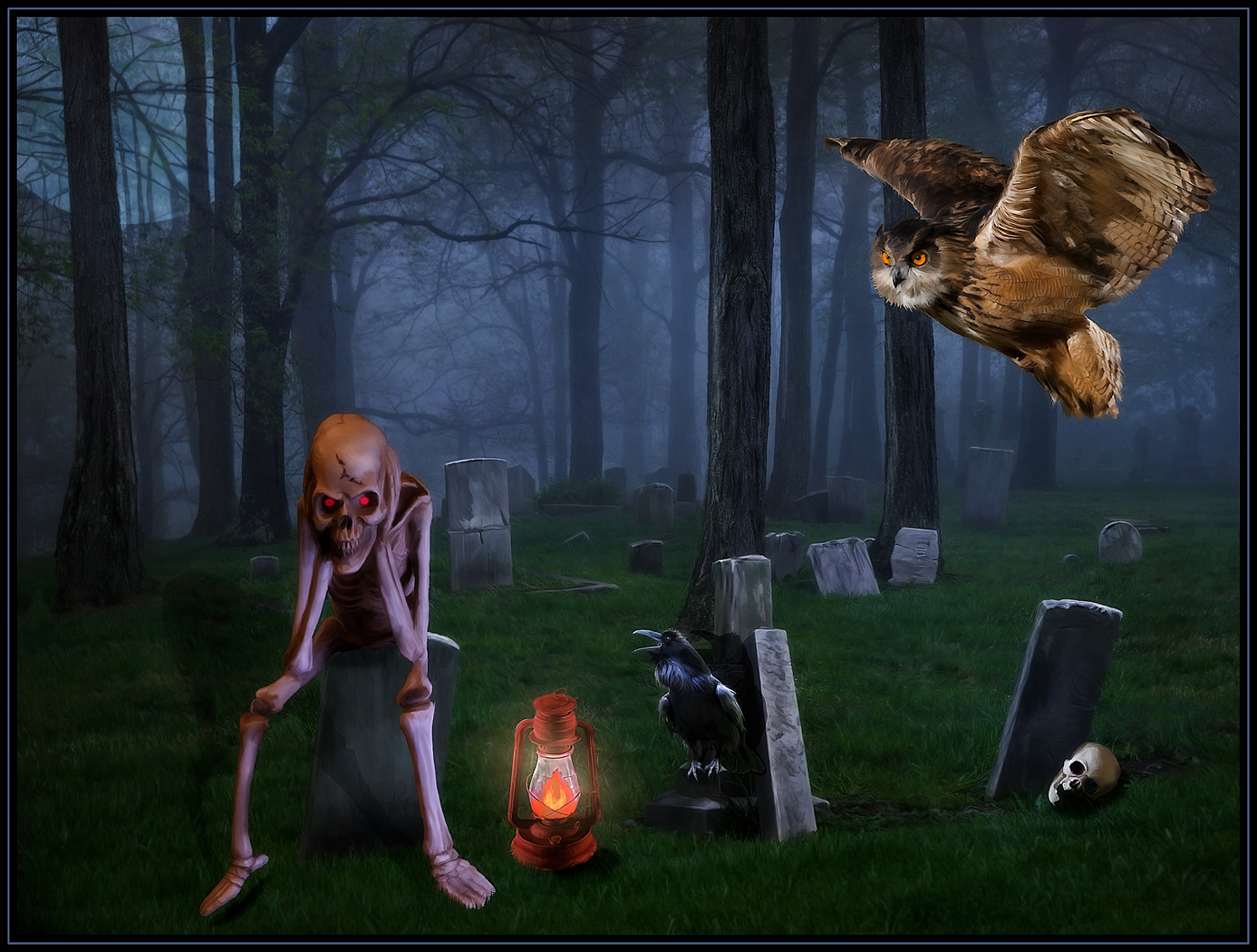
By removing a lot of the background color, and thus it's "Busy-ness" as well, this image now really pops. I love that the black skeleton pumpkin looks so sinister. Great job! I know that Halloween is just around the corner.... I am still grieving that summer is over. :-( |
Oct 2nd |
| 20 |
Oct 19 |
Comment |
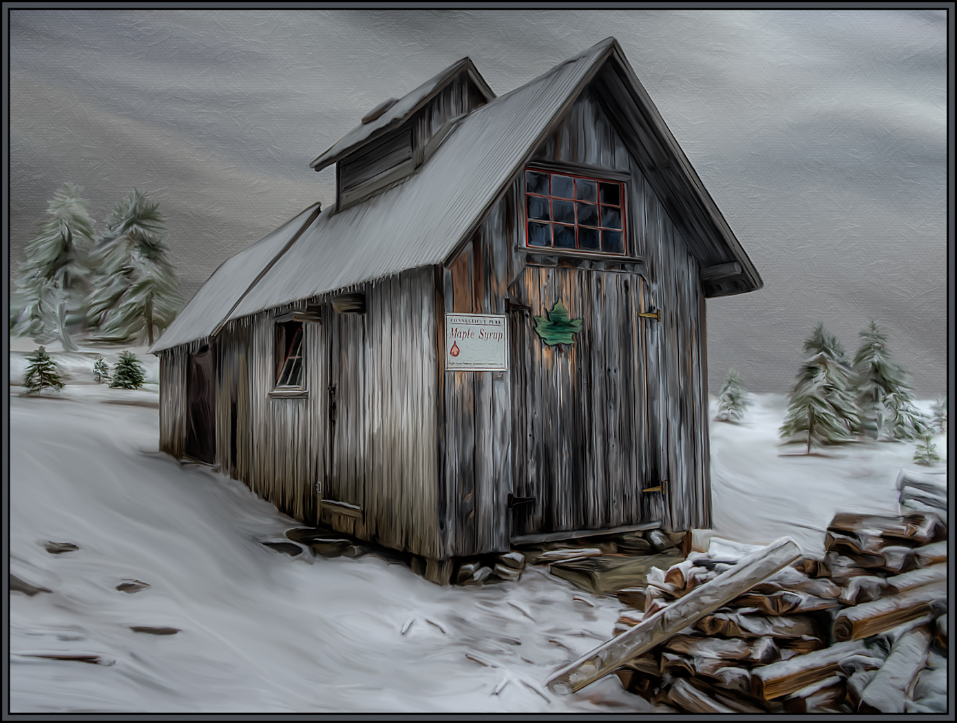
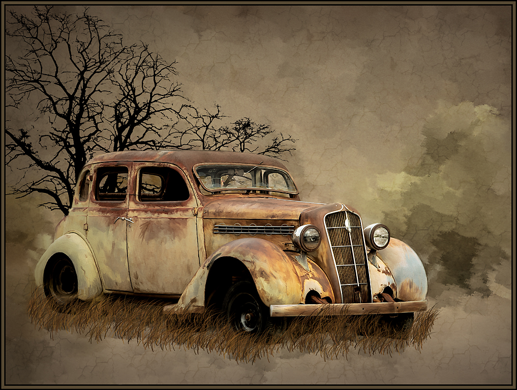
I absolutely love what the oil paint filter has done for this image. Everything is fantastic. Love the effect on the road... and especially on the table and chairs. I would not change a thing!! |
Oct 2nd |
6 comments - 1 reply for Group 20
|
| 56 |
Oct 19 |
Comment |
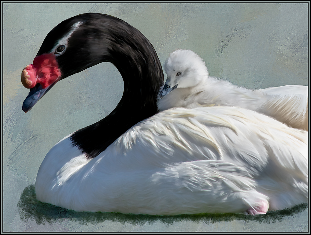
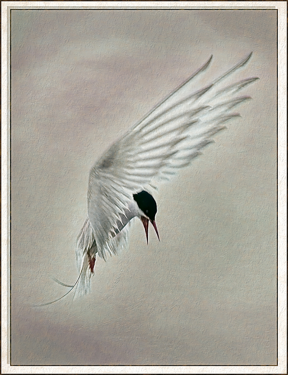
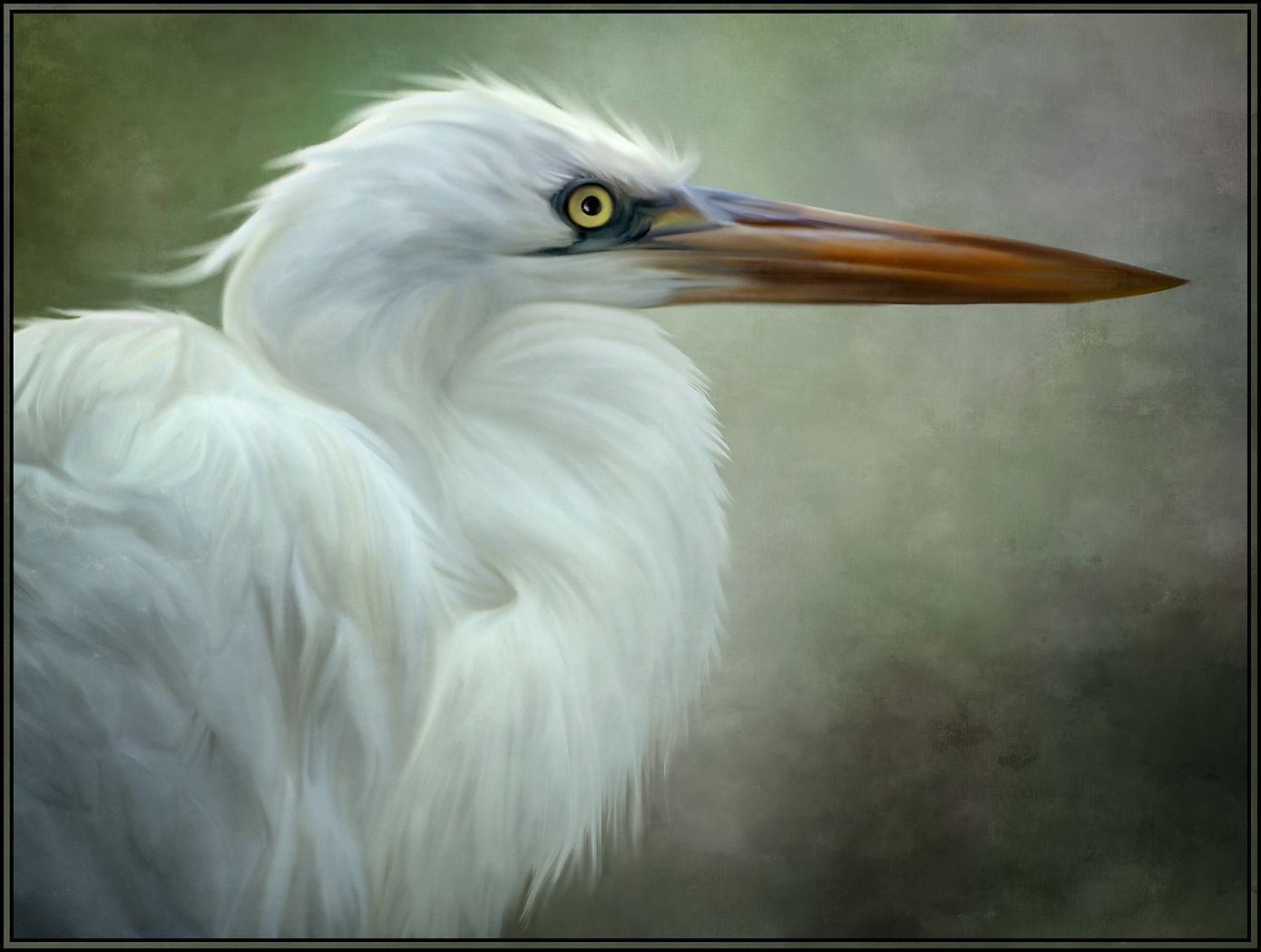
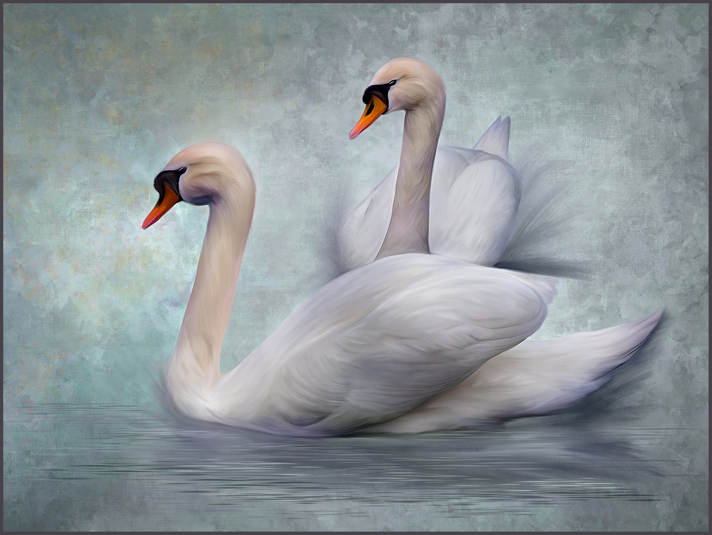
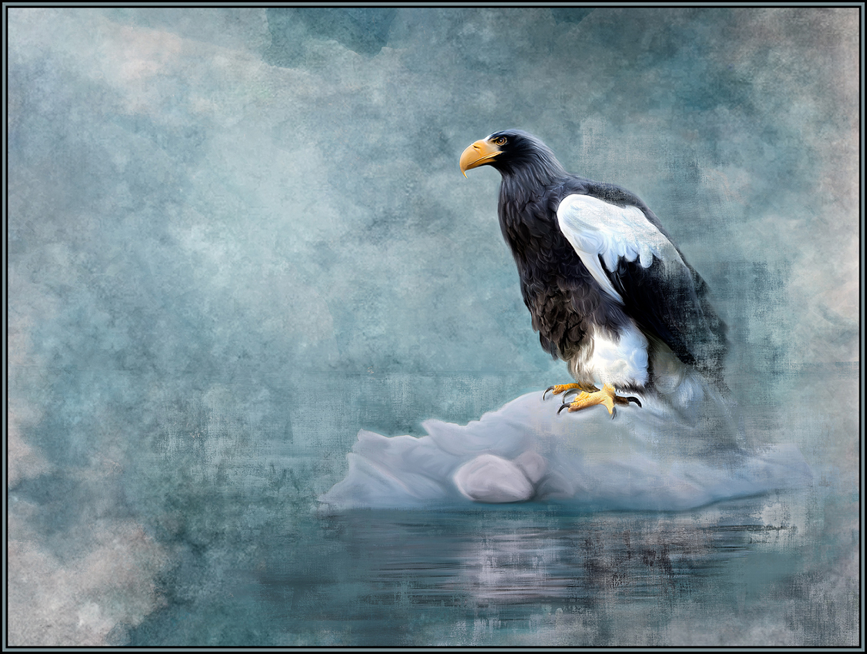
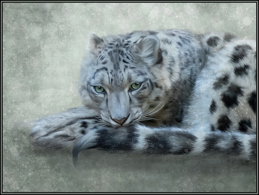
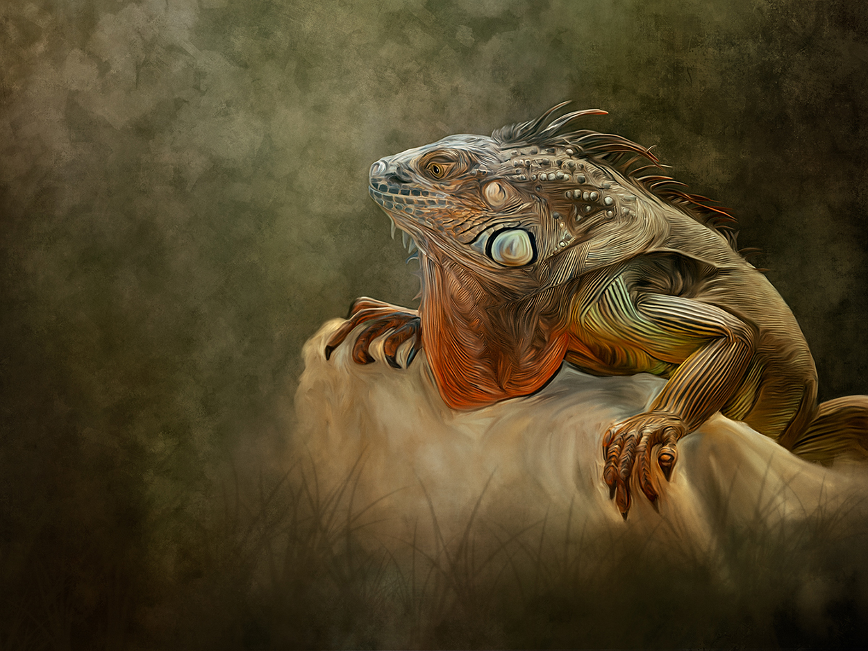
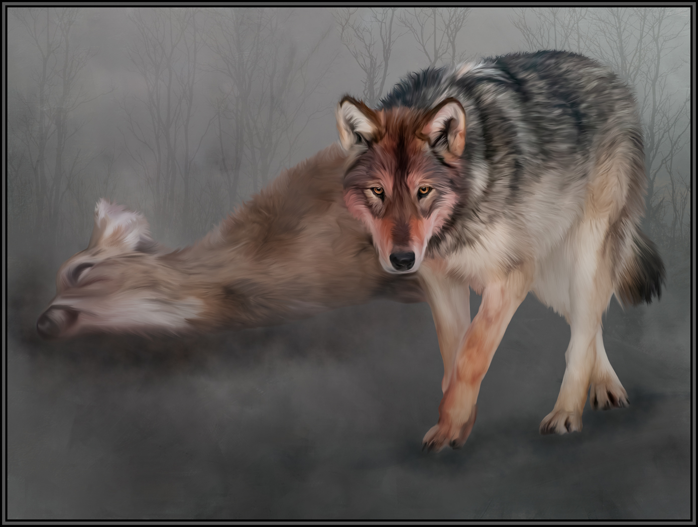
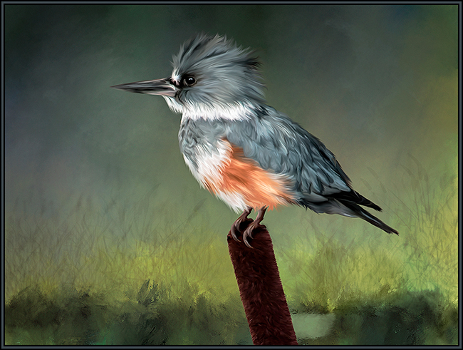
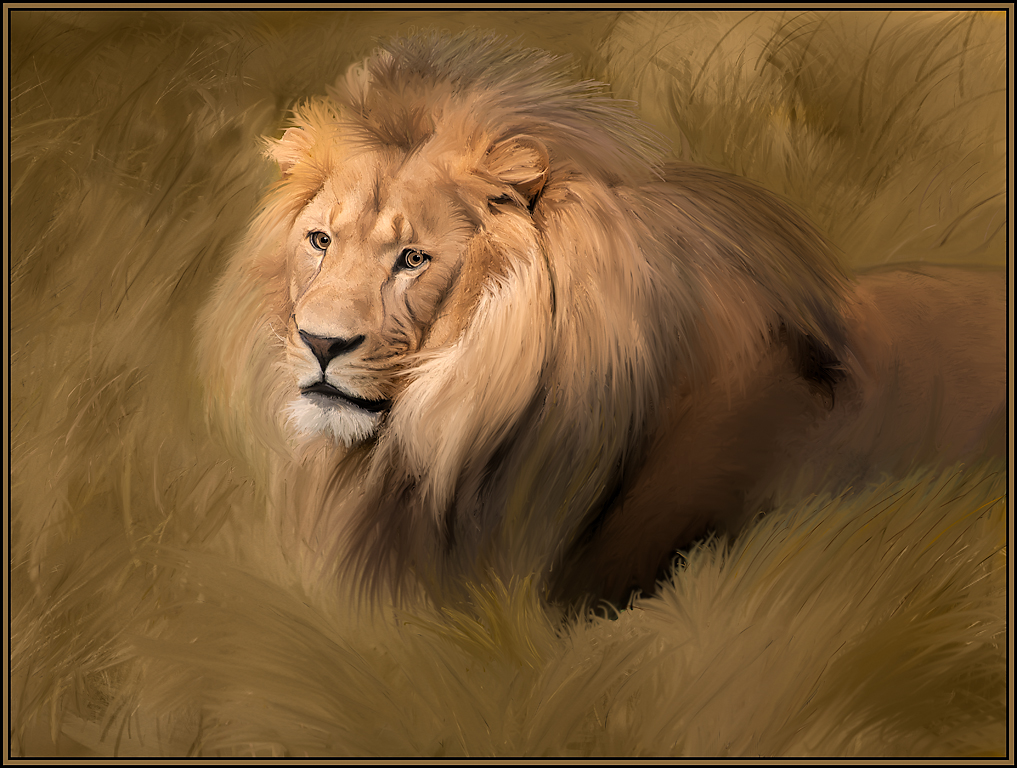
The paint strokes and subsequent feather detail in the bird are excellent. The painted background adds to the presentation of this image. A perfect composition and a great painting technique brings this image to an elevated artistic plane. Great effort and result. |
Oct 5th |
| 56 |
Oct 19 |
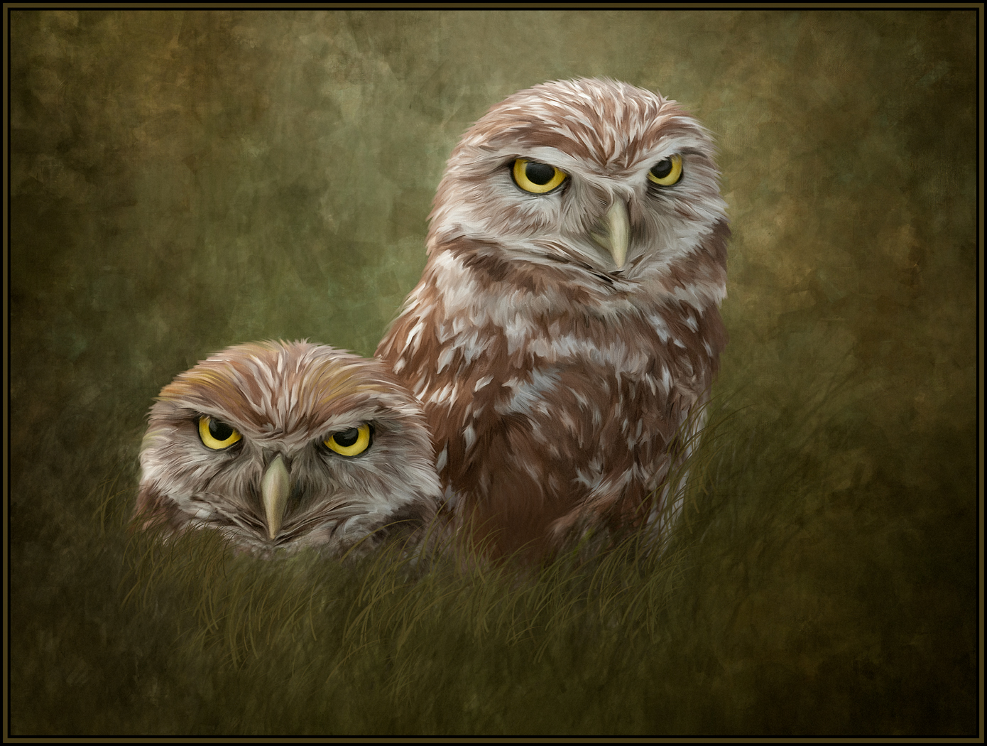
Comment |
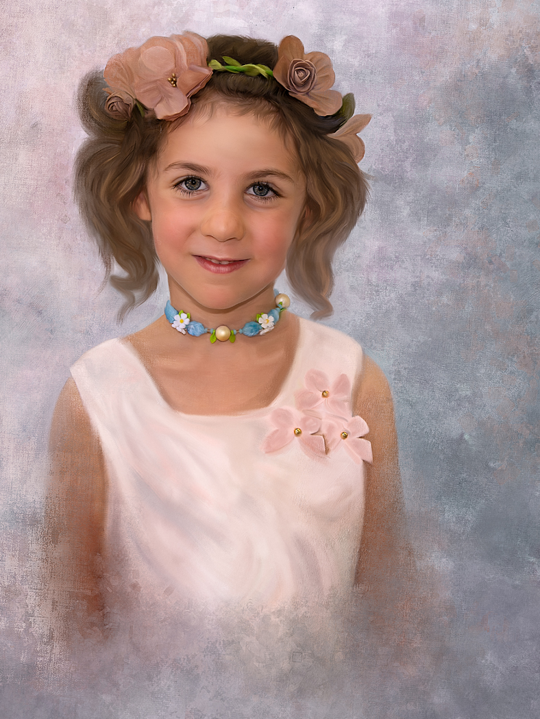
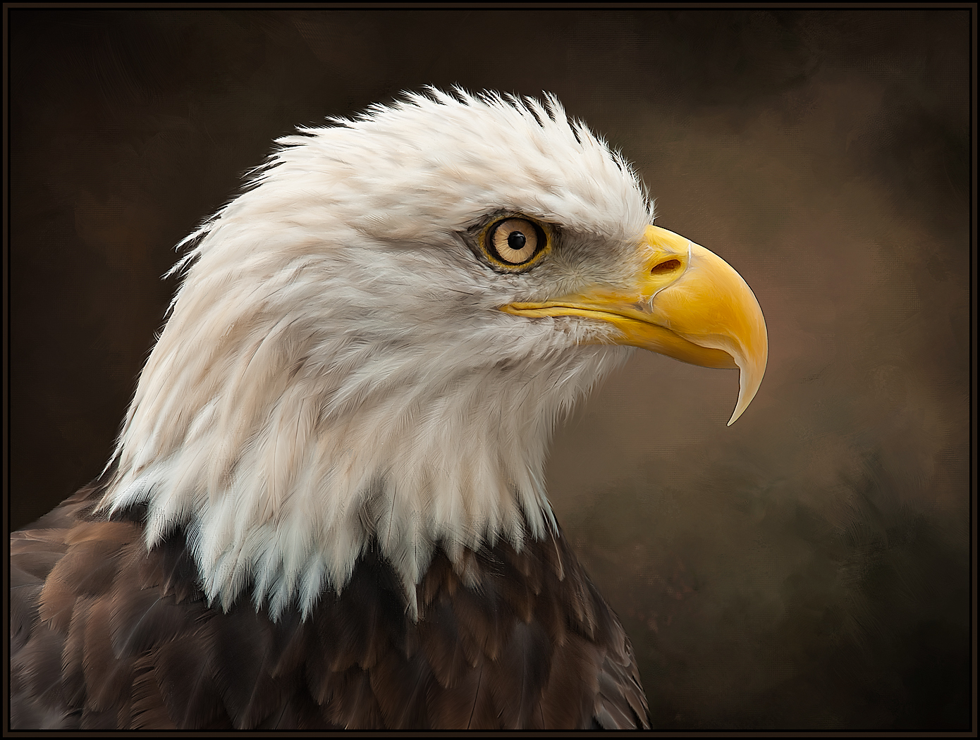
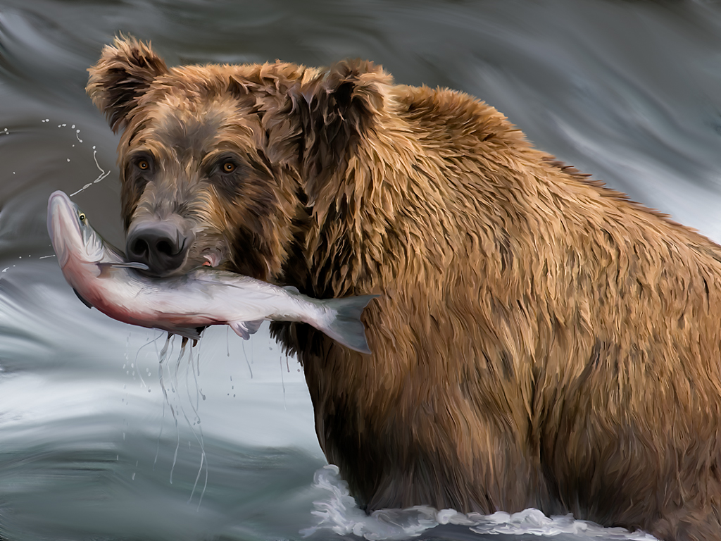
When I read your description of how this was done, my immediate thought was that you are thinking like a very experienced painter. I wish I was at the same level of expertise. The details and nuances that you have drawn from the original are fantastic. Like Cyril and Nancy, I also love the touches of red. Great image and great rendition. Everything that you've done here really works. |
Oct 4th |
| 56 |
Oct 19 |
Comment |
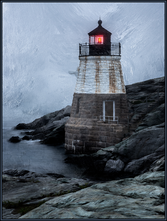
With the "S" curve of the river, the curve of the road and the great background mountains, this was a great way to begin a painting. I can just envision an easel set up in this exact spot! I love what the oil paint mode did to all the greenery, the mountains and the river. For my taste though, I might like to see less pronounced brush strokes on the white clouds. For my personal taste, the brush strokes in this part of the image have too much depth and detail. A little bit of a blur in this area might solve the issue. All in all, a very successful painting. I wish I had been there with you. |
Oct 4th |
| 56 |
Oct 19 |
Comment |
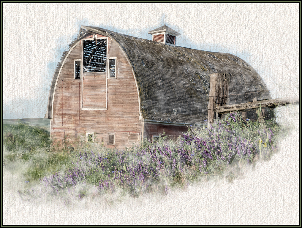
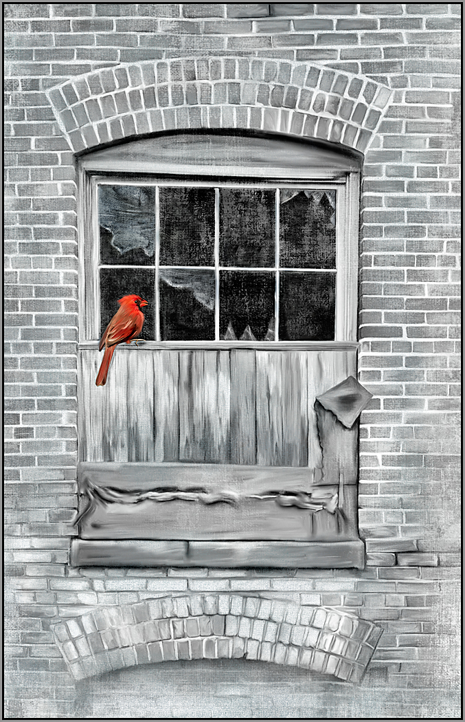
I applaud you for "seeing" the potential in this window box of flowers. Many would have walked right past it. Love, love, love the abstract paint strokes on the windows and building. The flowers themselves must have taken so long to paint; they look great. And the flower's shadows add to this image's appeal. This image is wonderful and you've made it so much better; so I would not worry about painting over the original. |
Oct 4th |
| 56 |
Oct 19 |
Comment |
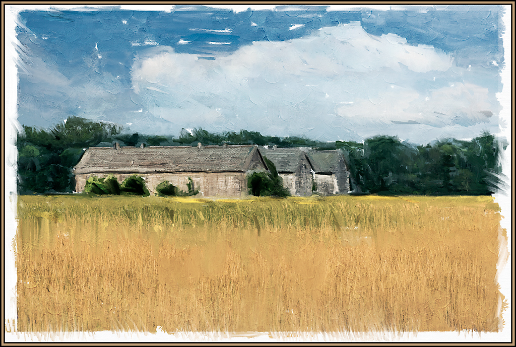
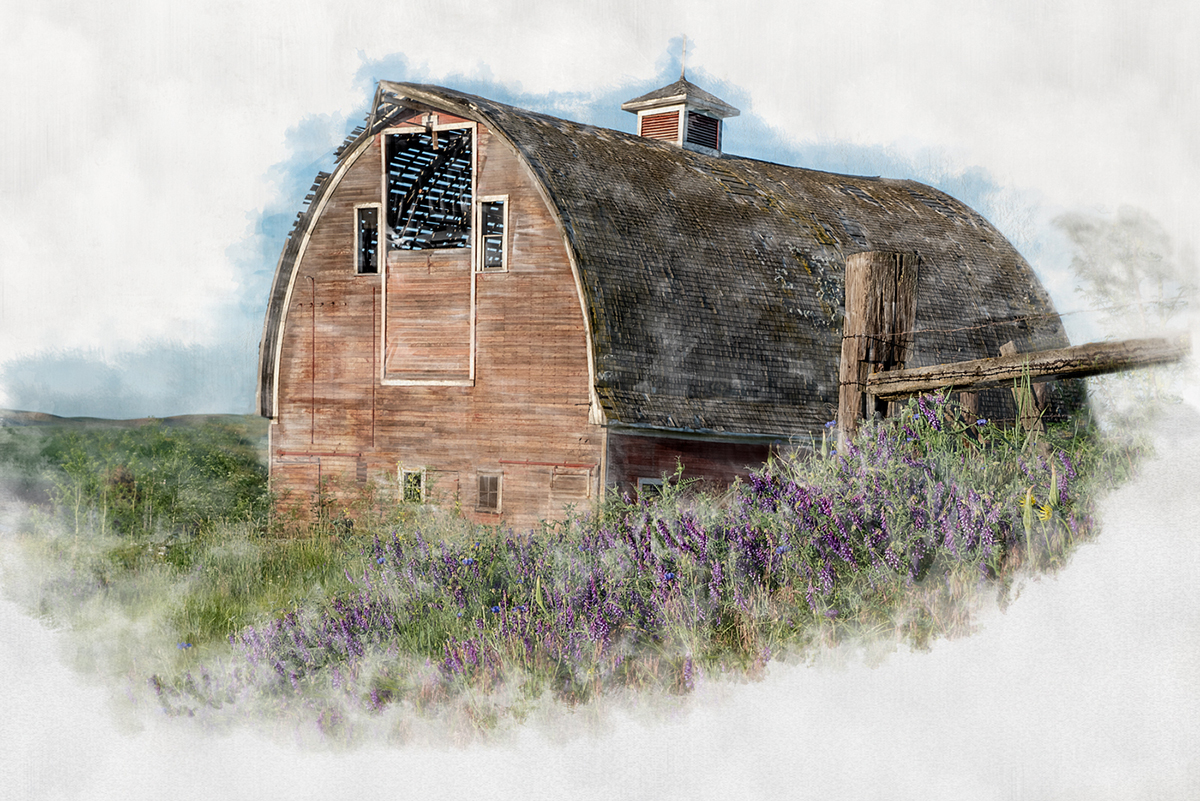
I love the big, "sweepy" paint strokes that you used for the grasses and sky. And the new color tones in the image are wonderful. Your painted rendition took an already dramatic image and put it into dramatic hyperdrive. I also love that the farmhouse is set off against the calm orange sky. Excellent result.
I have not tried any landscapes yet with the Michelle Parsley techniques, they'll now be added to my list of things to do.
|
Oct 4th |
5 comments - 0 replies for Group 56
|
11 comments - 1 reply Total
|