|
| Group |
Round |
C/R |
Comment |
Date |
Image |
| 20 |
Sep 19 |
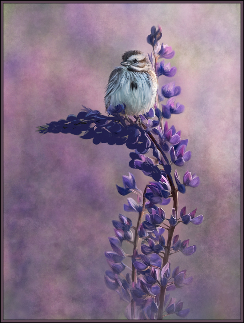
Comment |
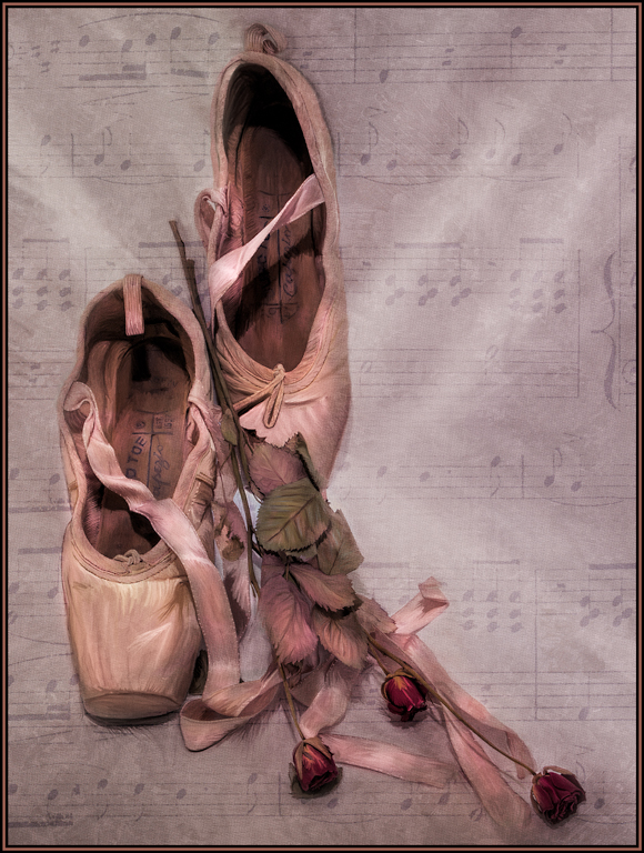
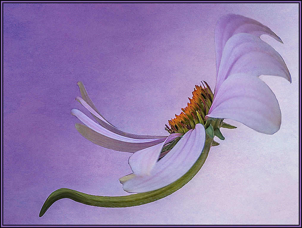
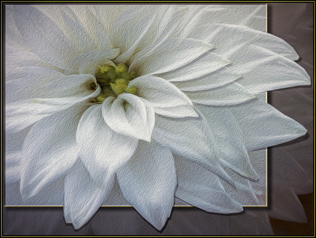
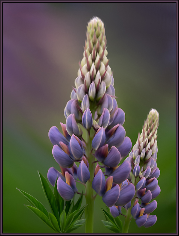
I love what the oil paint texture has done to the brown section of this image. However, for my taste, I would have "matched" the amount of texture on each of the flowers to what is shown in the top blossom. For me, the stem and the white flowers seem to be a bit too texturized. I love the story of this plant and applaud that this was something you captured in your images. |
Sep 1st |
| 20 |
Sep 19 |
Comment |
Even though the original is a multi image file, it looks more abstract, interesting and dynamic with the adjustments you've made in the final version. I love all the colors on the left side and the blue in the center is very compelling. Pat used the right words when she said that this now has more impact. Well done. |
Sep 1st |
| 20 |
Sep 19 |
Comment |
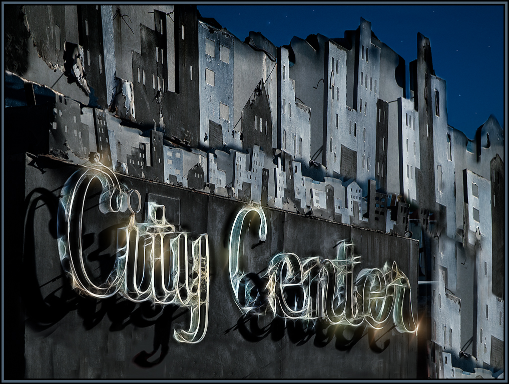
I love the idea that you've done these "cut outs" and now you can create a window to the world whenever you want to! I don't know how you did it, but this image even looks very 3-dimensional. I agree with Pat that I would add some additional blue sky to the left portion of the window. Very effective and creative effort! |
Sep 1st |
| 20 |
Sep 19 |
Comment |
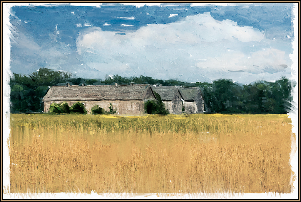
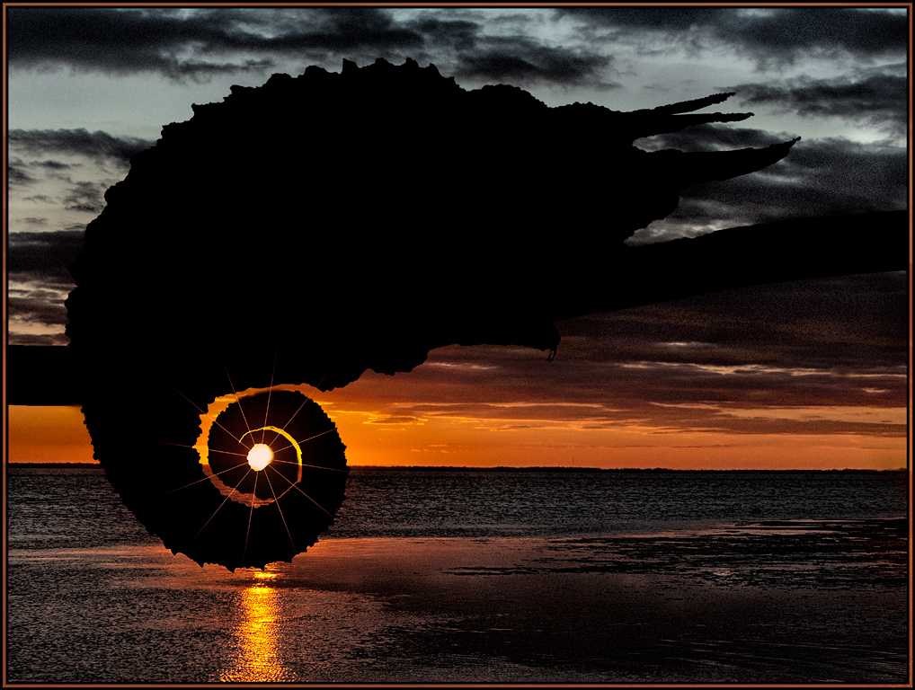
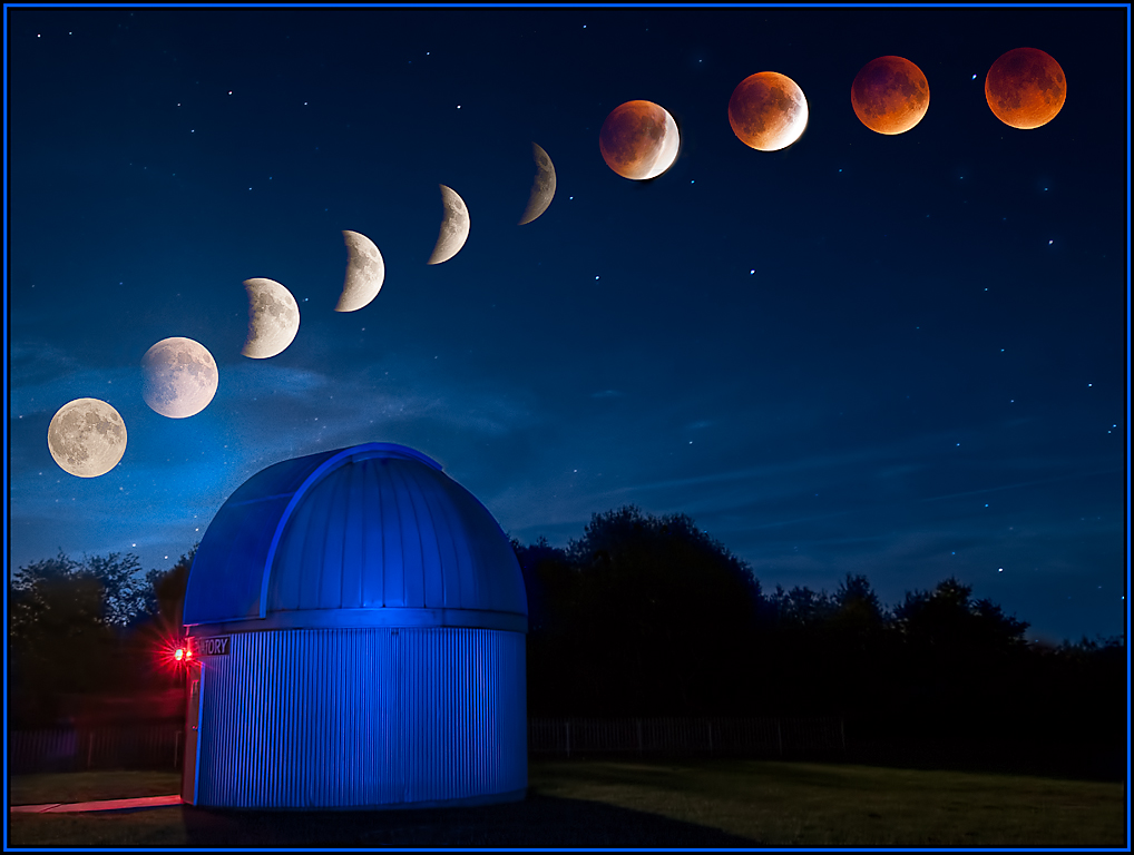
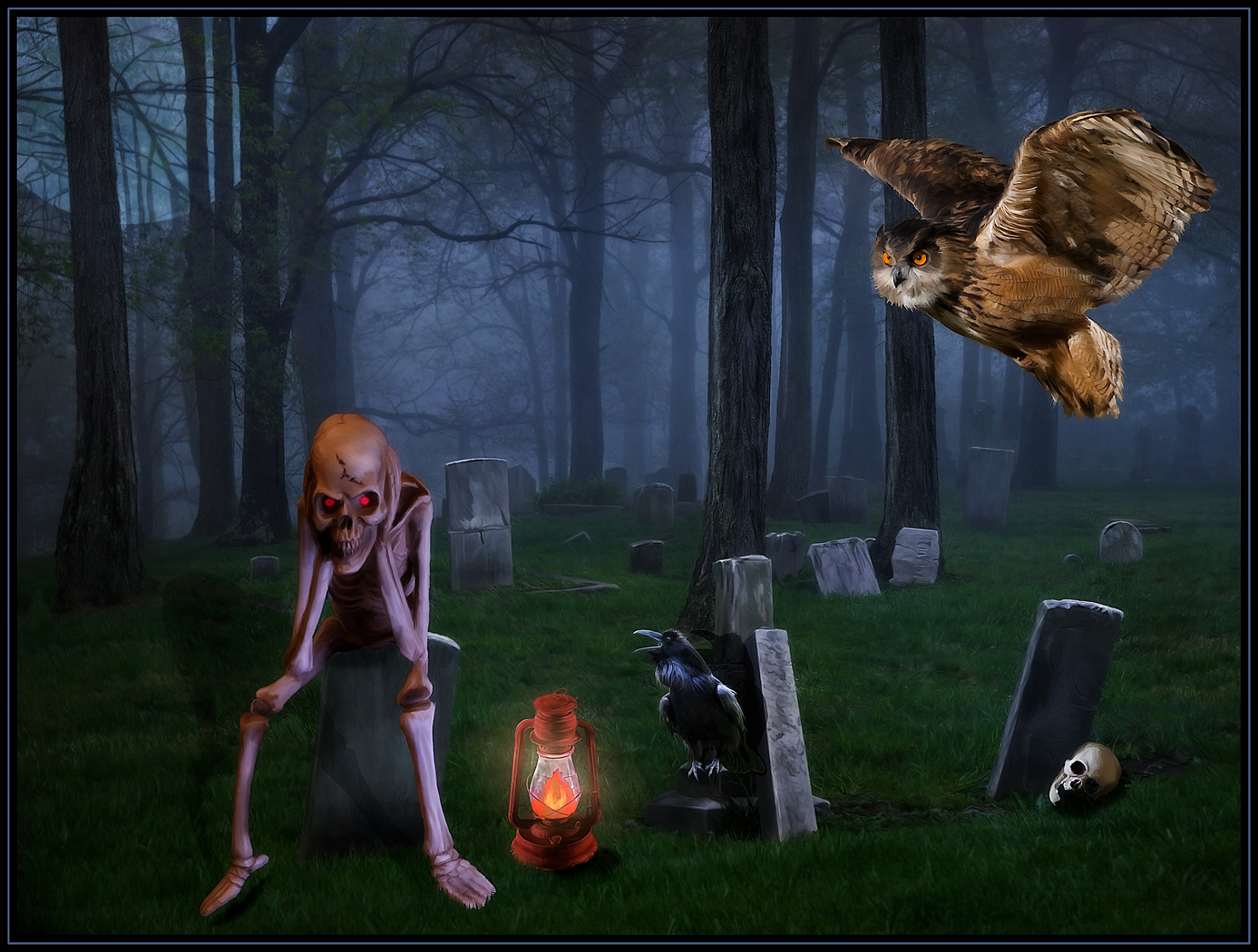
Excellent blending of the two transitional images. I love the effect in the sky and church, but I would lighten the foreground a bit, if you can. The composition is great; with the church offset to the right and the grave markers creating a leading line to the church. Well done.
(On a sidenote; in the original image I would have cloned out the little building in the middle left; but in this final version, that building is not as noticeable so it does not distract the eye). |
Sep 1st |
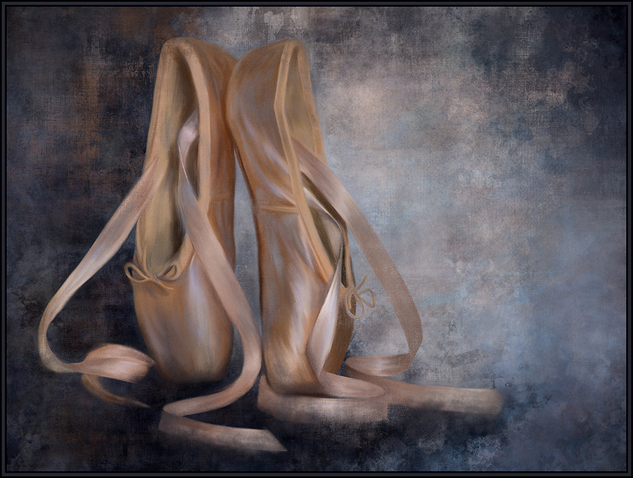
| 20 |
Sep 19 |
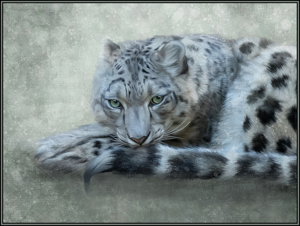
Comment |
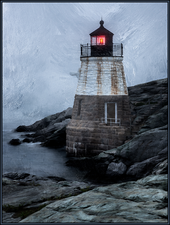
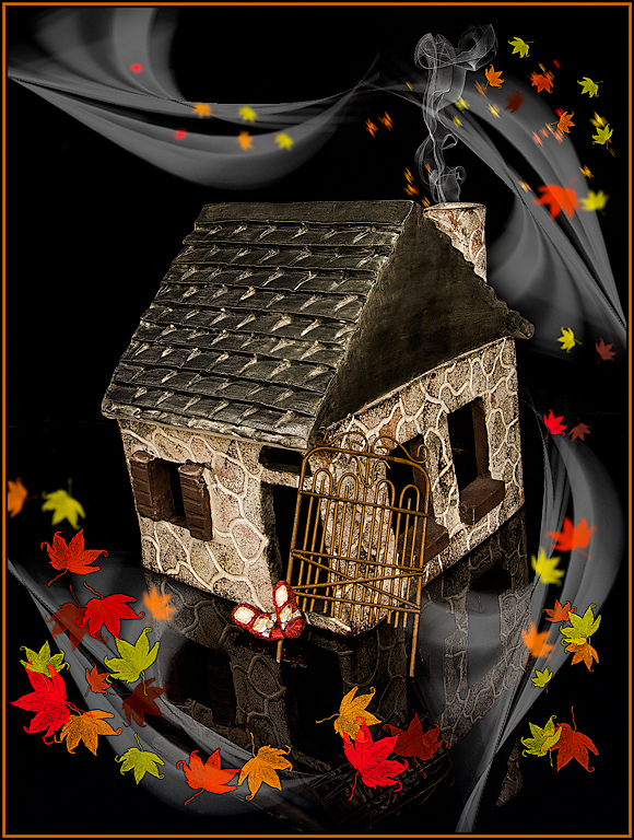
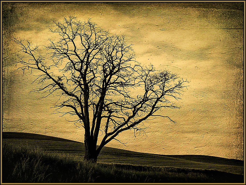
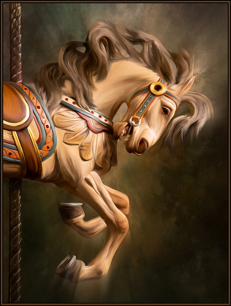
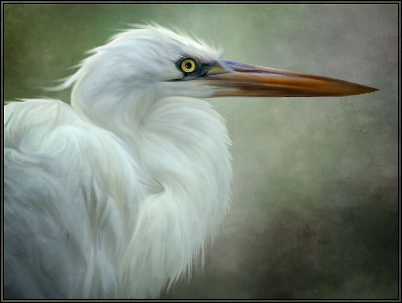
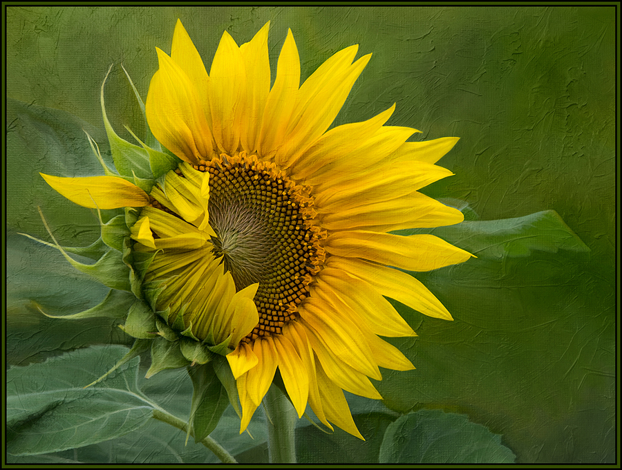
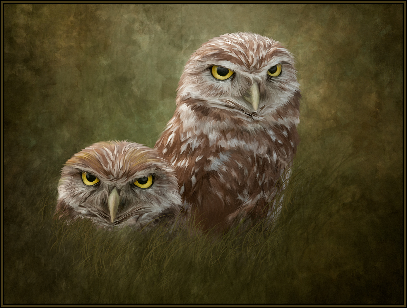
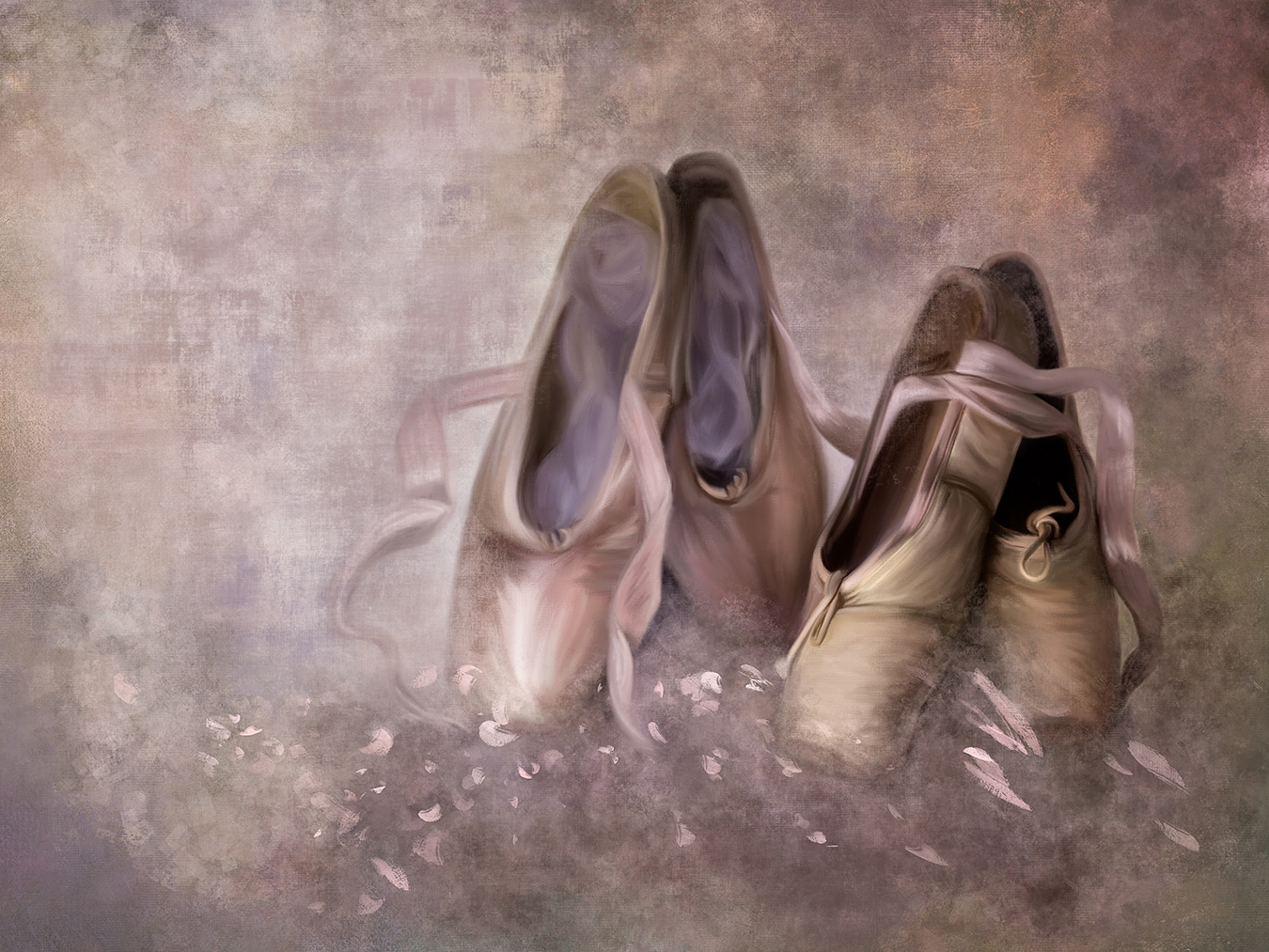
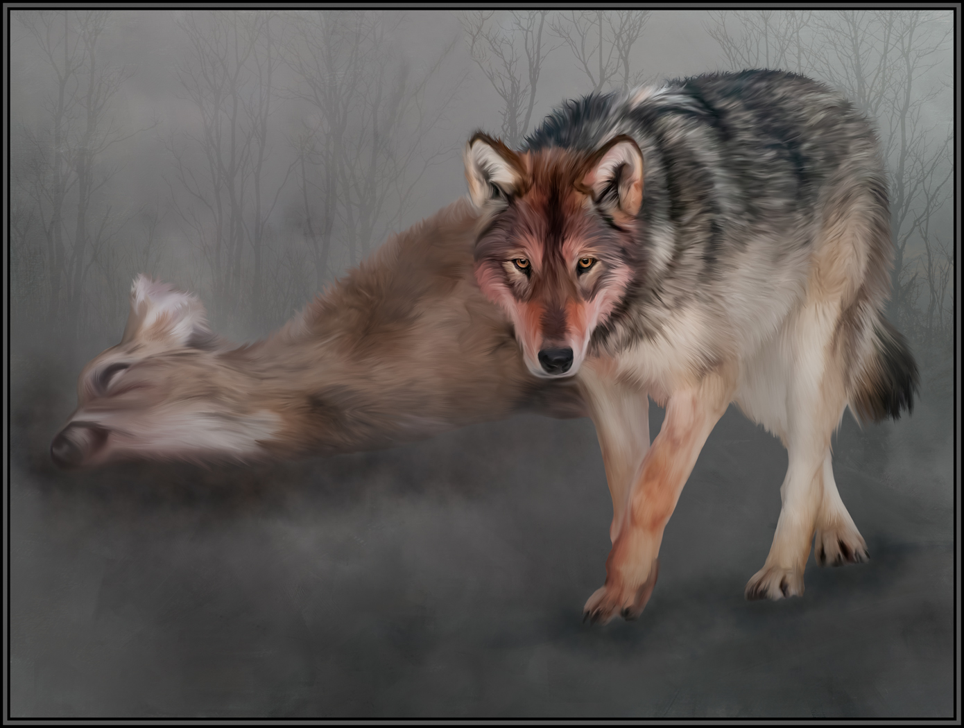
I love the serenity, calmness and perceived translucency of this image. You have done a masterful job combining this subject with its complementary background. You used just the right opacities and blending variables. I also would not change anything. Beautiful, exquisite image. |
Sep 1st |
| 20 |
Sep 19 |
Comment |
I like the resultant abstract that was created from this original. I love the blue portion. And I actually like the blue without any additional patterns. The solid blue gives my eye something to rest on before I travel this excellent maze again. I also love that there are hints of red on some of the blue edges. Great job. |
Sep 1st |
6 comments - 0 replies for Group 20
|
| 56 |
Sep 19 |
Reply |
Here's the difficult realization. This was beginner's luck!! It was my first painting. Subsequent ones have really gotten harder to paint. I like this quote from Degas: "Painting is easy when you don't know how, but very difficult when you do."
|
Sep 22nd |
| 56 |
Sep 19 |
Reply |
Hi again Nancy. I am painting and taking Michelle's program; and I like it very much. I have not posted any images to her site. I intend to use her lessons to further my skillset and then hopefully to adapt those skills to my own personal style. |
Sep 22nd |
| 56 |
Sep 19 |
Comment |
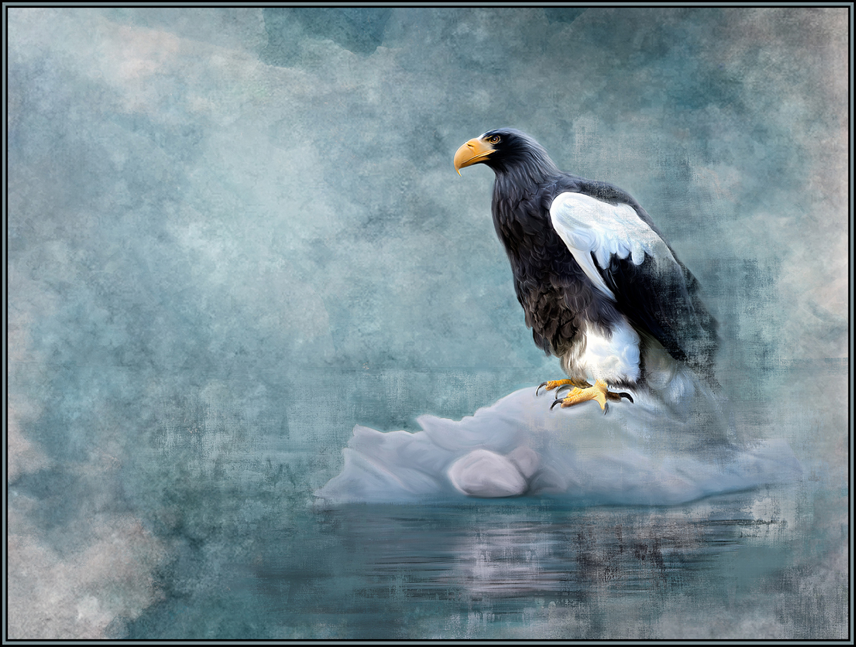
Like Cyril, I like the moodiness of this scene. And by painting in less detail (like in the water, mountains and sky), this now looks like a watercolor rendition. Great resultant painting. |
Sep 13th |
| 56 |
Sep 19 |
Comment |
The first thing I love about this image is the cropping. All three large boats are cropped excellently; you don't need to see their entirety to know what they are. And now this crop lets you see the incoming boater, who was actually very hard to see in the original image. The textures and lighting effects you chose now also further enhance this image. I love the area below the first boat!! Great vision to see this image's potential. |
Sep 13th |
| 56 |
Sep 19 |
Comment |
I love this painting. The detailed paint strokes in the zebras and water are fantastic. Perfect rendition. |
Sep 13th |
| 56 |
Sep 19 |
Reply |
Hi Cyril,
I absolutely agree with your insights. I did struggle with the concept of cropping the tree - knowing it would be so difficult and would really remove so much of the wonderful stone bridge. Of course, as always, this was just my personal insight. If I had done the cloning, I would have saved both versions; and then I'd probably like the version WITH the tree better after all the hard work was done. Thanks for the discussion. I always appreciate the feedback. |
Sep 11th |
| 56 |
Sep 19 |
Comment |
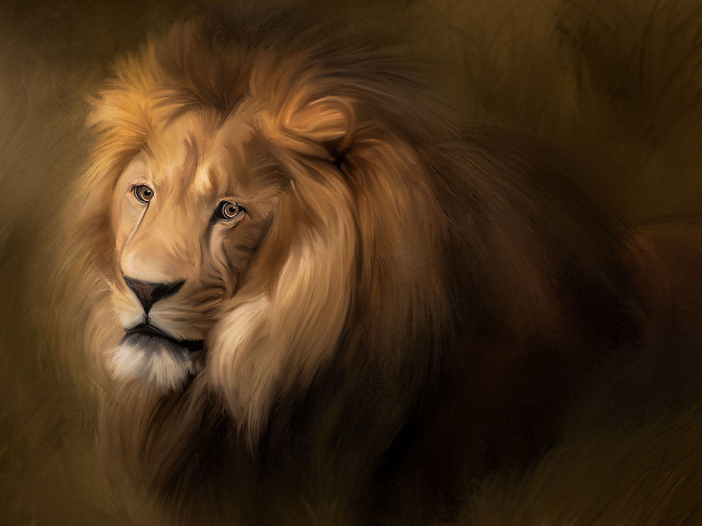
I love the feel that the painting aspect gave to this image. I am finding out that many images actually convey a better mood WHEN they are painted. That is definitely true of this scene - which is now more calm and serene. I love the painted water and the bridge reflection in the water.
I am struggling a bit with the idea of possibly cropping out the tree on the right. Cropping it out entirely would probably take away too much of the stone work, so maybe cloning or painting it out might work. |
Sep 10th |
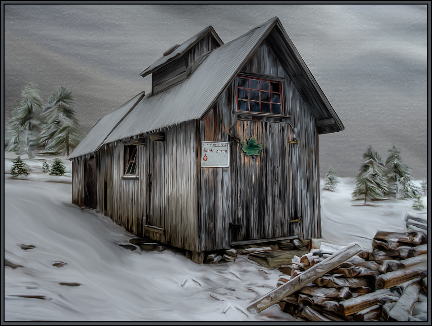
| 56 |
Sep 19 |
Comment |
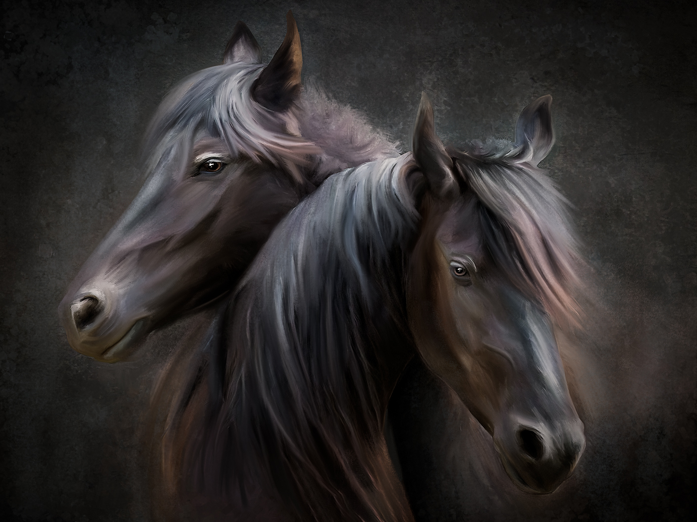
Wow, to me this looks like a scene right out of an Old Masters rendition. Great job. I went to a Renaissance Fair last weekend and only took head shots.... now I want to go back to capture those scenics as you have done. The transformation of this scene into a painting is fantastic. I love every aspect of it.
I have also signed up for Michelle Parsley's program as I do most of my painting by hand with mixer brushes in PS. |
Sep 10th |
| 56 |
Sep 19 |
Comment |
I like that you added the stingray to further accentuate the under water aspect of the aquarium. And the stingray's perspective in this image is spot on! I think that this image would work just as well, though, with the content below the water eliminated. If the bottom half of the image were cropped out, the gators, and their reflections would be the stars of the image. This might mean that you would have to "fix" a corner or edge, but it might be worth a try. Either way, great painting effects, especially the Impasto. |
Sep 10th |
6 comments - 3 replies for Group 56
|
12 comments - 3 replies Total
|