|
| Group |
Round |
C/R |
Comment |
Date |
Image |
| 20 |
Aug 19 |
Reply |
Absolutely great thoughts! Thanks for sharing your insights! And of course you are correct. Creativity is in the eye of the maker. |
Aug 4th |
| 20 |
Aug 19 |
Comment |
I like the non-uniformity that the tile 'breakup" created. It would not look as dramatic if all the breakup lines were evenly spaced or of equal boldness. I haven't run across this filter, so will need to give it a look. The tiles here all look well placed, but I'm wondering if they could have been masked if some of the breakup lines were created in an important part of the image. |
Aug 3rd |
| 20 |
Aug 19 |
Comment |
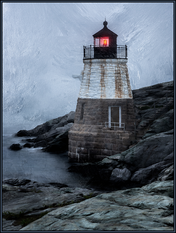
I agree that the portrait crop definitely makes this image more impactful and dramatic. And my personal preference would be to leave in the upper left buoy. To me, it gives the image a little more balance. Great job. |
Aug 3rd |
| 20 |
Aug 19 |
Comment |
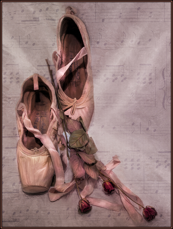
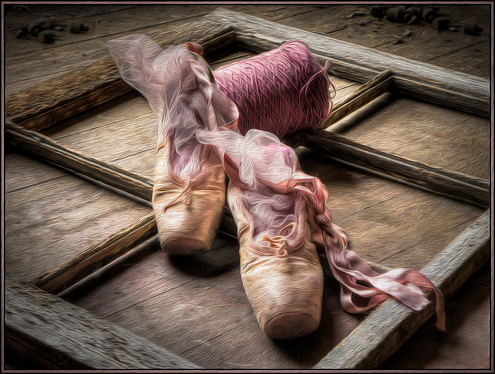
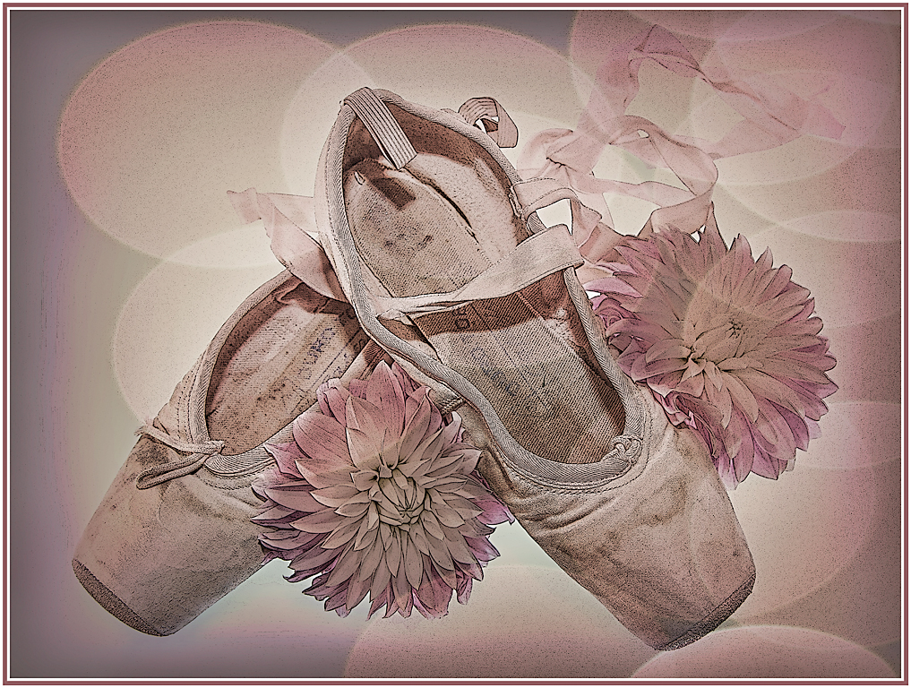
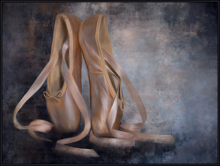
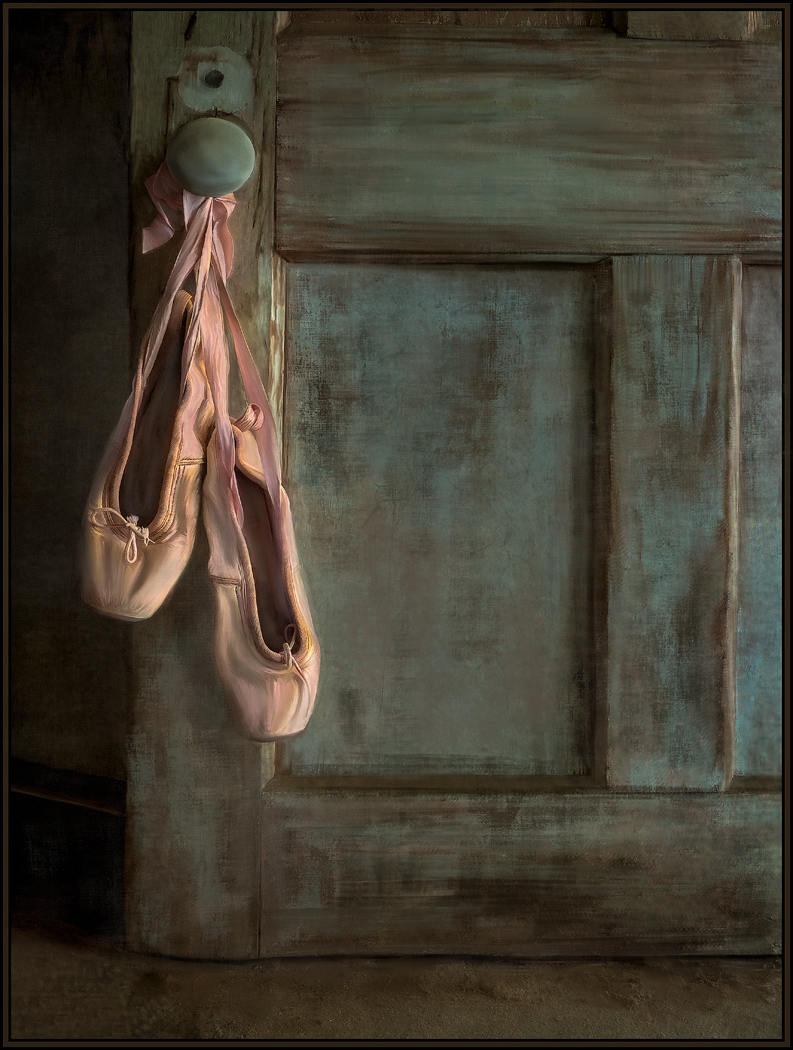
I like the color contrasts and subtle tonalities in the original, and even like the idea of using the liquefy filter. Very, very creative. I can tell that the poster edge filter was also used in the final version, which created many dark lines and dots. My preference is for the gentler tonality of the original; so would have just applied the liquefy filter without the added poster edge effect. It looks like the ballerinas are now spinning; great idea. |
Aug 3rd |
| 20 |
Aug 19 |
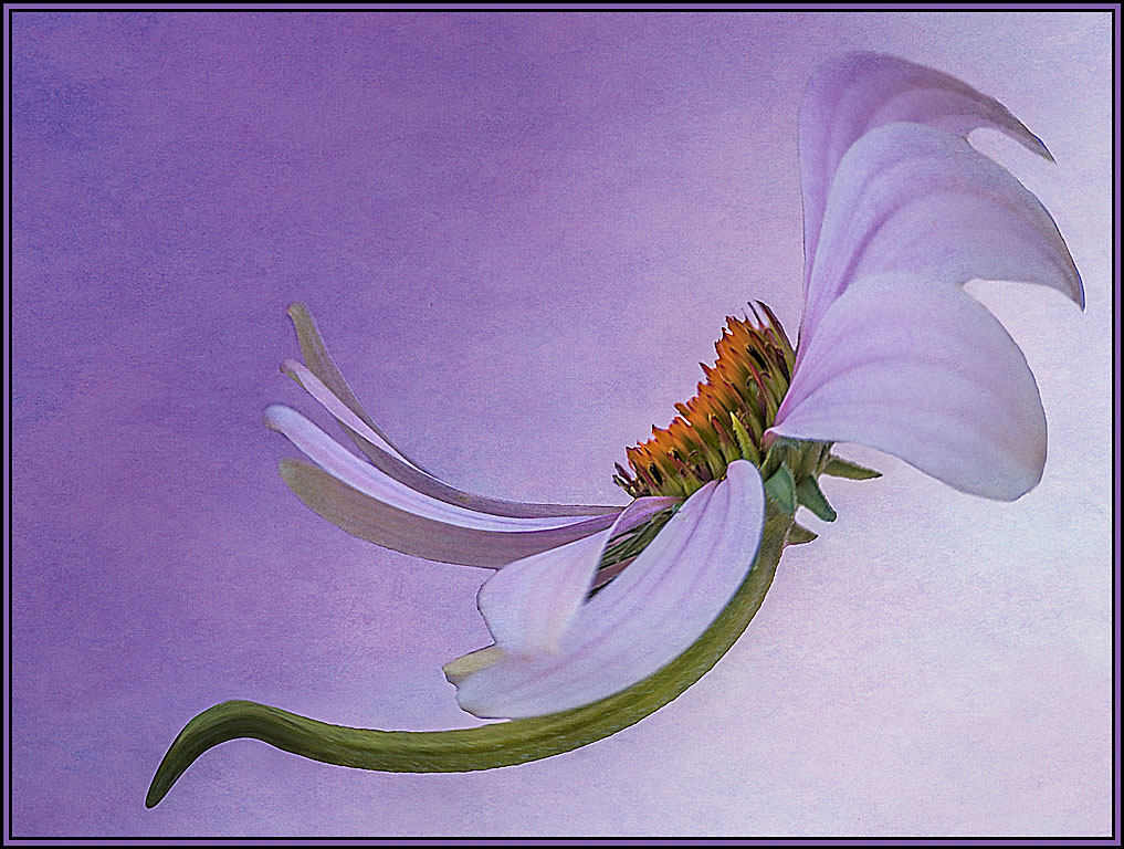
Comment |
I like this concept, but would personally have reduced the effect somewhat as, to me, you've lost some detail in the flowers themselves. I love the leading lines from the upper left leaf in the original. So, I might have even masked out the crayon effect around the edges and left the green tones as they are seen in the original. Lots of possibilities here. Thanks for seeing the crayon drawing potentials. |
Aug 3rd |
| 20 |
Aug 19 |
Comment |
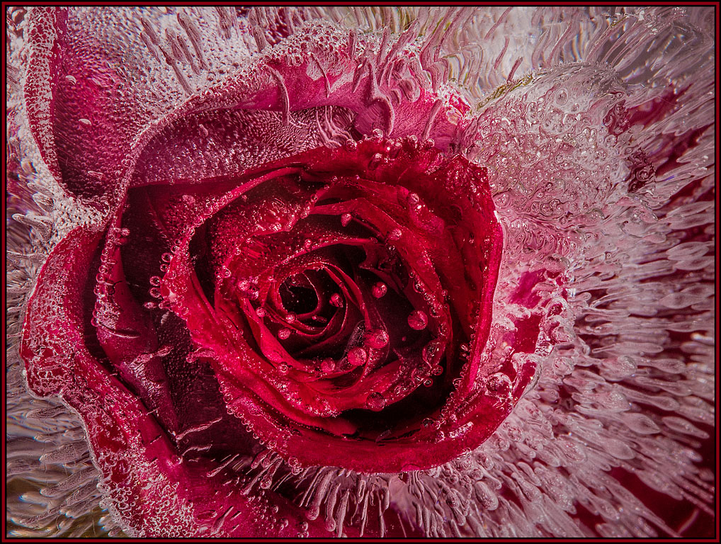
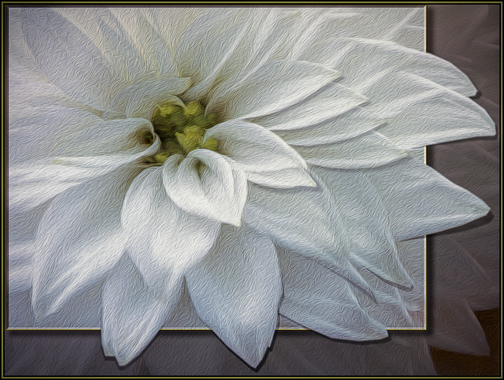
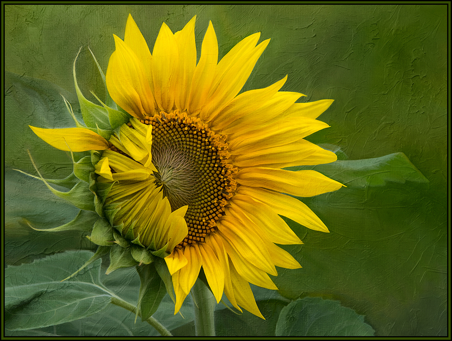
I am also drawn to square flower images, and this is a great one. The level of blur around the edges even makes it look somewhat like a lens baby image. The blur still allows me to see some detail, but then definitely draws my eye to the center of the flower. Great job. |
Aug 3rd |
5 comments - 1 reply for Group 20
|
| 56 |
Aug 19 |
Comment |
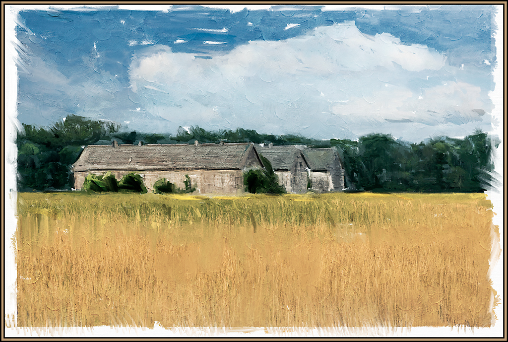
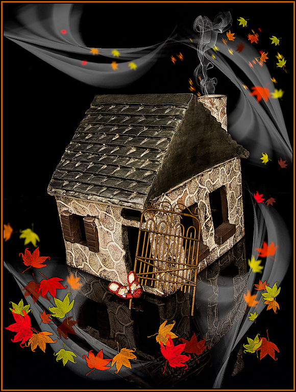
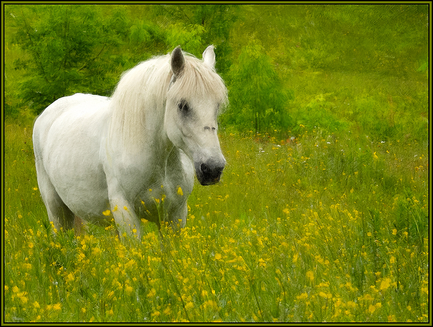
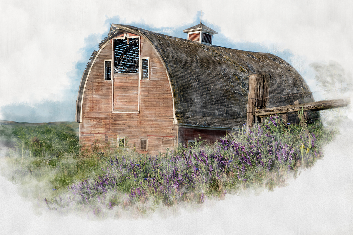
I love the Impressionistic feel of this painting, especially on the ground cover, where now all the distractions are removed. My eyes were quickly drawn to the yellows, oranges, greens and reds of the leaves and ground cover. So, for me, the gray sky both detracted and competed with the rest of the image. Nancy's crop was excellent and now allows you to see the beautiful colors of this fall day. I also originally thought about cropping out the tree on the right; but if you did that, one of the diagonal branches on the big tree would be distracting as it would sit right on the upper right corner of the image. So, I think it was appropriate to leave that tree as part of the composition. |
Aug 10th |
| 56 |
Aug 19 |
Comment |
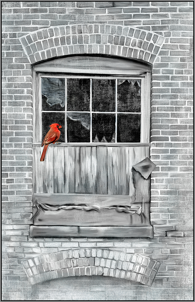
You have a great eye to even see this image as a possibility. And I love what you've done with it. The painting effect took it to another level, as compared to the original. I actually prefer the image as you presented it, with it's diagonal lines rather than a straightened version. Like you, I also like each individual pane. And I like looking through them to see the history of this building in juxtaposition with the reflections of the modern building as well. |
Aug 10th |
| 56 |
Aug 19 |
Comment |
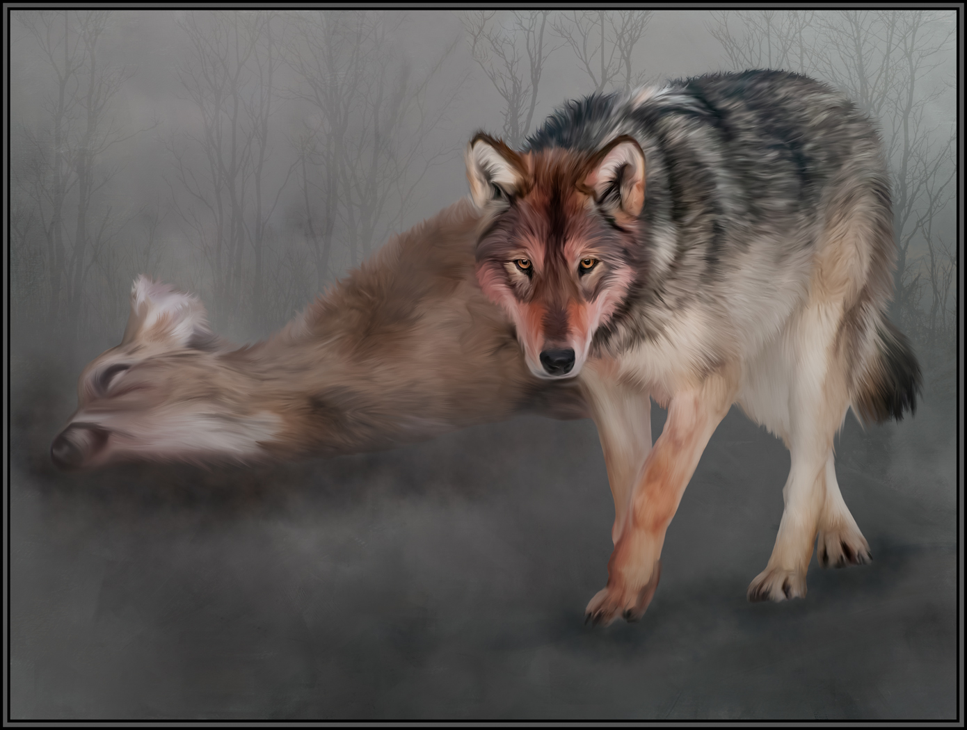
I absolutely love this painting. And I agree with Cyril that it's now the two dark elephants and the baby that demand our attention. The now semi-transparent elephant in the back adds excellently to the composition and the mood of the painting. Beautifully done, indeed.
Since a lot of the strong details are now muted in the painting, would it make sense to clone out the baby elephant under the bigger elephant. I believe we can see the trunk sticking out, but now have no other references that this baby is there. And, for me, the trunk sticking out of nowhere looks somewhat out of place. |
Aug 9th |
| 56 |
Aug 19 |
Comment |
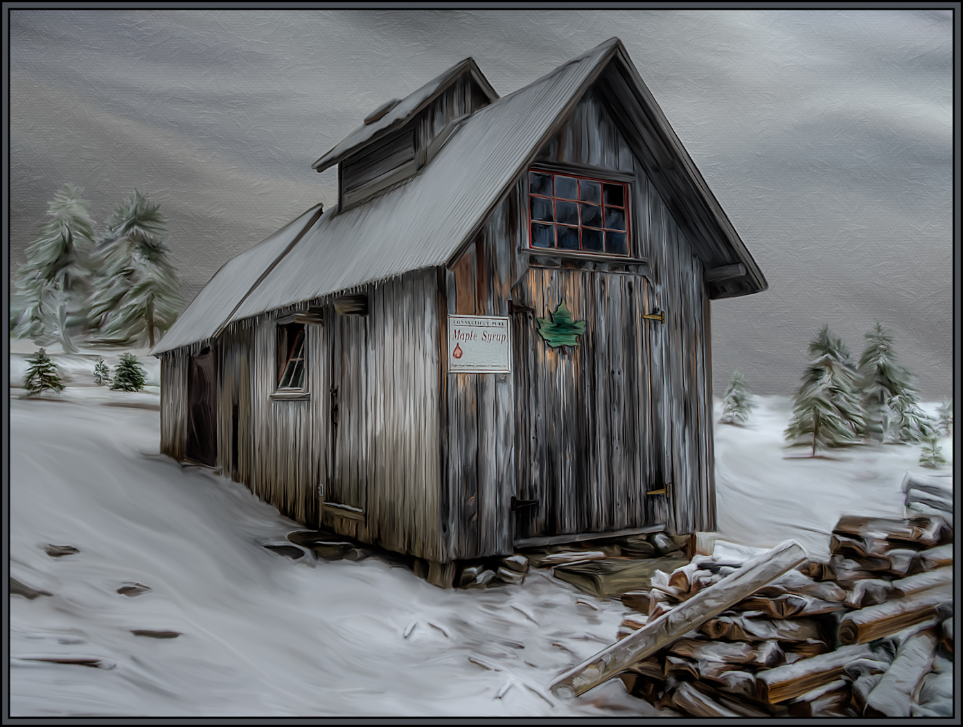
I love what Topaz did in this image. The brush strokes that were created are great and are not overpowering in their construction of detail. And compositionally, I love the leading line that the path creates through the painting and the saturation that the rain brought out. One small nit pick - there are some white brush strokes throughout the painting. I dont mind many of them, but would personally like to see some of the white brush strokes in the main flower bed (above the path but below the trees) reduced a bit if possible. |
Aug 9th |
| 56 |
Aug 19 |
Comment |
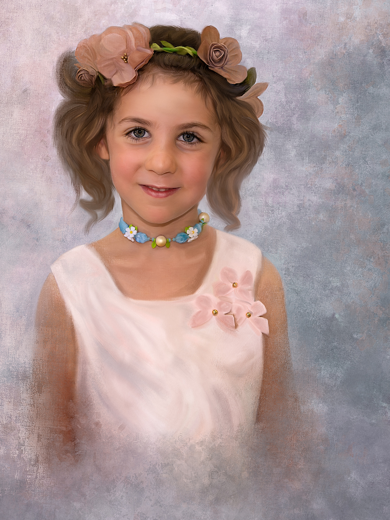
Wow. I love this little girl and that you created a wonderful, moody, painted image from such a simple touch of a child's nature. I love that I can't see her face, and that her shadow fades into the foreground and is not as sharp as seen in the original. The warm tonalities throughout the image help its mood. I definitely want to try your mat technique one day as well. It was a great complement to the composition. |
Aug 8th |
| 56 |
Aug 19 |
Comment |
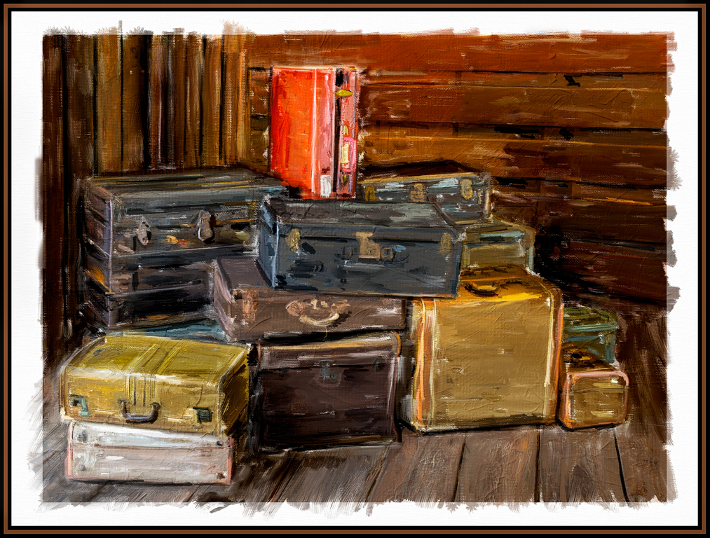
I like what Snap Art added to this image. It looks like a painting without being overdone. Sometimes the oil paint filter in Photoshop can add too many brush strokes and can look "overbaked". This is not the case here. I especially love the painted detail on the train and its steam. I also love the shadows in the foreground of the bridge going to highlights in the background of the bridge. These shadows and highlights lead my eyes right through the image. Great job. |
Aug 8th |
6 comments - 0 replies for Group 56
|
11 comments - 1 reply Total
|