|
| Group |
Round |
C/R |
Comment |
Date |
Image |
| 20 |
Jan 19 |
Comment |
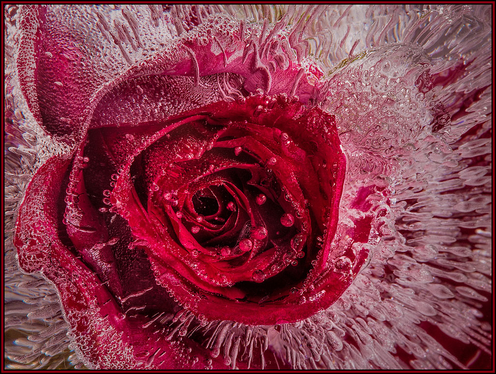
This version really speaks to me and is fantastic. When I first opened it, I said Wow. Now I really can connect and relate the feel of the western themed baskets to the mat. I love the swirls of color in the image. And the brown mat is the perfect, subtle color to lead my eyes into the image itself. Great job! |
Jan 7th |
| 20 |
Jan 19 |
Reply |
Thank you Jerry for taking my comments as they were intended... my opinions and suggestions only. I always appreciate the intent of the maker and suggestions for improvements are my preferences only. As I am sure we can all attest, judging can never be totally predicted. |
Jan 6th |
| 20 |
Jan 19 |
Comment |
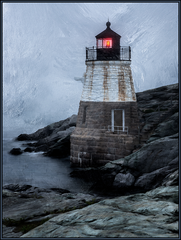
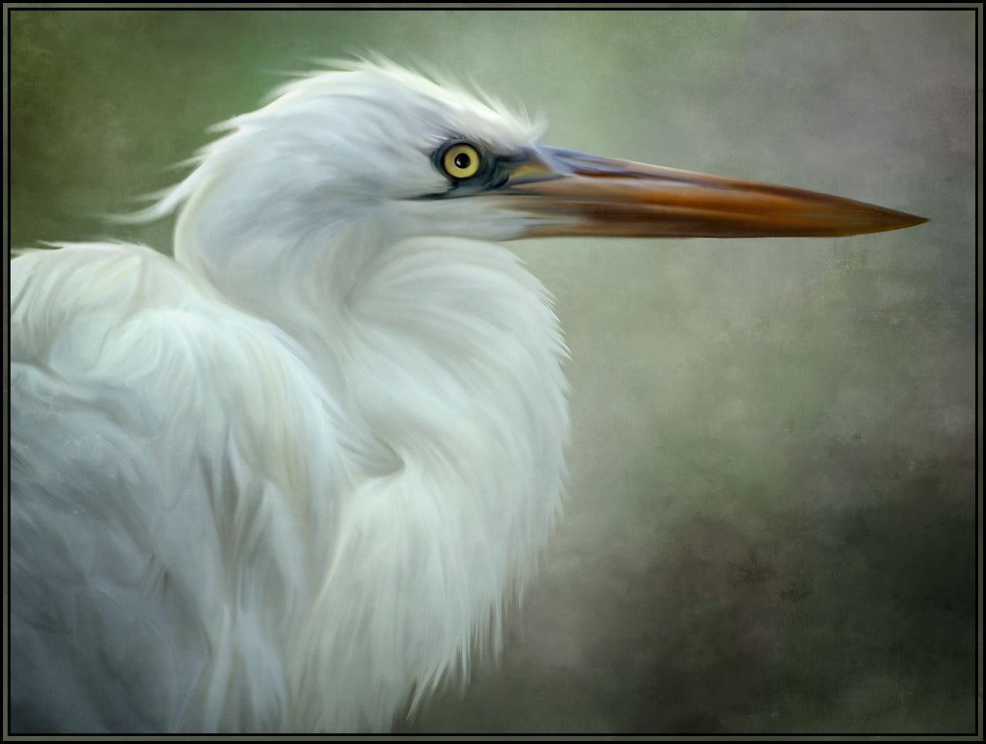
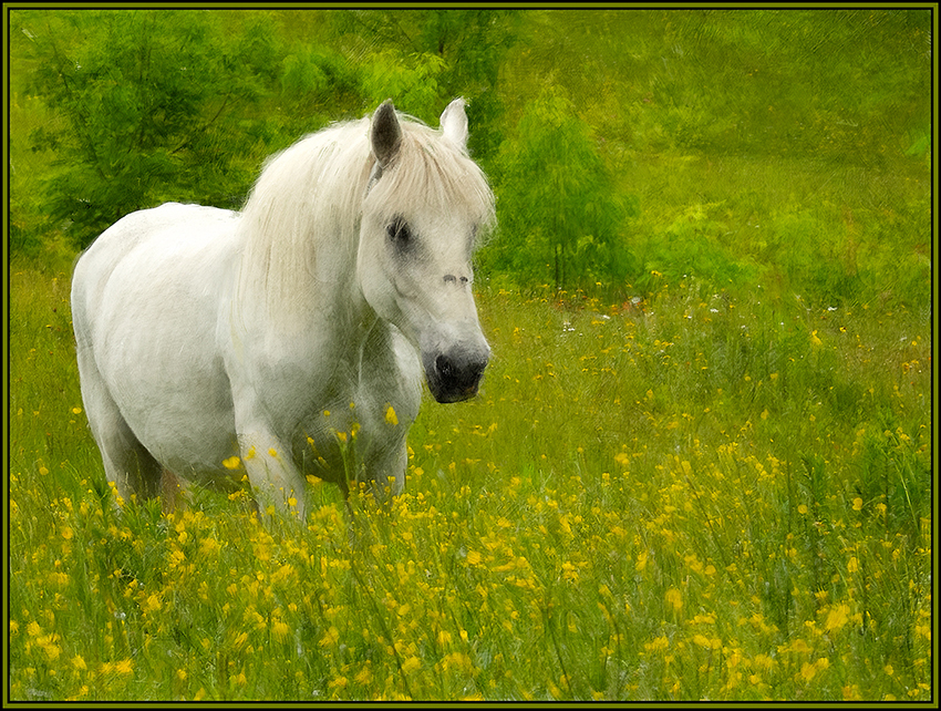
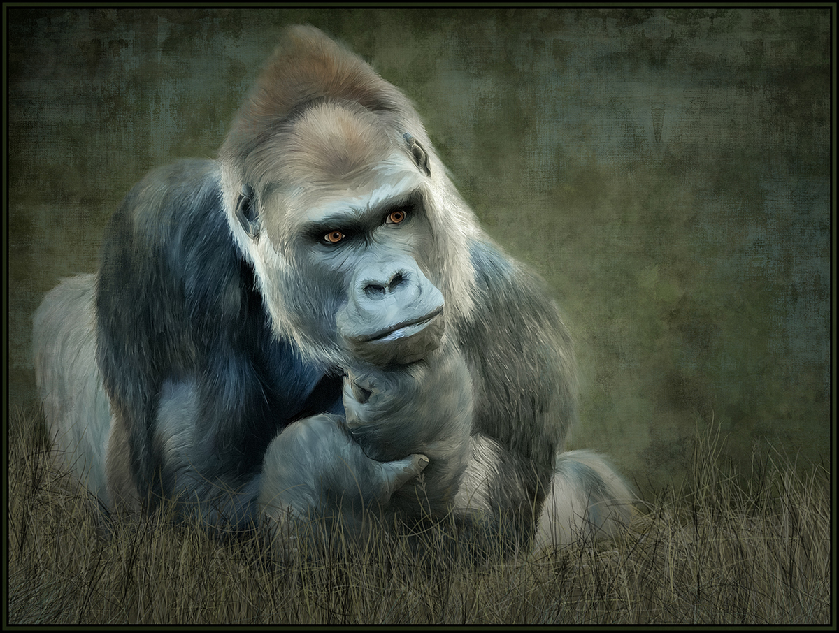
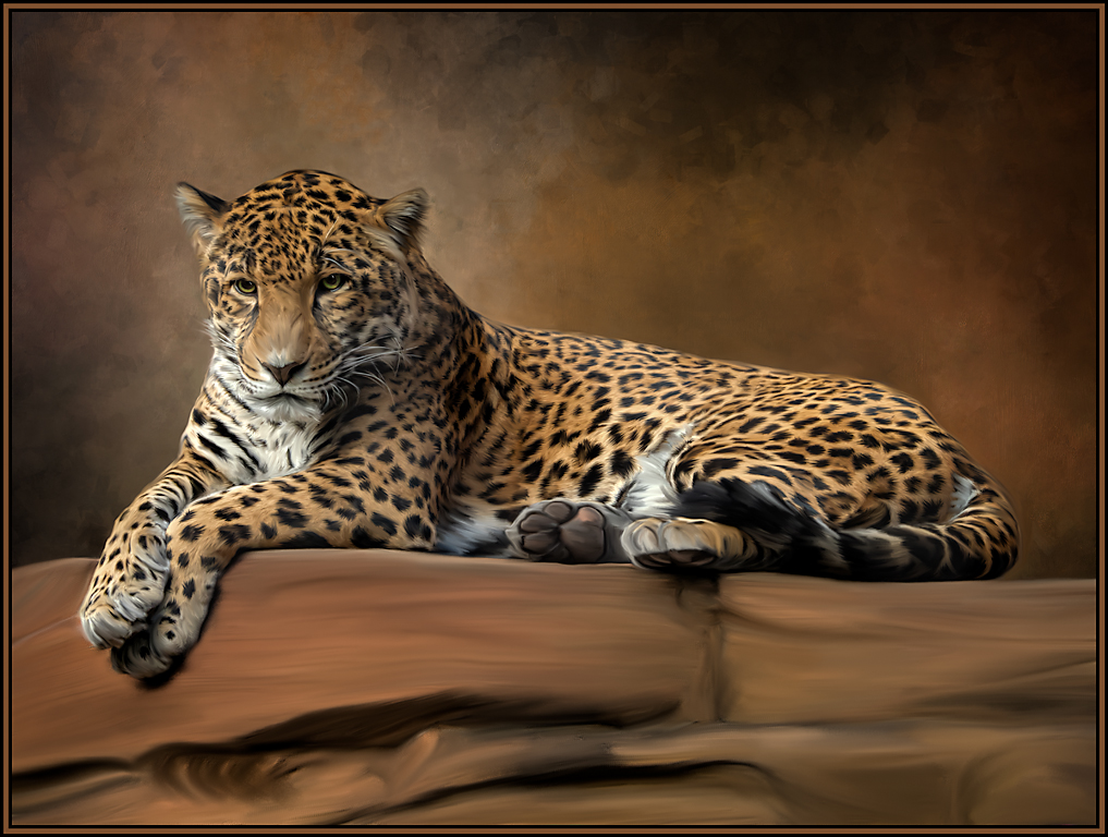
An interesting transformation. I did get the imagery of the Indian pictographs, but the glass artwork did not seem very western to me, but rather seemed like fine art (even though the title is Indian Basket). So, unless you KNOW the Chihuly title, the pictographs do not seem to complement the subject matter.
You asked about competition. I never claim to know what judges are thinking (who does); but I think the "double" bright lighting sources tends to divide the impact of the image; and thus leave doubt as to the center of interest. As a competition image, I think it would be stronger if the bottom lighting were reduced (keep the excellent reflection) and choose a more abstract mat. I love the thin blue and white simple border spilling into the outer frame; it's just the pictographs that seem out of place to me. The vertical presentation and the subtlety of the background is great. This image has a great concept and has great potential.
Lastly, is that you signature in the lower right of the image? Would this be allowed in your competitions?
|
Jan 6th |
| 20 |
Jan 19 |
Comment |
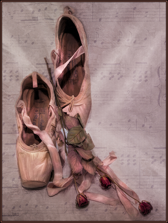
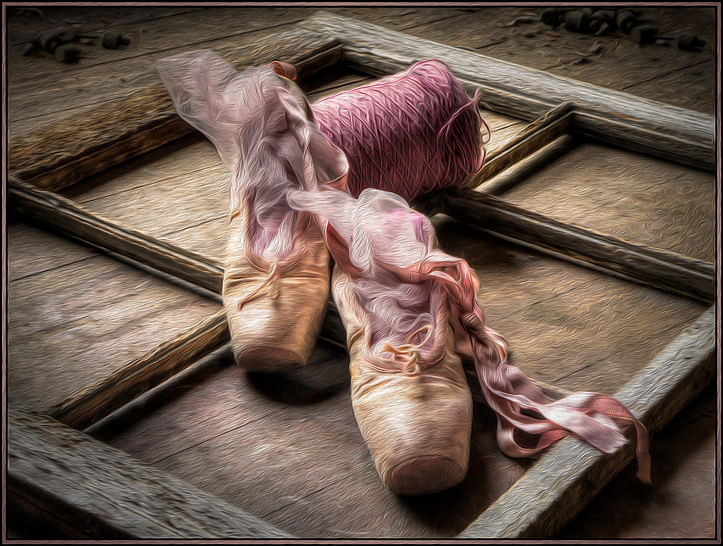
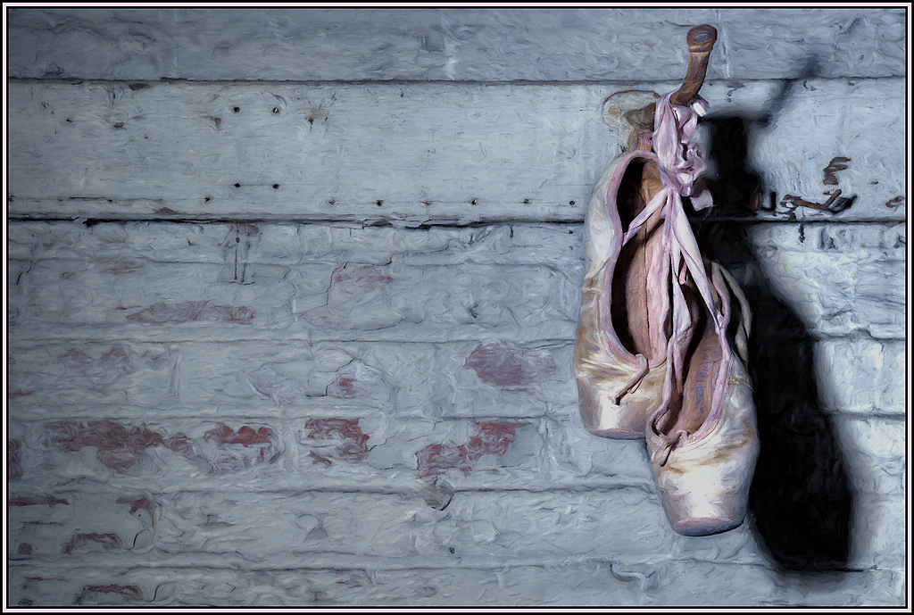
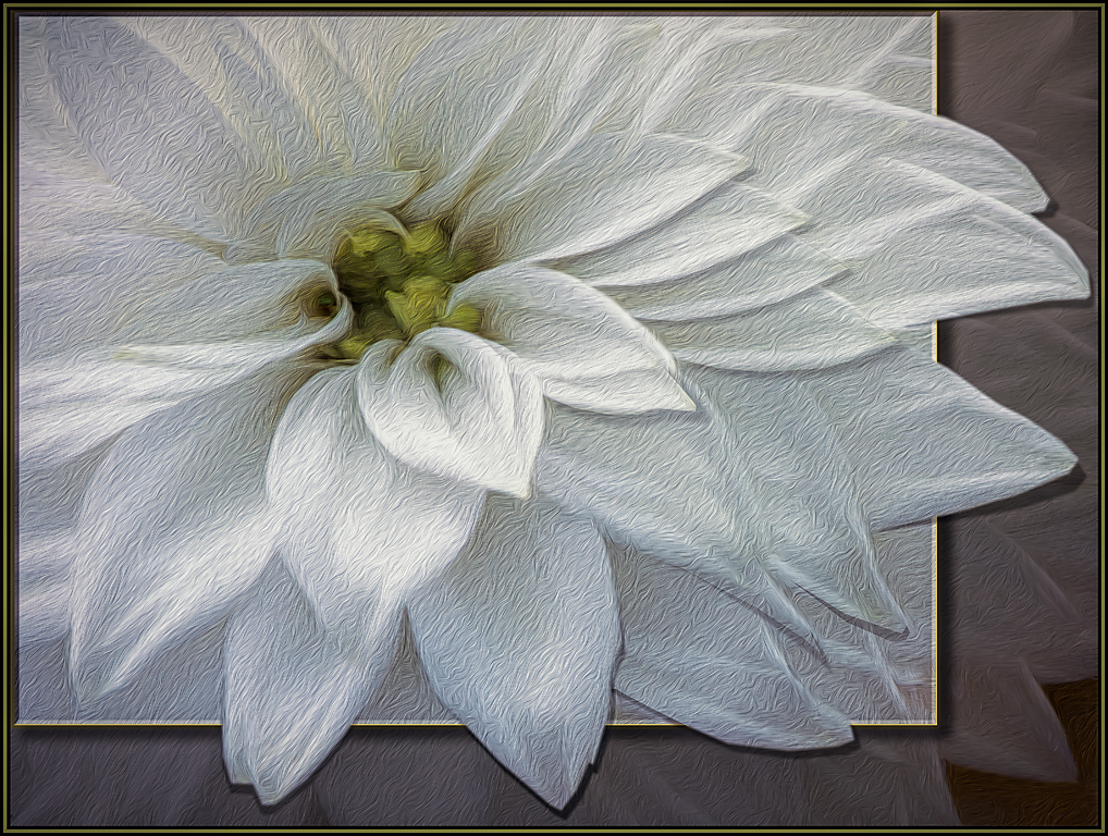
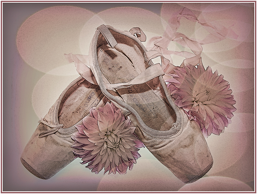
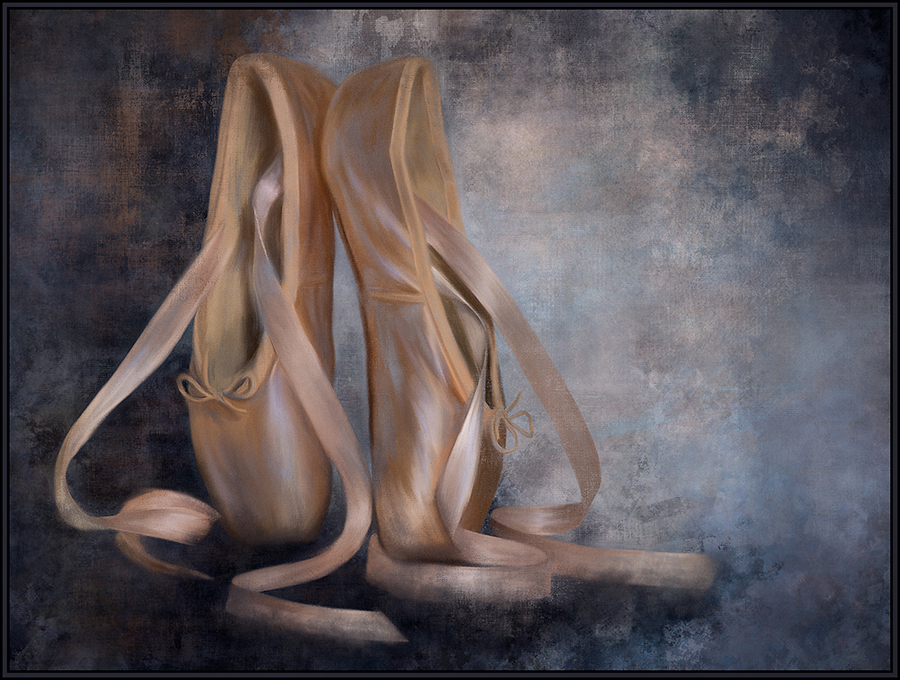
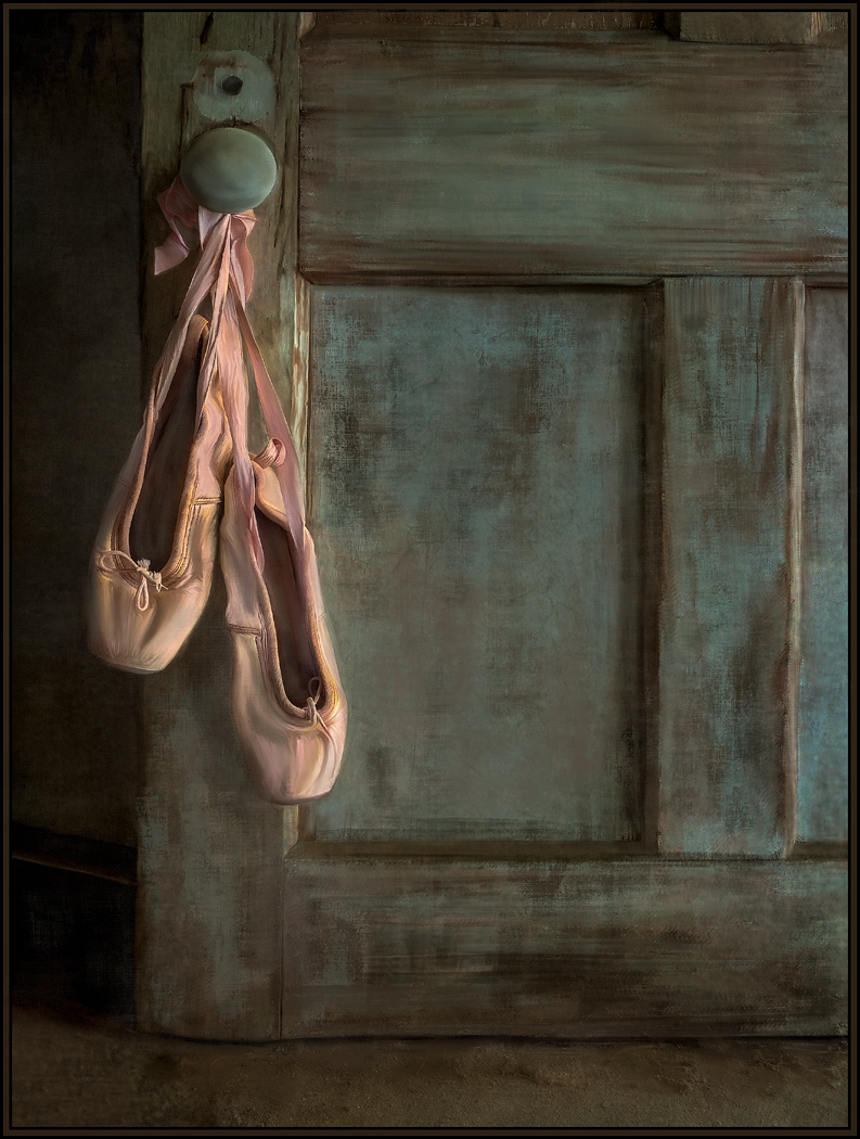
A great arrangement and composition. Since the pink of the sandals has a more subtle color, I wonder if poster edges on the sandals themselves would help to make them stronger and more impactful in the frame. Right now, my eye is drawn to the excellent impact of the left most rose and leaves. So I think the sandals need to be stronger to counteract the impact of the left objects. |
Jan 6th |
| 20 |
Jan 19 |
Comment |
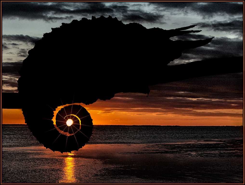
I love what you, and Topaz AI, have rendered. I especially love the sky and the intensity of all the colors. The sky now looks like fiery mountains to me. And to me the half circle at the top represents the sun. Great transformation! |
Jan 6th |
| 20 |
Jan 19 |
Comment |
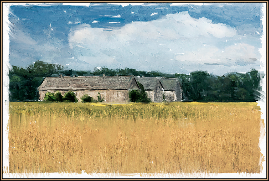
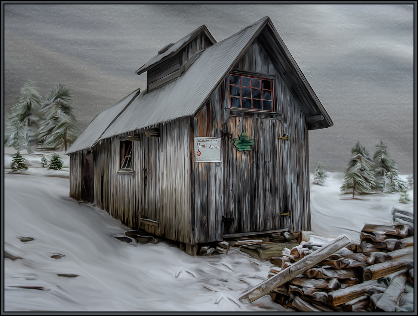
Excellent creative effort. I love what the combination of Reactor and Oil Painting has produced. I just have a few very minor suggestions. I would crop a little from the left, which would eliminate the lower, barely seen diagonal tree and brighter leaves; and then the fence would not end in a corner of the frame. Even though I love the "ridges" on the frame, I think "squared off" ridges would be more appropriate. I love the depth of the ridges, but the rounded off corners do not seem to match the rest of the image. |
Jan 4th |
| 20 |
Jan 19 |
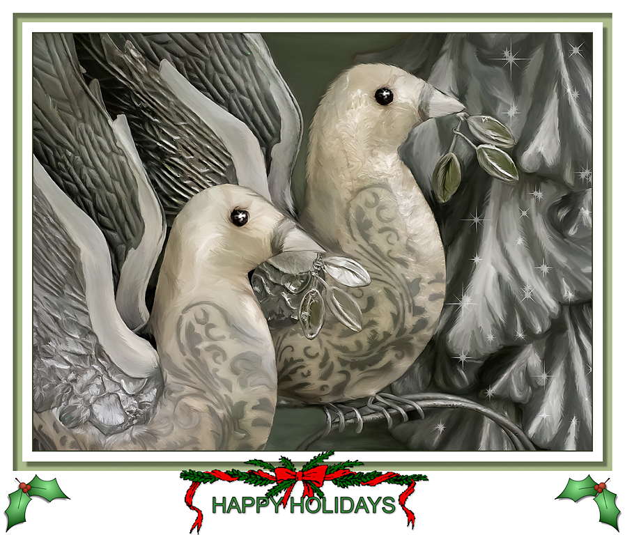
Comment |
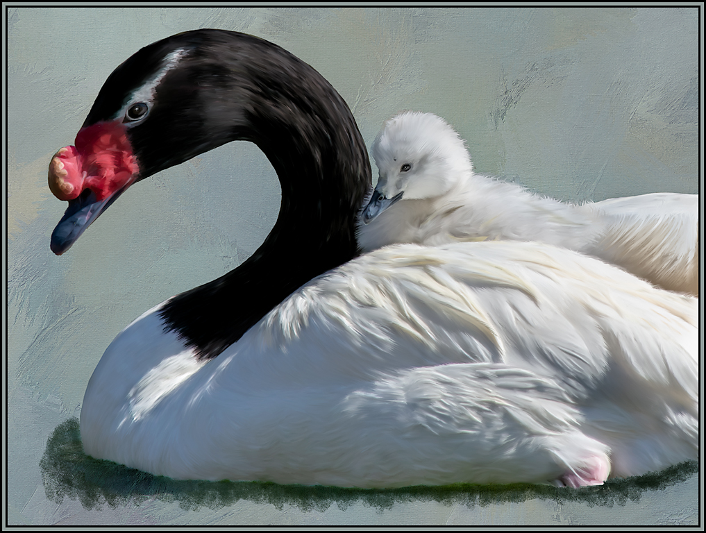
I love what you did to this image. Even though the original background was subtle, it is now so much better with the extraction of the macaws onto the textured layer. I also love the gradual transition of blue to gray of the texture. I agree with Jerry that I would not change a thing. Great job. |
Jan 4th |
6 comments - 1 reply for Group 20
|
6 comments - 1 reply Total
|