|
| Group |
Round |
C/R |
Comment |
Date |
Image |
| 20 |
May 18 |
Comment |
Thanks Betty, I like the idea of taking a few of the stories and creating a composition..... just imagine what the 1978 entry for "camera" looks like !!! |
May 7th |
| 20 |
May 18 |
Reply |
Thanks Shirley.... I though Laid to Rest was just the image title and not ALSO the assignment for the day. And YES, this did definitely fit the category!!! |
May 3rd |
| 20 |
May 18 |
Comment |
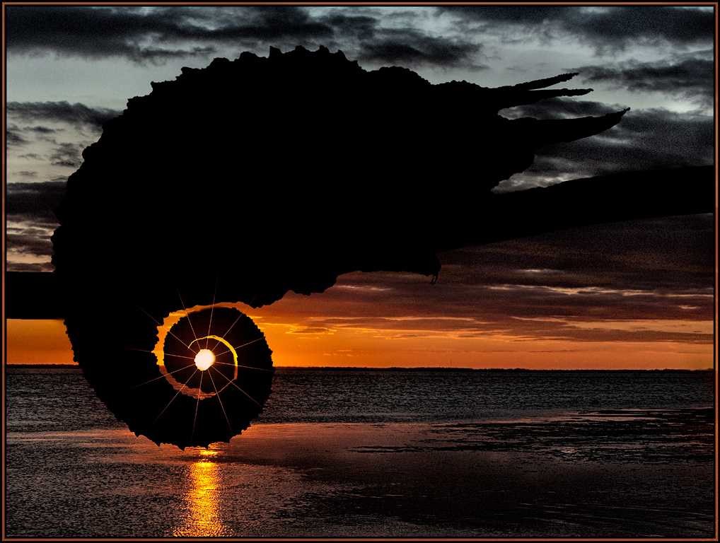
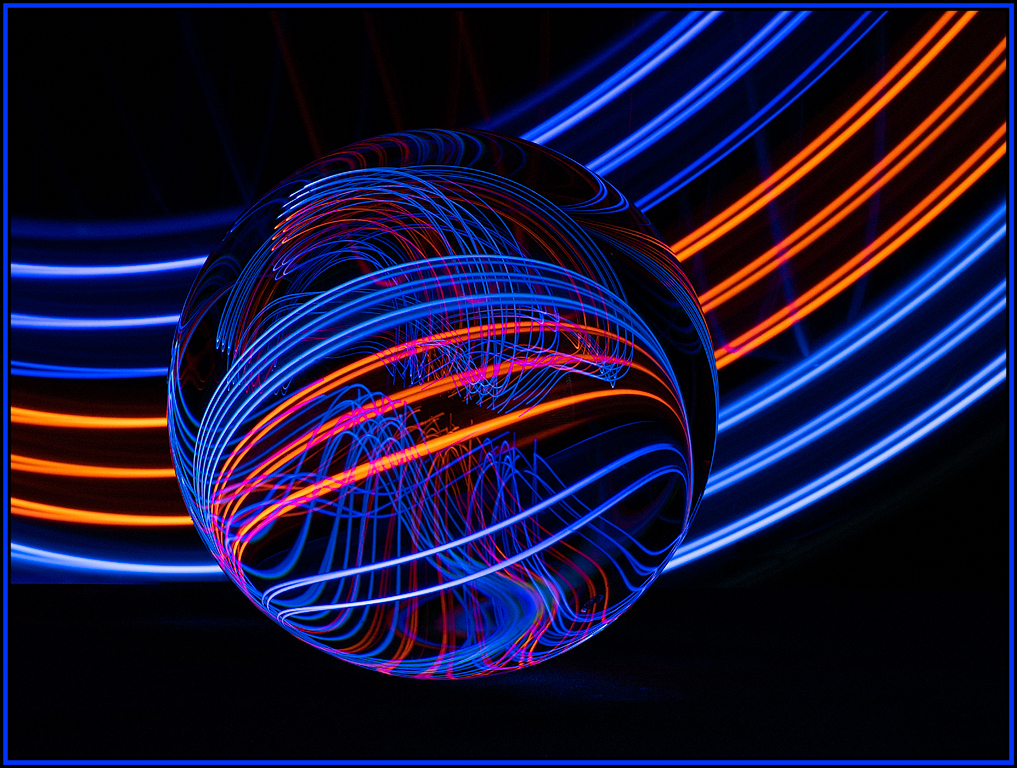
Great abstract. I especially like the light blue sections radiating from the middle. To me, this gives the abstract some depth. I see something different every time I look at it.
I'm debating as to whether or not I would have removed the "nautilus" like swirl in the lower left. That, to me, could be another abstract entirely (especially with all it's great tonalities). |
May 3rd |
| 20 |
May 18 |
Comment |
My friends see "faces" in all kinds of everyday objects; I sometimes find these a little creepy. And now, you go and create a very effective creepy composition!! The thing I find the most enjoyable is imaging what made you flip, rotate, duplicate, combine, etc these images in the first place. I don't know where that idea would have come from.
My personal take would be to present this without the "real" eyes and teeth. I think it still would have looked like a creepy face even with these elements removed. This way, more would have been left to the imagination. |
May 3rd |
| 20 |
May 18 |
Comment |
Very cool abstract. I would have also guessed that this was coral. I agree with you that I like the "more saturated" version. You took a sight that many would have passed by day after day and turned it into a work of art. |
May 3rd |
| 20 |
May 18 |
Comment |
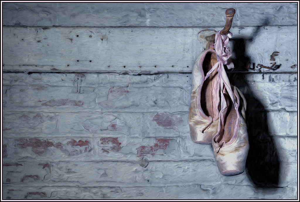
Very creative composition. You neglected to name the "assignment." I can just imagine what it was - perhaps vices, rest, sleeping on the job, etc. I like what poster edges did to the towel on the bottom; it accentuated all the folds. I wish there had been more folds in the background so that poster edges could have created more texture in this area as well. Good job. |
May 3rd |
| 20 |
May 18 |
Comment |
I also like this very much. Good idea to remove the color; when it is removed I can really concentrate on the unique and detailed architecture of the Abbey. The details in the windows and towers now really pop. And the concrete tiles in the front now serve as a definite leading line to the Abbey. Great job... and great idea to remove the women in the corner! |
May 3rd |
| 20 |
May 18 |
Reply |
Hi Jerry, By light painting, I mean I paint with a narrow beam of light from a flashlight. All the rooms lights are off, rendering the composition dark. Then, using the flashlight, I paint the stem... then another exposure set I paint the pages .... then another exposure the spines on the books, etc. Then each light painted portion was brought into Photoshop in order to get the finalized version. Thus the 25+ layers. There are many tutorials on LP on You Tube. I've watched many over the years and have tried this now once or twice. |
May 2nd |
6 comments - 2 replies for Group 20
|
6 comments - 2 replies Total
|