|
| Group |
Round |
C/R |
Comment |
Date |
Image |
| 20 |
Jan 18 |
Comment |
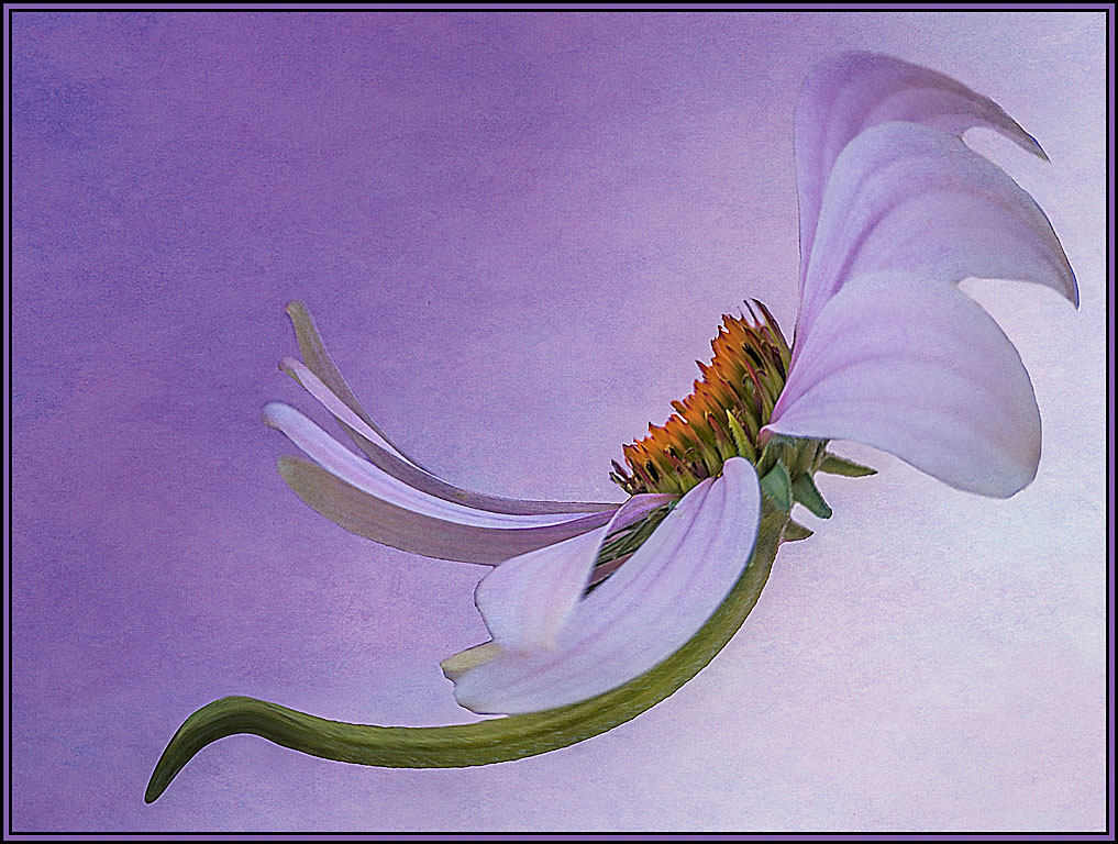
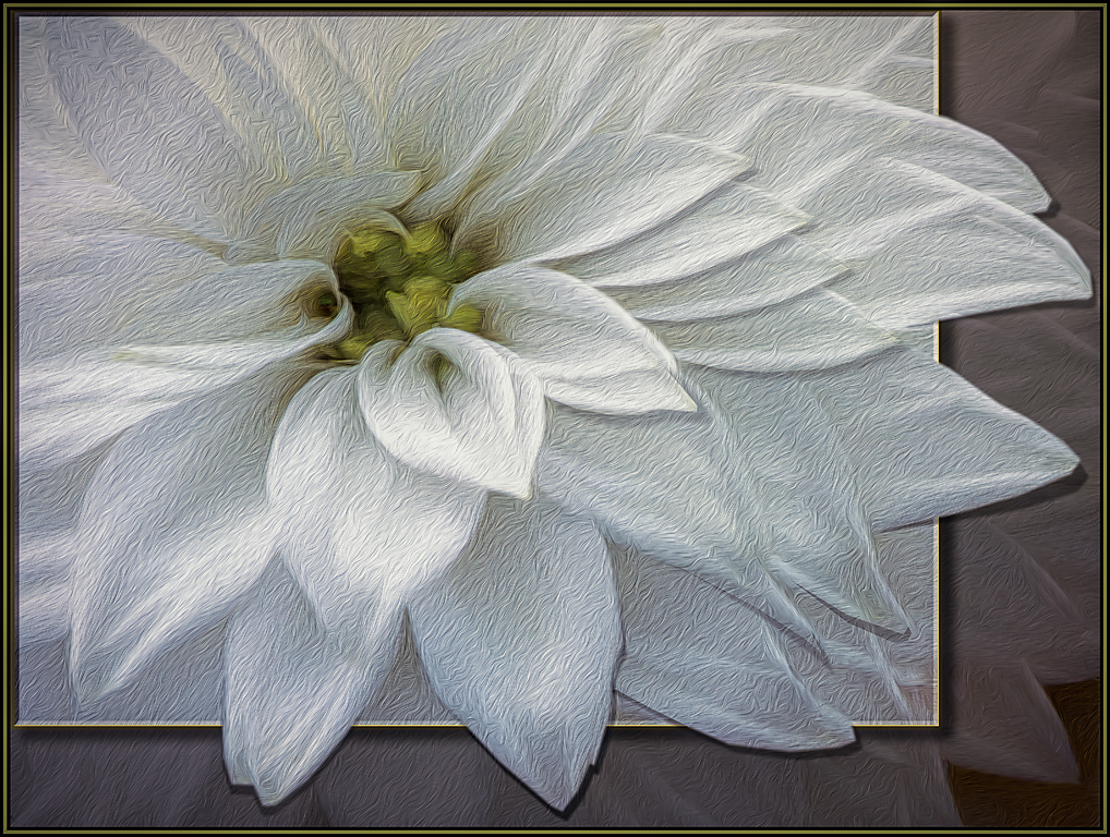
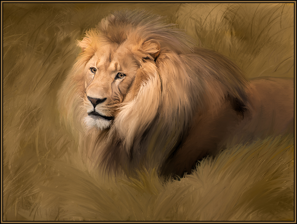
Barbara. Original 2 at the side was the original cone flower taken in its environment. The processed polar coordinates creative image is the large image as seen on the site with only one flower showing. Then I duplicated this creative flower to put two into the next composition - this was then called original 1 even though it's a second creative composition. Sorry for the confusion. Do you prefer the image with one flower or two?? |
Jan 25th |
| 20 |
Jan 18 |
Comment |
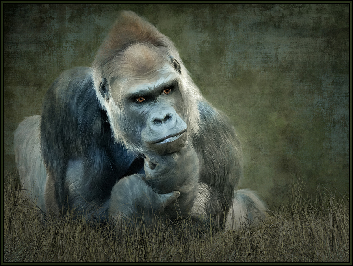
Tinker is indeed now famous!! Great job in reshaping the mask to fit him. And I love the expertly done, subtle fading of fur into the texture layer. I like both the original textured image and the extruded version. I went back and forth many times and by a slight margin, I prefer the extruded image best. Both, however, are wonderful. |
Jan 7th |
| 20 |
Jan 18 |
Comment |
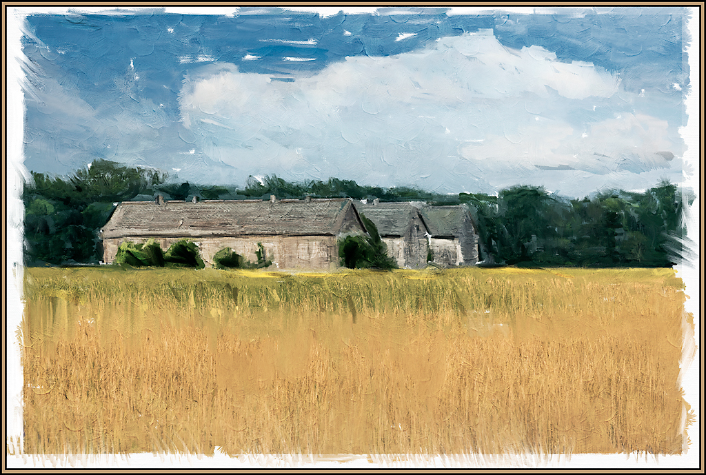
The colors and textures that you brought out from the original now definitely give this image impact; especially bringing out depth that was not noticeable in the original. I love all the colors and job well done!
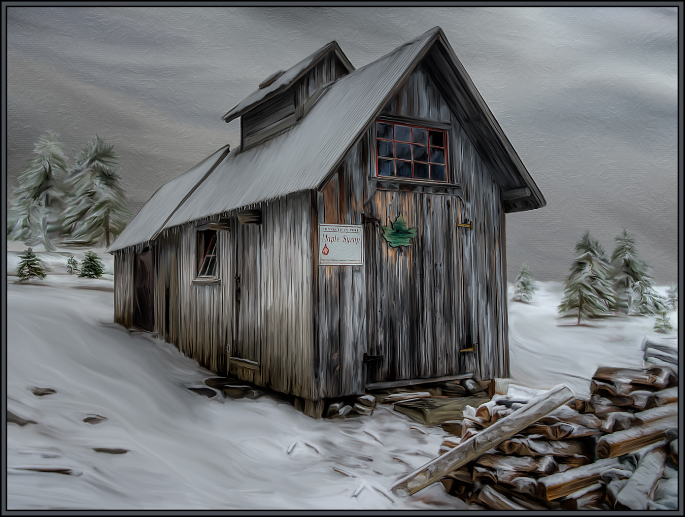
As for the frame; I too have taken shots of frames to use on images. I just have not gotten around to it yet. I appreciate that you used a drop shadow from this frame. However, my preference would have been to crop the frame tight so that you did not even have to place this on the green background. The gold of the frame is definitely coordinated with the colors of the mud pots. To me, the green background is a distraction.
OUR particular club would allow such a frame in the creative category only; but I can't determine if all judges would accept such a decorative addition. |
Jan 7th |
| 20 |
Jan 18 |
Comment |
To me, the original image seemed somewhat flat; your applications definitely brought out depth and drama. Great job! I love that you can now see the reflected blue colors of the bow in the water. To be REALLY picky, I would clone out the blue stripe from the boat in the very upper right. |
Jan 7th |
| 20 |
Jan 18 |
Comment |
I love this concept / composite - you were not sure that this worked - to me, it absolutely does !!! I agree with you that the texture could have more depth and dimension. Did you try changing the blend modes on the texture layer. "Multiply" may give the texture a deeper color and may even make it feel older by bringing out some of the mottled appearance. |
Jan 7th |
| 20 |
Jan 18 |
Comment |
Great job even "seeing" this image. I like that the ink lines gave depth and dimension to this image. To me, personally, the four blue areas at the bottom of the frame do not coordinate with the rest of the image. I think "color cloning" some of the darker reds from within the image would tone down the bright blues; giving this image a yellow/red tonality. Then you could use a darker frame color as well. For me, then, your eye would travel throughout the squashes instead of being drawn down to the bottom edge. |
Jan 7th |
| 20 |
Jan 18 |
Comment |
What an excellent, wonderful way to bring together the two different generations from two different times. Excellent concept and well done. I love the B&W treatment. My only suggestion would be to "bring back" some of the detail on your son's plane's upper wing and also on your husband's jacket. The vignetting seemed to take out some of this detail. By bringing this detail back, these areas may even seem to go "out of the frame"; see if you like it. |
Jan 7th |
7 comments - 0 replies for Group 20
|
7 comments - 0 replies Total
|