|
| Group |
Round |
C/R |
Comment |
Date |
Image |
| 20 |
May 17 |
Reply |
Great catch on the shadows Betty. I agree with you and have cloned out the dark shadows. Based on everyone's favorable comments, I might even use this in competition next season ! |
May 16th |
| 20 |
May 17 |
Reply |
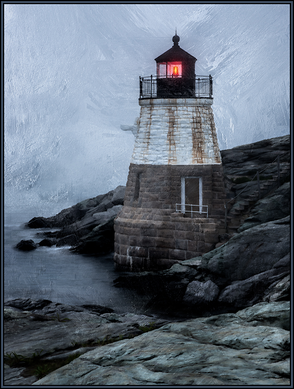
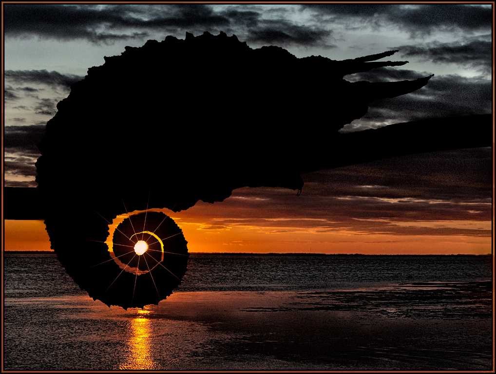
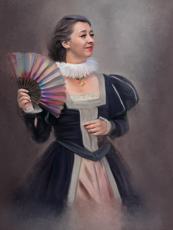
Thanks Nancy, I actually did not want it to look like it was taken this way. In my mind, I feel that it takes away from the creativity. But I guess the Glow adds to the creative effect. I'll have to think about whether or not this gets puts into competition. And WELCOME BACK into the fold. I hope you get to comment and post images next month. |
May 6th |
| 20 |
May 17 |
Comment |
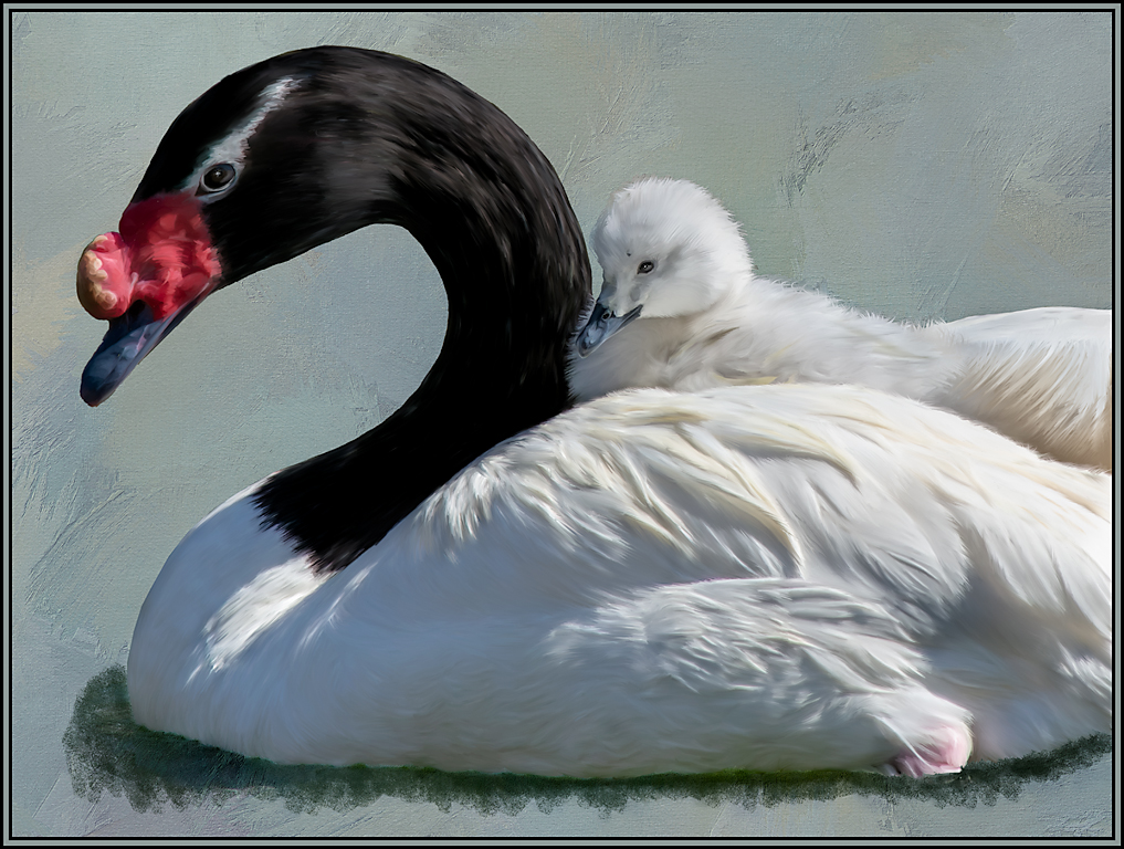
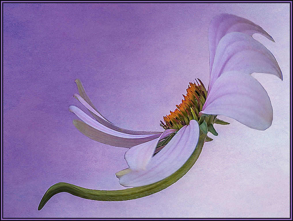
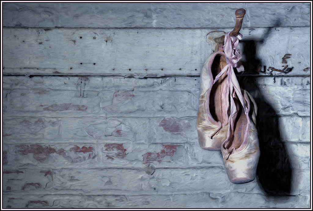
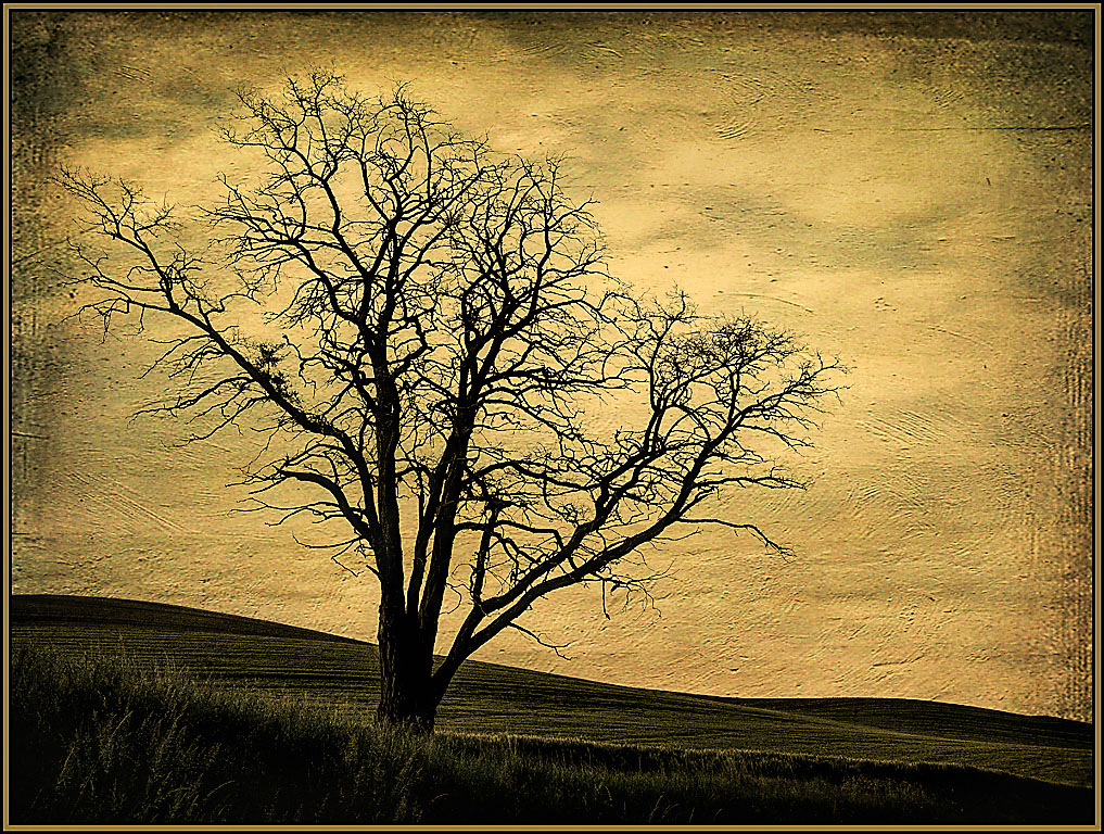
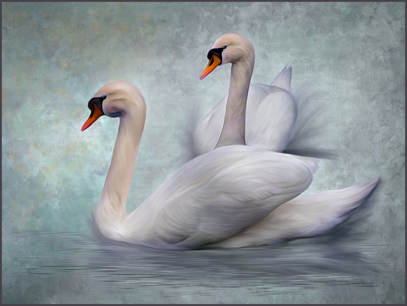
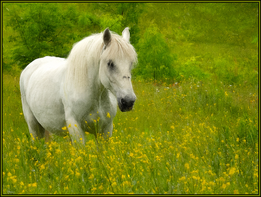
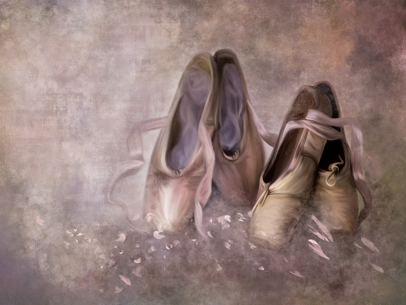
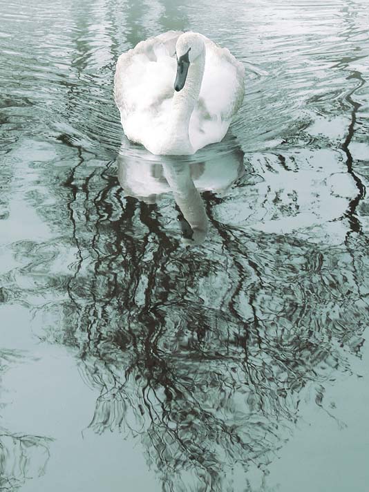
I absolutely love what the green overlay did to this B&W image. The mood is wonderful; peaceful and serene. The tones in this image are great. My personal preference would have been to crop this as a vertical image, removing most of the left side, and placing the swan in the upper portion of the vertical image. I think this revised crop would allow your eye to be drawn to the swan and the wonderful reflections of swan and trees. |
May 3rd |
 |
| 20 |
May 17 |
Comment |
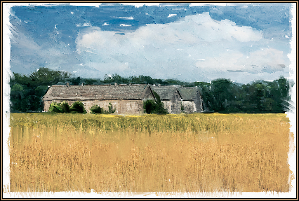
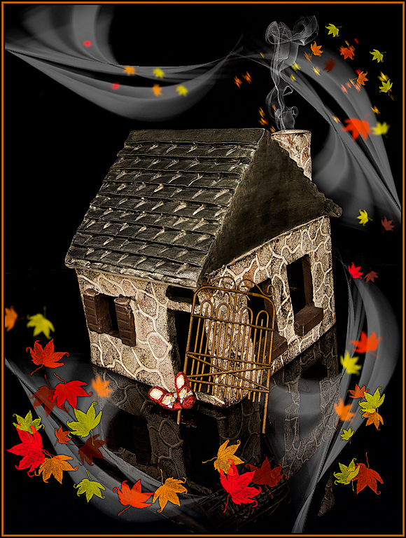
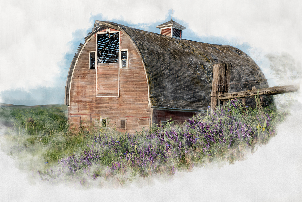
I absolutely love this image. The stone wall serves as a great leading line and has your eyes drawn to both sides of the old gate. The grasses seem to be moving and swirling around this gate. Best of all, the added textures in this image are absolutely wonderful... was that an addition via NIK (what filter) or Mediachance? Superb image. |
May 3rd |
| 20 |
May 17 |
Comment |
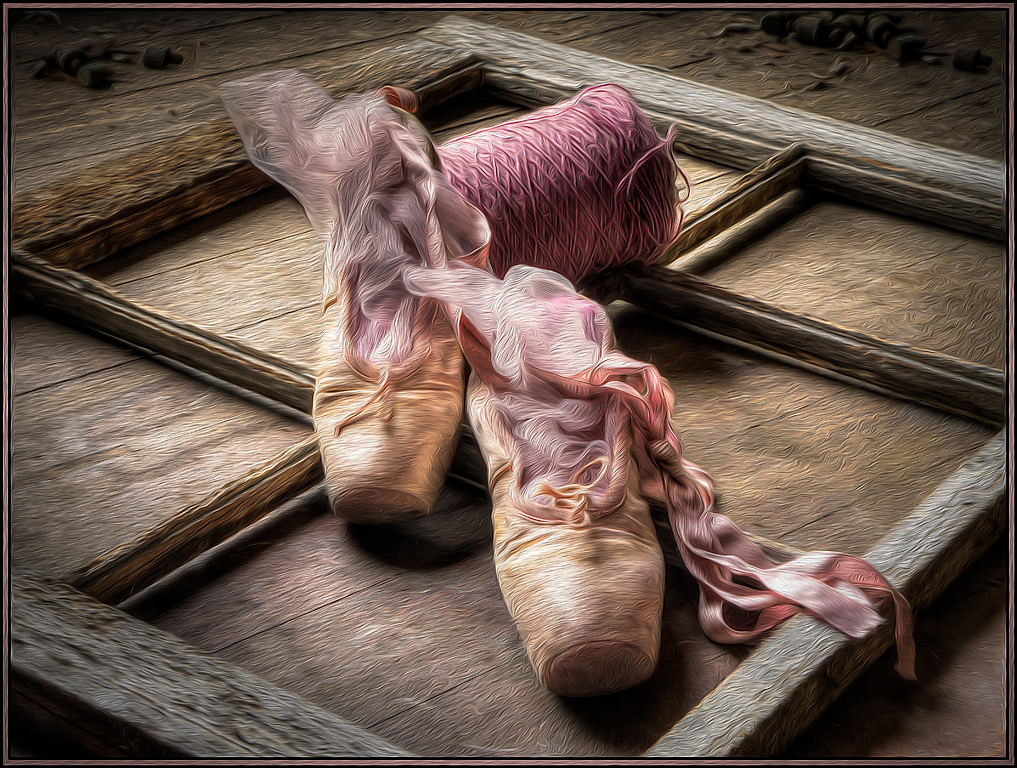
The use of Poster Edges really made this image come to life; it added texture, depth and impact! Red and green are such great eye popping complementary colors. I think removing the lone tomato was a good call.... hope it was delicious. And a top score is warranted for this image. |
May 3rd |
| 20 |
May 17 |
Comment |
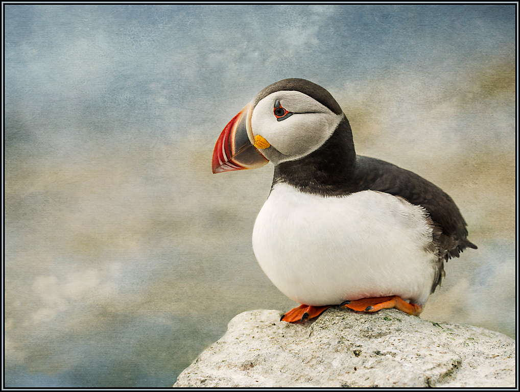
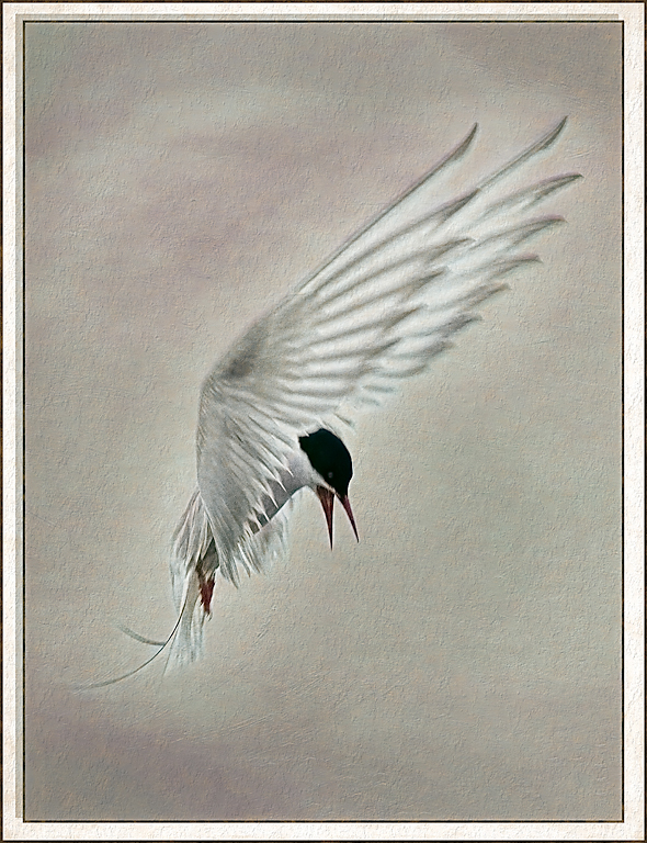
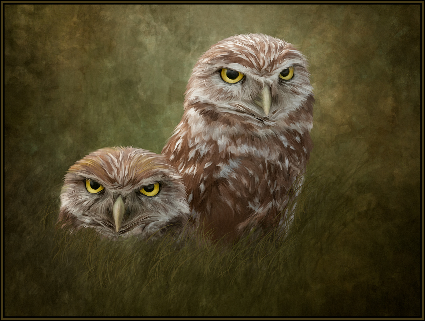
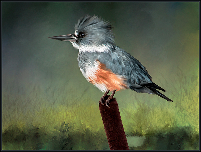
This background was the perfect choice to offset and enhance this thrush. The background color complements the birds tail feathers and eye. And of course the head placement in the lighter portion of the background was inspired. The only thing I might have changed was to clone out the lower "stump" on the branch. It merges with the bottom of the frame and my eye goes there; and is distracted. I like the upper stump as it adds imperfection to the branch and gives it character. All in all, an excellent image. Kudos for seeing that this thrush would work with the selected background and also for your ability to excellently select the bird out of its original image. |
May 3rd |
4 comments - 2 replies for Group 20
|
| 24 |
May 17 |
Reply |
I agree with the sometime heavy handed application of the flood filter. That is why I like the delicate rendition of the reflection that you created. Thanks very much for the information. |
May 5th |
| 24 |
May 17 |
Comment |
Thank you so much for your quick reply. |
May 5th |
| 24 |
May 17 |
Reply |
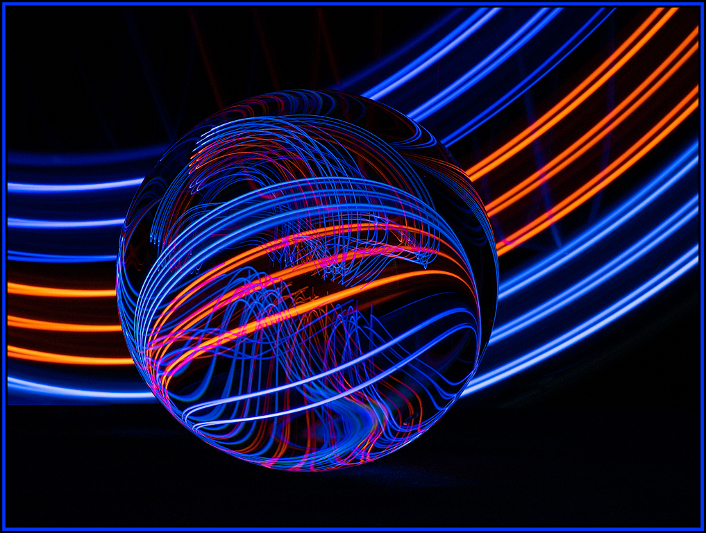
Hi Tom,
I am from Group 20 and would also be interested in this tutorial. Lovely image. And this reflection is so much better than if you had used the "flood" filter. Can you post the address here? |
May 5th |
1 comment - 2 replies for Group 24
|
5 comments - 4 replies Total
|