|
| Group |
Round |
C/R |
Comment |
Date |
Image |
| 2 |
Apr 19 |
Comment |
Piers has a good suggestion about darkening the nest slightly to bring it out from the background. The nest is very sharp and the thorns seem to provide further protection for the future or past inhabitants. Nice idea and great capture. |
Apr 11th |
| 2 |
Apr 19 |
Comment |
Nice colors and reflection of the sunset, Brenda. Looks like we all agree about the cropping suggestion and I further agree with your observation of the sticks at the bottom which could be eliminated for an improvement.
|
Apr 11th |
| 2 |
Apr 19 |
Comment |
Gives the feeling of a narrow street in a bazaar. Could have been improved if the people were walking toward the camera rather than away - but that's the luck of the draw. |
Apr 11th |
| 2 |
Apr 19 |
Comment |
Very nice capture and post processing handling. I cannot see anywhere where it could be improved. Great, Shirley. |
Apr 11th |
| 2 |
Apr 19 |
Comment |
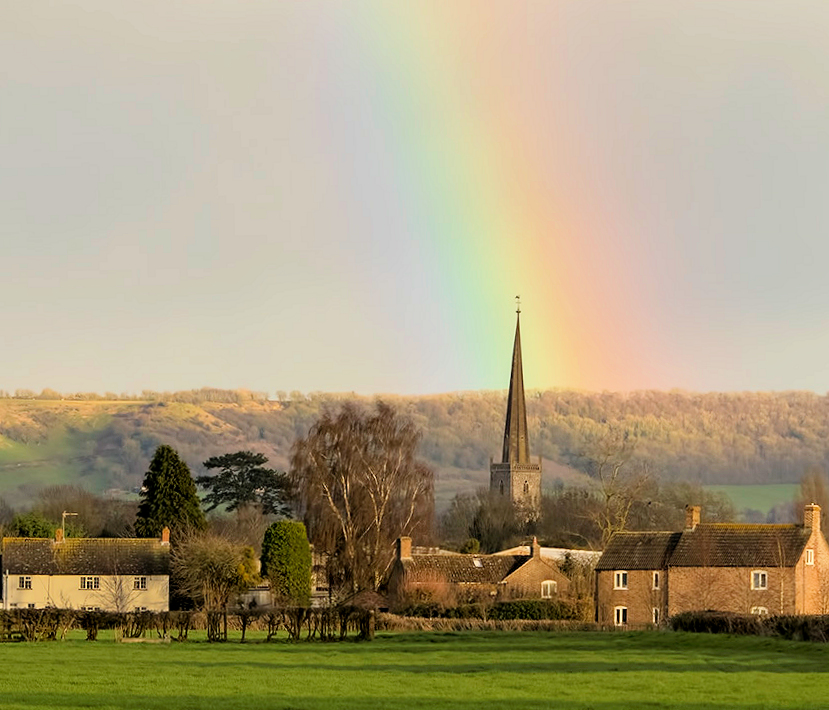
Nicely composed image of the village. To my eye, however, I think that the village should be brighter and my example highlights it with the rainbow being considered secondary. That might not have been your intent but just another opinion. I also straightened the horizon ever so slightly - horizontal horizons is just my thing. I agree with Laurie - the steeple is nicely placed. |
Apr 11th |
 |
5 comments - 0 replies for Group 2
|
5 comments - 0 replies Total
|