|
| Group |
Round |
C/R |
Comment |
Date |
Image |
| 2 |
Feb 19 |
Comment |
I actually prefer the color version over the B&W. I needed a mono image for our club competition and thought that this one lent itself best for the purpose. The color shot differentiates the claws from the background better than the softening of the feathers could. However, the B&W shot still managed an honorable mention. Thanks, everyone. |
Feb 16th |
| 2 |
Feb 19 |
Comment |
Great repair on a great image. I like the original image orientation over the main one but like the changes you made to the pillars. My preference on left to right orientation is similar to the difference of riding in the direction of travel in a train vs. facing backward and seeing where you have been instead of where you are going (something I experienced when crossing Australia in the Indian Pacific). |
Feb 14th |
| 2 |
Feb 19 |
Comment |
I go along with Piers' comments. The B&W looks great and the less bright foreground allows us to focus on the barn and those great clouds. Good job. |
Feb 14th |
| 2 |
Feb 19 |
Comment |
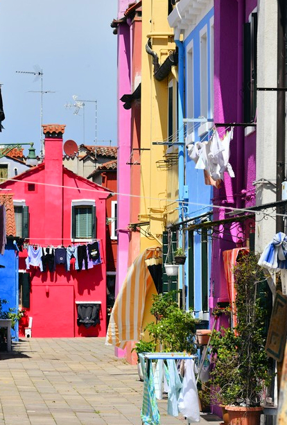
Very colorful and a nice display of everyone's washing. My feeling is that the left building could be eliminated - which would put more focus on the far house - and negative space of the sky reduced by that crop I suggest. I might also clone out the TV antennas but that is my dislike and might not be yours. |
Feb 14th |
 |
| 2 |
Feb 19 |
Comment |
I like the idea of the tree and its roots in the foreground but would have loved to see the roots in better focus - like the veins and arteries - leading to the trunk. Piers' suggested crop has improved the shot but my main concern is the bright background towards which my eye is initially drawn whilst the foreground and the main focus of the image is dark. |
Feb 14th |
| 2 |
Feb 19 |
Comment |
Very colorful and a near silhouette shot. Nicely done. |
Feb 14th |
| 2 |
Feb 19 |
Comment |
I would go with a truckless image over other suggestions. I might have composed the image differently by placing the table at the 1/3 intersection on the right rather than at dead center. The different angle may have also taken the building on the right out of the frame thus giving an impression of a single human element - the table - in an otherwise nature setting. But that is a future consideration - this image is otherwise sharp and interesting. |
Feb 14th |
7 comments - 0 replies for Group 2
|
7 comments - 0 replies Total
|