|
| Group |
Round |
C/R |
Comment |
Date |
Image |
| 2 |
Jun 18 |
Comment |
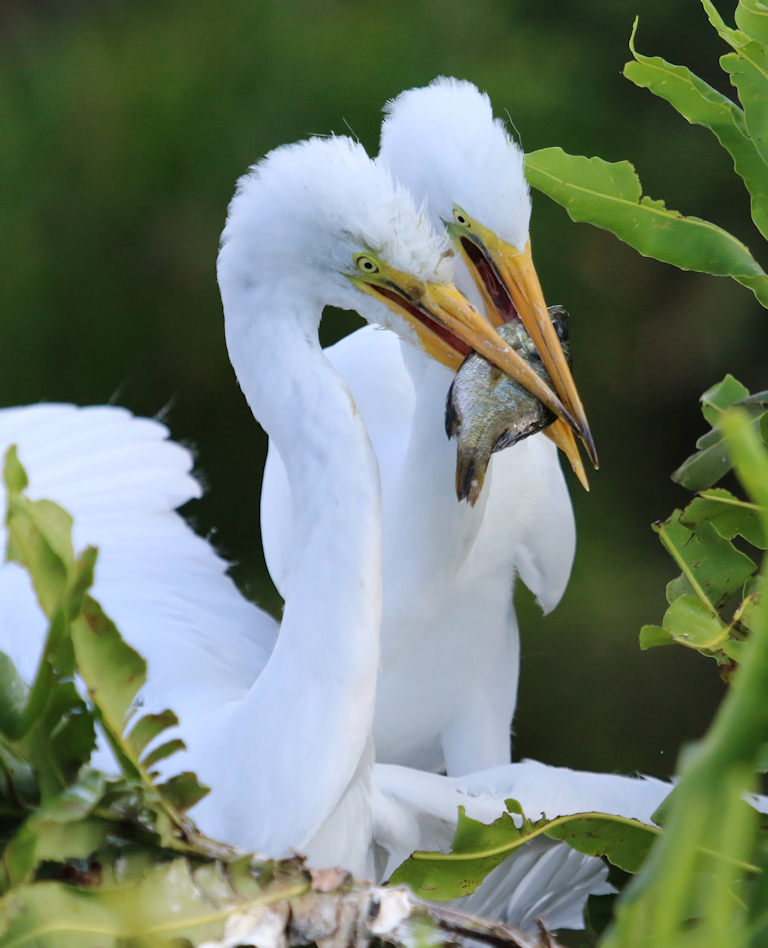
Sorry for the 'untitled' title - forgot to enter it and now it's too late. Image title should read "Great Blue Heron". - Harry
|
Jun 13th |
| 2 |
Jun 18 |
Comment |
Piers: The bird's pose is wonderful and the feathers are reasonably sharp. I think you did the best you could with the image as a whole but, as I have found with most of my large bird shots, having the subject so close to the background is not ideal because of the clutter presented by the leaves. Possibly darkening them may allow the eye to focus more on the bird without the distraction of the background detail. |
Jun 13th |
| 2 |
Jun 18 |
Reply |
That's the ticket. |
Jun 9th |
| 2 |
Jun 18 |
Reply |
Good point, Malabika. |
Jun 9th |
| 2 |
Jun 18 |
Comment |
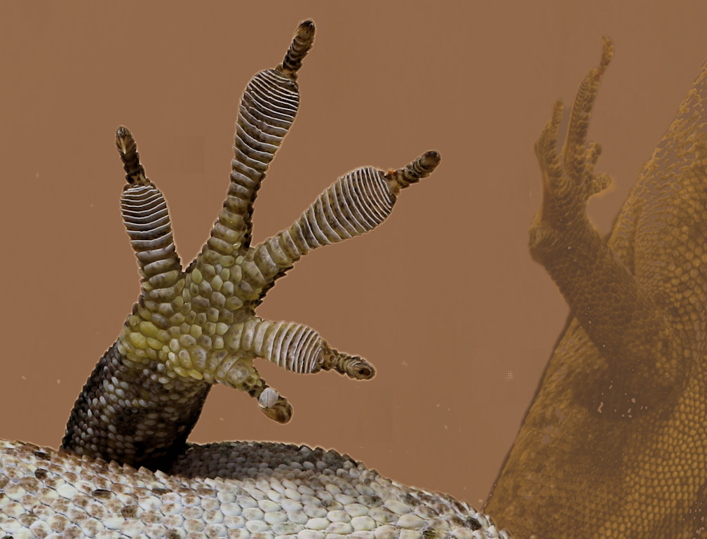
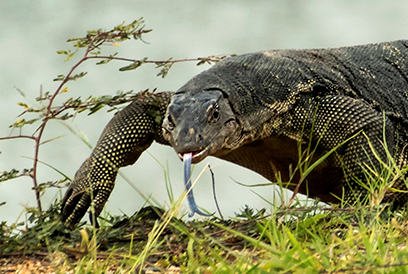
Malabika - if you have enough pixels for for a close up, I think the picture is this. The lizard's head is nicely framed by the plant. You may disagree, but my passion is always on the animal's head rather than including the whole body. But, it's just a matter of my taste. |
Jun 9th |
 |
| 2 |
Jun 18 |
Comment |
I really like this image as it is. It has a cartoonish feel which may not be what you intended. But it somehow reminds me of the type of art that Disney (Walt) studio may have produced. In this genre, it does not matter how far anything leans. |
Jun 9th |
| 2 |
Jun 18 |
Comment |
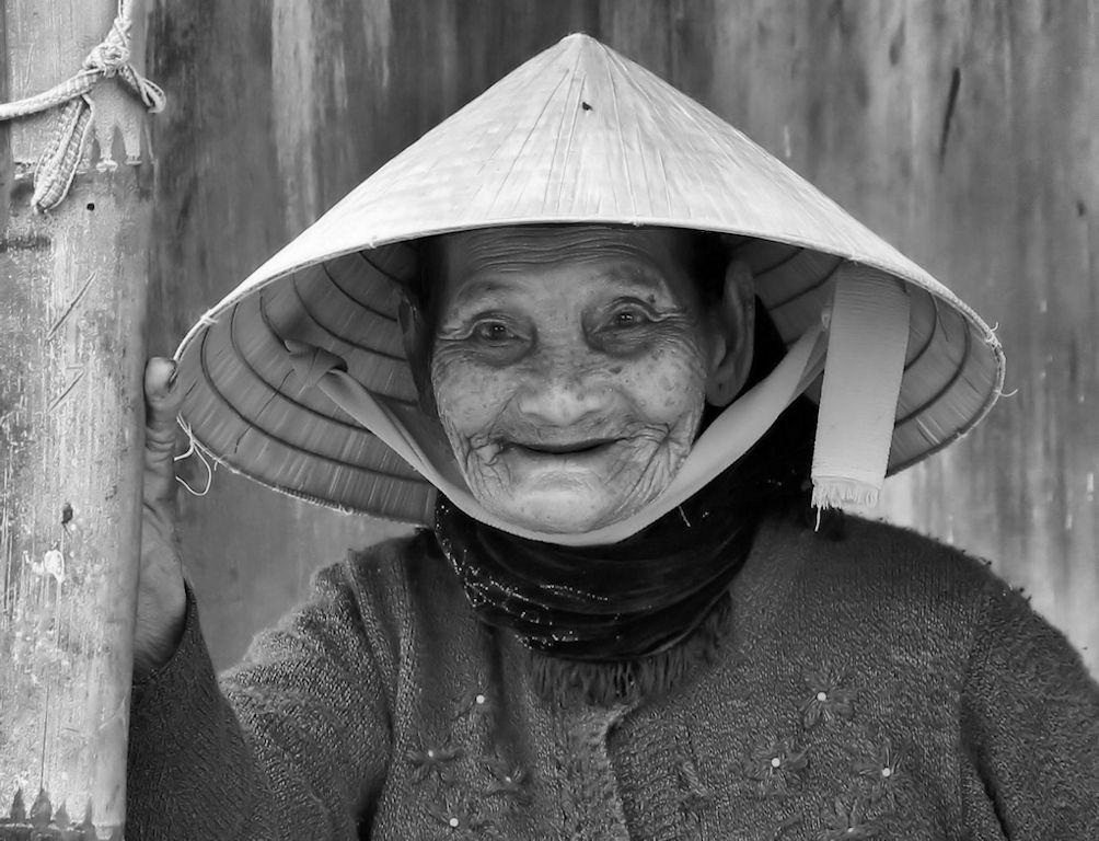
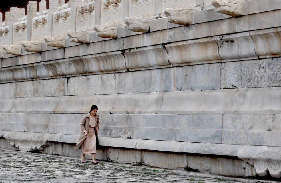
Nice capture, Hung. The hurrying lady is looking down (unfortunately) but I understand why - the rough terrain. My suggested improvements are to remove the right-hand column with its distracting brown stain and removal of the red area top left. That puts the lady exactly at the 1/3 mark horizontally. I tried the image in black and white but the color image looks better. Good work. |
Jun 9th |
 |
| 2 |
Jun 18 |
Comment |
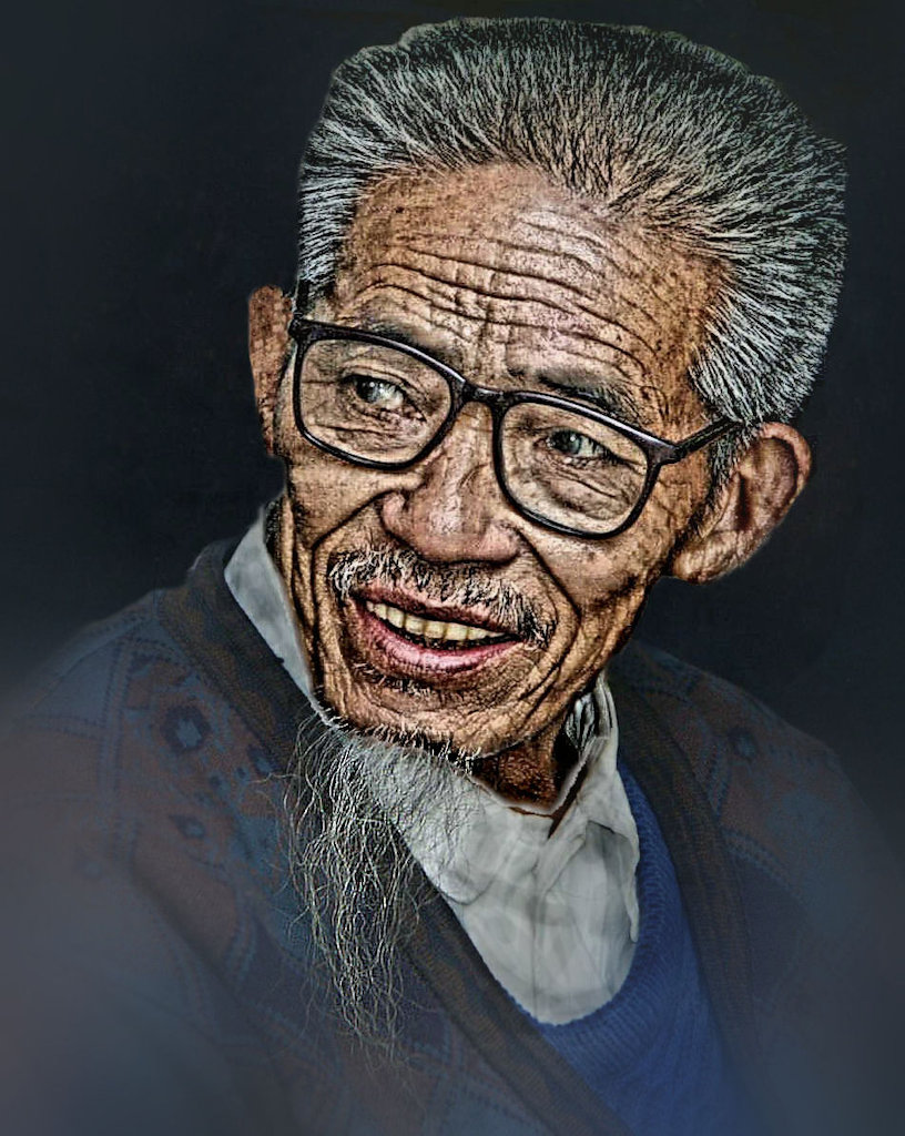
Beautiful shot of a beautiful model. I agree with others, however, on the hand crop and would suggest that a tighter cropping of the hat to bottom of the lower tie would be the real picture. The color and the sharpness is just perfect. |
Jun 9th |
| 2 |
Jun 18 |
Comment |
Sorry to see you go, Gary, but I am sure that it will be more to your liking when you get into mono full-time.
You left with a bang with this image! Very well lit with beautiful contrasts. With similar B&W images that I have seen presented in competition, the judges have opted for a thin white border to better define the image and show the limits of the image. You might consider this also.
As Shirley indicated, let us know the new group number and I shall post it on this site. Good luck! |
Jun 4th |
7 comments - 2 replies for Group 2
|
7 comments - 2 replies Total
|