|
| Group |
Round |
C/R |
Comment |
Date |
Image |
| 2 |
Dec 17 |
Reply |
Much better overall - except the grapevines are still too bright. A darker green would let the barn become the center of attraction. |
Dec 11th |
| 2 |
Dec 17 |
Comment |
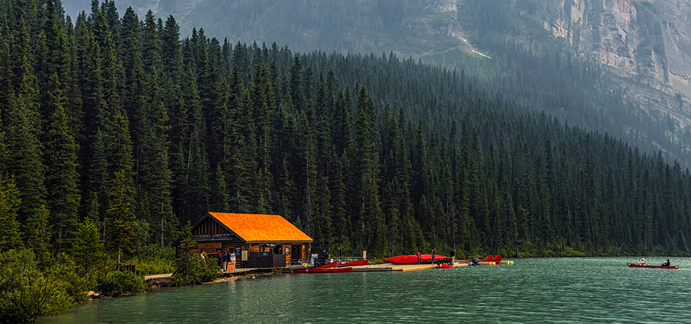
Along with Shirley's suggestion, perhaps you might feel that this is a better approach. I still haven't been to Lake Louise so maybe I am not qualified to make any suggestions. My wife is bugging me to go there but I am reserving that trip for the 'easy ones' when the harder ones become impossible. Meanwhile, perhaps moving the canoers closer to the foreground and enlarging them might fill in the water area a little better. |
Dec 11th |
 |
| 2 |
Dec 17 |
Comment |
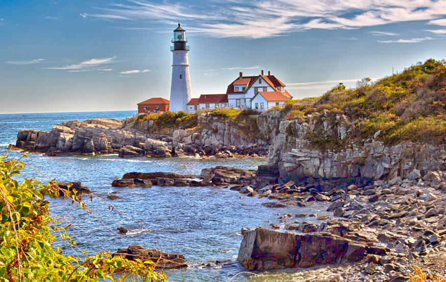
Al: Both Shirley and Gary expressed my thoughts. The foreground needs toning down but it does provide a nice frame to the image. There is some negative blue space in the sky on the left. I have attached a suggestion for some cropping which may take care of some of my comments. And the halo around the lighthouse is a little strange. |
Dec 11th |
 |
| 2 |
Dec 17 |
Comment |
Gary: I tend to agree with Al to an extent. However, I think that the post removal may be all that's needed. I would include my version of that scenario but my cloning tool has broken in Paintshop Pro and I am waiting for Corel to fix it. I do like the vignetting approach. |
Dec 11th |
| 2 |
Dec 17 |
Comment |
Neat image of the barn. But I feel, as did Al, that the foreground is rather overwhelming since the lightest areas in an image get our attention. I think that the center post also needs removal since it almost divides the image into 2 vertical parts (not quite, but you may see my point). Certainly a higher platform would have aided the image a lot. I like HDR and its wonderful pushed colors but many competition judges do not, as I can confirm during monthly competitions when others submit them. |
Dec 11th |
| 2 |
Dec 17 |
Comment |
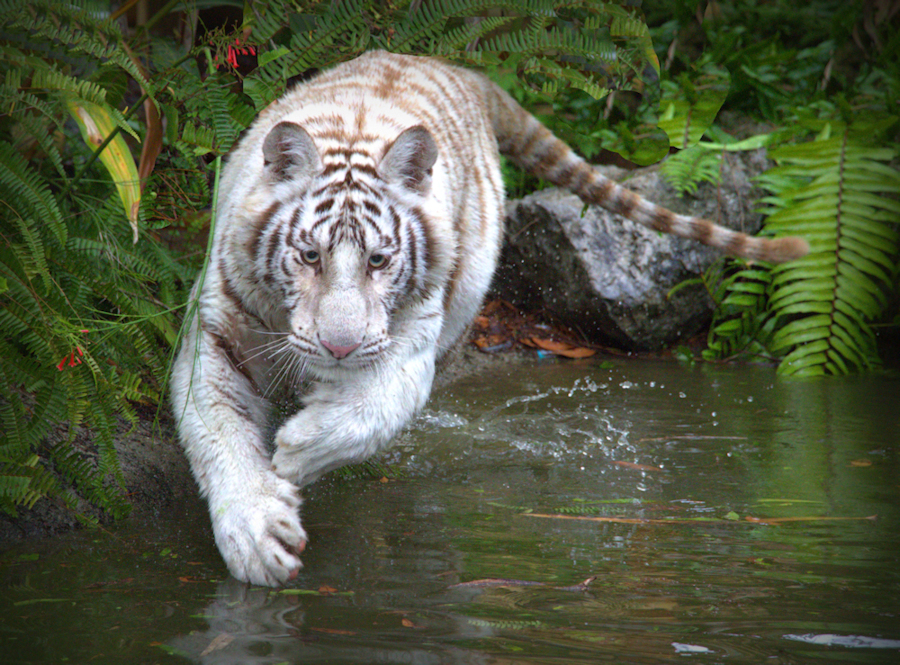
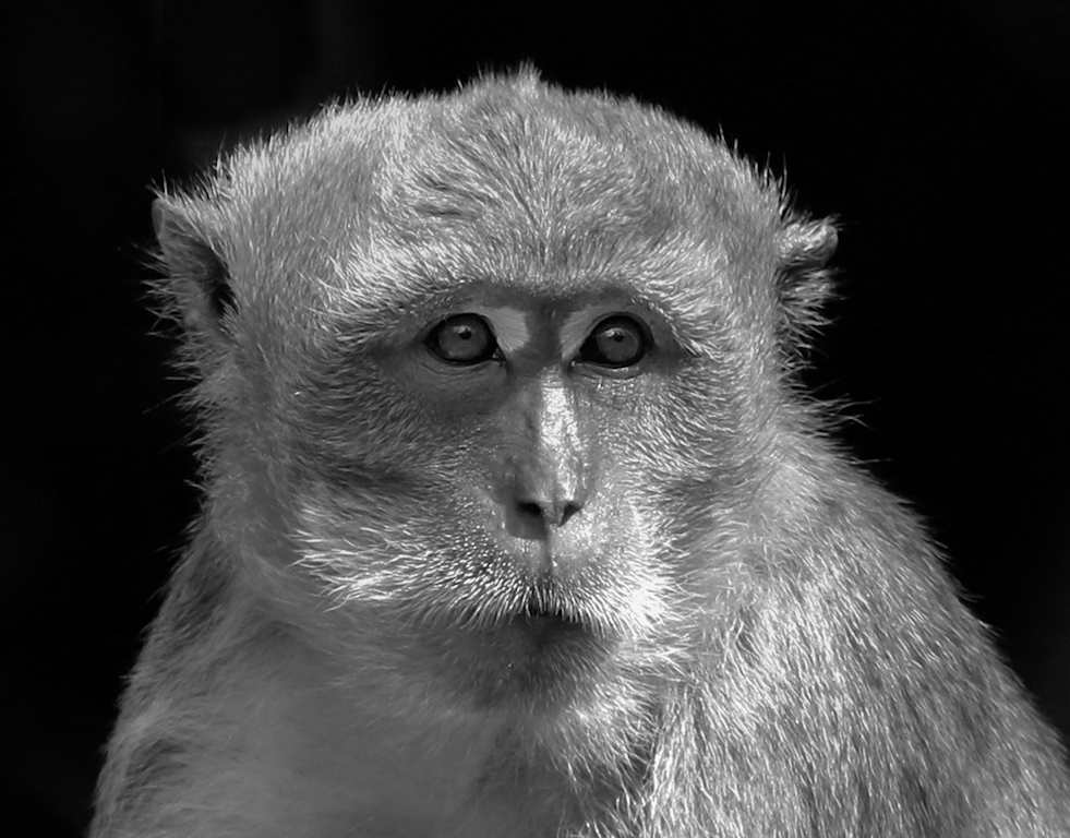
A wonderful pose and beautifully treated background. I agree with the others that the black & white presentation is best but disagree that the paws should be cut off to hide the surface. While concrete is not the best base, perhaps cloning some grass into its place might be a remedy. Also, removing the dark grey rock from the right side might be an improvement. One more thing, the image is not pure B&W, there is a green tinge to it. Otherwise, a nice job. |
Dec 11th |
| 2 |
Dec 17 |
Reply |
Thanks, Shirley. My freezer was actually warmer than the outside temperature in Florida yesterday.
|
Dec 11th |
| 2 |
Dec 17 |
Reply |
You are safe - you might not fit into my freezer. |
Dec 11th |
5 comments - 3 replies for Group 2
|
5 comments - 3 replies Total
|