|
| Group |
Round |
C/R |
Comment |
Date |
Image |
| 2 |
Feb 17 |
Comment |
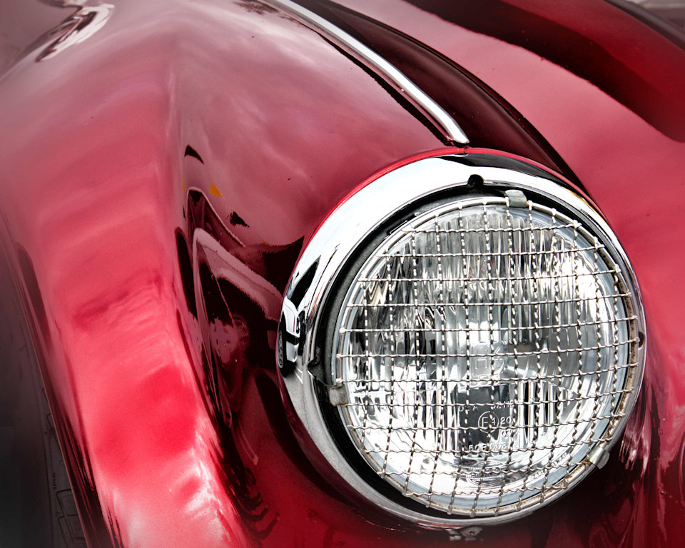
Good clarity, nice line made by the hood ornament (I believe you, Gary). It is depressing from the standpoint that the image suggests a crashing plane. On that note, I think that there should be more space on the left and less on the right since that is the "direction of travel" suggested by the artwork. One more note: in some clubs, artwork on its own is not considered competition-worthy. |
Feb 22nd |
| 2 |
Feb 17 |
Comment |
I agree fully with Shirley! That's a winner. |
Feb 19th |
| 2 |
Feb 17 |
Comment |
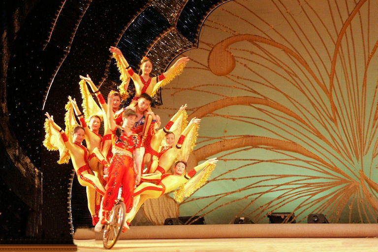
Well captured dancer with an interesting effect. The light that comes from the left forms a shadow of the dancer's face on her arm. Quite unusual and effective. The composition is perfect and it is just a beautiful shot. |
Feb 14th |
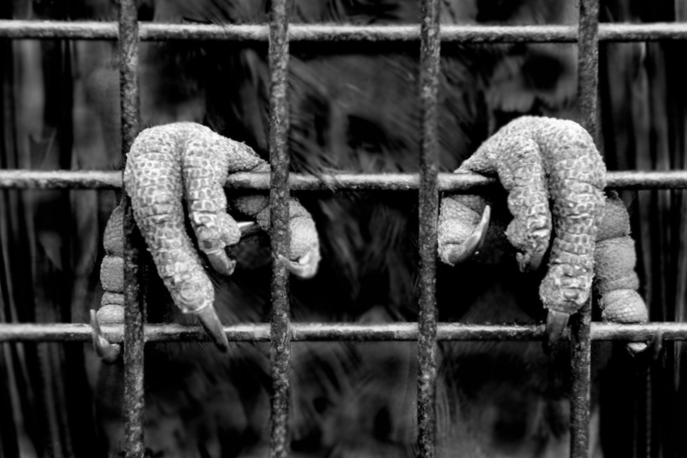
| 2 |
Feb 17 |
Comment |
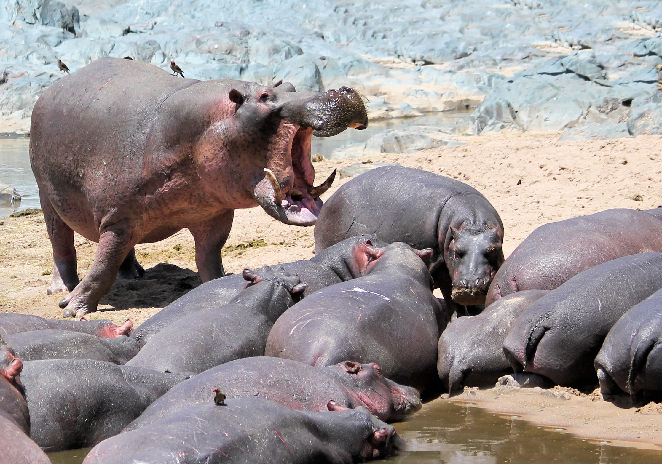
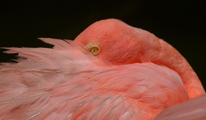
The capture of the birds at that point in time was excellent. I love the pose of the birds but I agree with Gary about the 'pop' factor. I also would have liked to see the color shot which may have popped the birds somewhat. A minor point - perhaps clone out the two branches under the left-hand bird to make its legs more distinct. But an otherwise beautiful nature image. |
Feb 13th |
| 2 |
Feb 17 |
Comment |
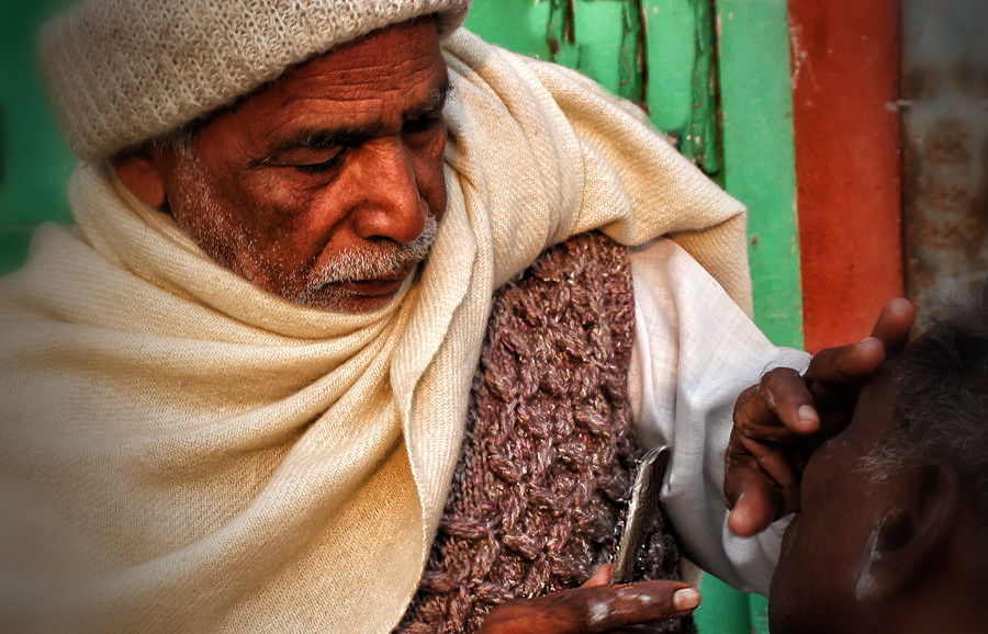
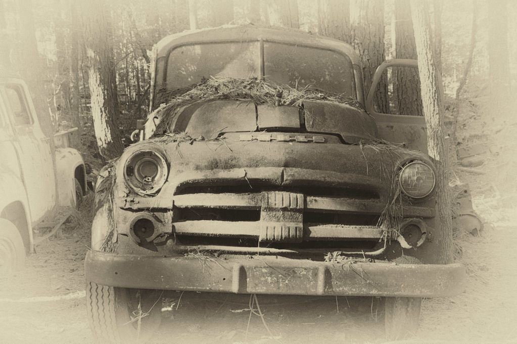
Gary: I can see what you have attempted to portray. However, the foreground is far too cluttered and I have a hard time trying to understand whether the center of interest is the machinery or the boat. Perhaps some cropping of the bottom and right side along with softening of the foreground might place greater emphasis on the boat. My comments appear to be similar to those of Al who posted his comments while I was writing. |
Feb 13th |
| 2 |
Feb 17 |
Comment |
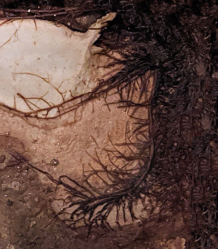
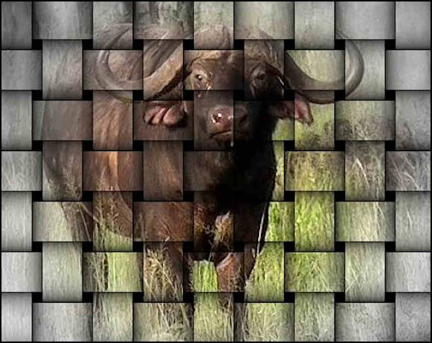
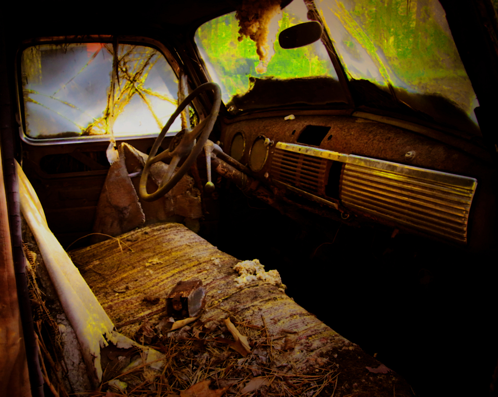
Al: Beautiful almost abstract image as Gary mentioned. That is its strength but also its downfall, in my opinion. I initially stared at the image and it took me a while to understand what it is. Without the title, almost impossible for me. There is not an easily identifiable center of interest and the eye is drawn everywhere there is a light surface, which is everywhere. Also, the dark water stains (?) top center could be mistaken for a defect in the photo. I would tone down the light surfaces in the rock faces, which would then allow the light floor and cave exit to predominate. |
Feb 13th |
| 2 |
Feb 17 |
Comment |
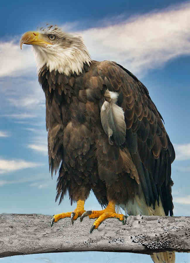
I think that the composition of the image is wonderful and I don't see that clouds would have added anything but possible distractions from the bird. I can easily see that, from the lighting, that the shot was taken with a low sun - to its credit. On the downside, focus is a problem with the wing feathers not being sharp. I understand that this may stem from the ISO, etc. and it is unfortunate with such a great composition. Otherwise, nicely processed with an interesting border. |
Feb 13th |
| 2 |
Feb 17 |
Reply |
Thanks, Shirley. Very nice analysis and I take your point about the light spot. |
Feb 12th |
7 comments - 1 reply for Group 2
|
| 69 |
Feb 17 |
Reply |
Nailed it! (Harry Stuart, visitor from Group 02) |
Feb 23rd |
0 comments - 1 reply for Group 69
|
7 comments - 2 replies Total
|