|
| Group |
Round |
C/R |
Comment |
Date |
Image |
| 41 |
Jun 24 |
Reply |
Tom, Many thanks for your kind words which are much appreciated. Taking risks are what make photography so exciting. |
Jun 29th |
| 41 |
Jun 24 |
Comment |
Nadia, I wonder if the visual storyline would be stronger if one of the rectangular doors (perhaps the one on the left) had been slightly ajar. This could have been achieved via the Transform Warp/Distort Tool which would invite the viewer to step through the doorway into the landscape beyond. |
Jun 18th |
| 41 |
Jun 24 |
Reply |
Nadia, Thank you for your kind words which are much appreciated. When I was constructing the image, I decided to remove the stem but on reflection I may have been wiser to have left it in. I suppose at the time, I wanted to create a sense of isolation and reaching out (literally); having space around the shadow hand seemed to gel with what I was trying to achieve. Clearly, there are many different ways to tell the same story. |
Jun 18th |
| 41 |
Jun 24 |
Comment |
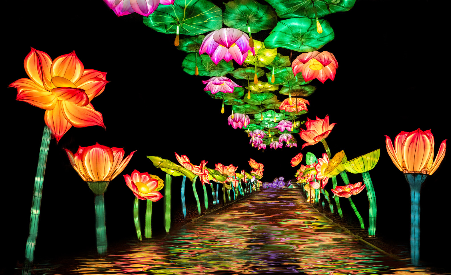
Lisa, I have always been a fan of the old Flood Filter and therefore it will come as no surprise that I am drawn to your image. I like the dichotomy between the random shapes and patterns of the pseudo water effect of the roadway and the analogue sharpness of the avenue of flowers. My favourite part of your image is the strip of flowers at the top of the frame. I feel that the image would have more impact in a panorama format to emphasize the sharper elements in the picture. I have attached a version to show what I mean. |
Jun 11th |
 |
| 41 |
Jun 24 |
Comment |
Nadia, The spaces between the trees in your Original 2 are crying out for something to be imported into them and the doors in your Original 3 provide a perfect match. There is a mystery and intrigue to this composite which is very appealing and I like the way that it mirrors the life choices that we have to make. I wondered whether the impact would be increased if we could not see the landscape in the background between the doors. This is very much a symmetrical image with three elements in it to create a good visual triangle of interest. I particularly like the way that the lantern above the central door throws its golden light on the ground. |
Jun 11th |
| 41 |
Jun 24 |
Comment |
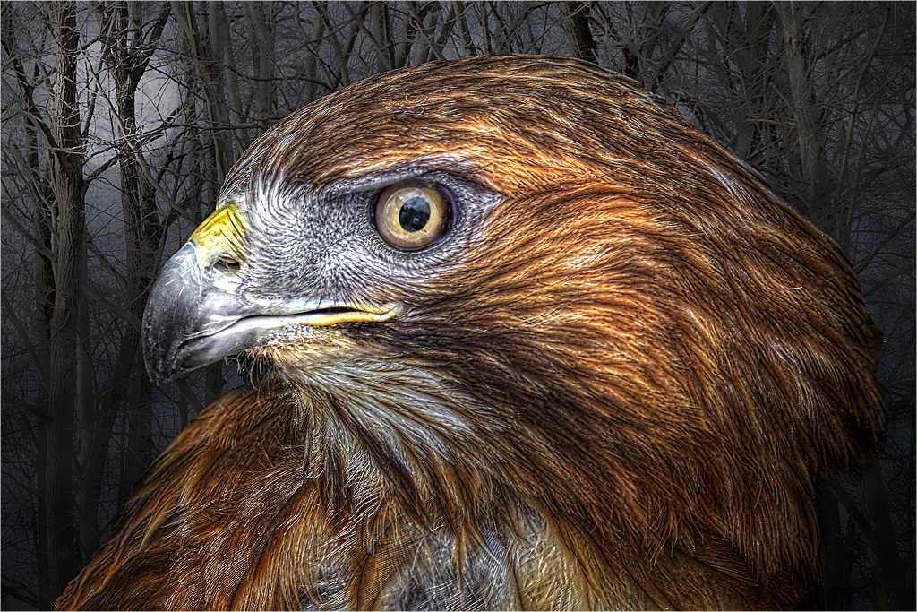
Tom, This is a departure from what I have come to know as your normal style of work. Having said that, I quite like this image. I like the way you have cropped tightly onto the raptor and combined it with a selection of the woodland. The change of sun to pseudo moon works well and enhances the overall visual story. It is a pity that the imported eye has not filled the eye space as we can still see some of the original. I would have been inclined at that stage to have rotated the new eye 45 degrees clockwise. Overall, I feel that the image is slightly under-exposed and a touch darker than ideal; perhaps that was your intention. Equally, the main issue I have is that the bird is a bit on the soft side. I have taken the liberty in the version below to tweak the exposure in Levels and to sharpen the image in Unsharp Mask. |
Jun 11th |
 |
| 41 |
Jun 24 |
Comment |
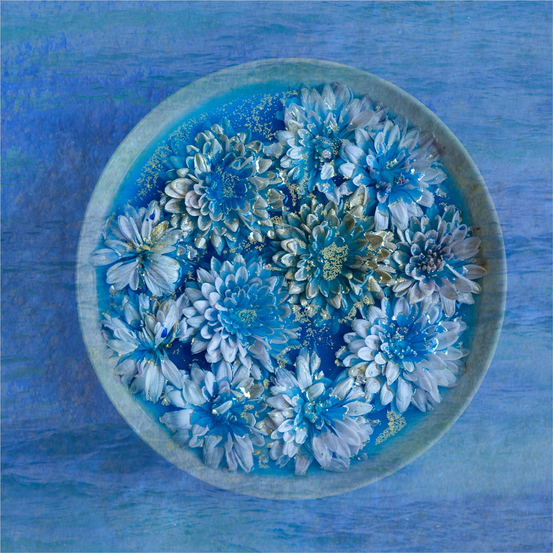
Hazel, I like your pre-visualisation of this image and your desire to create a storyline of flowers submerged in blue water. Your addition of the sea texture overlay has worked well for me as has the sprinkling of the powdered gold paint; blue and yellow/gold is an excellent combination on your colour palette. I have a slight issue with the vertical flow of the sea overlay; I would have preferred a horizontal flow. To show what I mean, I rotated the image 90 degrees clockwise and then flipped it vertically per version below. |
Jun 11th |
 |
| 41 |
Jun 24 |
Comment |
Brad, There is a visual disconnect in your image which I quite like. The castle wall and steps provide a good theatre backdrop against which your son is performing. I like the way that your son's legs and feet are facing forward towards the viewer yet his upper body appears to be facing away from the viewer and towards the wall. This illusion could have been enhanced further if his hands were tucked into his pockets with his fingers facing backwards. I am not sure whether the dog adds to the story and I would be happier without it. As far as a title is concerned, I offer the following: <Decisions, Decisions>, <Two Paces Forward, One Pace Back>, <They Don't Make Tops Like They Used To>, <Am I Coming Or Going?>. |
Jun 11th |
| 41 |
Jun 24 |
Reply |
Brad, Thank you for your kind words which are much appreciated. I wanted to have three elements in the image to help create a good visual triangle of interest. At the time, I wasn't too sure about the vignette but I wanted to create an added sense of mystery so I left it in. The thin line around the flower was deliberately chosen as I wanted to add a sense of clarity and crispness to the flower. |
Jun 11th |
6 comments - 3 replies for Group 41
|
6 comments - 3 replies Total
|


