|
| Group |
Round |
C/R |
Comment |
Date |
Image |
| 41 |
Aug 23 |
Comment |
Nadia, Forgive me but I meant to echo Tom's congratulations on your PSA Gold and HM in the Annual PSA Exhibition. Well done. |
Aug 29th |
| 41 |
Aug 23 |
Comment |
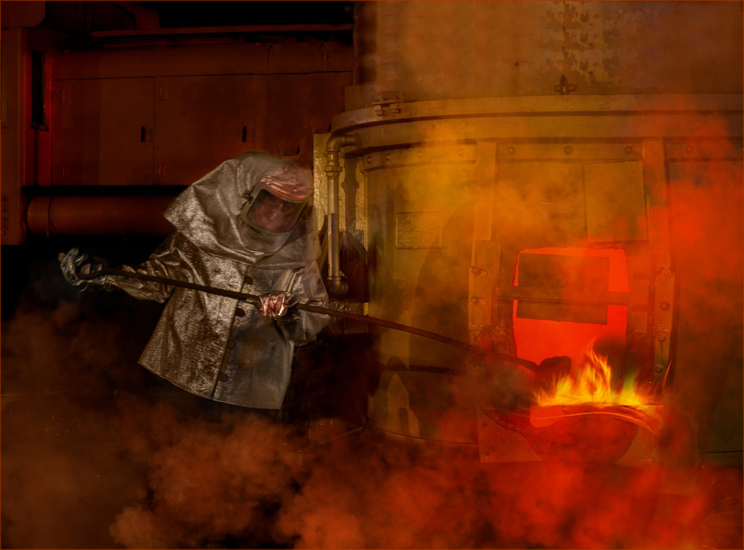
Lisa, This is a very dramatic and atmospheric composite, the visual story of which is enhanced by the warm colour palette, the left-to-right visual flow through the image and addition of the smoke. The flow of molten ore doesn't quite work for me as it looks a bit artificial and as though it has been pasted on. Therefore, I would be inclined to clone out the molten ore at the top left of the pouring, add some smoke in that area to create the illusion that it is actually pouring out of the kiln door and clone out most of the actual ore. See below. |
Aug 29th |
 |
| 41 |
Aug 23 |
Comment |
Nadia, Many years ago we had a holiday in Sydney and Tasmania. One day, while walking back to our friend's house in Sydney, we passed a junk shop and in the window was an oil painting by Lee Miller of 'One Tree Hotel' on the road between Hay, Hell and Booligal. Needless to say, we fell in love with it and bought it on the spot. It now hangs proudly on our lounge wall. I am reminded of that painting when I look at your image. You have given us a very busy composite this month and for me that is its undoing. As a staunch advocate of the old adage 'Less is More', I would be inclined to lose the lightning, the eagle and the chicken. This would make a much stronger image with the emphasis centred wholly on loneliness with the chap sat on his front porch and totally lost in his memories. I like the way that you have lost the brick wall on the left and the irrigation system on the right, and inserted the landscape in their place. Compositionally, the house and man are off-centre left which adds to the overall visual dynamic, and the lower bough of the tree points us to the house and introduces circularity within the image. I agree with the others that the chicken is a bit of a distraction and being the brightest part of the picture, tends to draw the eye.
|
Aug 29th |
| 41 |
Aug 23 |
Comment |
Tom, I meant to echo Nadia's congratulations on your success at the PSA Pictorial Competition. Well done. |
Aug 29th |
| 41 |
Aug 23 |
Comment |
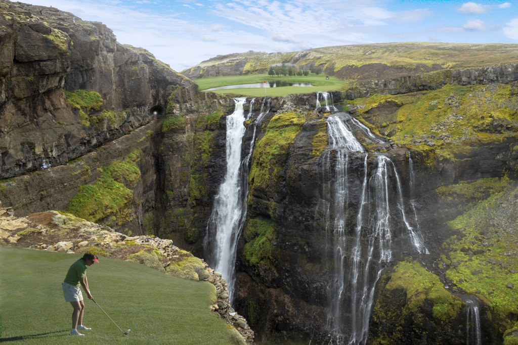
Tom, This is a fun image with much in it to occupy the viewer's attention. One wonders how many golf balls didn't make the green and were carried away on the waterfall. The elements in the landscape provide the theatre backdrop against which the player performs. They are perfectly placed to maximise the compositional strength of the image. The graduation of tones throughout the image and the lighter distant hills enhances the depth to the picture. I like your addition of the golf buggy and tunnel through the mountain which creates the visual journey to the green where we see the red flag above the hole. The bunker in the lower right-hand corner is a little distracting and needs to be toned down, cloned out or cropped out; see below. I tweaked the exposure of the sky and then flipped the image horizontally. This version is more appealing to me as the partial shadow provides a good lead-in line and the left-to-right visual flow through the image is enhanced. |
Aug 27th |
 |
| 41 |
Aug 23 |
Comment |
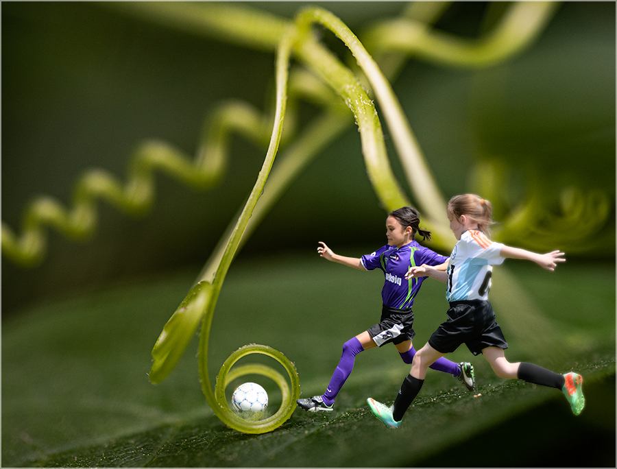
Brad, Firstly my apologies to you and the group for not submitting an image this month. It has been a busy time for us and often I have not been sure which way is up. However, I will try to do better 'next term'. I like your image. My vote goes to two players as it increases the overall dynamic and adds a visual tension to the image. I find your daughters and the ball rather central in the frame and therefore I would be inclined to crop a little off the right-hand-side as below. The added advantage of this is that you lose the distracting red area on the right, presumably an artefact from pasting in the single player with the red gear. I agree with the others that the addition of a shadow is desirable but in your iteration, it doesn't quite work for me as I find them a touch heavy and I wonder about their direction. |
Aug 27th |
 |
6 comments - 0 replies for Group 41
|
6 comments - 0 replies Total
|


