|
| Group |
Round |
C/R |
Comment |
Date |
Image |
| 41 |
Jul 23 |
Reply |
Bev, I have an old CanoScan 2700F which I used to use for scanning negatives and transparencies. I bought it for �528-00 way back when I was running Windows 95. Unfortunately, it uses a SCSI connector which was fine when I had my tower PC but there is no SCSI port on my current laptop. Needless to say, I haven't used it in ages. However, I am currently pursuing the possibility of using a SCSI-to-USB serial connection which will allow me to access the thousands of slides that are currently gathering dust. |
Jul 18th |
| 41 |
Jul 23 |
Comment |
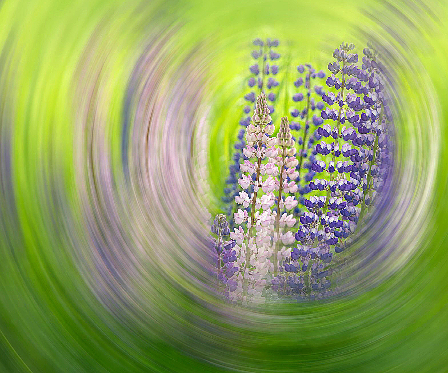
Lisa, I like the limited colour palette and the blend of ICM and slow shutter speed. You have created the impression that we are looking through a swirling tube at the flowers beyond. The lupins have been placed rather centrally in the frame which makes for a visually static image despite the obvious movement created in-camera. In order to improve the overall visual dynamic, on off-centre placement of the main subject usually works. In the attached iteration, I have cropped more tightly onto the lupins, placed them off-centre to the right and added some sharpness to the overall result. This seems to make the lupins stand out even more. |
Jul 18th |
 |
| 41 |
Jul 23 |
Comment |
Tom, I warm to the fact that you are exploring other genres which allows us to discover another dimension of your photographic make-up. This a very busy image with much in it to interest the viewer. I would argue that perhaps a less complicated structure with fewer elements in it would have greater impact. Perhaps the first place to start would be to have much less on the table; a case here for 'Less is More'. Given the title, I like the way that the lighting on the foreground subject is subdued as he wants to blend into the shadows and doesn't want to be seen. I sense that the troops are not actually engaged in battle but perhaps regrouping in readiness for the next onslaught. Overall, I would see this image as 'Work in progress'. |
Jul 18th |
| 41 |
Jul 23 |
Reply |
Hazel, Many thanks for your kind words which are much appreciated. Overall, I quite like the granularity and general lack of definition which accords well with the vibes of the cold war. See my reply to Brad above. |
Jul 18th |
| 41 |
Jul 23 |
Reply |
Bev, Many thanks for your suggestion which I quite like. See my reply to Brad above. |
Jul 18th |
| 41 |
Jul 23 |
Reply |
Brad, Many thanks for your comments which are much appreciated. I normally add an original but in this case I couldn't find it in my filing system; I suspect it may have been a colour transparency and at present I don't have a slide scanner ... but that may change! I take your point about making the foreground figure stand out more with increased contrast (see Bev's iteration below). I was trying not to give him any specific identity and to make him blend more into the background in order to retain his anonymity. |
Jul 18th |
| 41 |
Jul 23 |
Comment |
Hazel, I quite like this version which has been Flipped Horizontal. |
Jul 18th |
 |
| 41 |
Jul 23 |
Comment |
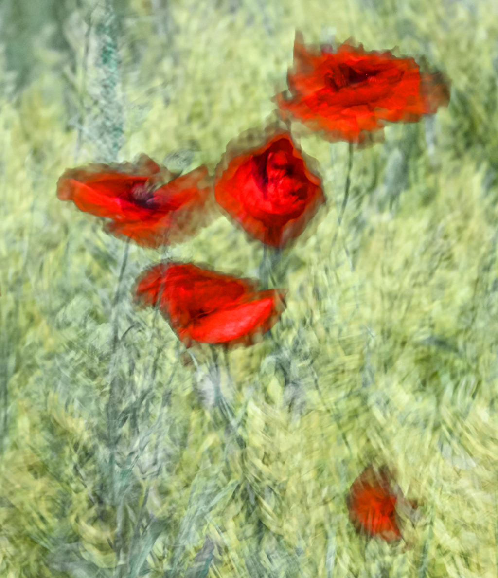
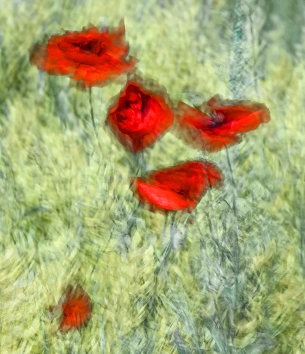
Hazel, I have always been a sucker for Artistic Filter effects and Intentional Camera Movement. I don't want to get all the visual messages in one go but much prefer to be drawn in to an image and then to engage with it. Your image ticks those boxes for me. Compositionally, I like the arrangement of the poppies within the frame and particularly the lone poppy that has broken away from the group. It's a personal thing but I am less happy with the soft-focus empty space at the top quarter of the frame which tends to draw the eyes away from the lovely textures in the lower three-quarters of the image. For information, I have attached another version where I have Cropped to almost square and played around with the Hue/Saturation on the green and red channels. In this version, I quite like the contrast coming through in the more subdued steely blues. |
Jul 18th |
 |
| 41 |
Jul 23 |
Comment |
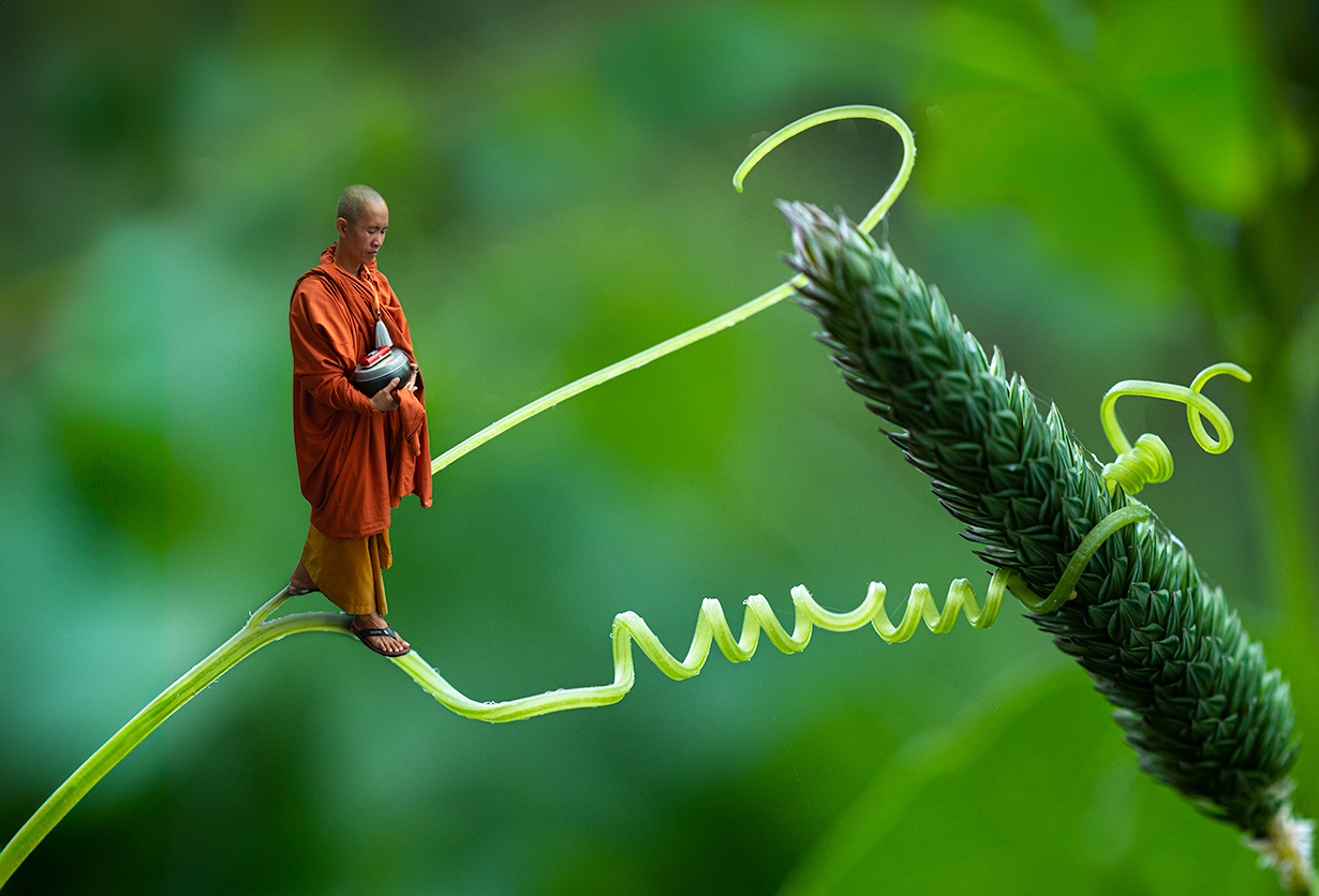
Brad, I like the way that you were thinking outside-the-box to create an image that works well at different levels; the visual message is superb. You have portrayed the Buddhist monk at a crossroads in his journey and illustrated how he has chosen to follow the more difficult route to his objective, which accords well with his religious beliefs. Removal of his name tag and replacement with a more appropriate tassel works well. Photographically, changing the orientation of the monk works well and enhances the left-to-right visual flow through the image. However, I find distracting the leaf edges at the bottom of the frame and the brighter elements in the background. I have attached a tweaked version where I have cropped more tightly onto the subject and cloned out the distractions. This version is much stronger, at least for me. |
Jul 18th |
 |
5 comments - 4 replies for Group 41
|
5 comments - 4 replies Total
|


