|
| Group |
Round |
C/R |
Comment |
Date |
Image |
| 41 |
Mar 23 |
Reply |
Lisa, Thank you for your kind words; much appreciated. I have never before been called a true Renaissance man which is a label I will treasure and wear with pride. Thank you for the link which makes interesting reading; clearly the notion of unlucky numbers is culture-specific. |
Mar 26th |
| 41 |
Mar 23 |
Reply |
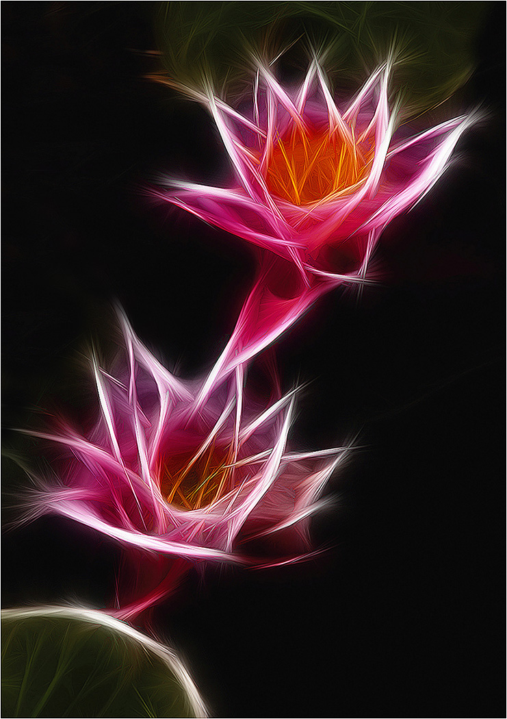
Nadia, Thank you for your kind words which are much appreciated. Glad you liked the image. I particularly like the way that the colours of the flowers pop forward out of the black background. |
Mar 26th |
| 41 |
Mar 23 |
Reply |
Lisa, Thank you for your kind words which are much appreciated. Glad you liked the image. I hadn't realized how the stray white lines on the left-hand side were so dominant and took your eyes out of the frame. Once seen, they cannot be ignored. I have removed them and the image is the better for it. I hope you enjoy your return to Fractalius. |
Mar 26th |
 |
| 41 |
Mar 23 |
Reply |
Hi Brad, I agree with Tom that Lisa's version works better. Having seen this variation, I particularly like the absence of converging verticals, removal of the bright lines and greater emphasis on monochrome. |
Mar 26th |
| 41 |
Mar 23 |
Reply |
Henry, The official website for Fractalius is <redfieldplugins.com>. Also <cnet.com> is worth a look. Try typing 'Fractalius' into Google/You Tube. There are a lot of sites out there. |
Mar 14th |
| 41 |
Mar 23 |
Reply |
Brad, Thank you for your kind words which are much appreciated. I have always loved the Fractalius filter and cannot understand why anyone could not. However, it is very much a Marmite option; you either love it or hate it. At the time of creating the image, I thought it was important to anchor the two lilies in the pseudo reality of the green base. I also wanted to have three elements in the composition to create the visual triangle of interest. |
Mar 12th |
| 41 |
Mar 23 |
Reply |
Brad, Isn't that interesting, I didn't even see what could be construed as horns coming out of Tom's head. However, once seen, they cannot be ignored. |
Mar 12th |
| 41 |
Mar 23 |
Reply |
Henry, There is no right or wrong way in photography. Being an art form where we paint with light, they are all right for the photographer, artist, time and/or place. It is good that you still like your version for the reason you have given, which is right for you. |
Mar 10th |
| 41 |
Mar 23 |
Reply |
Hazel, Thank you for your kind words which are much appreciated. Fractalius is a Plug-In Filter but I understand that a similar, and arguably superior, effect is available in Topaz but I don't know which one as I don't have it. Perhaps someone else in the group can help. |
Mar 10th |
| 41 |
Mar 23 |
Comment |
Hazel, Your Original image reminds me of a patchwork blanket, dare I say, a Welsh blanket. I see this overlaying a double bed with the two pillows at the top. I like the geometric shapes, the fact that they are all different, the way you have overlapped them and the soft muted colour palette you have used which adds to the overall visual aesthetic of your composite. The way you have imported the pyramid of roses in a 3-2-1 pattern works well. I particularly like the way that the stem of the bottom central rose appears to pierce the shape beneath it and I wanted to see more of that effect. Well done. |
Mar 10th |
| 41 |
Mar 23 |
Comment |
Lisa, There is a lovely, tactile quality to this image which I like very much. I am reminded of the Fibonacci Sequence of numbers which describes a growth pattern in Nature, is seen in many natural phenomena, can be heard in music and is connected to the Golden Ratio in works of art. Not only have you created this Nautilus shell type of effect with the flowers but also you have doubled the effect, rotated one and positioned it in such a way that the two groups of flowers appear to be embracing and engaged in a visual dialogue with one another. I hope you are not superstitious but you have created an unlucky number thirteen of the circular repetitions. Congratulations and well done. |
Mar 7th |
| 41 |
Mar 23 |
Comment |
Nadia, I love the windy, soft texture and superb lighting that you have created on the bondu and the stormy strength of the clouds. These provide the backdrop against which the tree and pizza are performing. Your pre-visualisation through execution to completion is an exemplar to us all. The idea of a tree eating the food waste humans throw away is excellent. The mouth you have created from the tree canopy, open and ready to devour the pizza is both illustrative and cartoon-like. The colour saturation of the tree foliage and trunk adds to the richness of the visual story. I am not sure whether the discards (presumably pizza boxes) at the base of the tree need to be included. Being the brightest part of the image, it does draw my eye away from main story of the tree about to chomp on the pizza. Congratulations and very well done. |
Mar 7th |
| 41 |
Mar 23 |
Comment |
|
Mar 7th |
 |
| 41 |
Mar 23 |
Comment |
|
Mar 7th |
 |
| 41 |
Mar 23 |
Comment |
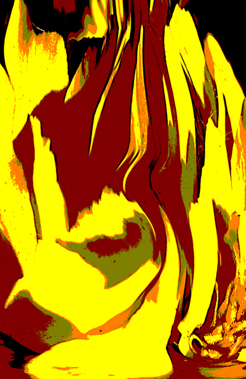
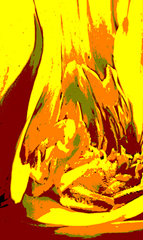
Henry, This is one of those images that reminds me of a Giles cartoon; the more I look, the more I see. Equally, it also makes me think of a Rorschach Ink Blot test used to examine an individual's personality characteristics and emotional functioning. Looking at your image would suggest that I am totally dysfunctional! One of the main issues I have is that it is very busy and arguably there is too much in it, with no obvious focal point. Perhaps it needs less visual stimuli to avoid saturating the senses. There are many areas of your picture that I am drawn to, two of which are shown below to provide a flavour of what I mean. In these iterations, I have cropped onto areas of interest and/or flipped horizontally/vertically. The limited palette from the warmer end of the colour spectrum works well. |
Mar 7th |
| 41 |
Mar 23 |
Comment |
Brad, I like the granularity of the trees in the forest which sets the scene, against which the cruciform figure is ascending. The converging verticals of the tree-tops reinforces the overall upward trajectory of the visual story you have created. However, I am afraid it doesn't quite work for me. My main reservation is the dichotomy between the softness of the overall scene and the harsh sharpness of the light painting which doesn't seem to gel with the background. Perhaps that was your intention which of course is fine. I wondered whether the image would work better if this light was a little softer and more diffused, in keeping with and blending more into the background. |
Mar 7th |
| 41 |
Mar 23 |
Reply |
Angela, Many thanks for your kind thoughts; much appreciated. Glad you liked the image. |
Mar 7th |
| 41 |
Mar 23 |
Reply |
Hi Tom, Many thanks. Much appreciated. |
Mar 2nd |
| 41 |
Mar 23 |
Comment |
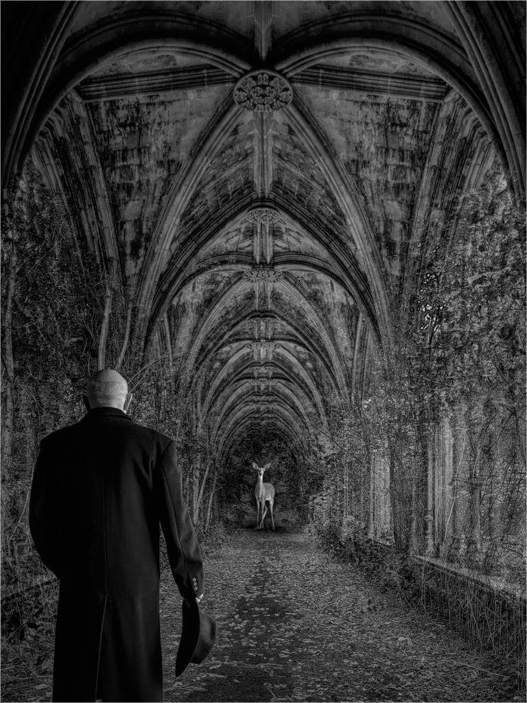
Tom, I warm to all the academic metaphors and interpretation in the 'ChatGPT' description of your image and I can see the spirituality, connection, introspection and contemplation in the image itself. Technically, I like the way that you have reduced to mid-range, the tonality of the combined cloister and woodland which acts as the theatre backdrop against which the figure front-right and the deer mid-distance can perform and are dominant in the frame. Your dark-toned coat helps to isolate your light-toned head and the similarly light-toned deer which emphasizes the bond between you. As you know from my previous critiques, I am a left-to-right visual flow person and for me the image works better when flipped horizontally (see below). In this orientation, at least for me, the lead-in lines and visual aesthetic are stronger. I am more conscious that the figure (ie your good self) poses no threat to the deer and is trying to communicate with it, a fact that is reinforced by the fact that you have removed your hat and you are not carrying a weapon in what is now your right hand. In this version, I have stroked a white line around the image to prevent bleed-over top left/right into what could be a black background. |
Mar 2nd |
 |
8 comments - 11 replies for Group 41
|
8 comments - 11 replies Total
|


