|
| Group |
Round |
C/R |
Comment |
Date |
Image |
| 18 |
Jan 23 |
Reply |
Joan, I hope you are keeping well and enjoying life in the fast lane of SG18. I like the changes you have made to Ian's image which has added a new energy to the picture. As you know from our time in SG21, I am a fan of distortion. |
Jan 25th |
| 18 |
Jan 23 |
Comment |
Ian, I am always interested in what we see in images and how we interpret them. I would agree with your title as the time is 'Ten to Two'. Andrew is correct that the image needs to be straightened horizontally for maximum visual impact. The strength of this pattern picture for me is your addition of the red lines which makes it pop out of the black background. Strangely, when I look at your image, I am reminded of the Metropolitan Police Force. Grateful if you could contact me on my home email address (brianswinyard@btinternet.com) as I need to ask you something? |
Jan 25th |
1 comment - 1 reply for Group 18
|
| 41 |
Jan 23 |
Reply |
Nadia, In view of the comments about lighting, I wondered what the image would look like if we removed the moon. Put your thumb over it to see the effect. It works for me. Suddenly, the birds have a much stronger role in the image. |
Jan 31st |
| 41 |
Jan 23 |
Reply |
Nadia, Thank you for your kind words which are much appreciated. |
Jan 29th |
| 41 |
Jan 23 |
Reply |
Tom, Thank you for your kind words which are much appreciated. |
Jan 24th |
| 41 |
Jan 23 |
Reply |
Henry, I can understand your pre-visualization of the message you were trying to portray but I found that your choice of this particular couple 'detracted from' rather than 'reinforced' your visual story. I was reminded of one of my images entitled 'Nuclear Holocaust' which has a strong sense of confusion and chaos, which I believe is needed in your image to emphasize the point. It is a triple sandwich of images of Hong Kong, Honolulu and Chernobyl, reduced to monochrome with a Smudge Stick run through the composite. I have attached this below for your information. |
Jan 23rd |
 |
| 41 |
Jan 23 |
Reply |
Brad, Whenever you place your subject centrally in the frame, it makes for a visually static picture. In other words, the space in front of and behind your subject is the same and therefore the viewer is unsure of whether the subject is moving 'into' or 'out of' the frame. Ideally, we should always aim for the former. It is always a good idea not to have light tones on the edge of the frame whenever possible as this draws our attention and takes the eye out of the frame. I have attached a Cropped version below to show what I mean. |
Jan 23rd |
 |
| 41 |
Jan 23 |
Reply |
Hazel, Thank you for your kind words which are much appreciated. It is indeed good that we are back in the same group having been relocated from SG21. |
Jan 13th |
| 41 |
Jan 23 |
Reply |
Henry, Thank you for your kind words which are much appreciated. I always like to play around with something new as you never know what is likely to emerge and it is good to visually illustrate the journey that you have made. |
Jan 13th |
| 41 |
Jan 23 |
Reply |
Brad, Thank you for your kind words which are much appreciated. Dahlias are wonderful flowers with such a variety of shape and configuration. If I remember correctly, the rim of framing colouring was a Drop Shadow I added to try to create a sense of elevation and added depth. It is interesting now that you have pointed it out, how my eyes keep wandering back to it. |
Jan 13th |
| 41 |
Jan 23 |
Comment |
Lisa, I love what you have achieved with your image and I am always drawn to creations where I haven't got a clue what I am looking at; this is one of those occasions. I like the way that your submission this month is like an alien bat emerging from the darkest depths. I am drawn particularly to the tuft of 'hair' on its triangular-shaped Dalek-like head, the extended chameleon-like eyes, the all-embracing large antennae/feelers and the fiery mouth waiting to devour an unsuspecting prey. I hope you're getting the impression that I quite like your image. Congratulations and well done. |
Jan 13th |
| 41 |
Jan 23 |
Comment |
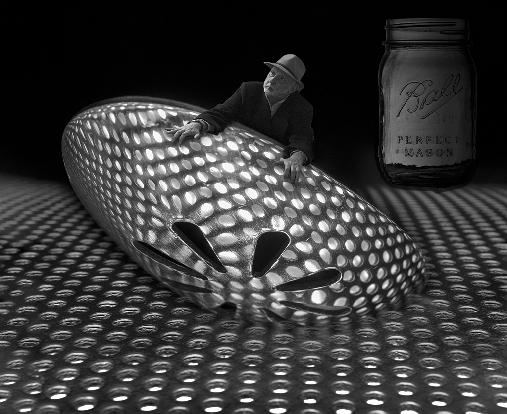
Nadia, The first thing that impressed me about your image was the wonderful range and control of lighting throughout. Your creation of the hole was clearly a labour of love and it is readily apparent that it took a fair bit of time to complete. The end result looks superb with lovely texture and pseudo lichen throughout. The slightly subdued lighting on the hole provides an excellent backdrop against which the players can perform. Placement of the subject is perfect and the strong lighting, together with his red jacket ensure that he remains the focus of attention wherever the viewer's eye wanders around the picture. Similarly, addition of the sky, moon and birds in the background has been well controlled. Overall, this is a lovely image which I like very much. Congratulations and very well done. |
Jan 13th |
| 41 |
Jan 23 |
Reply |
|
Jan 13th |
 |
| 41 |
Jan 23 |
Comment |
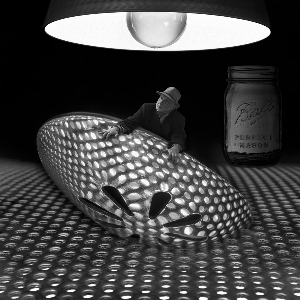
Tom, You have come up with another cracking image which you have developed from pre-conception through to completion. Clearly, you are a conceptual artist with many talents. I love the way that the underlighting shines through the grid to throw patterns on the spoon and your use of scale in the elements you have chosen to create the illusion of Tom in Wonderland. In the few images I have seen of yours since joining the group, it is readily apparent that you have found a photographic formula that works for you; yourself dominant as foreground interest with lead-in lines taking the eye to something of interest in the background. I assume that you are primarily a monochrome worker and this adds to the gravitas of the visual stories you are creating. It is a pity that the light at the top of the frame is the brightest part of the picture and tends to draw the eye away from the wonderful visual storyline below it. Perhaps it needed to be toned down or removed completely per examples below. My preference would be for the latter. |
Jan 13th |
 |
| 41 |
Jan 23 |
Comment |
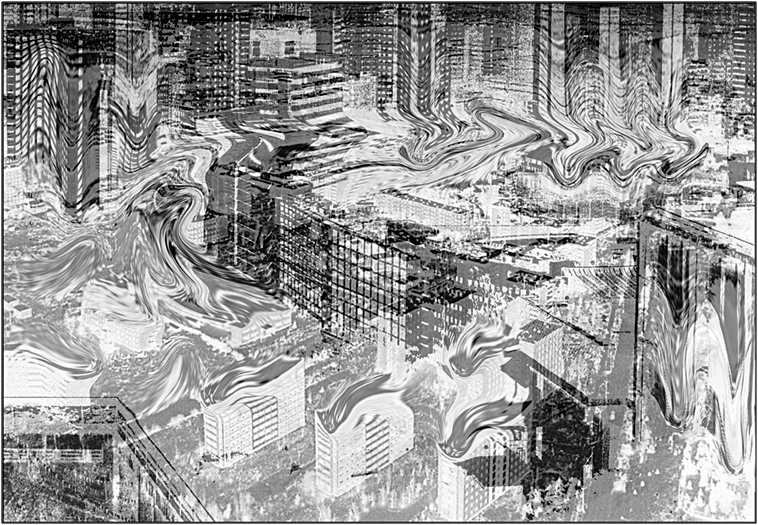
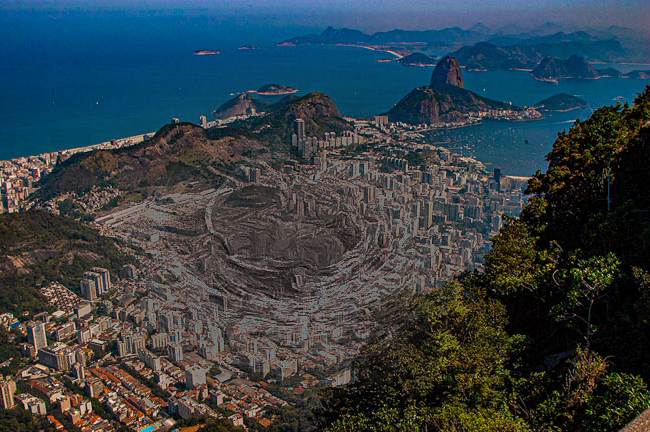
Henry, Your Original images are both quite powerful in their own right with the high vantage point adding to their gravitas. I like your idea of creating a concept image to show how world growth is impacting on natural land and pollution. However, in this case, I am not getting that message as the end result is too clean with overtones of it being a holiday snap. This is further reinforced by the fact that the imported couple are well-dressed and smiling which rather goes against the visual story you are trying to create. I played around with your original image: flipped horizontally, elliptical marquee selection on the central part, changed that to monochrome, then applied polar coordinates, oil paint filter, adjusted colours in channel mixer and then solarized. I wanted to create the illusion that the denuding of the natural world was spreading outwards like a cancer. My resulting iteration looks like a volcano erupting from the city.
|
Jan 13th |
 |
| 41 |
Jan 23 |
Comment |
Hazel, Welcome to SG41 and I am glad that we are once again in the same Study Group. I like the way when presented with a problem that you can find a solution; in this case, picking the flower heads and floating them in water. The advantage of course is that by so doing you have much more control particularly over the composition and colour balance of the final image. I like the technical qualities of your original image but I love the romantic softness of your final version with the tonal changes of the flowers set against the soft-focus background. Well done. |
Jan 12th |
| 41 |
Jan 23 |
Comment |
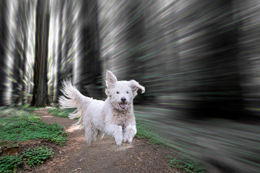
Brad, Your dog looks like a very happy little chappie and the expression on his face is priceless. I like the way that you have created a monochrome background with the motion blur running through it on all but the path. The greenery and the path provide a good foil for the monochrome. I am impressed with the way you have selected your dog, particularly the feathered tail, from the background in Original 2. You have placed your dog rather left-to-right central in the lower frame which makes for a visually static picture despite your dog being airborne. Subconsciously, I wanted to see your dog leaping 'into' the picture. Although there was no shadow beneath your dog in the original, for pictorial reasons, I wanted to see a Drop Shadow in the final version. Our eyes are always drawn to the brightest part of any picture and in this case that point is your white dog. Well done. |
Jan 12th |
6 comments - 9 replies for Group 41
|
7 comments - 10 replies Total
|


