|
| Group |
Round |
C/R |
Comment |
Date |
Image |
| 18 |
Oct 22 |
Reply |
Joan, Thank you for your very kind words which are much appreciated. I too will miss the image critique and banter on SG21. For your information, Barbara has assigned me to SG41 if you ever feel like dropping in. |
Oct 12th |
0 comments - 1 reply for Group 18
|
| 41 |
Oct 22 |
Reply |
Henry, Thank you for your kind comments which are much appreciated. In its construction, I wanted to provide an image that stretched the boundaries visually, perceptually and conceptually. I am quietly pleased that you found it difficult to relate the image to any real-world construct. This might warrant the inclusion of a 'QED' post. Initially, I warmed to the hues of the copper tones and also to the myriad of geometric shapes in the original pictures. Structurally, I felt that the four rectangular shapes connected by the narrow line formed a cohesive whole. In addition to that, I wanted to have the rectangular shape on the right-hand-side divorced from the main body of work yet linked to it by the commonality of tones and patterns of the band of rivets. I wanted to create a tension in the visual story; a sense of togetherness yet separation. I am pleased that you picked up on the fact that all bar one of the outline shapes are portrait format. I sense from your comment 'for some unknown reason' and your bio image that you warm to verticals because you are a tall chap unlike me who is vertically challenged. It is important in study groups such as these that we all stretch our minds to think outside the box and to stretch our perceptions. I hope you enjoy the contemplative moments with this image hanging on a wall in the smallest room of your house. |
Oct 22nd |
| 41 |
Oct 22 |
Comment |
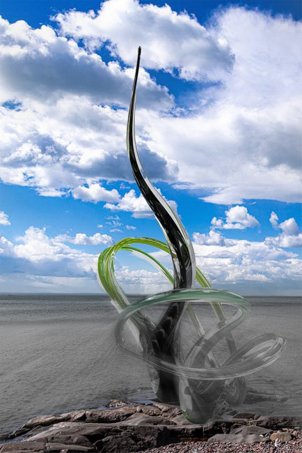
Henry, Alternatively, you might like to leave the colour above and to remove the colour below the horizon line; then add some Radial Zoom Blur centred in the central loop of the glass structure; then Erase the blur from the rocks. This creates the illusion of the finger of glass emerging from the primordial soup and reaching for the riches of the coloured sky, and the monochrome glass changing colour and soaking up the chlorophyl from the environment. Don't you just love photography and digital imaging? |
Oct 11th |
 |
| 41 |
Oct 22 |
Comment |
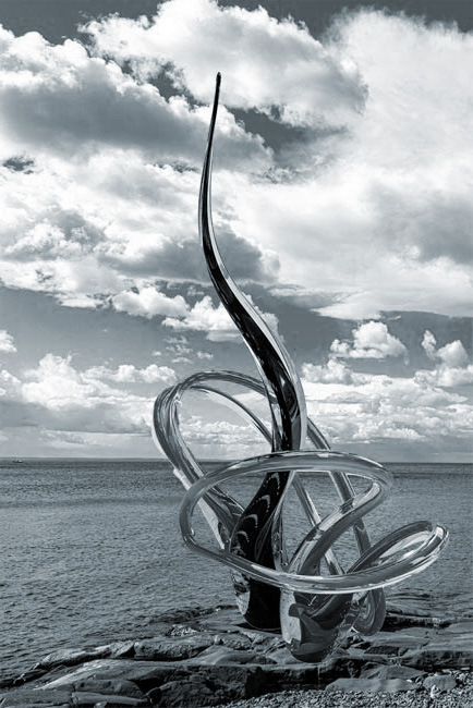
Henry, Whenever you photograph someone else's artwork, it is important that you bring to the frame, something of yourself and in this case, you have done just that. Well done. One of the most important ingredients for me in photography is composition and this image ticks that box. I particularly like the way that the black glass rises centrally, the way that the green glass pulls it off-centre and fills the lower left quadrant, and the way that the horizon line is perfectly placed low in the field of view. I agree with Tom's suggestion to convert to monochrome. Suggest you go a little further to colourize the image a pale blue and flip the image horizontally to make good use of the left-to-right lead-in shapes of the rocks. |
Oct 11th |
 |
| 41 |
Oct 22 |
Comment |
Tom, I have just had a look at your images on 500px. They are stunning. Congratulations and very well done. |
Oct 11th |
| 41 |
Oct 22 |
Reply |
Tom, As an ex Civil Servant, my mantra has always been 'Why use twenty words when you can get away with two hundred?' Your image is very thought-provoking, hence the considered response. I always have difficulty with images that have a foreground element placed centrally in the frame, which causes me to be in a visual quandary. Do I look left or do I look right? In your composite, when you look in either direction, you see similar things; mirror, distortion, man and window. I wanted to break the visual symmetry to make it more visually appealing, at least for me. After all is said and done, there is no right/wrong way in photography. They are all right. |
Oct 11th |
| 41 |
Oct 22 |
Reply |
Tom, Thank you for your kind words which are much appreciated. The addition of drop shadows to some or all of the geometrical shapes would add a greater depth to the composite. |
Oct 11th |
| 41 |
Oct 22 |
Reply |
Angela, Thank you for your kind words which are much appreciated. Glad you liked the image. It is interesting that you picked up on the diagonal 'line' acting as a linking mechanism for the various elements within the picture, which is what I had in mind at the time. |
Oct 8th |
| 41 |
Oct 22 |
Reply |
Julie, Thank you for your kind words which are much appreciated. For me, one of the key ingredients of this approach is to get a good balance between the geometric shapes and I like to think that I have achieved that. The long rod was achieved by making a diagonal selection from Original 2, transforming its scale down to a few pixels wide and then adjusting the Layer stack in Photoshop to create the illusion that it was above the largest image but below the rest. Brad's suggestion of applying drop shadow is a good one. |
Oct 7th |
| 41 |
Oct 22 |
Reply |
Brad, Thank you for your warm welcome to the group. I look forward to many months of photographic discussion with like-minded individuals. Thank you also for your comments which are much appreciated. In photography, it is so important to take, create and produce images for yourself. If our main objective is to please others, then our photography will never improve. The high-key white background in this image is a key ingredient of this approach. I agree with you that the end result feels more artistic than photographic, and that was my intention. I like to stretch the boundaries between the various genres and after all as photographers, we are merely painting with light. I like your suggestion of adding a drop shadow to creat a 3D effect. |
Oct 7th |
| 41 |
Oct 22 |
Comment |
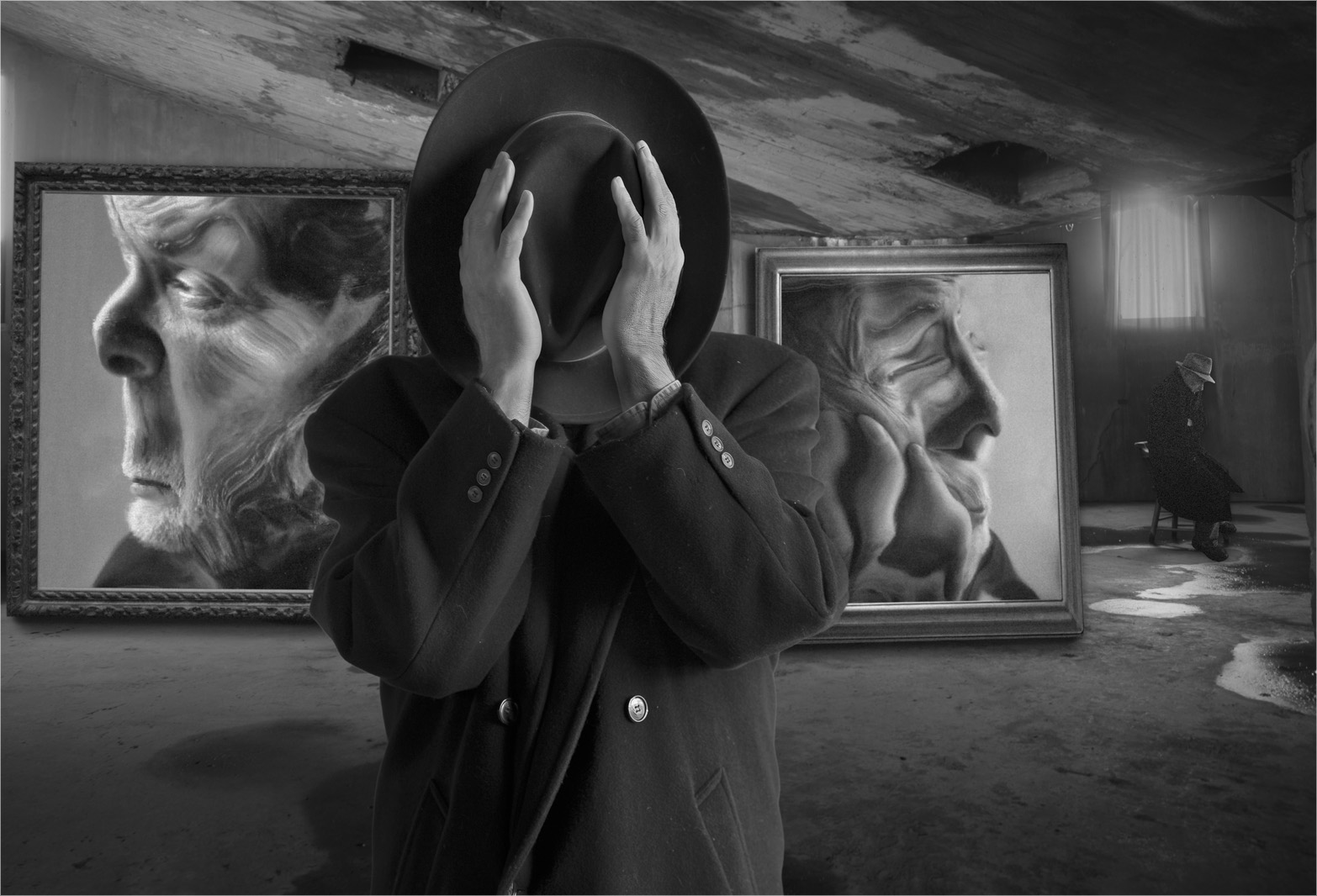
Tom, This is what I would call an academic picture that has a visual story which would not be out of place in a student's dissertation. It poses a visual scenario and encourages the viewer to think about what they are looking at and how the constituent elements relate to each other and complement the whole. Structurally, I like the way that you have placed the anonymous figure as foreground interest and main stimulus for the visual story. The viewer is then encouraged to relate the other elements in the picture and join up the dots. There is a good recession through the picture from the anonymous, blank canvas of the figure in the foreground, through the two distortions of the mind's eye to the reflective figure in the back rear of the room. Compositionally, the central placement of the main figure makes for a visually static image. in order to increase the overall visual dynamic, an off-centre place is preferable. I find the figure on the left a little distracting as he is looking out of the frame and taking the viewer's attention with him. I would prefer not to have this character and to crop him out which would make for a more focussed picture. I have attached such a version below to show a flavour of what I mean. In this version, we travel on a left-to-right visual journey through the picture towards the man in the background and the bright light of the window. Overall, I like the way that your photographic mind works. Well done. |
Oct 6th |
 |
| 41 |
Oct 22 |
Comment |
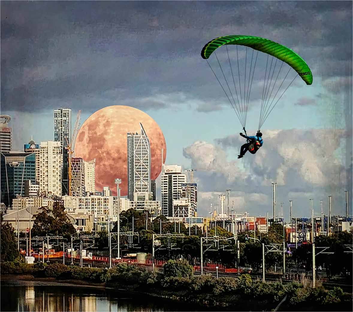
Julie, This was clearly a labour of love in which you have combined the various elements into a composite whole that has a flavour of reality yet it doesn't. The constituent parts are well placed within the frame and all are positioned in their most logical places. Compositionally, the image works well with a myriad of diagonal lead-in lines (the triangular outcrop of rock; the fishermen and their rods; the waterline, the railway line, the overhead gantries; the flight of the glider) all taking our eye towards the moon. Looking at Original 3, you have done well to select the glider from the clouds behind and import him seamlessly into a different sky. As far as titles are concerned, I automatically read 'Parachute Landing - they came, they saw, they conquered'. This is a very busy composite with many individual pictures within it that would stand alone. I find the top two thirds more interesting that the lower third and have copped into this area to show a flavour of what I mean. In this case, the title might be 'Moon Landing' and makes for a much stronger picture. |
Oct 6th |
 |
5 comments - 6 replies for Group 41
|
5 comments - 7 replies Total
|


