|
| Group |
Round |
C/R |
Comment |
Date |
Image |
| 41 |
Sep 22 |
Reply |
Tom, There is much to be said for the old adage 'Less is More'. When creating composites, it is always a delicate balance as regards what to include and what to exclude. Indeed, with digital imaging in general, it is always difficult to know when to stop. Without the elephant on the left, there is a strong diagonal line from bottom left through the image into the distance top right. With the elephant on the left, a distraction is introduced and the strength of that diagonal is reduced. |
Sep 29th |
| 41 |
Sep 22 |
Reply |
Lisa, Picking up on Brad's point, there are several white line artefacts in the green background which I believe are a function of the Oil Paint and/or Liquify Filters. However, I don't mind their presence as they add another dynamic to the picture. |
Sep 21st |
| 41 |
Sep 22 |
Reply |
Henry, When creating abstract images, the inclusion of something sharp and/or reality can be very beneficial to the overall visual aesthetic of an image. In this case, what I see as 'feelers' meets that criteria and bridges the gap. |
Sep 21st |
| 41 |
Sep 22 |
Comment |
Brad, I was referring to the dark areas of the image bleeding over into the black background I use on my laptop per screenshot below. Having the single pixel stroked line around the image would prevent this bleed-over on other people's screens who might use a similar setup to me as it provides a finite boundary for the image. |
Sep 21st |
 |
| 41 |
Sep 22 |
Reply |
Brad, Glad you liked the changes. It seems that the additional lighting on the foreground has increased the depth of field and overall quality of the image. |
Sep 21st |
| 41 |
Sep 22 |
Comment |
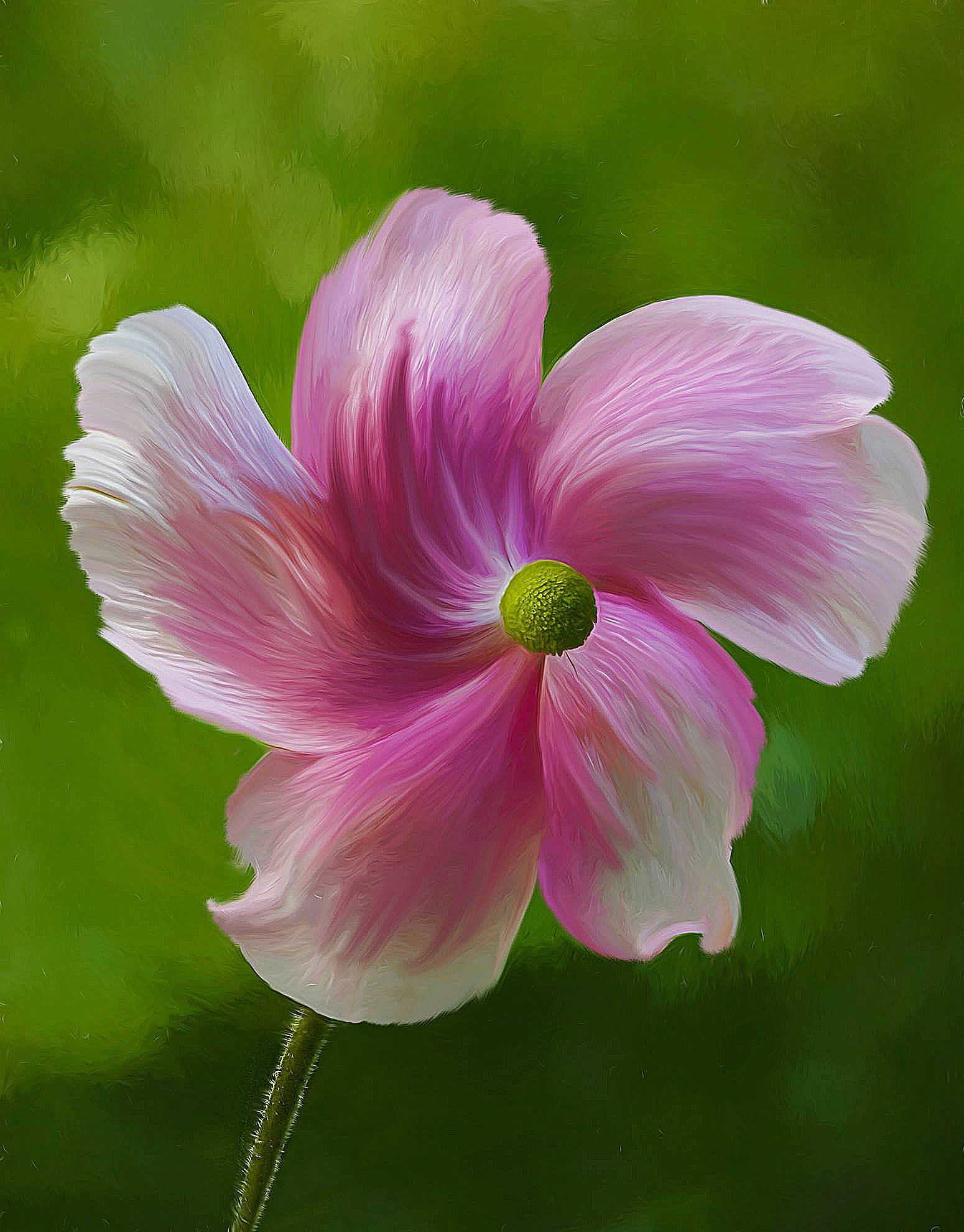
Lisa, This is a delightful image of the anemone which has wonderful romantic overtones. Your use of the Oil Paint and Liquify Filters, of which I am a fan, have added a lovely artistic feeling. The limited colour palette works well as does the shallow depth of field and the soft-focus background. Images do not have to be presented in the same orientation in which they were taken; sometimes, they work as well if not better when flipped horizontally. In this case, I prefer to see the stem of the flower originating from the lower left-hand corner which enhances the left-to-right visual flow through the image. In the image below, I have done that which has created the illusion of the flower being like a rotating propellor and the central part of the flower being projected outwards from the petals. I have also sharpened the image which has reinforced the filter effects you have used. |
Sep 18th |
 |
| 41 |
Sep 22 |
Comment |
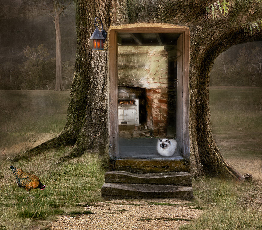
Nadia, It is readily apparent from this image that you have a good Photoshop technical skill base and are au fait with using the various techniques available. I like your pre-visualisation about creating the entrance to a tree house. Compositionally, the pathway provides a good diagonal lead-in line from the bottom left-hand corner towards the doorway. I would be inclined to move the cat to the other side of the doorway as that would provide a good visual counterpoint with the cooker in the background. Not sure whether we need both chickens; I would be inclined to remove the one on the right as it is looking out of the picture and taken the viewer with it. I agree with the others about the shallow depth-of-field into the house. I wondered whether this could be increased by applying a touch of Radial Zoom Blur beyond the cat and into the room. The image below gives a flavour of what I am suggesting. |
Sep 18th |
 |
| 41 |
Sep 22 |
Comment |
Tom, Your image is very powerful with the background landscape as the theatre backdrop, into which you have placed the various key elements. The ape in the foreground provides excellent foreground interest and anchors the picture well. Conversion to monochrome works well although I would like to have seen a tad more contrast on the ape. Flipping Originals 1 and 2 into the composite works well. This provides good lead-in lines, and enhances the visual story and the left-to-right movement through the picture. Compositionally, I wondered whether we needed the single elephant on the left as without it, there is a good diagonal from bottom left to top right of the frame. Care needs to be taken when cloning to ensure that the results are not obvious. In this case, the marking on the four elephants are obviously the same elephant. |
Sep 18th |
| 41 |
Sep 22 |
Comment |
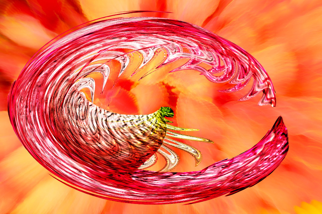
Henry, I have a reputation on this side of the pond as a photographer who doesn't do sharp. Therefore, it will come as no surprise that I am a fan of Zoom Effects, Liquify and Distort Filters. You have used these to good effect in producing your composite. I like images where you can visualise stories from things that are not there; very much a case of joining up the dots. In this case, I see a horse-shoe, rear-facing shark's teeth, an insect fallen into a sticky pitcher plant and a shrimp caught in a web. The zoom effect of the soft-focus background and the overall limited colour palette works well. I wondered whether the visual impact of the image would be stronger if rotated ninety degrees clockwise per the iteration below. |
Sep 18th |
 |
| 41 |
Sep 22 |
Comment |
Julie, Congratulations and very well done in creating this outstanding piece of work which encapsulates the ethos of creative photography. Clearly, it was a labour of love and you had in your mind's eye at the outset, a journey from pre-visualisation through execution to completion. You have used your Photoshop skills to perfection and your selection of tools to use is well chosen. I like the arrangement of the various elements in the frame which enhances the left-to-right visual flow that we expect to see in our images. The three large poppies create a good visual triangle of interest. I love the group of small notes in the lower left quadrant which seem to be drawn into the umbrella, churned up and then spat out the other side much larger than before into the top right quadrant and beyond. I hope I am giving the impression that I simply love your image. |
Sep 18th |
| 41 |
Sep 22 |
Comment |
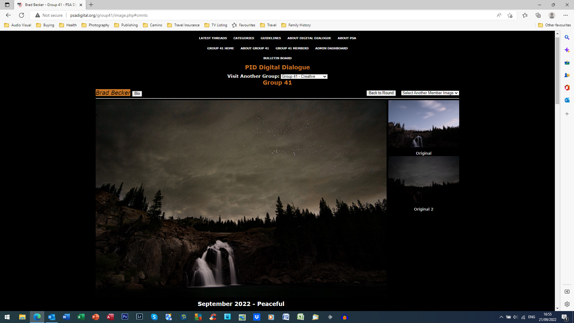
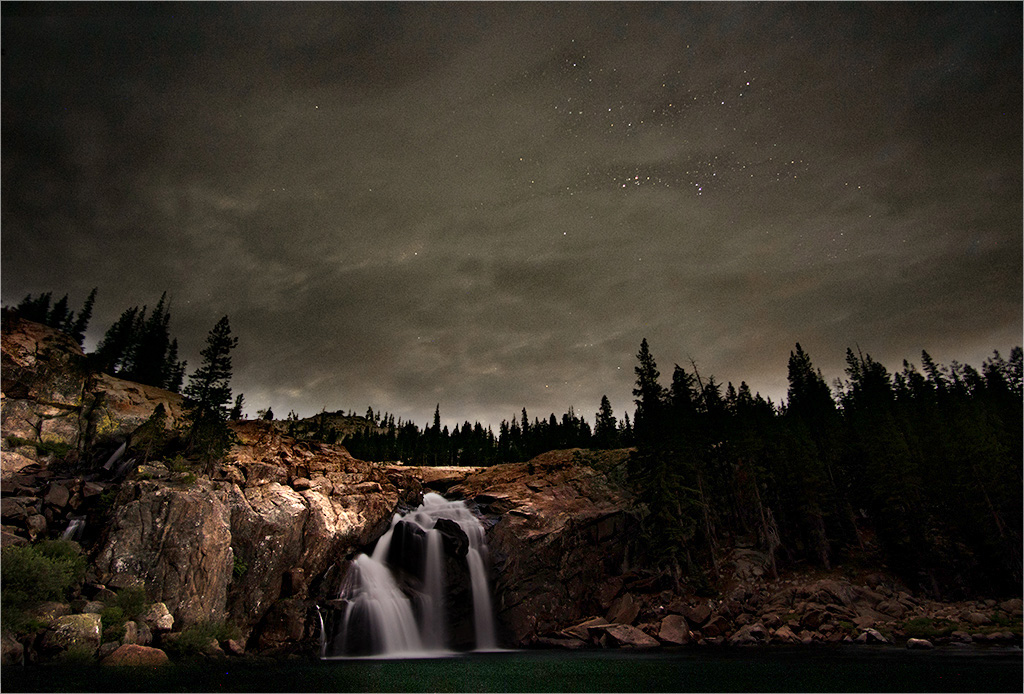
Brad, Thank you for your kind welcome to the group and I look forward to many exchanges of views and healthy debate with other like-minded creative photographers. I like your rationale to combine two images taken two hours apart to produce an atmospheric and magical composite. I can imagine your chagrin when the lady decided to take a bath at 9:45 and pitched her tent right in front of that wonderful view. At that point, your pre-visualisation of capturing star trails was doomed. Although this was a night-shot, I felt that the overall feeling was a little dark to realize its full potential. Compositionally, I like the off-centre position of the waterfall, which adds to the overall visual dynamic of the picture, and the sombre, dark sky. However, I wanted to see more of the detail in the rocky foreground which would create more of a visual tension within the landscape. I hope you don't mind but I have taken the liberty to lighten some of the foreground, leaving the sky and waterfall. I have also stroked a one pixel white line at Opacity 50% around the image as some of the darker areas are bleeding into the background. Unfortunately, this doesn't show up on the image below. |
Sep 18th |
 |
7 comments - 4 replies for Group 41
|
7 comments - 4 replies Total
|


