|
| Group |
Round |
C/R |
Comment |
Date |
Image |
| 21 |
Mar 22 |
Reply |
Hazel, I totally agree that your image has feeling, emotion and mood that would have been destroyed had it been in sharp focus. As an advocate of ICM, I prefer images that are (deliberately) soft-focus. For example, in a gallery, as you physically approach images that are sharp, you automatically process the stimuli from a distance before you even reach the picture and then move on. However, with those that are not sharp, you cannot process them with the same speed as you necessarily try to interpret and understand what you are looking at. Consequently, you stand and stare, and visually engage longer with the picture before moving on. |
Mar 31st |
| 21 |
Mar 22 |
Reply |
Peter, In a strange kind of way, I quite like what you have done to the image by changing the upper part to a pseudo night sky and the lower part to something quite surreal. |
Mar 31st |
| 21 |
Mar 22 |
Reply |
Joan, Although I can appreciate what you were trying to do, such a severe crop on the foreground doesn't work for me. I feel as though the characters in the lower part of the picture need space in which to breathe. |
Mar 31st |
| 21 |
Mar 22 |
Reply |
Skip, I love your reference to '... each experience of working with a file should be unique, and also should be informed by new insights about the image. The output is merely a snapshot of a new processing experience.' This is so refreshing. I also enjoyed reading your article on 'Metarealism'. As a general throw-away remark, I warm particularly to negatives and infra-red because they rely on fewer visual cues and stretch the cognitive boundaries. |
Mar 30th |
| 21 |
Mar 22 |
Reply |
Peter, Thank you for your kind words which are much appreciated. This deconstruction style is a bit of a departure for me and has the flavour of a 'Marmite' image; you either love it or you hate it. |
Mar 30th |
| 21 |
Mar 22 |
Reply |
Steve, Thank you for your comments which are much appreciated. See my reply to Joan above, the content of which applies equally here. When presented with this image, the Chairman of our local camera club saw it as 'judge bait' and he is probably right. |
Mar 26th |
| 21 |
Mar 22 |
Reply |
Joan, Thank you for your insightful comments which are much appreciated. My opening gambit for this month's image was that it was a bit off-the-wall and unlikely to appeal to everyone. That is the joy of photography in that we all warm to different stimuli and see different things in our pictures. I can understand the difficulty in trying to relate the 'before' and 'after' images. In many respects, you could argue that they are not necessarily connected to one another. Perhaps it is simply a means to an end. I used the original from a previous month's offering to start me off down another route to minimalism. Importing the lines onto the blank white background, I suddenly saw the conductor of an orchestra emerging before my eyes. I am pleased that you can see the copper colours in the lines. As far as being a music aficionado is concerned, all I can say is that I have quite an eclectic musical taste across all genres, I have several accoustic/electrical guitars and I have played in many bands over the years. |
Mar 26th |
| 21 |
Mar 22 |
Reply |
Hazel, thank you for your kind words which are much appreciated. Glad that you can see the musical connotation and glad that you liked the original. I would be more than happy for you to use the original as a textured background for one of your flower images. |
Mar 19th |
| 21 |
Mar 22 |
Reply |
Mike, What a wonderful thought. In my experience of exhibitions in galleries in UK, people tend not to buy art work if they think it is too cheap and not worth the money. However, if you add a zero to the price, they tend to fly off the shelf, the rationale being that if it is expensive, then it must be good value. |
Mar 19th |
| 21 |
Mar 22 |
Reply |
Mike, Thank you for your kind words which are much appreciated. Delighted that you were drawn to the linear patterns in the image. If it was entered into a UK camera club competition, I suspect that it would attract a very low score with a judge's comment something like "I don't understand this ... next image ..." I like your analogy to it being successful in a ritzy area. This is an image that I would be happy to give away but if someone is daft enough to pay for it in the thousands, then I would be happy to wait for the cheque or bank transfer. |
Mar 19th |
| 21 |
Mar 22 |
Reply |
Hazel, I am quarter Welsh and I have just been watching the Six Nations rugby. Unfortunately, Wales lost to Italy 21-22. |
Mar 19th |
| 21 |
Mar 22 |
Comment |
|
Mar 19th |
 |
| 21 |
Mar 22 |
Comment |
|
Mar 19th |
 |
| 21 |
Mar 22 |
Comment |
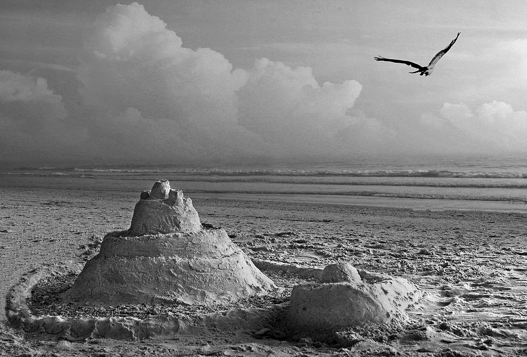
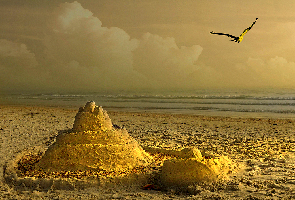
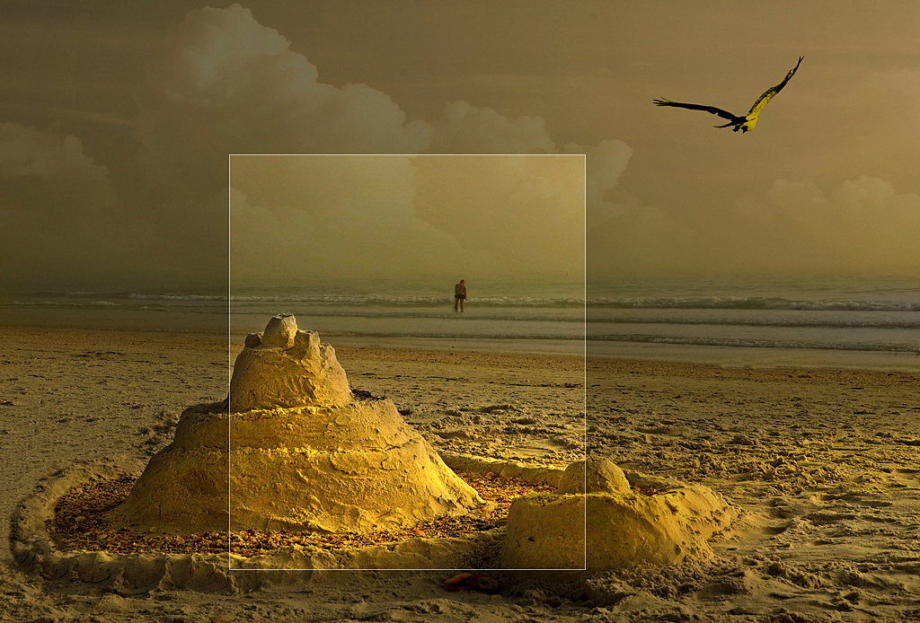
Mike, The sandcastle with its side-lighting has created an atmospheric subject and good focal point for your picture. My initial impression of your image was that it was slightly under-exposed and a little darker than ideal. I checked this in the Levels display and found that the tonal distribution erred towards the darker end of the spectrum. I adjusted the light tone slider to correct the exposure in a selection of the image per first example below. Compositionally, three is a strong number (in this case the sandcastle, seagull and person) as it creates a good visual triangle of interest. I like the way that the sand-castle is placed off-centre in the frame which increases the overall visual dynamic of the picture. However, in this case, I am not wholly convinced about your inclusion of the man as the image is strong enough without him, per second example below. I also wondered about the overall yellow colour cast and I played around with the colour balance to try to correct it. In the end, I thought it better to remove all the colour and change it to monochrome with added contrast as per third example below. |
Mar 19th |
 |
| 21 |
Mar 22 |
Comment |
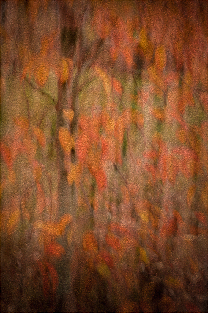
Hazel, I am a fan of anything that is not sharp, whether through chance or by design, eg via Intentional Camera Movement (ICM) or post-event in the computer. Therefore, it will come as no surprise that I quite like your Autumnal soft-focus image. I always warm to images where initially I don't know what I am looking at and how they draw me in to visually engage with them in an attempt to understand what I am looking at. The colour palette of your picture is lovely and sings Autumn. I like your subtle use of the Oil Paint Filter which adds gravitas and depth to the picture. It is worth remembering that images do not have to be presented in the same orientation in which they were taken. Sometimes, they work as well if not better when rotated and/or flipped. In this case, I preferred the image when flipped horizontally as below. |
Mar 19th |
 |
| 21 |
Mar 22 |
Comment |
Steve, Comparing the 'before' and 'after' image, you have done very well to produce the final version. As I have said before, images need a theatre backdrop (in this case, the terminal building and people in the background) in front of which the players perform (in this case, the man walking from left-to-right into the frame). I quite like the symmetrical arrangement of the architectural elements in the background and the clarity, sharpness and contrast you have achieved throughout the picture. Similarly, I like the way that the bus in the centre, the parked car on the right and the man on the left are all travelling 'into' and not 'out of' the picture. I don't mind the business of the background as this adds to the occasion. However, it is a pity about the bland white sky which tends to draw the eye as it is the brightest part of the picture. Perhaps toning down would help. |
Mar 19th |
| 21 |
Mar 22 |
Comment |
Skip, First of all, welcome to the Study Group and I hope you enjoy the experience. Your submission this month is very eye-catching and has immediate impact. The complementary yellow and blue colours work well together. I have always been a fan of infra red and many years ago, I had a Canon EOS 40D converted to IR. Using Channel Swapping, it is possible to achieve some outstanding results. I quite like the addition of the solarization which has added the third colour and provided greater depth to the picture. Compositionally, the image works well with the reverse L-shaped tree in the background holding it all together. |
Mar 19th |
| 21 |
Mar 22 |
Comment |
Joan, Whenever I judge images in camera club competitions, I make the point that successful pictures should have a 'theatre backdrop' against which the 'players' perform. In your submission this month, you have achieved that with aplomb. The monochrome woodland background works perfectly as the foil against which the coloured balloons dance and play in the wind. I like the way that you have insured that there is a commonality of lighting highlights on the balloons, the way that you have arranged the different colours and particularly the way that you have some balloons in front of the tree trunks and some behind. There is a sense of being uplifted coming across in your picture. Well done. |
Mar 19th |
| 21 |
Mar 22 |
Reply |
Hazel, Many congratulations for having an image in the Members' Showcase this month. Well done.
|
Mar 19th |
7 comments - 12 replies for Group 21
|
7 comments - 12 replies Total
|


