|
| Group |
Round |
C/R |
Comment |
Date |
Image |
| 21 |
Feb 22 |
Reply |
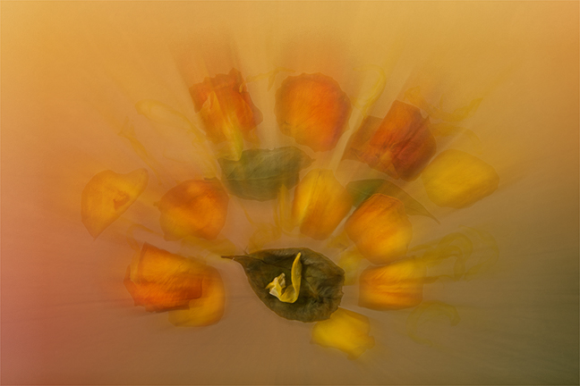
Steve, Thank you for your comments which are much appreciated. It is interesting how you have seen forests and switchbacks. I saw the three green vertical triangles as fir trees growing out of the snow and the four horizontal triangles pointing eastwards as inclines that the locomotive had to traverse. Credence for this interpretation is afforded by the number plate 61306 which creates the illusion that the locomotive is travelling from right to left and therefore up the inclines. I had in mind a favourite poem by W.H.Auden entitled 'Night Train' which is read to the clickety-clack rhythm of the wheels rumbling over the tracks. It starts: This is the night train crossing the border, bringing the cheque and the postal order, letters for the rich, letters for the poor, the shop at the corner and the girl next door ... |
Feb 24th |
| 21 |
Feb 22 |
Reply |
Hazel, Thank you for your kind words which are much appreciated. I suppose the locomotive name 'Mayflower' automatically conjures up images of sailing ships and the sea. Of the three deconstructed images that I have submitted thus far, my ranking in order of preference is December, January, February. Next month, if I don't get side-tracked, I will be offering a more minimalist deconstruction. I agree with you that it is a novel technique, which alas most judges shy away from, but it is fun to do. There is always the question whether this is photography or art. My rationale has always been that in photography, we are painting with light and indeed anything goes. |
Feb 24th |
| 21 |
Feb 22 |
Comment |
Mike, You are to be congratulated in producing an image this month that has attracted so many comments; the total so far is 24. Well done. |
Feb 24th |
| 21 |
Feb 22 |
Reply |
Mike, The key thing with vignettes and borders is that they have to be used in a subtle way almost to the point of not realizing that they are there. |
Feb 24th |
| 21 |
Feb 22 |
Reply |
Mike, I love this image which is very atmospheric and draws you in. Suggest that it would be useful to stroke a one pixel beige line at 25% opacity around the image so you don't get bleed over from the dark areas of the image into the black surround. |
Feb 24th |
| 21 |
Feb 22 |
Comment |
Mike, I thought I would ad another sentence as '13' comments is an unlucky number. Now we have '14' ... |
Feb 12th |
| 21 |
Feb 22 |
Reply |
Mike, Have no fear, if I don't think much of your image, I will tell you so. However, being English, there are ways of getting the message over in a kindly way. Consider yourself among friends in Study Group 21. As a matter of interest, whenever I judge club competitions, I have a policy of scoring all images in the range 15-20 marks. In this way, no-one is disappointed and everyone goes home happy bunnies. If I had submitted an image that wasn't up to scratch, I would be happier in the knowledge that the judge scored it 15 rather than 9 out of 20. After all, you only need one mark to signify that one image is better than the next. On this side of the pond, I rarely if ever use the word 'nice' as to me it is a non-word with negative connotations. |
Feb 12th |
| 21 |
Feb 22 |
Reply |
Mike, Thanks for the link which I found most informative and easy to follow.
|
Feb 12th |
| 21 |
Feb 22 |
Reply |
Joan, I have used the Spherize option in Photoshop to create globes and I have found it easy to use. It can provide realistic impressions if handled in a subtle way and also distorted views when not. Of course, we must not forget that images seen in globes are inverted and need to be viewed as such in order to create the sense of reality. |
Feb 12th |
| 21 |
Feb 22 |
Comment |
Hazel, I like the way that you pre-visualised how you could change your image (with which you were not happy) into one that had a greater aesthetic appeal. It is interesting that you wanted to reduce the amount of space around the petals, even though space can often be a positive thing compositionally. The colour palette of your picture is lovely. Your use of Layers to create a multi-exposure effect has worked but I find that it is now a little too busy and the repetition of the leaves in the lower left quadrant a little distracting. I have taken the liberty of playing with your original and taking it in a similar direction. This included applying Radial Zoom Blur centred on the lower green leaf, using the Eraser to remove the blur from that leaf, applying the Glass Artistic Filter then finally adding a touch of Unsharp Mask. |
Feb 12th |
 |
| 21 |
Feb 22 |
Comment |
Steve, I like the visual disconnect between the frozen Winter icicles and the vibrant Spring tulips. I feel as though I am sitting inside a cabin, basking in the heat from a log fire, and looking out on this wonderful vista. I wondered whether the feeling of Winter would have been enhanced if there had been some icicles hanging from the tree. You have done very well to import the tulip field as a background behind the tree, or perhaps you added the tree over the tulips? Whichever way you did it, it has been done seamlessly. I like the way that the tree provides a link between foreground/background and land/sky. Congratulations and very well done. |
Feb 12th |
| 21 |
Feb 22 |
Reply |
Joan, Thank you for your kind words which are much appreciated. I quite like the way that the rearrangement of the deconstructed elements takes the viewer off in a different direction, in this case from trains to boats. I like your analogy of the green triangles being like nautical signal flags. |
Feb 12th |
| 21 |
Feb 22 |
Reply |
Joan, I agree with Mike that when one sense is failing, the others become more acute and make up for it. Creativity is in the mind's eye and not necessarily in the physical eye. I can imagine that the problem you may have is one of frustration at finding it increasingly difficult to do those things that you used to find so easy. |
Feb 12th |
| 21 |
Feb 22 |
Reply |
Mike, It is interesting that I hadn't noticed that the lions had been stretched until you mentioned it. However, I quite like them extended and prefer them to the reality of the original. I gather Joan wanted to produce a creative image and this seemed to fit the bill. |
Feb 6th |
| 21 |
Feb 22 |
Reply |
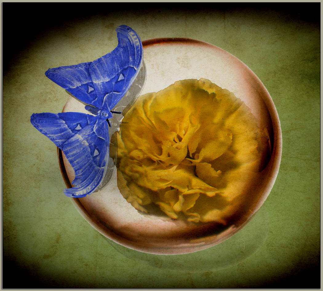
Mike, I too found the white triangles a little disconcerting but that was the nearest I could find in my research on the internet. Composition is very much a personal choice, a bit like the Rule of Thirds, which is there merely as a guide. The bottom line as to whether the moth is better placed to the left or right is very much a personal choice. As I said in my reply to your comment on my image this month, photography is very much an art form where there is no definitive right or wrong way. We all have personal preferences and what is right for one may not be right for another. |
Feb 6th |
| 21 |
Feb 22 |
Reply |
Mike, Many thanks for your kind words which are much appreciated. Glad you engaged with the image. Thank you also for researching the preserved steam locomotive 61306 Mayflower and tracking its origins to the GCR. It is interesting that your perception of the geometric shapes in the deconstruction conjured up images in your mind's eye of boats and yachts. This for me reinforces the notion that photography is an art form and there is no right or wrong way. We all see and perceive images differently. It is also interesting that you wanted to see more of the obvious locomotive aretefacts. I suppose the nearest I got to achieving your objective was to include the rectangular image bottom right which showed the tender's leaf-springs and steam. In creating the image, I wanted to achieve something that was non-specific where the viewer could draw on their own experiences to make their own interpretations. You might want to have a look at my other deconstructed images submitted in December and January. |
Feb 6th |
| 21 |
Feb 22 |
Comment |
Joan, I like this image which has a surprisingly relaxing quality about it that I find most refreshing. You have done well to pre-visualize the image from concept to completion. Your technique of expanding the canvas size and then flipping horizontally/vertically has created the theatre backdrop against which the lions are performing in their elliptical bubble. The colour palette of complementary yellows and blues works very well and the essence of these hues is mirrored in the tones of the two lions. It has all the hallmarks of it being the National flag of an African country. A minor point but it is a pity about the small horizontal blue line to the right of the lions which appears to be an artefact of not quite aligning the flipped copy. It probably needed nudging up another pixel or two. Well done on producing such a thought-provoking and certainly creative image. |
Feb 4th |
| 21 |
Feb 22 |
Comment |
Mike, Welcome to Study Group 21. I hope you enjoy the journey and I look forward to seeing your images in the coming months. I like the way that you have pre-visualised this image from the concept of wanting to place a flower inside a crystal ball to the end game of a moth trying to sip the flower's nectar inside the glass with the visual story of the glass preventing access. The arrangement of the elements in the frame works well as a composite. The moth is perfectly positioned on the third which works well. I particularly like the vibrant blue colour you have chosen for the moth and the granularity of the lime-green background. Three is a strong number compositionally and here you have ticked the box with the butterfly, flower and crystal ball. In Western cultures, where we read/write from left-to-right, we expect to see the visual flow lines and diagonals in our pictures following a similar convention. In this case, I wanted to see the moth on the left-hand-side of the frame, which for me would be more visually pleasing. Be careful when applying a vignette to your images as in this case it is possibly a little on the heavy side. Although I like your stroked line around the image and the drop shadow which work well, I find the whiteness of the surrounding border a touch on the bright side and a little distracting. In the latter case, if you had selected the lime-green colour and applied that to the border at 50% opacity, that would have softened the effect. I have added an iteration of your image to show a flavour of what I mean. I tried to identify your moth by scanning through the internet and failed miserably. The nearest I could get was a Tulip-Tree Silkmoth (Callosamia Angulifera), native to North America. |
Feb 3rd |
 |
6 comments - 12 replies for Group 21
|
6 comments - 12 replies Total
|


