|
| Group |
Round |
C/R |
Comment |
Date |
Image |
| 21 |
Aug 21 |
Reply |
Janice, That must have been a worrying time for you. Not much chance to get any sleep in case things escalated out of hand and the speed of change is something to behold. Glad that you and your family are ok. Keep safe and well. |
Aug 23rd |
| 21 |
Aug 21 |
Reply |
Peter, Thank you for your kind words which are much appreciated. Delighted to hear that you warmed to the subtle colours and the simplicity. |
Aug 17th |
| 21 |
Aug 21 |
Reply |
Jim, Thank you for your kind words which are much appreciated. Glad you liked the image. |
Aug 17th |
| 21 |
Aug 21 |
Reply |
Hazel, Thank you for your kind words which are much appreciated. ICM is such a powerful tool which creates a simple stimulus to generate a myriad interpretations. |
Aug 12th |
| 21 |
Aug 21 |
Comment |
Janice, Photographing moving water is an art form in itself. Choice of shutter speed is critical here as you need to retain a sense of sharpness, yet more importantly introduce a silky smoothness to the flowing water. Choose too slow a shutter speed and you end up with cotton wool white water without any detail. You have done well here and ticked the boxes. I love the detail you have captured in the tumbling white water and the eddies below. The silky blue-green water flowing from left-to-right is lovely. Compositionally, your image is very much like vertical layer cake with horizontal layers running through it. We are always drawn to the brightest part of any picture and in this case it is the fall of white water in the top half of the picture. The gradient of colour from top to bottom is lovely. Well done. |
Aug 12th |
| 21 |
Aug 21 |
Comment |
Hazel, Here is the other image. |
Aug 12th |
 |
| 21 |
Aug 21 |
Comment |
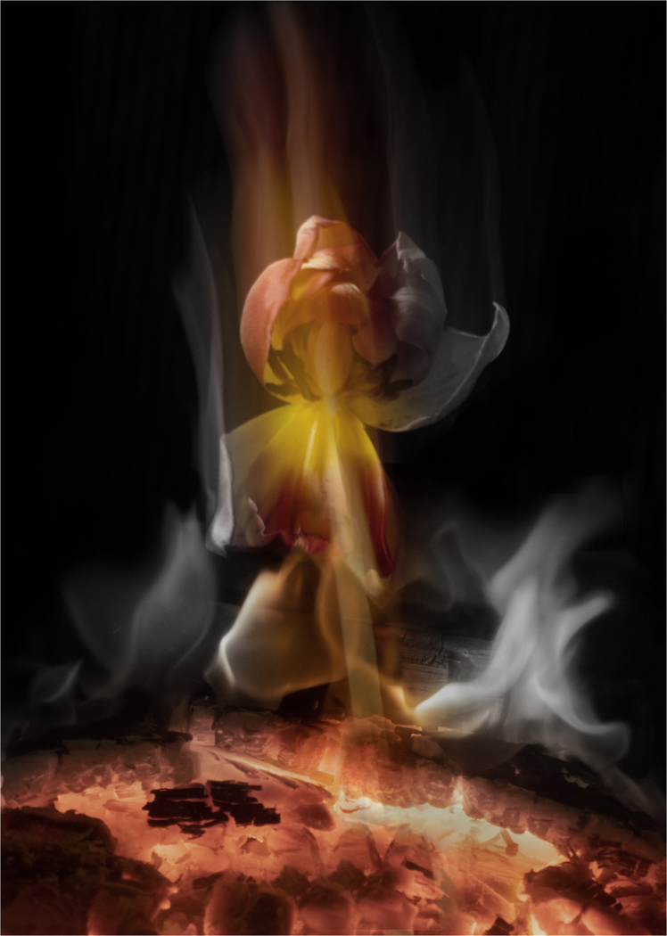
Hazel, I like the way that you used ICM to capture the image of the tulip and then saw something more than the tulip in the end result. You created a visual story in your mind's eye and decided to incorporate an element of fire into the composite. I like your original image which creates the illusion of the tulip plunging downwards out of the heavens. Inclusion of the fire has created a further illusion of the tulip returning from space and re-entering the earth's atmosphere. This got me thinking about playing around with removing some of the colour to enhance the overall visual aesthetic. I have attached two examples below. |
Aug 12th |
 |
| 21 |
Aug 21 |
Comment |
Steve, Your image reminds me of a colour negative. As I have a penchant for negatives and posterization, it will come as no surprise that I am drawn to your image. The colours, although flat, are unusually psychedelic and create a sense of pseudo-reality. However, on balance, I prefer your detailed version which has more punch and vibrancy than the submitted version. Compositionally, it is a pity about the partial hansom cabs on the left and right-hand sides and the person standing on the left-hand side. It would have been preferable at the taking stage to select three hansom cabs (a compositionally strong number), perhaps more of the one on the right and less of the one on the left. I agree with Joan about straightening the verticals but disagree on removing some of the foreground. For me the cobbles create a sense of space and lead the eye in nicely to the ponies. |
Aug 12th |
| 21 |
Aug 21 |
Comment |
Peter, When I first saw your image, the mental picture I had in my mind's eye was one of bathroom fittings. Like Joan, I could also see Pluto and Goofy the dogs. I like the way that you have pre-visualised this image and created something which is far removed from the original. Your digital imaging skills are readily apparent here and the transitions are seamless. I quite like the graphic complexity of the image and the chocolate sepia toning which adds to the overall aesthetic. I can see the dahlias throughout the image. |
Aug 12th |
| 21 |
Aug 21 |
Reply |
Steve, Thank you for your kind words which are much appreciated. I am delighted that you warmed to the overall simplicity of the image. |
Aug 12th |
| 21 |
Aug 21 |
Reply |
Janice, Thank you for your kind words which are much appreciated. This is very much an image of shapes, patterns and texture which relies for its strength on the fact that nothing in the image is sharp. The soft-focus provides the stimuli which creates visual stories in the mind's eye of the viewer. |
Aug 12th |
| 21 |
Aug 21 |
Reply |
Joan, Thank you for your kind words which are much appreciated. The blue tulip certainly catches the eye due to its size and position in the frame. I found the blue and lime green colouration quite relaxing and chose these in favour of colours at the warmer end of the spectrum. I tried red but it didn't work for me. |
Aug 12th |
| 21 |
Aug 21 |
Comment |
Joan, It is readily apparent from this image that you had a lot of fun putting it together and that it was a labour of love. There are many elements within it and I am not sure whether they all gel together as a cohesive whole. There is much to be said for the old adage 'Less is More'. I love the colours of the balloon and how this contrasts with the otherwise monochrome image. I recognise the gorilla, balloon, lightning and birds from your previous submissions over the years. One of the main strategies in digital imaging is knowing when to stop and I feel that in this case I suspect that you were so wrapped up in what you were doing that you didn't realise you may have gone a step too far. |
Aug 12th |
6 comments - 7 replies for Group 21
|
6 comments - 7 replies Total
|


