|
| Group |
Round |
C/R |
Comment |
Date |
Image |
| 21 |
Jul 21 |
Reply |
Peter, W O W !!! |
Jul 23rd |
| 21 |
Jul 21 |
Reply |
Peter, I cannot match that. The notion of digital imaging for thirteen and a half hours is mind boggling. |
Jul 17th |
| 21 |
Jul 21 |
Comment |
Hazel, Once I start playing, I find it difficult to stop. In this latest iteration below, I have Inverted the image, applied some Sharpening, then Brushed in some Scattered sycamore leaves. |
Jul 15th |
 |
| 21 |
Jul 21 |
Comment |
Hazel, another version for you where I have increased the canvas size 200% horizontally, duplicated the layer, flipped it vertically, selected the three leaves, imported them into the other layer, flattened the image, stroked a one pixel white line around the image, added radial zoom blur and finally increased the image size vertically to 200%. |
Jul 13th |
 |
| 21 |
Jul 21 |
Comment |
Hazel, In the third version I used the low-key black background and Solarised the image, similar to your version above but rotated/flipped. |
Jul 13th |
 |
| 21 |
Jul 21 |
Comment |
Hazel, In the second version I added the Oil Paint Filter effect. |
Jul 13th |
 |
| 21 |
Jul 21 |
Comment |
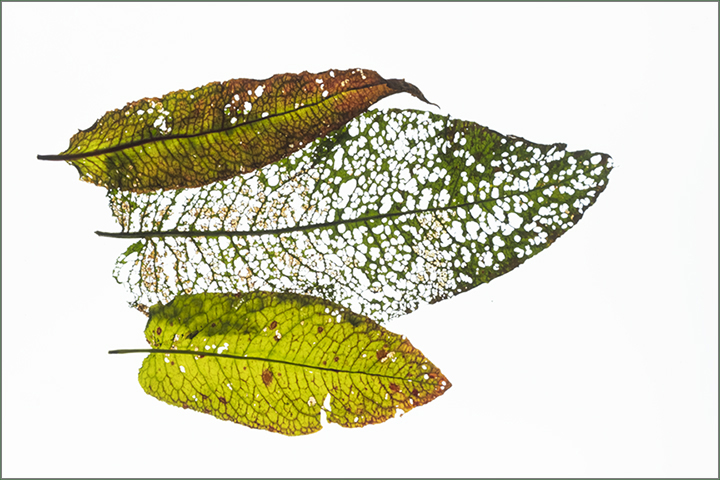
Hazel, I like the simplicity of your image and sometimes simple is best. The holes in the dock leaves adds to the visual story. I hope you don't mind but I have tried a few simple iterations. The first one is a simple rotation clockwise and than a flip vertically. In the end result, I could see a Paddington Bear figure with a flat cap and a scarf around his neck. |
Jul 13th |
 |
| 21 |
Jul 21 |
Reply |
Hazel, On balance, I think I prefer this low-key version with the black background to the high-key version with the white background. The white key line around the image is important to define the boundaries. Three is a compositionally strong number which creates a visual triangle of interest. Well done. |
Jul 13th |
| 21 |
Jul 21 |
Comment |
Peter, I love the saturated colours of the original and the abstract arty feeling of the composite. I warm to images that are not pre-planned but develop as you play around with your digital imaging tools and the ideas in your head. Of course, one of the key things is knowing when to stop. I like the granular quality of the image and like the others I too can see a helmet. This is the kind of image in which you can get lost. Well done. |
Jul 13th |
| 21 |
Jul 21 |
Comment |
Joan, Congratulations on moving the house in such an artistic way, drawing on your digital imaging skills and knowledge gained from your course. I like your pre-visualisation from concept to completion. The dominant feature of the composite for me is the group of balloons which are lovely. They are so crisp and perfectly oriented. I don't know whether it is my screen but the left-hand-side of the house as I look at it seems a little lighter in tone than the rest of the house. I would have preferred this to be a similar tonal value to the right-hand-side of the house. Apart from that, congratulations and well done. |
Jul 13th |
| 21 |
Jul 21 |
Reply |
Hazel, Thank you for your kind words which are much appreciated. At the time I created the image, the troops marching into battle was an afterthought as a scene-setter. Having done that, I deliberately reduced the opacity to minimize any distractions |
Jul 13th |
| 21 |
Jul 21 |
Reply |
Joan, Thank you for your kind words which are much appreciated. I think it is important to have a low opacity monochrome background against which the colour images can shine forth. I reduced the opacity to make it appear less busy. I was pleased with the shine on the armour and the colour saturation. |
Jul 13th |
| 21 |
Jul 21 |
Reply |
Marti, Thank you for your kind words which are much appreciated. I agree with you that it would have been useful to have a bit more space in front of the man's nose in the far left image. At the time I created the composite, I was more preoccupied with positioning the portrait format images rather than the content. |
Jul 13th |
| 21 |
Jul 21 |
Reply |
Peter, Ditto above. |
Jul 13th |
| 21 |
Jul 21 |
Reply |
Peter, thank you for your kind words which are much appreciated. I agree that battle horrors and blood would enhance the overall visual story but it might put people off if it was too gory. |
Jul 13th |
7 comments - 8 replies for Group 21
|
7 comments - 8 replies Total
|


