|
| Group |
Round |
C/R |
Comment |
Date |
Image |
| 21 |
Jun 21 |
Reply |
Peter, Thank you for your kind words which are much appreciated. I agree that the revised version is much stronger and punchier than the earlier version; a function of the increased saturation of the reds and blues. The Flood Filter I used was Flaming Pear. |
Jun 30th |
| 21 |
Jun 21 |
Reply |
Joan, In my comment above, the reference to 'bionic hand tremor' should actually read 'benign essential hand tremor'. Clearly, my mind was on other things at the time! |
Jun 19th |
| 21 |
Jun 21 |
Reply |
Steve, Many thanks for the overview. I'm afraid I wouldn't know where to start. I'm a simple chap and it takes me all my time to handle one camera let alone nine! |
Jun 15th |
| 21 |
Jun 21 |
Reply |
Joan, Hazel, Photographing wilted or dead flowers is a genre that has a good following on both sides of the pond. Just type an appropriate question into Google and see what comes up. There are many websites available. |
Jun 15th |
| 21 |
Jun 21 |
Reply |
Steve, Interesting that I perceived the adult and child as being outside in the rain whereas in fact they were inside in the dry and advertising a product. I like the way that I am drawn past those walking in space to the detail of the two mannequins in the shop window who are placed in a compositionally strong position and the brightest parts of the image. |
Jun 15th |
| 21 |
Jun 21 |
Reply |
Steve, WOW! That is a serious amount of kit! How on earth do you manage to control it all? |
Jun 15th |
| 21 |
Jun 21 |
Reply |
Joan, Thank you for your kind words which are much appreciated. When I took the original image of the garden flowers, I applied a little bit of ICM and moved the camera in an umbrella shape. I agree that the final composite appears a little muted and more translucent than the original. I have attached another version where I have boosted the colour Saturation and increased the Sharpening. I quite like producing images that remind the viewer of other places, in your case the Sydney Opera House. |
Jun 15th |
 |
| 21 |
Jun 21 |
Reply |
Joan, Perish the thought that any of the images submitted by our Study Group members needed to be removed. |
Jun 15th |
| 21 |
Jun 21 |
Reply |
Joan, My mother suffered from age-related macular degeneration which meant that the central part of her vision was blurred. In order to see anything sharp, it was necessary for her to look out the side of her field of vision. As a photographer, you must find that terribly frustrating. I have a similar problem with my shaky hands, diagnosed as bionic hand tremor and fortunately nothing more serious. As with any challenge, there is always a work-around and a coping strategy to use. In my case, I promote the problem I have in advertising myself as a photographer who doesn't do sharp. That way, people are not surprised when they see my blurred images which I pass off as Intentional Camera Movement. |
Jun 15th |
| 21 |
Jun 21 |
Reply |
Joan, I like the way that the beam of light now fades out towards the top left-hand corner which prevents our attention wandering out of the frame. Unfortunately, there are still some rectangular artefacts along the border between the dark land mass and the brighter sky. It would indeed be a sad state of affairs if we all liked the same things in our pictures. In this case, I am still drawn to your original because of its simplicity and indeed the blue cast over the foggy scene. |
Jun 15th |
| 21 |
Jun 21 |
Reply |
Hazel, Thank you for your kind words which are much appreciated. I would recommend that you try combining your ICM images and see where it takes you. You might be pleasantly surprised. It is always a good idea to think outside of the box. |
Jun 11th |
| 21 |
Jun 21 |
Comment |
Hazel, This is a very competent piece of digital photography which I like very much. You have ticked the technical boxes of sharpness, exposure, colour saturation and composition. Your choice of colour palette is fabulous and it embues a wonderfully warm feeling. Even though the tulip is past its best, it nevertheless has provided you with an excellent subject to photograph. I love the gradient colours through the background framing. Congratulations and very well done. Your image would do well in external competitions. I hope you don't mind but I have created a triptych which reinforces the decay of the tulip as you visually travel from left-to-right from the colour version to the monochrome version. |
Jun 11th |
 |
| 21 |
Jun 21 |
Reply |
Peter, Thank you for the clarification. I can see from the left-hand edges of the flags that there was a repetition of three shots in the composite. I agree with you that the image works well without the aircraft and I cannot see what value they would add to the whole. I hope your PS and attempted identity theft issues are resolved soon. |
Jun 11th |
| 21 |
Jun 21 |
Comment |
Steve, Your image this month has all the hallmarks of it being a 'Steve Wessing'. I like your use of the 'Alien Map' effect which has created a new dynamic to what is an everyday scene of people walking by. This is further enhanced by the negative, solarized emptiness in some of the figures. I particularly like the way that the only heads we can see are those of the adult and child in the distance. |
Jun 11th |
| 21 |
Jun 21 |
Comment |
Peter, I love the effect you have created with the three groups of flags set against the abstract background which works very well. However, I have trouble in relating that to your original with the aircraft in the upper two thirds. Your image this month seems to be a vertically stretched version of the lower third of your original. Or am I missing something? |
Jun 11th |
| 21 |
Jun 21 |
Comment |
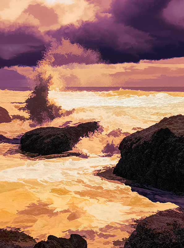
Charles, Given that you are travelling the perimeter of the United States, which is a mammoth task in itself, I hope you are keeping yourselves safe and well during this pandemic. Your colour palette is well chosen as it has created the illusion of a cauldron sea of hot, flowing, molten lava. It reminds me of my childhood when I would have a canvas to 'Paint by Numbers'. The essence of the picture for me is the spray of water in the top left quadrant which seems to be spiralling upwards into the heavens. The patch of bright sky top left is a little distracting and draws the eye. Also, I wanted the horizon line to be a little less central in the frame. I have taken the liberty of applying a slight Crop to the image to show what I mean. |
Jun 11th |
 |
| 21 |
Jun 21 |
Comment |
Joan, I am glad that you enjoyed the course and are starting to put into practice, some of the lessons learned. The idea of using a Brush to paint in a bird is very attractive. Your image is a very busy one with much in it to occupy our attention and for me that is its undoing. I am an advocate of the old adage 'Less is More' and for that reason I much prefer your original which is full of mystery and intrigue. In your offering this month, I find that my eyes are being drawn in different directions; following the line of the lighthouse beam (out of the picture), the streak of lightning on an opposite diagonal, the bird lower left, the group of birds top right and the three window lights in the building. However, I do like the way that you have created a pseudo-monochrome picture enhanced by colour from the beam and the windows of the house. The mottled, blurred sky works well. It is a pity that rectangular artefacts have crept in above the sea horizon line and to the left of the base of the lighthouse. I note you had a problem with the Gradient Tool and I wondered whether you had Edit in Standard Mode (Q) set in the Tool Box? |
Jun 11th |
| 21 |
Jun 21 |
Reply |
Joseph, Thank you for your kind words which are much appreciated. Glad you liked the image. |
Jun 11th |
| 21 |
Jun 21 |
Reply |
Janice, Thank you for your kind words which are much appreciated. I find that combining linear shapes (in this case the rain stains on the wall) with analogue shapes (in this case the ICM and flood filter effects) creates a visual tension that engages with the viewer. |
Jun 11th |
| 21 |
Jun 21 |
Reply |
Jerry, I love the textural and tactile quality to your image which is enhanced by the russet colour palette. Given that this wall of rust was ten feet tall, one can only imagine how much water had seeped through those weep holes over the years. I quite like the two curves in the upper part of the picture, how four of the shapes have 'grown through' the lower curve and how the spike on the left-hand-side has 'pierced through' the upper curve. It is almost like looking through a slice of soil at plant roots growing upwards. |
Jun 11th |
| 21 |
Jun 21 |
Comment |
Janice, Then I thought ... I must stop playing ... |
Jun 9th |
| 21 |
Jun 21 |
Comment |
Janice, Then I thought about rotating ninety degrees clockwise and flipping it horizontally ... |
Jun 9th |
 |
| 21 |
Jun 21 |
Comment |
Janice, Then I thought about using a square format to focus even more attention on the curves ... |
Jun 9th |
 |
| 21 |
Jun 21 |
Comment |
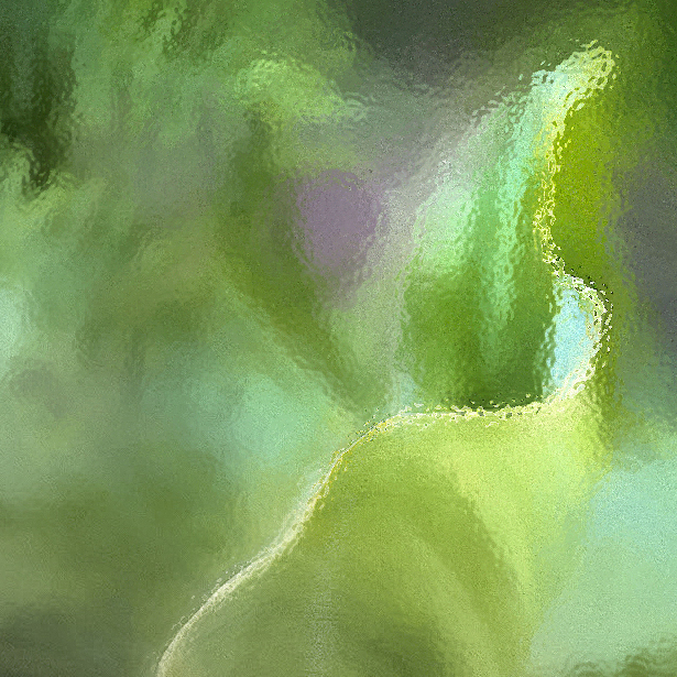
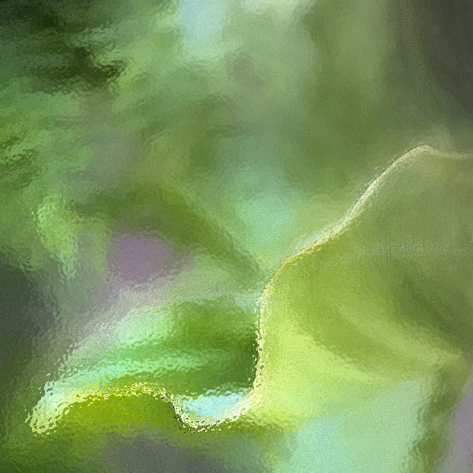
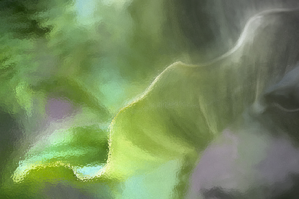
Janice, Then I thought to myself that I would like to play around with your image to see where it took me. I hope you don't mind but I did the following: Flip Canvas Horizontal, Linear Gradient with Refined Edge, Desaturated colour from selection, Added Glass Effect filter. This ended up with a version which flowed from a mottled colour gradient through to a pseudo-monochrome.
|
Jun 9th |
 |
| 21 |
Jun 21 |
Comment |
Janice, I quite like your original which goes to show that a cloudy sky provides good lighting conditions for natural history photography. Compositionally, I have this thing about the strength of left-to-right, bottom-left-to-top right visual flow in a picture. I offer the attached to show what I mean. |
Jun 9th |
 |
| 21 |
Jun 21 |
Reply |
Jerry, Thank you for your kind words which are much appreciated. It sounds as though we have similar tastes in our photography. I quite like creating images that stretch the viewer's interpretation, forcing them to stop, stare and engage with what they are looking at. In my younger days, I was a fan of Giles cartoons, the raison d'etre of which was 'The more you look, the more you see'. |
Jun 9th |
| 21 |
Jun 21 |
Reply |
Diana, Thank you for your kind words which are very much appreciated. Like you, I am always drawn to pictures that work at different levels and draw you in. I am flattered that you would like to hang it on your wall. |
Jun 8th |
10 comments - 17 replies for Group 21
|
10 comments - 17 replies Total
|


