|
| Group |
Round |
C/R |
Comment |
Date |
Image |
| 21 |
Mar 21 |
Reply |
Peter, As we say on this side of the pond "There's nowt so queer as folk ..." Sometimes, people can't (or don't want) to see the wood for the trees, or indeed they only see/believe want they want to. |
Mar 31st |
| 21 |
Mar 21 |
Comment |
Peter, Thank you for your comments which are very much appreciated. WOW! I certainly didn't see that coming. Clearly, you have a very fertile imagination. Try as I may, I cannot see the basketball player about to take a shot. However, I like the idea of the left two thirds of the image having an implementation resonance and the right one third having a completion resonance. There is much to be said for 'March Madness'. |
Mar 31st |
| 21 |
Mar 21 |
Reply |
Janice, Having had another look at your image, I might be inclined to lose the lowest crane as its feet are trailing behind and not hanging down. Alternatively, you could keep this crane and clone the dangling feet from another bird to match the others. |
Mar 29th |
| 21 |
Mar 21 |
Reply |
Steve, I have attached below in my reply to Joan, the version you suggest which works for me. |
Mar 29th |
| 21 |
Mar 21 |
Reply |
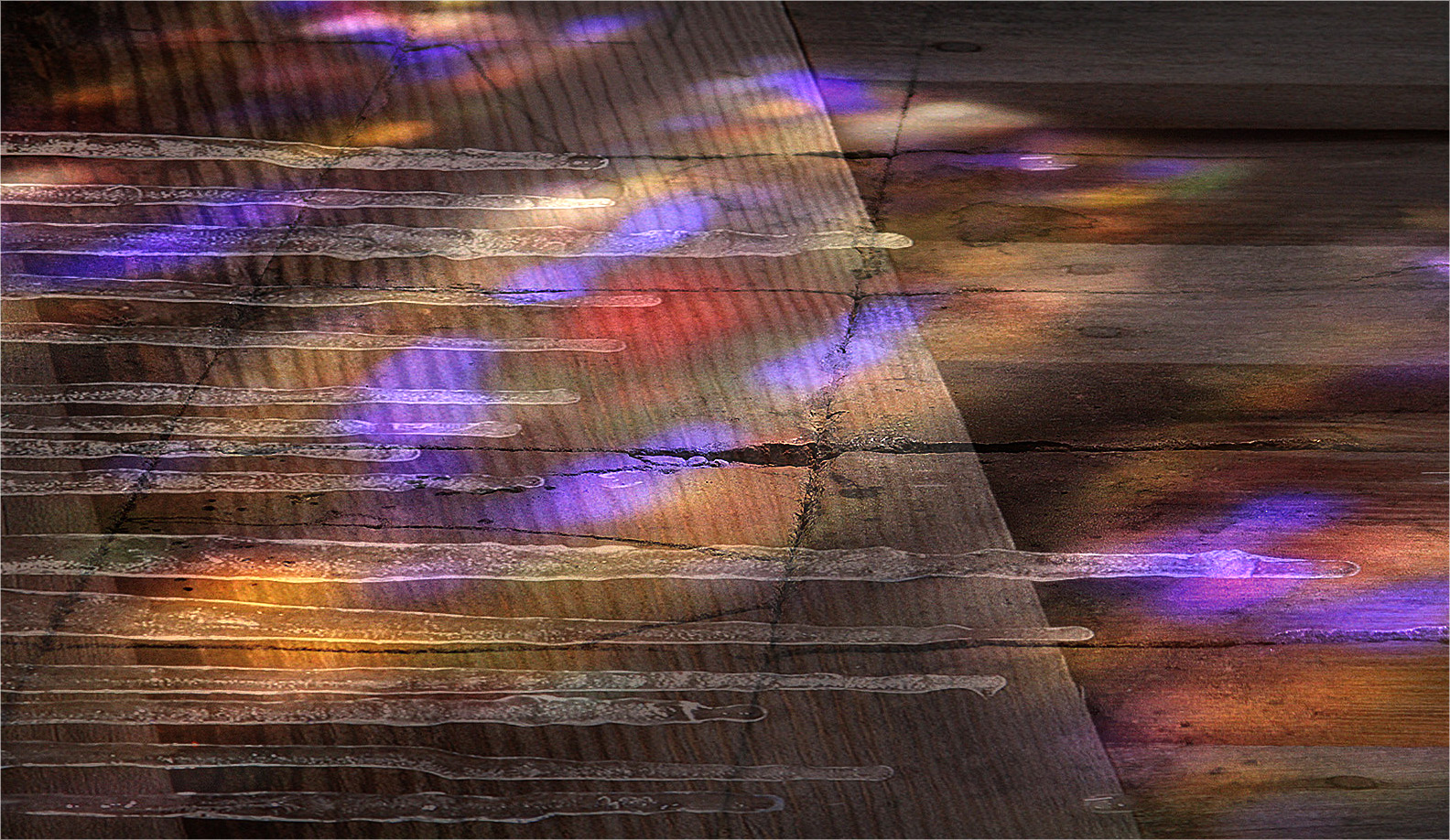
Joan, Thank you for your kind words which are much appreciated. Interesting how the notion of horizontal icicles plays havoc with the little grey cells and one's cognitive processes. There is a clear visual disconnect at play here between horizontals/diagonals and the muted hues/tones. See my Reply above to Phillipa. I have attached an alternative version where I have removed the distracting strip top right and enhanced the exposure. |
Mar 25th |
 |
| 21 |
Mar 21 |
Reply |
Janice, Thank you for your kind words which are much appreciated. Glad you liked the interplay between horizonals/diagonals and the muted tones. |
Mar 25th |
| 21 |
Mar 21 |
Reply |
Steve, Thank you for your kind words which are much appreciated. See my Reply to Phillipa above. Interesting that you found distracting the dark strip of wood in the top right corner as I thought of that as a key point. |
Mar 25th |
| 21 |
Mar 21 |
Reply |
Jan, Thank you for your kind words which are much appreciated. |
Mar 25th |
| 21 |
Mar 21 |
Reply |
Phillipa, Thank you for your kind words which are much appreciated. I agree with you that the colours in the Original are lovely and it was a pity to spoil them by diluting the effect. This month's offering was done very quickly (literally in five minutes) and what I needed to do was to remove the underlying layer from some of the icicles to create the illusion that they were sharper. I'll try to do better next term ... |
Mar 25th |
| 21 |
Mar 21 |
Comment |
Janice, this is a very striking image which works well as a piece of graphic art. Compositionally, the sandhill cranes are in a strong position with space in the frame to fly into. The contra-jour, silhouette effect works well and adds an extra dynamic. The skeletal trees at the bottom provide a good foundation for the picture. As you have the component parts on four layers, I would be inclined to lose those with the flocks of different size birds as they are a bit of a distraction and the image would be much stronger without them. I wanted to see a bit more contrasty true black in the cranes which would lift the picture. It might be worth playing around with the posterized background and increasing the numerical value of the effect. Notwithstanding my suggestions, I quite like your picture. Well done. |
Mar 25th |
| 21 |
Mar 21 |
Comment |
Phillipa, Of all four variations that I have on my screen, my undoubted favourite is your Original 1 which is fabulous. It is crisp, fresh, bright, cold and bracing. I love the clean lines of the house on the right hand side to which my attention keeps returning because there is a hidden warmth there which I enjoy very much. Although your final version is very well done, I don't get the same amount of excitement from the tonality that I do from Original 1. |
Mar 25th |
| 21 |
Mar 21 |
Comment |
Steve, I quite like your original image due to the dominance of tonality of the hanging icicles. Your use of Gimp has added an extra aesthetic and dynamic to the picture, which draws the viewer in and holds their attention. Whereas I like the negative effect of the tree and the blobs of colour in the lower two thirds of the picture, I am drawn less to the psychedelic colours on the icicles. |
Mar 25th |
| 21 |
Mar 21 |
Comment |
Peter, Isn't it just great when you wrong-foot judges and leave them in a quandary wondering whether you are telling the truth, the whole truth or nothing but the truth. It is evident that the compilation of this image was a lot of fun to do although I agree with Joan that it is a pity about the selections around the monkey which are not quite true and have left the tell-tale black halos. |
Mar 25th |
| 21 |
Mar 21 |
Reply |
Joan, I remember your Tom Thumb image.
|
Mar 25th |
| 21 |
Mar 21 |
Comment |
Charles, It looks as though this has been a labour of love with you trying to get the best out of all the layers. The end-result you have achieved on the poppy is lovely and you have created a paper-thin texture to the petals which is delightful and very artistic. It is a real pity that the background is white as it draws the eye and becomes a distraction. I would suggest you try a tonally less dominant colour or add a larger version of the poppy to fill the frame but change it to monochrome, add Gaussian Blur and reduce the opacity. That would work for me and you would have the contrast between colour and monochrome. |
Mar 25th |
| 21 |
Mar 21 |
Comment |
Joan, The first thing that hits me with this image is the range of vibrant, saturated colours of the fish which almost pop off the cactus in the background. The fish look as though they are suspended motionless in the current. I like Steve's idea of adding a layer of pool water to increase the realism and to link foreground subjects to the background in a more natural visual story. The off-centre placement of the yellow flower enhances the overall compositional strength although for me just the top three fish would have worked better. |
Mar 25th |
7 comments - 9 replies for Group 21
|
7 comments - 9 replies Total
|


