|
| Group |
Round |
C/R |
Comment |
Date |
Image |
| 5 |
Nov 20 |
Comment |
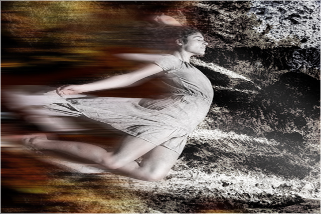
Freddie, I hope you don't mind me taking this opportunity on your Study Group page to thank you for your kind words on my image 'The Dove Has Flown' in October on SG21 which are much appreciated. Unfortunately, our page was closed for comments before I saw your comments and could reply. I love using the technique of Intentional Camera Movement as the result is different each time. I wish you well in your endeavours and I look forward to seeing some of your results. Changing the subject, I love your image this month particularly the golden glow on the body and the visual contrast of the blonde cropped hair against the brown skin tones. I also love your image in October which is a good example of moving the camera while the shutter is open. Well done. |
Nov 4th |
1 comment - 0 replies for Group 5
|
| 21 |
Nov 20 |
Reply |
Steve, Many thanks for the clarification. The Samsung Gear 360 sounds like a good piece of kit. |
Nov 14th |
| 21 |
Nov 20 |
Comment |
Steve, I like the way that the lower half of the picture looks like something that would have been taken with an extreme wide-angle lens. As my gaze travels northward through the picture, it seems to morph into something that would have been taken with a fisheye lens with you lying on the woodland floor and looking upwards into the tree canopy. This presents an interesting visual disconnect which I quite like. Although you have boosted the colour saturation, I am drawn more to the natural colour palette of the original. |
Nov 14th |
| 21 |
Nov 20 |
Reply |
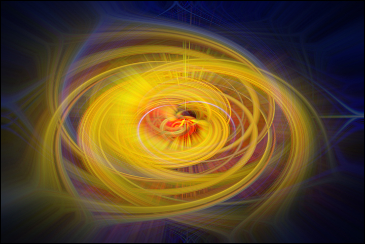
Joan, I love this technique because there is an infinite number of variations to whet the appetite. In this version, I see a hand of green and yellow bananas. Perhaps next month I will submit another image from my colour panel. |
Nov 14th |
| 21 |
Nov 20 |
Reply |
Joan, Not sure whether any effect has been added to this picture which looks like a straight image. For a bit of fun I have applied my Action to the image, switched off some of the Layers, rotated it 90 degrees clockwise and then flipped it vertically and horizontally. |
Nov 14th |
 |
| 21 |
Nov 20 |
Reply |
Joan, As you rightly say, the permutations are endless. I found that by creating an Action for the 32 individual steps, I could replicate the process simply by one key stroke. I also found by repeating the whole process three times that this produced some interesting results. Some subjects work better than others and indeed sometimes monochrome works better than colour. Looking at your version, I can see a young girl with dark hair in a red dress trying to break free or enjoying the excitement of a roller-coaster ride. |
Nov 14th |
| 21 |
Nov 20 |
Reply |
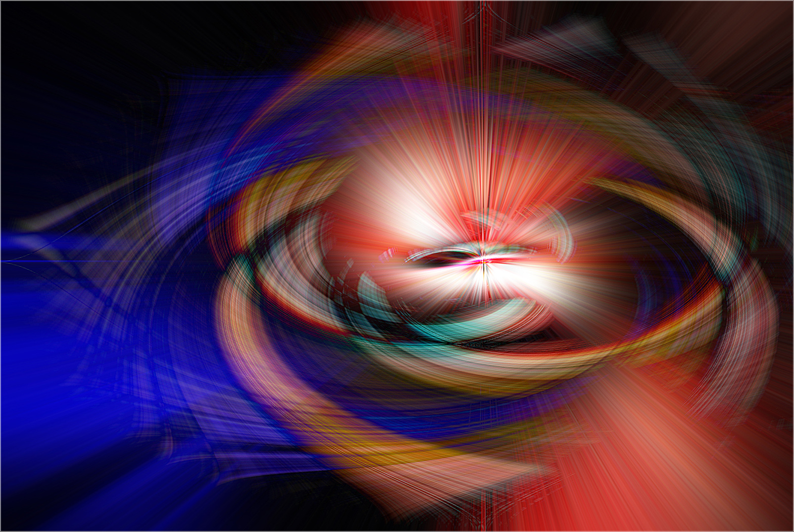
Joan, Thank you for your kind words which are much appreciated. This is one of those images that you can daydream into and get lost in your thoughts. It is not unlike a Giles cartoon in that the more you look the more you see. The viewer is certainly drawn to the starburst in the centre of the picture. |
Nov 14th |
| 21 |
Nov 20 |
Reply |
Joan, Done and dusted below. |
Nov 14th |
| 21 |
Nov 20 |
Reply |
Charles, We seem to have lost your latest version. |
Nov 10th |
| 21 |
Nov 20 |
Reply |
Mark, Thank you for your kind words which are very much appreciated. As far as choice of subjects is concerned, I tend to avoid those with high tonal contrast and those containing bright areas of sky. I quite like subjects with hues from the red and blue parts of the spectrum. Bottom line is suck it and see. You might discover a range of subjects that is unique to your good self. Let me know when you upload your first offering to Study Group 5 and I will make some comments, all positive of course. |
Nov 10th |
| 21 |
Nov 20 |
Comment |
Charles, Looking at the three originals, I would never have visualised putting them together in the way you have to create 'Woman Sliding'. The more I looked at your image, the more I had a feeling of the woman plunging headlong into the dark unknown. In order to enhance that storyline, I hope you don't mind but I have played around with the Transform Tool to stretch the picture, added a Duplicate Layer and Desaturated it, and then applied Motion Blur to enhance the sense of movement. Perhaps it needs to be rotated clockwise a touch to enhance the sense of falling into a hole. Isn't it interesting how we all see images in different ways? |
Nov 7th |
 |
| 21 |
Nov 20 |
Reply |
Charles, Your iteration works for me and the added colour contrast makes the composition pop out of the background. |
Nov 7th |
| 21 |
Nov 20 |
Reply |
Charles, I presume the softening in the final version is a function of the effects of Topaz Studio 2/Filters when applied to Original 2. |
Nov 7th |
| 21 |
Nov 20 |
Reply |
Charles, I like your version which has a softer flow of colours through the image and the top right hand corner is less dominant on the eye. Well done. |
Nov 7th |
| 21 |
Nov 20 |
Reply |
Charles, Thank you for your kind words which are much appreciated. Glad you liked it. Like you, I find it difficult to get my head round the fact that the original image morphed itself into the final version. Indeed, the wonders of Photoshop. |
Nov 6th |
| 21 |
Nov 20 |
Comment |
Joan, Your image is an explosion of colour, shape, pattern and texture which is very appealing to the eye. I like the blue/yellow complementary colours which provide a focus and anchor for the picture. I would like to have seen white tips to the sagebrush captured in Peter's inverted variation. I like Peter's analogy with Haydn's Symphony. |
Nov 6th |
| 21 |
Nov 20 |
Reply |
Peter, I like the way that your inversion has highlighted the whiteness of the sagebrush tips emerging from the orange beneath. |
Nov 6th |
| 21 |
Nov 20 |
Reply |
Phillipa, I agree with you that this is something worth following up. The notion is sound that our brains are wired up the same and it is only our perceptions that are shaped by cultural influences. There is a visual hierarchy in the process of organising content to follow natural eye movement patterns. The way we perceive information is affected by several factors that contribute to how we rank the hierarchy of content within the visual layout, eg size, colour, contrast, alignment, repetition, proximity, whitespace, texture and style. Eye-catching images need psychology and there are common patterns that our eyes tend to make when presented with visual stimuli. English readers have a set scanning pattern left-to-right whereas Arabic readers have a different pattern right-to-left and Chinese readers follow a top-down regime. Eye flow is the path our eyes naturally take through content, eg Z-pattern or F-pattern. It is amazing what has stuck from my Psychology Degree all those years ago. |
Nov 6th |
| 21 |
Nov 20 |
Reply |
Phillipa, Thank you for your kind words which are much appreciated. I have attached below a version with the centre a little to the side. You are correct in that it improves the composition and enhances the overall visual dynamic. |
Nov 6th |
 |
| 21 |
Nov 20 |
Reply |
Peter, Thank you for your kind words which are very much appreciated. As an aside, I recently rediscovered the process of creating 'Actions' in Photoshop. In this case, there were 32 different steps in its production. Imagine my joy to know that I can replicate the process by clicking just one button. Why don't you try this process on one of your images and see where it takes you? |
Nov 6th |
| 21 |
Nov 20 |
Reply |
Peter, I love this artistic iteration of your triptych which I prefer to your earlier version. The painterly effect to the images and the textured border add a sense of mystery and romance which is most appealing. The ragged edges to each image is perfect. Interesting that you made the first image maroon/orange/yellow and the other two blue/aquamarine. Presume that was deliberate on your part to introduce a colour tension but I wondered how it would look if there was a common hue across all three images, perhaps the blues to make it more visually relaxing. Either way, I love it. Well done. |
Nov 5th |
| 21 |
Nov 20 |
Reply |
Peter, You make a good point about the cultural differences in an international organisation. Whenever, I am asked to judge at camera clubs, inevitably the question of composition pops its head up and I make the point about left-to-right visual flow in Western cultures. I also make the point that if I was an Arab or a Chinese photographer, then the visual flow would be in a different direction. |
Nov 5th |
| 21 |
Nov 20 |
Reply |
Freddie, Thank you for your kind words which are very much appreciated. As a former radiologist, I expect you are glad to be out of all the techie stuff and now able to relax more in the artistic side of photography. Who needs Photoshop when you can create the arty stuff simply through Intentional Camera Movement? |
Nov 5th |
| 21 |
Nov 20 |
Comment |
Phillipa, Your image, although a still-life, has a resonance of 5th November and Guy Fawkes celebrations. I love the maroon/violet side-lighting which works well and creates a sense of mystery and intrigue to the overall visual story. This is enhanced further by the green/blue granularity in the picture. I prefer the darkness you have created in favour of your Originals 1 and 2 which are well exposed and tick the technical boxes but for me lack the visual excitement that you have created. You have taken your still-life to a new level. Well done. |
Nov 4th |
| 21 |
Nov 20 |
Comment |
Peter, What do judges know? Clearly, the one at your Camera Club must have been looking at something else and/or had his/her mind elsewhere. It is amazing how we photographers are always drawn like magnets to old rusty pipes and flaking paint. I love the visual softness and flow through the three elements of the triptych. The colour palette works across the composite and the individual colours link together well. However, I am less keen on the brightness of the border which needs to be toned down and a little less dominant as it draws the eye. |
Nov 4th |
| 21 |
Nov 20 |
Comment |
Joan, I presume this is the same image as you submitted last month and I have repeated my comments here...
This looks like having been a labour of love. I like the way that you have arranged the dark tones in the centre of the flower, how they get lighter towards the outside and how they seem to blend with and bleed over into the background. The softness of the background works well. Colour preferences are a personal thing but for me I'm not sure about the overall pink hues. Also I wanted to see a little bit more punch in the centre of the flower. Would the image work if it was flipped horizontally to make good use of the left-to-right visual flow through the stems? |
Nov 4th |
6 comments - 19 replies for Group 21
|
7 comments - 19 replies Total
|


