|
| Group |
Round |
C/R |
Comment |
Date |
Image |
| 21 |
Aug 20 |
Reply |
Joan, Why don't you start another thread on the Bulletin Board? |
Aug 29th |
| 21 |
Aug 20 |
Reply |
Charles, If you photograph anyone with the intention of using the resulting images for commercial gain then it is essential that you have a Model Release Form duly completed by the subject. Barrie makes a good point in his image profile and that is the need to protect the subject from any facial recognition. In the case of figure studies, Joan also makes a good point that the keynote here is that it should be artistic and in good taste. |
Aug 28th |
| 21 |
Aug 20 |
Reply |
Joan, Isn't it wonderful to see a crossover between two art forms; photography and baking? I love the term 'Stodgy' which reminds me of childhood! |
Aug 19th |
| 21 |
Aug 20 |
Reply |
Joan, I quite like the way that you have used Curves to add colour but I prefer the visual tension of the monochrome version. |
Aug 19th |
| 21 |
Aug 20 |
Reply |
Joan, Thank you for your kind words which are much appreciated. Daliesque is a genuine word which relates to the work of Salvador Dali. I like your idea of attaching wings to the clock which would enhance the visual story of 'Time Flies' and indeed the breakdown of time. |
Aug 19th |
| 21 |
Aug 20 |
Comment |
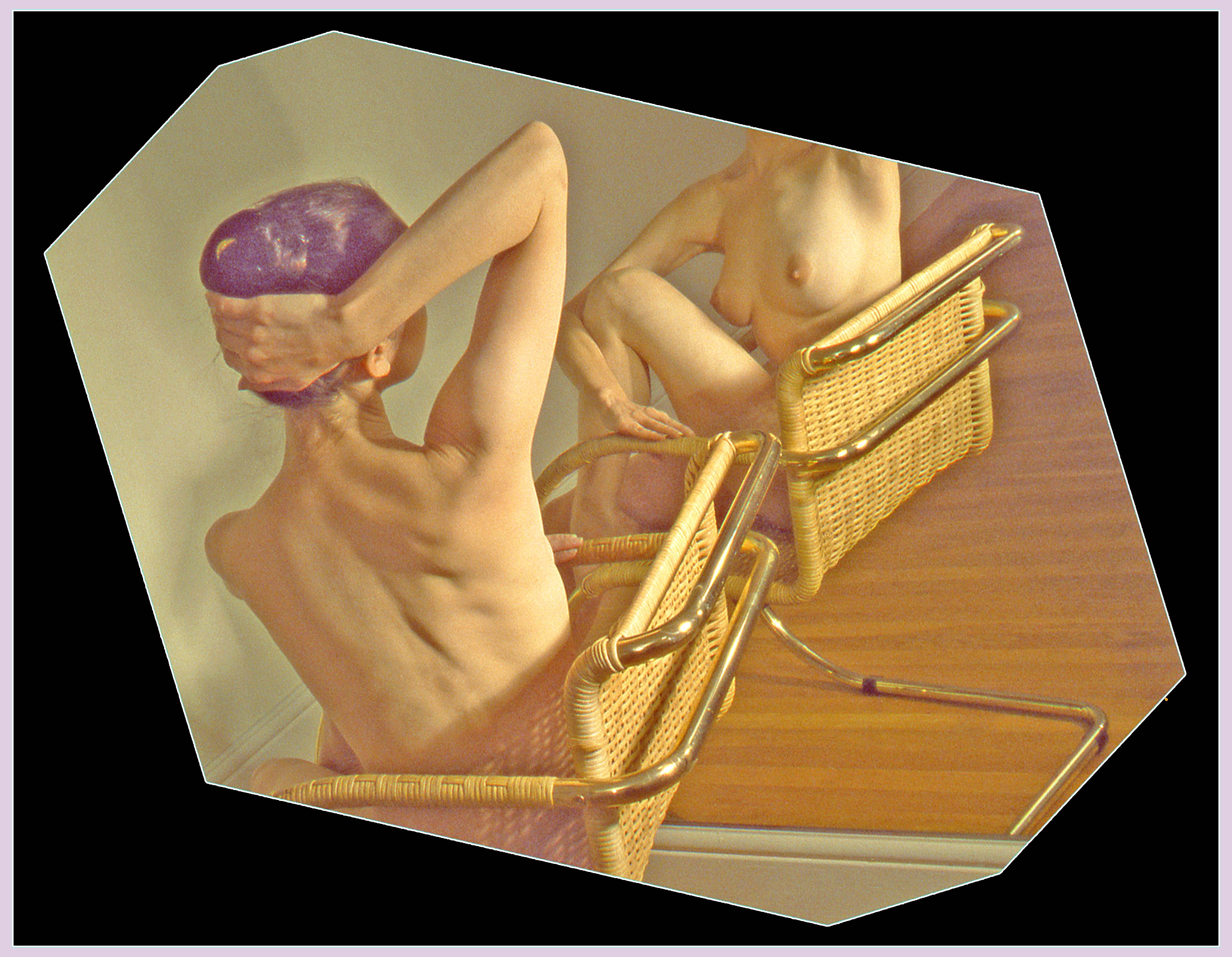
Barrie, This is a departure from your usual style of image where you have used variously the Edges Filters. I like the idea behind this image of the model sitting on a chair looking at her reflection in the mirror. In this way, we have a 360 degree view of the model. I am pleased that the model remains anonymous in accordance with her wishes in the Model Release Form. I like your octagonal cropping of the image which adds an artistic dimension. It is a pity that we can see the wooden rail at the bottom of the mirror. Had that not been there, then this would have increased the overall aesthetic and visual tension in the image. I am not sure about the colour of the background which draws my eye away from the model. Equally, the bright white border seems to be too dominant for me. I have taken the liberty of applying a black background and inserting a pale colour similar to the model's hair into the white stroked border. With this combination, my eyes are channelled directly to the model. |
Aug 11th |
 |
| 21 |
Aug 20 |
Reply |
Peter, I am glad that it wasn't me losing my marbles as I saw the same thing ... |
Aug 11th |
| 21 |
Aug 20 |
Comment |
Phillipa, I like the way that you have taken your original images and combined them to create something that is artistic and dreamy. You have placed your red hibiscus flower centrally in the frame which makes for a visually static image. In order to increase the overall visual dynamic, an off-centre placement is preferable. Peter is spot on with his use of Crop/Rotate. However, it is a pity in this case that we are left with two flowers which compete for our attention. An ideal number would be three which would create a visual triangle of interest. You need to remember that our eyes are always drawn to the brightest part of a picture and in your image they are the yellow stamens placed centrally in the frame. |
Aug 11th |
| 21 |
Aug 20 |
Comment |
Peter, When I first saw your image, I saw a mountaintop with two rivers joining and the water (coloured by peat bogs upstream) cascading over the edge into a waterfall. When I looked at it a second time, I saw a rainforest that had been decimated by illegal logging. When I looked at it a third time, I saw a miscellany of flying deer, dogs and pelicans. Then I read your explanation of the image and discovered that it was the sand at your feet. Wow! I love images that speak to me in different ways at different times. Well done. |
Aug 11th |
| 21 |
Aug 20 |
Comment |
Charles, You have done well to combine the amethyst and the poppy with the model to create an image that is believable. I like the way that you have softened the amethyst and used it as the background although I would be inclined to tone down the highlights a little. Your selection from the poppy to create the flared skirt and bra works very well although I wonder whether a single garment would work better as this would have greater resonance with the flamenco dancer visual story that you are trying to create. Have you thought about changing the background to monochrome and/or applying Radial Zoom Blur to make the dancer jump off the page? The original colour of the poppy would work well against a B&W or colorized background. |
Aug 11th |
| 21 |
Aug 20 |
Reply |
Peter, Thank you for your kind words which are much appreciated. I love your expression 'to noodle around' which reminds me of my childhood. I would be happy to lose a sliver off the top of the picture. I like your analogy to the nursery rhyme Hickory Dickory Dock and it does look as though the mouse has taken a chunk out of the clock frame. |
Aug 11th |
| 21 |
Aug 20 |
Reply |
Phillipa, Thank you for your kind words which are much appreciated. Like you, I quite like the intoxicated sensation I get when looking at the clock, although having had one too many at 1640 hours does beg the question about this individual? |
Aug 11th |
| 21 |
Aug 20 |
Comment |
Joan, I like the creativity of this one. I am reminded of a strobe image where left-to-right movement has been captured and presented in the same frame. It is an interesting interpretation and the way that you have arranged the component parts into a letterbox panorama works well. |
Aug 11th |
5 comments - 8 replies for Group 21
|
5 comments - 8 replies Total
|


