|
| Group |
Round |
C/R |
Comment |
Date |
Image |
| 21 |
Jun 20 |
Reply |
Steve, Thank you for your kind words which are much appreciated. I must admit that when I first saw the face sculpture on the side of the cottage, I was drawn to it immediately because it was large (around 3' x 2') and very striking. However, being of the creative persuasion, I couldn't help myself playing around with it to produce something that was more than the reality. Interesting that you prefer the original. |
Jun 30th |
| 21 |
Jun 20 |
Reply |
Thanks Peter. |
Jun 24th |
| 21 |
Jun 20 |
Reply |
Joan, Thank you for your kind words which are much appreciated. I like your analogy of the elderflower being a visual representation of the pain of a migraine headache which can be so strong and almost unbearable. |
Jun 18th |
| 21 |
Jun 20 |
Comment |
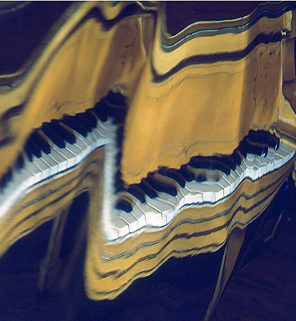
Barrie, We are so used to seeing your use of Posterization and Edges Filters that it feels a little strange to see an image of yours that does not feature those effects. I like your use of the complementary colours 'yellow and blue' which works well. There is a good visual contrast between the reality of the keyboard on the right and the wrinkly versions in the middle and on the left hand side. Given my style of photography, I am drawn more to the non-reality. Therefore, I have attached such a version where I have Cropped off the keyboard on the right hand side. |
Jun 18th |
 |
| 21 |
Jun 20 |
Comment |
Phillipa, Your image is compositionally strong with the Danish windmill positioned off-centre in the frame on the left hand third. This works well and creates a visually dynamic picture. I love the Fractalius-like effect that you have achieved on the foreground which is echoed on the sea in the background. However, I am less happy with the addition of your sun glasses and colour into the composite. I like the idea behind your Original 2 with the rectangle of colour over a monochrome surround but the addition of your spectacles spoils it for me. |
Jun 18th |
| 21 |
Jun 20 |
Comment |
Steve, I like the graphic simplicity of this image and the interplay of pseudo-monochrome and colour. It is very much a picture of shapes, patterns, textures and recession which works well compositionally. The addition of the contrast adds to the overall aesthetic. Your choice of using a coloured glass marble for the sky is a master stroke. The Cartoon Filter has created a pen-and-ink effect on a white background which draws the eye through the cobbled pathway to the house in the distance. Well done. |
Jun 18th |
| 21 |
Jun 20 |
Comment |
Peter, Your low viewpoint has provided the perfect angle to create a visually dynamic picture with immediate impact. I like the way that you have used Coral Essentials to produce an image that has an artistic, painterly feeling to it. This works very well. The range of saturated blobs of colour lets the mind wander. A small nitpick if I may but I find the area of lime-green in the top right hand corner a little distracting and which draws the eye. Perhaps it could be toned down a touch. |
Jun 18th |
| 21 |
Jun 20 |
Comment |
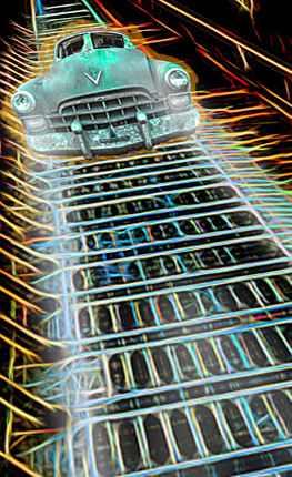
Charles, I have always been a fan of the Fractalius and Topaz Filters, both of which produce similar effects. I like the added Neon option which has created a cobweb effect that raises the image to a higher aesthetic. The way that you have used the linear geometrical shapes of the subway to form the roadway and imported the car onto it works a treat. Placement of the car in the upper part of the frame adds to the visual dynamic of the composite. Every time I looked at your image, I wanted to stretch the reality a little. Therefore, I have attached such a version to give a flavour of what I mean where I have used Crop, Rotate and Edit>Transform>Distort. |
Jun 18th |
 |
| 21 |
Jun 20 |
Reply |
Charles, Thank you for your kind words which are much appreciated. I agree with you that looking to the left is the preferred option which goes against the perceived wisdom that a left-to-right visual flow through an image is better than the reverse. |
Jun 18th |
| 21 |
Jun 20 |
Reply |
Peter, Many thanks for the heads-up about 'Content Aware Scaling'. |
Jun 18th |
| 21 |
Jun 20 |
Reply |
Joan, Thank you for your kind words which are much appreciated. How time flies when you're having fun! Has it really been 20 years? Wow. |
Jun 18th |
| 21 |
Jun 20 |
Comment |
Joan, I recognize this balloon from way back and indeed the boy looks familiar. This is a very creative image and your collage of the three elements has been arranged seamlessly. I like the way that you have applied the colour gradient to the background to harmonize with the boy's clothing. This works well. Slight pity about the banding on the darker petals of the flower lower left. I wondered whether we needed to see a hint of the flower stem? Overall well done. |
Jun 15th |
6 comments - 6 replies for Group 21
|
6 comments - 6 replies Total
|


