|
| Group |
Round |
C/R |
Comment |
Date |
Image |
| 21 |
Feb 20 |
Reply |
Steve, Thank you for your kind words. |
Feb 29th |
| 21 |
Feb 20 |
Reply |
Joan, Delighted that you prefer the second book cover. |
Feb 29th |
| 21 |
Feb 20 |
Reply |
Joan, You might also be interested to know that we have changed the title and front cover of our second book as follows. It is more modern, more punchy and operates at different levels. |
Feb 13th |
 |
| 21 |
Feb 20 |
Reply |
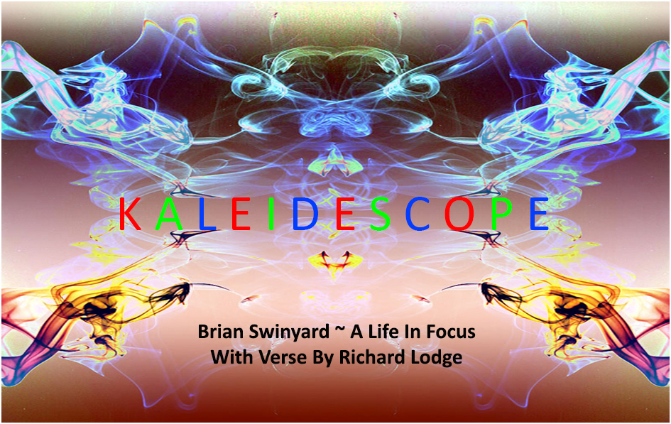
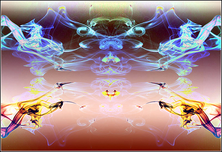
Joan, You might be interested to know that until recently, Richard and I were going to use the Kaleidescope title and image for our second book, as below. |
Feb 13th |
 |
| 21 |
Feb 20 |
Reply |
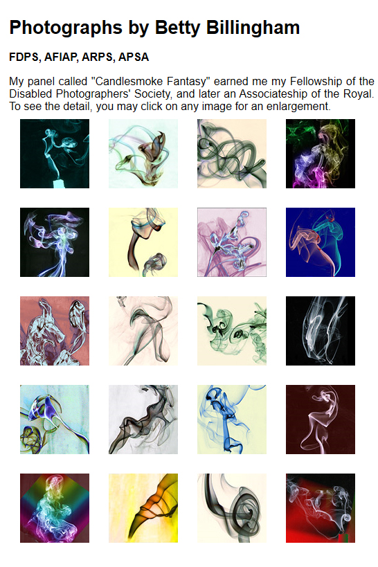
Phillipa, Please thank Jane for allowing you to show me her smoke images. They are lovely. The next time I do this I will be reaching for black cardboard as background. A good friend of mine, Betty Billingham, also does smoke images. You and Jane might like to have a look at her website at
http://www.bettybillingham.co.uk/Galleries.html?LMCL=wUpaRl
I have attached a screenshot of the opening page which shows the images she used to obtain her Fellowship. |
Feb 12th |
 |
| 21 |
Feb 20 |
Reply |
Phillipa, Please let me know if you find out how to do it against a black background. |
Feb 11th |
| 21 |
Feb 20 |
Reply |
Phillipa, I haven't tried a black or white background and I am not sure how to go about that post-event. I am sure there must be an easy way in Photoshop using Layers and Blending Modes. It would be interesting to do and I wonder what it would look like with the white areas bleeding into a white background and the black lines lost in a black background. |
Feb 11th |
| 21 |
Feb 20 |
Reply |
Phillipa, Further to my last comment: note how I have also cropped off some of the black from the bottom, the result of which focusses more attention on the face (which is larger in the frame) and also makes the face much lighter. |
Feb 10th |
| 21 |
Feb 20 |
Reply |
Phillipa, Thank you for your comments which are much appreciated. For interest, I have attached an Inverted version to show a different colour palette. |
Feb 10th |
 |
| 21 |
Feb 20 |
Reply |
Phillipa, Your mono image is lovely and gets my vote over the colour version. I have taken the liberty of rotating it slightly anti-clockwise to place the eyes on a slight diagonal which not only increases the overall visual dynamic but also enhances the romantic overtones. |
Feb 10th |
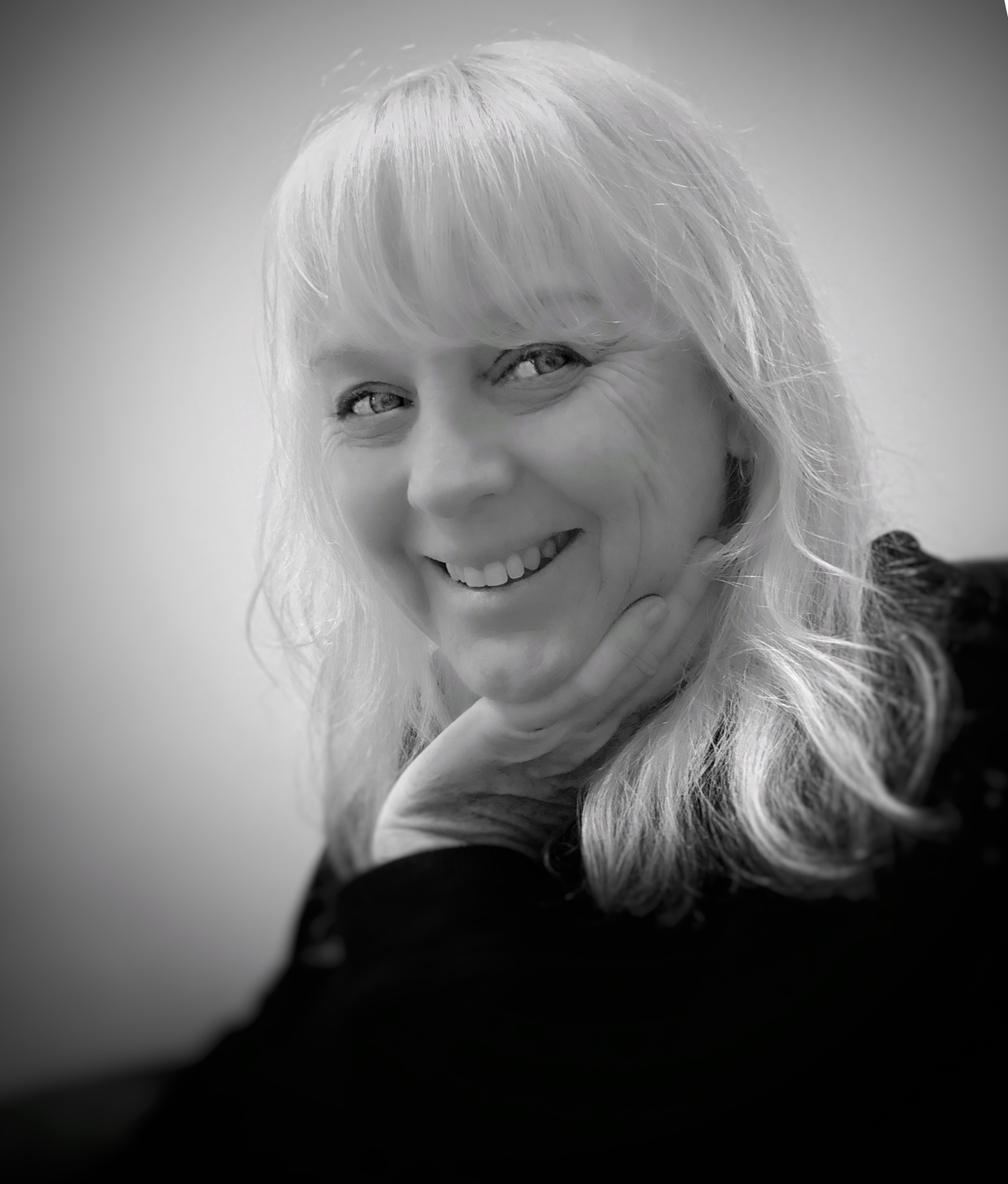 |
| 21 |
Feb 20 |
Comment |
Phillipa, It looks as though the original and the submitted images this month are the same. I am looking forward to seeing the mono version. Bronwyn looks like her Mum. When taking portrait pictures I find it is a good idea to have the eyes on a slight diagonal which increases the overall visual dynamic. Keep an eye on the background, in this case we have the line of the two walls which is a little distracting. I also find that hands can be the most difficult subjects to photograph. The best option is to photograph them edge on as you have done here but my preference is to keep them hidden from view. |
Feb 9th |
| 21 |
Feb 20 |
Comment |
Steve, This is a wonderfully creative image, full of mystery and intrigue. It was a good decision to rotate the original ninety degrees anti-clockwise to ensure that the main subject (I presume your good self) is in a compositionally stronger position. Replacement of the white sky with the interference pattern works a treat and enhances the visual story of a planet floating through space. Well done. |
Feb 9th |
| 21 |
Feb 20 |
Comment |
Joan, There is a freshness to this image that is very appealing. The saturated colours work a treat (sorry for pun) and compositionally, I like the swirling effect that you have created. Normally with this kind of effect I would expect to see blurred movement but in this case everything in the image is bitingly sharp and it works. Well done. |
Feb 9th |
3 comments - 10 replies for Group 21
|
3 comments - 10 replies Total
|


