|
| Group |
Round |
C/R |
Comment |
Date |
Image |
| 21 |
Apr 19 |
Reply |
Joan, I didn't use a particular App or Program. The spheres were created manually using Spherize in Photoshop. |
Apr 28th |
| 21 |
Apr 19 |
Reply |
Joan, Thank you for your kind words which are much appreciated. As I mentioned to Steve, I flipped the bubbles to accord with the laws of physics. I did another version with four bubbles but it didn't work so well as this one. A good example of knowing when to stop fiddling and diddling. I share Donna Reed's sentiments; we need to produce images for ourselves and not for judges. Delighted that you like both mono and colour versions. |
Apr 28th |
| 21 |
Apr 19 |
Reply |
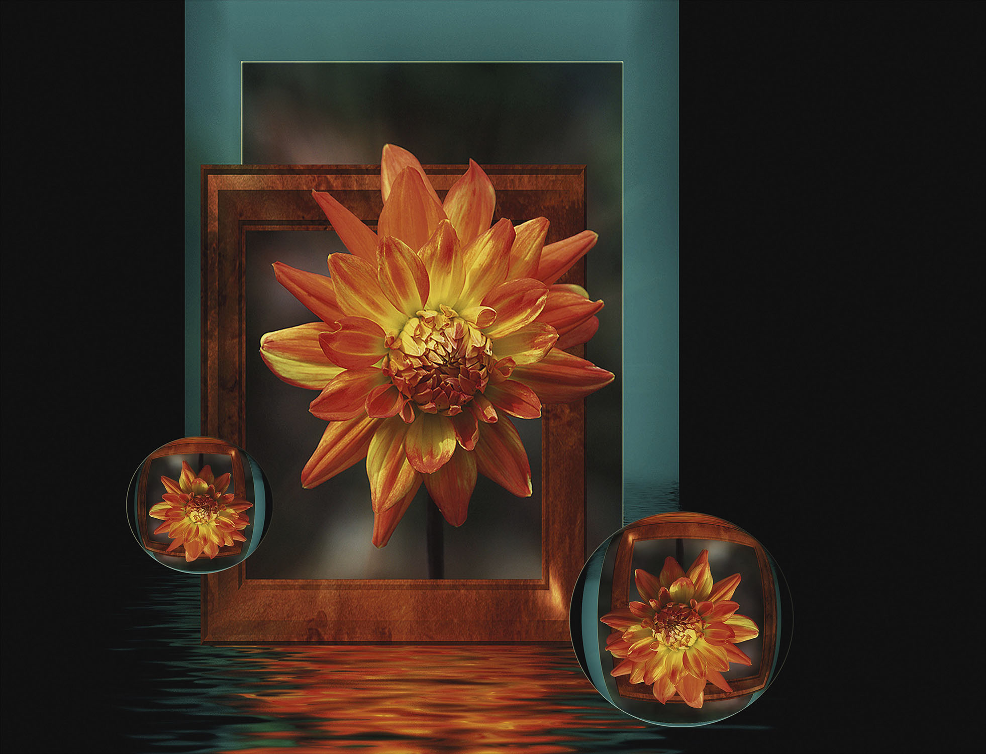
Steve, Thank you for kind words which are much appreciated. With regard to the flower petals on the right, the flower is in front of the small wooden frame which is in front of the larger plane frame behind it. I can understand your concern but I quite like images where there is a visual ambiguity. I deliberately didn't overlap the furthest tip onto the larger frame to create that ambiguity. I flipped the bubbles to accord with the rules of physics whereby the sphere acts as a lens to invert the reflected image. In fact both bubbles are flipped vertically but in addition the right bubble is flipped horizontally. |
Apr 28th |
| 21 |
Apr 19 |
Reply |
Barrie, Sounds like a good idea. I would go for an eagle in either of the red circles. |
Apr 17th |
 |
| 21 |
Apr 19 |
Comment |
John, you have created an interesting image of simple shapes, patterns and textures. The saturated colours work well and hold the composition together. It is a pity about the white halo around the tomatoes. |
Apr 14th |
| 21 |
Apr 19 |
Comment |
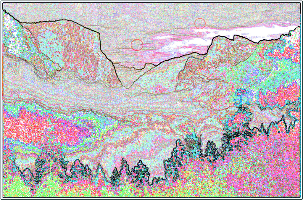
Barrie, There are some interesting shapes patterns and textures created by the Find Edges filter. I wonder whether it needs another element to play in front of the background landscape. |
Apr 14th |
| 21 |
Apr 19 |
Reply |
Barrie, Many thanks for your comments and suggestions which I shall try. |
Apr 14th |
| 21 |
Apr 19 |
Comment |
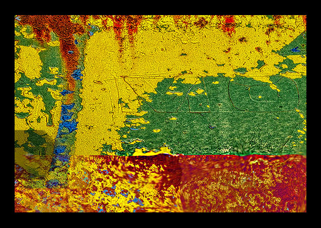
Peter, It never ceases to amaze me how we photographers are drawn like lemmings to peeling paint and rust which provide a myriad of shapes into which we can dream and get lost. I love the saturated colours and the plethora of patterns and textures. Compositionally, I find the horizontal boundary line separating the green and red areas is too central and splits the image into two halves which compete for attention. I have attached a cropped version below to show what I mean and in which I have sharpened some of the blurred areas. |
Apr 12th |
 |
| 21 |
Apr 19 |
Comment |
Steve, I am impressed with your technical expertise necessary to correct the visual anomalies in the creation of this full circular fisheye image. The transition from original to post-processed version works perfectly. I like the sense of covert intrusion into someone's private space. The natural feeling of the lead-in, horizontal and vertical lines works well. |
Apr 12th |
| 21 |
Apr 19 |
Comment |
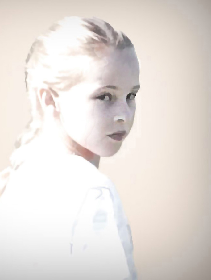
Susan, I am a big fan of high key images and you have done well to isolate Leslie from the background and to create an image that has a translucent and simplified feeling to it. Compositionally, the subject is rather central in the frame which makes for a visually static image. I find that an off-centre placement increases the overall visual dynamic. The attached cropped version gives a flavour of what I mean. In this version, I have also sharpened the eyes to create the illusion that she is looking through the misty haze. |
Apr 12th |
 |
| 21 |
Apr 19 |
Reply |
Susan, Creative means different things to different people and to me your image is indeed creative.
|
Apr 12th |
| 21 |
Apr 19 |
Comment |
Joan, You have presented an interesting visual story in this image with dichotomies working between child/bird and meerkat/bird. The three subjects create a good visual triangle of interest which draws the viewer in. However, overall I find it a little disconnected and I am not sure whether it quite works for me. |
Apr 12th |
| 21 |
Apr 19 |
Reply |
Steve, I love your analogy of the child not belonging here and asking the bird to take him home! |
Apr 12th |
| 21 |
Apr 19 |
Comment |
Susan, Many thanks for your comments. It is interesting that you found the orange too strong as that was the actual colour of the original dahlia bloom. I have attached a toned down version of the colour for comparison where I have reduced the saturation level to -20. I included the two spheres to stretch the overall visual dynamic. |
Apr 12th |
 |
7 comments - 7 replies for Group 21
|
7 comments - 7 replies Total
|


