|
| Group |
Round |
C/R |
Comment |
Date |
Image |
| 21 |
Mar 19 |
Reply |
Joan, Thank you for your kind words which are much appreciated. I agree with you that we don't always need to use Photoshop to be creative. |
Mar 31st |
| 21 |
Mar 19 |
Comment |
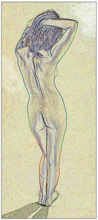
Barrie, I quite like the simplicity of this image with its limited colour palette and structure delineated simply by the black lines. The shadow is tantalizing which makes me want to see more of it. I also quite like the flipped version to make more of the left-to-right visual flow. |
Mar 20th |
 |
| 21 |
Mar 19 |
Reply |
Steve, Good point which I hadn't even noticed! |
Mar 20th |
| 21 |
Mar 19 |
Reply |
Steve, I quite like the first iteration (ie the tree-like colours) but I am not so sure about the second. They are both certainly unique and custom to your good self. |
Mar 20th |
| 21 |
Mar 19 |
Reply |
Steve, I like what you have done to these iterations which I will try. Many thanks. |
Mar 20th |
| 21 |
Mar 19 |
Comment |
John, Your image has immediate impact created by removal of the radial blur over the player and the basketball. This works well and focusses the attention on the slam dunk yet retains the feeling of crowd excitement in the background. Compositionally, there is a good left-to-right and diagonal visual flow which I like. |
Mar 12th |
| 21 |
Mar 19 |
Reply |
Peter, I quite like the idea of alien beings emerging from the primordial soup ... |
Mar 12th |
| 21 |
Mar 19 |
Reply |
Peter, I don't believe the fish eyes are too prominent, in fact they add to the overall aesthetic and mystery. |
Mar 8th |
| 21 |
Mar 19 |
Comment |
Peter, Thank you for your comments. Pleased to read that you see the images as a sequence with each one building on the one before. I hadn't thought about a grey border but it certainly works better than the stark white which is a little distracting and tends to draw the eye. I have added a slightly darker grey border for comparison. |
Mar 8th |
 |
| 21 |
Mar 19 |
Comment |
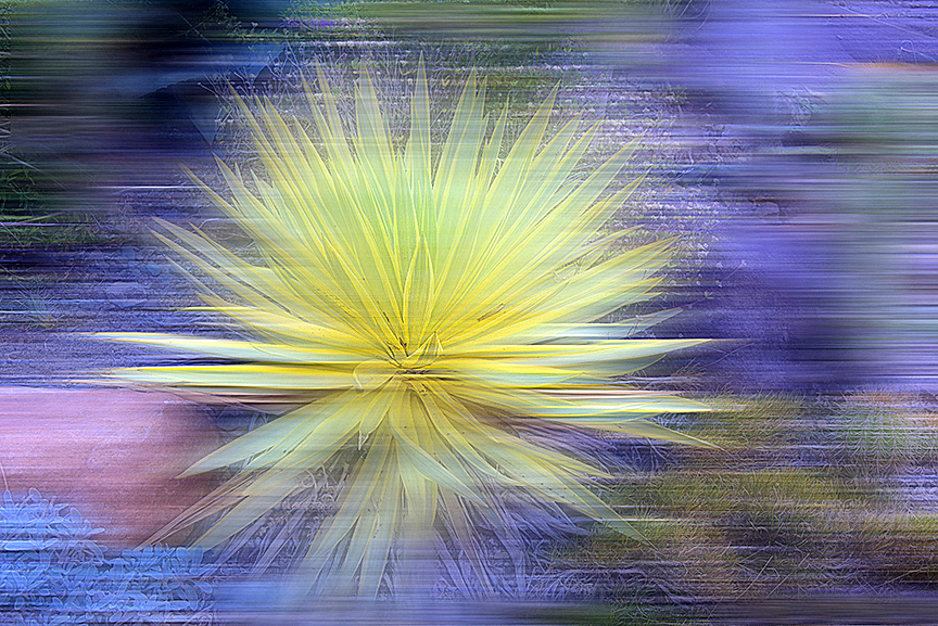
Peter, I quite like this image. It is compositionally strong with the crown of the plant placed off-centre in the frame to increase the overall visual dynamic. I love the azure blue and the darker tones running throughout, and the effect that you have created which is not unlike the Plastic Wrap Filter. I like the way that you have added three fish which is a compositionally strong number to create a good visual triangle of interest. After a while, I start to see fish eyes all over the picture. |
Mar 6th |
| 21 |
Mar 19 |
Comment |
Steve, This is an interesting image and is the stuff of dreams where the reference points and visual anchors are shifted out of the reality spectrum. I like your use of the Warp Tool to create the distortion and the way you have returned the foreground tombstone to its original state which provides a foil for all the stuff that's going on in the background. I quite like the sharpness of the trees which gives a visual disconnect with the warped grass and headstones below. I particularly like the tree on the right. The grass is almost like a sea of red clover. |
Mar 6th |
| 21 |
Mar 19 |
Comment |
Joan, Then I tried Inverting the image to create a negative per below. |
Mar 6th |
 |
| 21 |
Mar 19 |
Comment |
Joan, I like the soft-focus, romantic, painterly feeling that you have created with this image and the swathes of colour in the background. However, I wanted to see the succulent a little sharper to stand out from the abstract background. I have taken the liberty of attaching such a version. |
Mar 6th |
 |
7 comments - 6 replies for Group 21
|
7 comments - 6 replies Total
|


