|
| Group |
Round |
C/R |
Comment |
Date |
Image |
| 21 |
Aug 18 |
Comment |
John, Your image is full of beautifully saturated colours and geometric shapes, patterns and textures. I agree with Joan that your addition of the Oil Paint Filter has added a creative textural feeling which is quite attractive. The image is a busy one with much in it to focus the attention. I find that my eye flitted around the disparate parts and I wanted some element on which I could rest my gaze. Compositionally, I wanted to see all of the building on the left-hand side. I also found the two balloons a little distracting, particularly the red, white and blue one that was partly behind the lighthouse. I would have removed that one and left the red, orange and yellow one which is well placed. I also found a little distracting, the residual effects of removing the horizontal rails in front of three of the buildings. |
Aug 26th |
| 21 |
Aug 18 |
Reply |
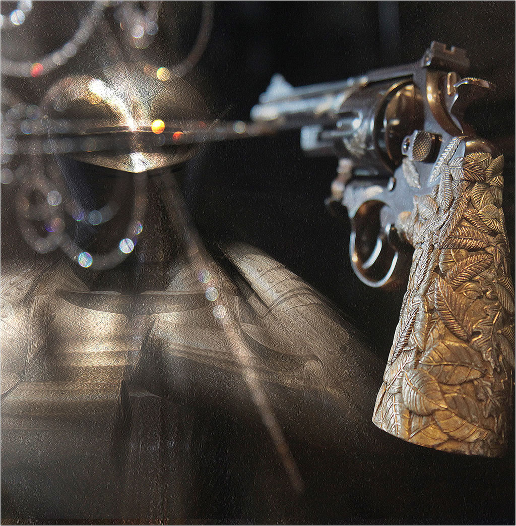
Joan, Thank you for your comments which are much appreciated. I agree with your suggestion to align the line of interest and the gun barrel which works perfectly. Interesting that you picked up on the repetition of shapes between the spiral loops and the gun trigger. |
Aug 26th |
| 21 |
Aug 18 |
Reply |
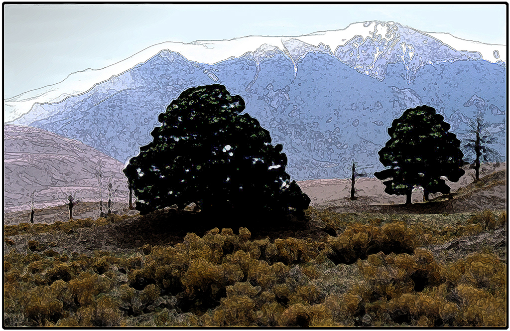
Barrie, Thank you for the clarification. It is quite disconcerting for me that I didn't see the snow-capped peaks as such but interpreted them as a function of your filter technique. They say the camera never lies �� I agree with Peter that the foreground could be a touch lighter. |
Aug 24th |
| 21 |
Aug 18 |
Reply |
Peter, Thank you for your comments which are much appreciated. I am pleased that you have got the dichotomies; ying/yang, sharp/blur. I agree that the armour is a touch on the bright side and I have darkened it down a bit on the second iteration below. |
Aug 24th |
 |
| 21 |
Aug 18 |
Reply |
Susan, Thank you for your comments which are much appreciated. I am pleased that you picked up on the fading focus of the gun which leads the eye to the armour. Indeed, it was my intention to combine the two original images to create the illusion that the gun was firing at the armour and that the bullet, on hitting the head-guard, was creating the myriad of flare spots. The original gun image included in its glass cabinet a static display of the circular and linear shapes that were encrusted with diamonds which created the bright highlights. I agree with your understanding of bokeh to be the aesthetic quality of blur produced in out-of-focus parts of an image produced by a lens. It is the way a lens renders out-of-focus points of light and usually occurs for parts of the scene that lie outside the depth of field. Bokeh is often most visible around small background highlights such as specular reflections and light sources but actually occurs in all out-of-focus regions of an image. In this case, I agree with your assertion that it would be better to line up the gun and the reflections to make it appear more real. |
Aug 24th |
| 21 |
Aug 18 |
Comment |
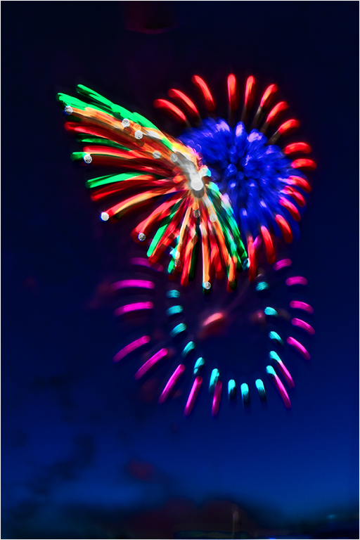
Peter, Fireworks can be a tricky subject to photograph and from experience I share you concerns about blurry results. However, undaunted, you didn't give up but pursued the visual story in the computer. I agree that the composition is good; your three bursts of fireworks are compositionally strong and create a good visual triangle of interest. The colours are beautifully saturated and really pop. Your digital technique has worked very well and created a pseudo 3D effect where the colours, shapes and patterns jump out of the screen. I note your concern about the bottom of the picture. I think it needs something at the bottom of the frame to anchor the fireworks in reality. The bright highlight is a little distracting and needs to be toned down a touch. What about flipping the image horizontally to enhance the left-to-right visual flow? See below. In this case, I find that the breaking firework leads me into the upper ring to create the illusion of disappearing through a black hole into space. Well done. |
Aug 12th |
 |
| 21 |
Aug 18 |
Comment |
Susan, You have made good colour choices here to create a composite that not only has spooky overtones but also is greater than the sum of its parts. I like the left-to-right visual flow through the image and the soft-focus, textural, tactile quality that you have achieved. Your hint of lightning in the top left quadrant works a treat. Congratulations and well done. |
Aug 12th |
| 21 |
Aug 18 |
Comment |
Barrie, I quite like this image which works for me. Your addition of the Ink Outlines Filter has created a wonderful tactile quality to the foreground and distant hills. I particularly like the way that the technique has changed the sand dunes in the distance to snow-capped mountains. This adds another dimension to the image. I would like to have seen a touch more detail in the two dark trees which as they stand are a little distracting. I have attached a tweaked version to show what I mean. |
Aug 12th |
 |
| 21 |
Aug 18 |
Comment |
Joan, You have done very well to assemble the various elements into a seamless whole. The addition of your red balloon is a masterstroke. I particularly like your inclusion of the graduated starry sky which adds to the overall visual story; that Humpty dumpty is drifting off into space! |
Aug 12th |
5 comments - 4 replies for Group 21
|
5 comments - 4 replies Total
|


