|
| Group |
Round |
C/R |
Comment |
Date |
Image |
| 21 |
May 18 |
Reply |
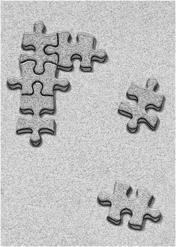
John, The two missing pieces do fit together with the other four pieces. An interesting thought about them not fitting. |
May 28th |
| 21 |
May 18 |
Reply |
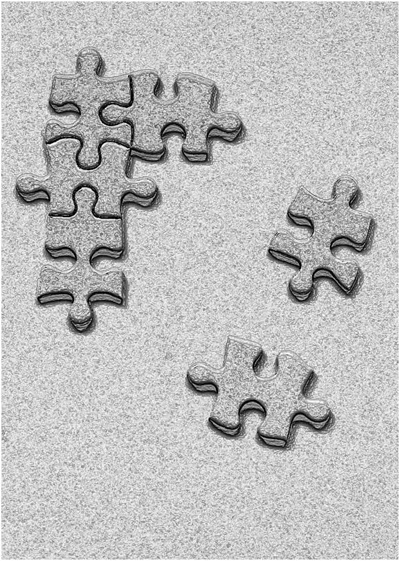
Nancy, On balance, I probably prefer this version as it is compositionally and visually stronger. Clearly, this process illustrates the value of Study Groups and the iterative discussion that takes place between its members. |
May 17th |
| 21 |
May 18 |
Reply |
Nancy, On balance, I probably do like this one better as the composition and visual story are stronger. This iterative process clearly illustrates the value of a Study Group in the sharing of ideas between its members. |
May 17th |
| 21 |
May 18 |
Reply |
Nancy, I have moved the offending piece lower in the frame for comparison. |
May 17th |
 |
| 21 |
May 18 |
Reply |
Nancy, Having looked at the image again and on reflection, I think I favour the non-blurred version. |
May 15th |
| 21 |
May 18 |
Reply |
Nancy, Thank you for your kind words. The reason I added the blur on one of the pieces was to try to add to the visual story. I have included the non-blurred version for interest. |
May 15th |
 |
| 21 |
May 18 |
Reply |
Marie, Thank you for your comments. |
May 15th |
| 21 |
May 18 |
Reply |
Joan, Thank you for your comments. Interesting that you saw the lower piece escaping from the pack and not trying to join it. Hence your comment about the blur. |
May 15th |
| 21 |
May 18 |
Comment |
John, I quite like the way that your use of Topaz Adjust has created an effect that makes the pitcher appear to pop out of the surreal into the real. The granular, soft-focus background, including the single fielder, works well to create a sense of environment without distractions. Your camera settings were well chosen to freeze the ball in mid-air. There is a translucent quality to the main subject that is visually appealing. I think I would like to have seen a little bit more contrast in the red to make him pop forward even more. |
May 12th |
| 21 |
May 18 |
Reply |
Nancy, You are very kind.
|
May 11th |
| 21 |
May 18 |
Comment |
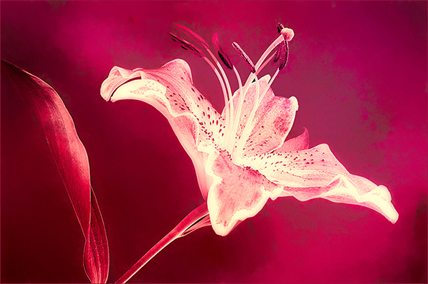
Marie, You have used your technical skills well to create an artistic image that is very appealing. I love the overall toned monochrome feeling that you have achieved and the compositional strength of the image. There is a wonderful light and shade through the flower which draws me in and holds my attention. I like images that work as well and sometimes better when flipped or rotated. I have taken the liberty to include a ninety degrees clockwise rotation to show what I mean. Congratulations and well done. |
May 10th |
 |
| 21 |
May 18 |
Comment |
Nancy, This is an interesting image which I like very much. It ticks the technical boxes of exposure, sharpness, colour saturation, etc., yet it goes beyond a mere record into something else with a unique visual story. Your placement of the horse and rider in the lower left quadrant would normally make the image compositionally weak and reduce the overall visual dynamic as the horse is riding out of (and not into) the picture. However, this is saved by the fact that the rider is pulling on the reins to halt the forward movement of the horse and at the same time is looking over his shoulder to wonder at the visual story that is unfolding in the sky behind him. I like the way that the horse and rider have dominance as foreground interest and the way that the main story (at least for me) is being told by the horses (at reduced opacity) in the sky. The visual story for me is that you can almost hear the rider shouting 'Whoa!' to his horse as he wants to retrieve the escaping, riderless horses in the sky. A title suggestion would be 'Onwards and Upwards'. Congratulations and very well done! |
May 10th |
| 21 |
May 18 |
Comment |
Joan, I like your idea of 'The Red Balloon' as the title for an Audio-Visual sequence. This offers endless opportunities to follow the balloon on its travels around the world. In this image, I like the inclusion of one splash of colour in an otherwise monochrome image which adds credence and dominance to the red balloon. I also quite like the visual disconnect in the lighting; the bright highlight on top right of the balloon as opposed to the dark shadow on top right of the Statue of Liberty. Compositionally, it works well as the statue is off-centre in the frame and the balloon is placed in the top left quadrant. The plain, unobtrusive background works a treat. Well done. |
May 10th |
| 21 |
May 18 |
Reply |
Dear Sharon, Thank you for your kind words about my image on Group 21 which are much appreciated. I am glad you liked it and pleased that it has resonance with your current work. Thank you also for your kind words about my draft article for the June issue of PSA Journal. I am on FB and I would be delighted to receive a friend request. Your image for May is lovely; it ticks the technical boxes and has an appealing visual story. Congratulations and well done. |
May 9th |
4 comments - 10 replies for Group 21
|
| 52 |
May 18 |
Comment |
Dear Sharon, Thank you for your kind words about my image on Group 21 which are much appreciated. I am glad you liked it and pleased that it has resonance with your current work. Thank you also for your kind words about my draft article for the June issue of PSA Journal. I am on FB and I would be delighted to receive a friend request. Your image for May is lovely; it ticks the technical boxes and has an appealing visual story. Congratulations and well done. |
May 9th |
1 comment - 0 replies for Group 52
|
5 comments - 10 replies Total
|


