|
| Group |
Round |
C/R |
Comment |
Date |
Image |
| 21 |
Apr 18 |
Reply |
Marie, Given what you had to work with originally, you have done exceptionally well to get the end result that you have. Compositionally, I quite like the S-shaped curved lead-in line of the water's edge on the right hand side which takes our eyes towards the Angkor Wat Temple. |
Apr 23rd |
| 21 |
Apr 18 |
Reply |
John, I tried Inverting your image and it worked better for me than your positive version. What do you think? |
Apr 22nd |
 |
| 21 |
Apr 18 |
Reply |
Nancy, Thank you for your kind words which are much appreciated. Like you, I was drawn to the overall simplicity of this lamp hanging on the farmhouse wall. Sometimes, you find subjects that speak to you before you have even pressed the shutter. |
Apr 22nd |
| 21 |
Apr 18 |
Reply |
Marie, Many thanks for your kind words. |
Apr 21st |
| 21 |
Apr 18 |
Comment |
Marie, We had a holiday in Cambodia several years ago and spent two whole days photographing the temples at Angkor Wat. What a fabulous place for taking pictures! I suspect that I stood on the same spot as you did and took a similar picture. I like the way that you have taken the original and then applied your techniques to create something that transcends reality. I get a sense that I am at the edge of an oasis in the desert and standing at a watering hole looking over at an ancient ruin. Well done. |
Apr 19th |
| 21 |
Apr 18 |
Comment |
Nancy, There is a lovely tactile quality to your image which I like very much. Compositionally, your decision was correct to flip it horizontally to maximize the left-to-right visual flow through the picture. There is a greater hue and tonal depth to the 'after' flower which is most appealing. I like the loose border which has the feeling of a posterized gradient. Well done. |
Apr 19th |
| 21 |
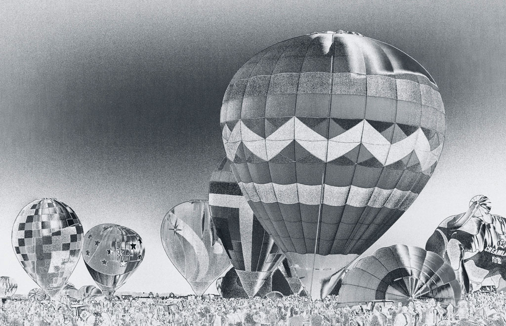
Apr 18 |
Comment |
John, You are to be congratulated in trawling through the various filter effect options to find something that was different and which you liked. However, this doesn't work for me as the wonderfully saturated colours typical of air balloons have been reduced to a rather flat and lacklustre monochrome. This is a real pity as I wanted to enjoy the colour spectacular that was obviously present at the time of taking the picture. |
Apr 19th |
| 21 |
Apr 18 |
Comment |
Barrie, This is a very striking image and one that catches and holds the attention. I love the inverted blue tones of the foreground and mid-ground but I am not attracted to the lime green tone of the mountains in the background. This is too much of a visual jar for me. The negative effect of the trees in the foreground is stunning and has the feeling of infra-red which I like anyway. Similarly, the curves on the sand dunes are lovely. Well done on two thirds of the image. |
Apr 19th |
| 21 |
Apr 18 |
Reply |
Marie, That sounds like a good idea. Many thanks.
|
Apr 19th |
| 21 |
Apr 18 |
Comment |
Joan, As a technical exercise this composite works and demonstrates that you have put a lot of work into its creation. However, pictorially I am not sure whether it works for me as I find the elements in the image somewhat disparate and unconnected. I tend to agree with Marie that there are other potential images within this one that could be developed. |
Apr 19th |
5 comments - 5 replies for Group 21
|
5 comments - 5 replies Total
|


