|
| Group |
Round |
C/R |
Comment |
Date |
Image |
| 21 |
Jan 18 |
Reply |
John, Thank you for your comments. I decided to stay with the original colours of blue sky and sandy coloured wheat field. However, I will try different colours to see how they work. |
Jan 27th |
| 21 |
Jan 18 |
Reply |
Alan, Thank you for your comments which are much appreciated. It is good to have a fresh input as sometimes we can't see the wood for the trees. Seems as though you are having an interesting time at the moment weather-wise. |
Jan 27th |
| 21 |
Jan 18 |
Comment |
Alan and Joan, Whenever you use someone else's art work, it is imperative (certainly in the context of photographic competition) that you also incorporate something of yourself into the final composite. I would suggest that there is nothing new in photography and arguably it has all been done before. Stimuli are all around us and from which we draw inspiration for our photography. With Joan's picture, although the original sculpture is someone else's art work, Joan has added something of herself via the kaleidoscope effect, Layers and Channels to create something unique. While I would agree that to just use someone else's art work alone should be disqualified in competition, I disagree with the carte blanche approach to disqualify all images that contain someone else's art work per se. If this was the case, then competition at all levels would whither on the vine ... |
Jan 21st |
| 21 |
Jan 18 |
Reply |
Joan, Thank you for your kind words which are much appreciated. |
Jan 15th |
| 21 |
Jan 18 |
Comment |
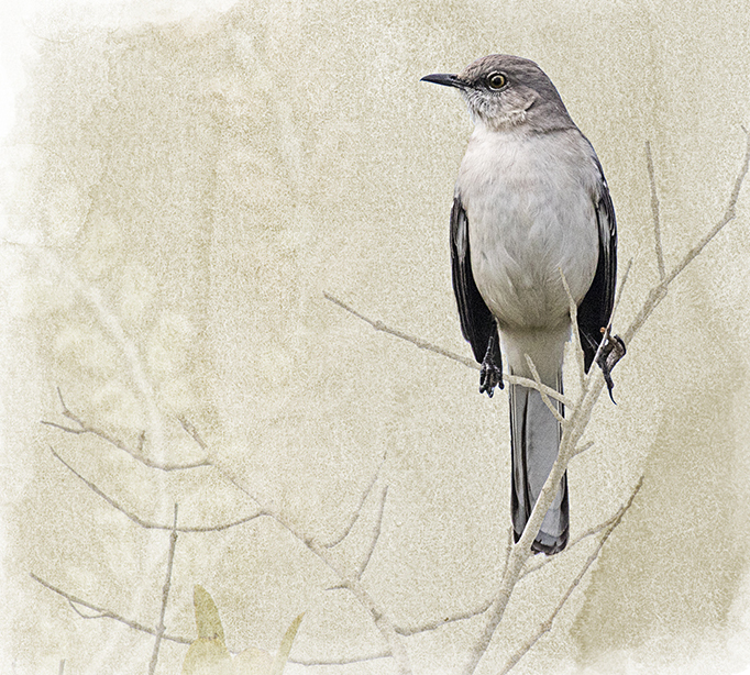
Nancy, There is a clean freshness about your image that I like. The bird is perfectly positioned in the frame with space on the left to look into which adds to the overall visual dynamic. I like the way that the bird is tonally strong in the picture and how it stands out perfectly from the muted, subtle and granular background. I wondered whether the image would have been stronger without the white border which I find a little distracting and I have taken the liberty of cropping the image to give a flavour of what I mean. |
Jan 14th |
 |
| 21 |
Jan 18 |
Comment |
Marie, This is a lovely image that I like very much. You have created something that is beautifully tactile which transcends from being a mere record of a 'Bird on a Stick'. Compositionally, the visual flow is perfect with the bird's off-centre placement increasing the overall visual dynamic. The detail on the bird's plumage is enchanting and the catch-light in the eye is perfect. The abstract shapes and colours in the background provide the ideal foil against which the bird can perform. Congratulations and very well done on producing such a beautiful image that I enjoyed very much. |
Jan 14th |
| 21 |
Jan 18 |
Comment |
Alan, This is another thought-provoking image which for me has continuity and discontinuity within it. I love the boy looking through the window space at the desert horizon and the way that you have arranged the chess pieces at different opacities in the azure gradient sky with the Queen coming towards the viewer and the pawn receding from the viewer. This would be sufficient for me as it alone would make for a powerful visual composition. I find that the pictures on the walls adds confusion to that simple story. It is interesting how you have opposing reference points on the walls; a Muslim cleric in the left picture and a naked female model in the right picture, almost facing off against each other and competing for our attention. Similarly, it is interesting how the bright door frame on the left hand side takes my eye out of the picture. The red apple(?) in the lower left hand corner seems to be floating above the ground and its shadow is at variance with that of the boy, presumably both created by the same light source. Perhaps that was your intention and that is fine. |
Jan 14th |
| 21 |
Jan 18 |
Comment |
John, I commend you on the process of converting the original to the final image. It sounds as though it proved to be a labour of love. I quite like the moonlit lighting effect that you have created, that on the trees behind the barn almost having the feeling of pseudo infra-red. It is good that the barn door is the brightest part of the image as it has a controlling impact on our visual attention. The various elements in the picture look as though they have been stuck on a blank canvas, which is a slight pity. Not sure about the sky. |
Jan 14th |
| 21 |
Jan 18 |
Comment |
Barrie, Compositionally, this image works well as you have positioned the figure off-centre in the frame which adds to the overall visual dynamic. There is an interesting visual story here with the lady reaching upwards towards the tree canopy as if stretching for the forbidden fruit. I like the interplay of greens and blues but I am less happy with the pink foliage and how this bleeds down into the subject's hair. There are some interesting shapes in the green boulders at the base of the picture. |
Jan 14th |
| 21 |
Jan 18 |
Reply |
Marie, Thank you for your kind critique which is much appreciated. |
Jan 14th |
| 21 |
Jan 18 |
Comment |
Joan, I love your image which is so creative. It is crisp, clean and shows enviable imagination. I like the kaleidoscope effect that you have achieved, the visual story of which draws me in. I particularly like the contrast between the irregularity of the original sculpture and the regularity of the spheres. Compositionally, your choice of three spheres works very well and, being of different sizes, creates an interesting visual triangle of interest. The spotlight on the background adds depth to the image. Congratulations and very well done. |
Jan 14th |
7 comments - 4 replies for Group 21
|
7 comments - 4 replies Total
|


