|
| Group |
Round |
C/R |
Comment |
Date |
Image |
| 21 |
Dec 17 |
Reply |
Nancy, Thank you for your kind words which are very much appreciated. See my later comment regarding how others have interpreted this image. |
Dec 12th |
| 21 |
Dec 17 |
Comment |
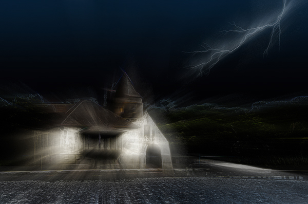
When we see a picture for the first time, we normally interpret what we are viewing in light of our own life experiences. We don't necessarily see it as a mere record but feel it as an emotion, a feeling or a mood. I often give talks to Camera Clubs and Photographic Societies and during the half-time interval, I put one of my prints on the stand and invite the audience to say what they think it might be. This image is one such example. I thought you might like to share other peoples' perceptions of this particular image:
... Napoleon's retreat from Moscow; DNA gone wrong; Somewhere in Switzerland; Fence posts in snow; People on frozen lake; Trooping colour in London; Barometric readings; Little Red Riding Hood and wolves; DNA analysis; People in snow; Sense of space; Ruined town; Saint Petersburg; Bar code; Pine forest; Pencils; Skyscrapers; Central Park; Ice skating; Reversed picture; Moses in bulrushes; Barcode orgy; Buildings; People queuing ...
We all see different things in pictures and that is the joy of photography and photographic interpretation. |
Dec 12th |
| 21 |
Dec 17 |
Reply |
Marie, I agree with Alan that in Western Cultures where we read/write from left-to-right, we expect to see the visual flow and diagonals in our pictures following a similar convention. The lighting bolt in the top right quadrant stops our attention wandering out of the frame. It is worth remembering also that our eyes are always drawn to the brightest part(s) of a picture which in this case are the white areas of the house. This creates circularity within the image and makes it compositionally stronger. |
Dec 10th |
| 21 |
Dec 17 |
Reply |
Nancy, When you let Alan know how to do it, please include me as well. I am still trying to get to grips with your use of rectangular brush strokes ... |
Dec 10th |
| 21 |
Dec 17 |
Reply |
Alan, I can see why you may think that the man's shoeless foot is dominant but I don't have the same sense of distraction that I had before with your previous iteration. If that is an issue, perhaps there might be a case for toning down the left foot to the same opacity as the right foot. This would channel the viewers' attention even more towards that wonderful face. Overall, I don't have a problem with there being no real bottom to the picture. I quite like the visual migration from translucent to clear. The opacity of the left foot works for me as part of that transition. |
Dec 10th |
| 21 |
Dec 17 |
Reply |
Marie, This is a compositionally stronger image with the lightning bolt in the upper right quadrant. The difference in orientation of glow from the house and lightning bolt could be tweaked by rotating clockwise the lightning bolt Layer and dropping it slightly such that it breaks the top right hand side of the frame. As I don't have access to this Layer, another way of helping would be to apply Radial Zoom Blur to the whole image and centred on the house. I have attached such a version to give a flavour of what I mean. Hope it helps. |
Dec 10th |
 |
| 21 |
Dec 17 |
Reply |
Marie, Thank you for your kind words which are very much appreciated. Delighted to read that you found it thought-provoking. I quite like it when images start life in one dimension and then go off at a tangent the more you think about them. |
Dec 10th |
| 21 |
Dec 17 |
Comment |
Marie, Welcome aboard to our Group and I hope you find the experience rich and rewarding. Your first offering certainly has impact and draws me in to explore the various elements of the composite. I particularly like the effect that you have achieved on the house and the inclusion of the lightning bolt. Compositionally, I would like to have seen the lightning flipped horizontally into the top right quadrant. This would add credence to the orientation of the motion blur from the lightning and that emanating from the windows. I like the rich saturated colours which work well and add to the visual dynamic of the image. Well done. |
Dec 7th |
| 21 |
Dec 17 |
Comment |
Nancy, There is a wonderfully Oriental overtone to this image which I find very attractive. I like the way that you have placed the screen within the frame and the way that the flower appears to be on one plane which visually disconnects with the fan-fold of the screen. The purple colour and the reflections add gravitas to the composite. Having lived in Hong Kong for nearly four years, I can identify with exotic flowers on screens. I find the image surprisingly relaxing. Congratulations and very well done. |
Dec 7th |
| 21 |
Dec 17 |
Comment |
Alan, This is now a cracking image which gets my vote. I love the added mystery created by the softness around the bag which draws me in. The colours are lovely, the technique has been very well executed and I like the attitude you have caught on the facial expression of the cigar smoking Cuban. Wherever my eyes wander around the image, they are always drawn back to the man's face. Congratulations and very well done. |
Dec 7th |
| 21 |
Dec 17 |
Comment |
Joan, Your original image provides an excellent start point for your composite. I particularly like the lighting, the compositional simplicity and the visual story that ensues. Clearly, Van Gogh provided a good source in influencing your creativity. Topaz Impressions has been used to good effect to create an image that stretches the visual boundaries. I quite like the texture that you have created on the tree and earth in the lower third of the picture and in the sky. However, I wonder whether the effect has been taken a little too far on the circles in the sky, the middle of which is quite bright and a little distracting. Interestingly, the more I look at your image, the more I am conscious of the yellow 'question mark' shape in the upper left side of the image. |
Dec 7th |
5 comments - 6 replies for Group 21
|
5 comments - 6 replies Total
|


