|
| Group |
Round |
C/R |
Comment |
Date |
Image |
| 21 |
Nov 17 |
Reply |
Joan, Thank you for your comments which are much appreciated. It is an interesting thought to make the eye symmetrical like a cyclops. That would be scary ... When you use Photoshop Spherize, it is a good idea to play around with the slider to get the inner or outer effect that suits and to apply the effect twice. Â |
Nov 19th |
| 21 |
Nov 17 |
Reply |
Marie, Thank you for your comments which are much appreciated. When I created this image, the last element to be added was the eye in the sky. Consequently, the eye was not reflected in the spheres which perhaps in a strange sort of way adds to the visual dynamic and mystery of the image. I like the idea of a bird flying by, reflected in the spheres and providing a continuation of the diagonal lead-in line into what would become a portrait format picture. Sorry to hear that your study group is being dismantled. Fortunately, their loss is our gain and I look forward to working with you from next month. |
Nov 17th |
| 21 |
Nov 17 |
Reply |
Charles, Many thanks for your kind words which are much appreciated. |
Nov 12th |
| 21 |
Nov 17 |
Comment |
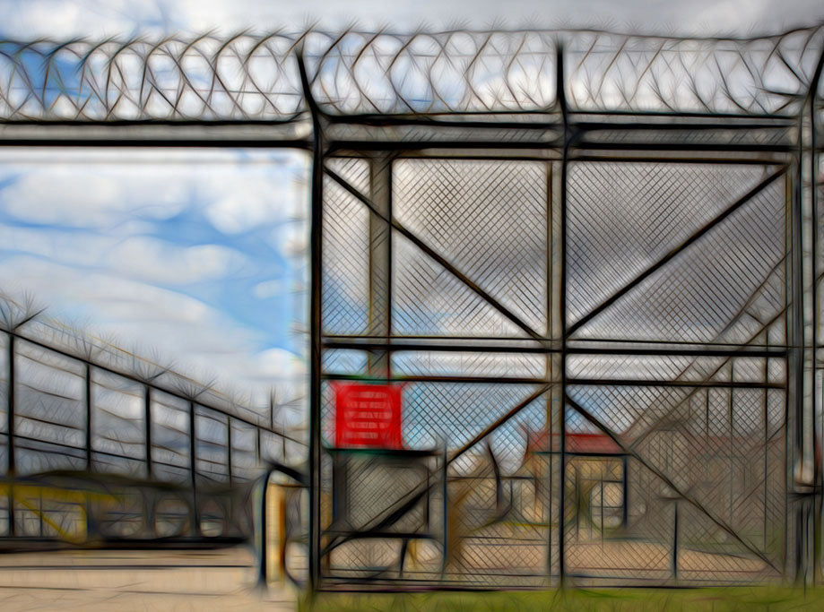
John, I quite like the effect you have created with Topaz Glow which is not unlike the result you get with Fractalius Filter. The simplicity works for me as it is an image of pattern, shape, repetition and texture which is enhanced by the lack of a human element. Compositionally, I would be inclined to crop a little off the left hand side to make the red sign a little less central, to straighten the left-hand upright of the gate and to level the roll of barbed wire at the top of the frame. This would increase the overall visual dynamic. I have taken the liberty of attaching these tweaks. |
Nov 12th |
 |
| 21 |
Nov 17 |
Comment |
Nancy, Don't stop using your brushes as your resulting images are truly lovely. There is a wonderfully romantic tranquillity to this image reinforced by the choice of subtle muted colours. The gradient of soft colours in the background is delightful and contrasts perfectly with the pink sharpness of the flower. Compositionally, I like the way that you have placed the flower in the lower part of the frame and how you have used the stroked rectangle to link it with the background. The positive space around the edge of the frame works a treat. Congratulations and well done. |
Nov 11th |
| 21 |
Nov 17 |
Comment |
Alan, Despite the fact that he is a poser, you have captured the essence of this cigar-smoking Cuban character very well. The expression on his face and his body language are priceless. I like the way that the sharpness of the main character seems to be emerging from the impressionistic abstract background, the subtle muted colours of which are lovely. I agree with Nancy that the sharpness and dominance of the shoe in the foreground is a bit distracting. That may have been your intention and that is fine. However, I wondered if the shoe had been cloned out completely whether this would add to the overall visual story and visual dynamic of the picture. The viewer would be left wondering whether this chap only had one shoe or where was his other shoe? Overall this is a lovely image, without the foreground shoe. |
Nov 11th |
| 21 |
Nov 17 |
Comment |
Joan, As a photographer who has a reputation for 'Not doing sharp' it will come as no surprise that I love this image. I like the way that you have vertical motion blur in the background forest and horizontal motion blur in the foreground egret. This creates an interesting visual disconnect which I find very pleasing. I love the range of Autumnal colours in the background foliage and the hint of silver tree trunks. Your decision was a good one to remove the blurred movement on the bird's head as this provides a point of sharpness within what is otherwise an image full of movement. The bright area immediately behind the egret's neck is a little distracting and I would have been inclined to tone it down a touch. Congratulations and well done in producing an image that is visually full of emotion, feeling and mood. |
Nov 11th |
| 21 |
Nov 17 |
Reply |
Nancy, Thank you for your comments. I can well understand why you may think that this composite is a bit scary. As far as I recall, I didn't have any ulterior motive in its creation. It was merely a technical exercise playing around with negatives, Flood Filter, spheres, an eye in the sky and breaking the physical boundary of the frame. Perhaps I need to rethink whether there actually is a deeper meaning behind it all. I will be interested to read the views of others in the group. |
Nov 11th |
4 comments - 4 replies for Group 21
|
4 comments - 4 replies Total
|


