|
| Group |
Round |
C/R |
Comment |
Date |
Image |
| 56 |
Jul 19 |
Reply |
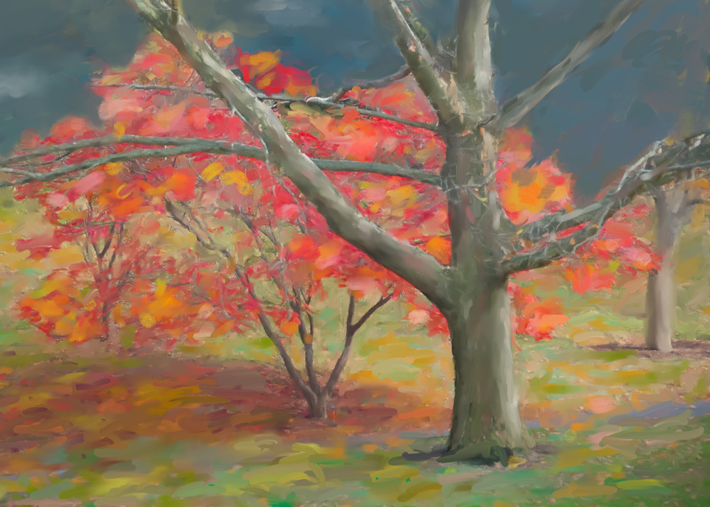
Thanks Pat. Painting stripes is easier than painting plaid! |
Jul 16th |
| 56 |
Jul 19 |
Reply |
Good point, Terry. |
Jul 13th |
| 56 |
Jul 19 |
Reply |
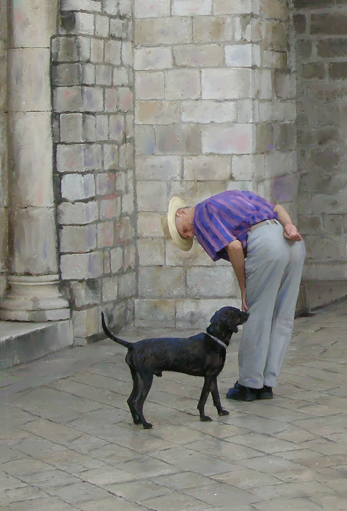
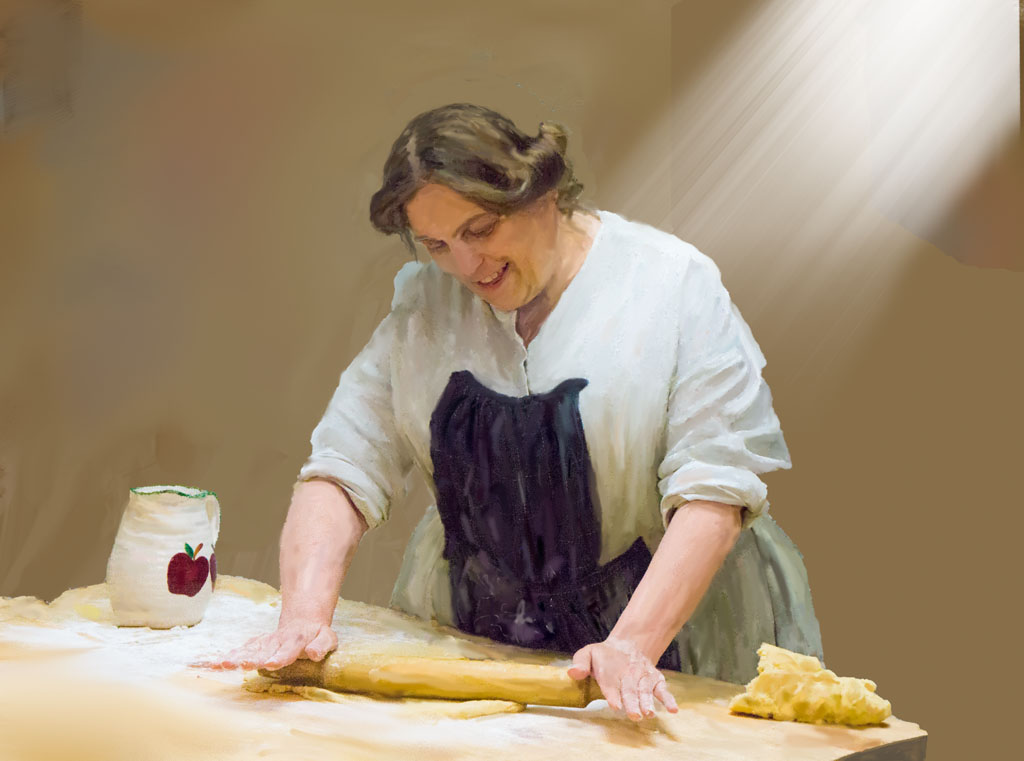
Thank you Cyril and Terry. I appreciate your comments. As for the man's shirt, for some reason I do not like plaid. |
Jul 11th |
| 56 |
Jul 19 |
Comment |
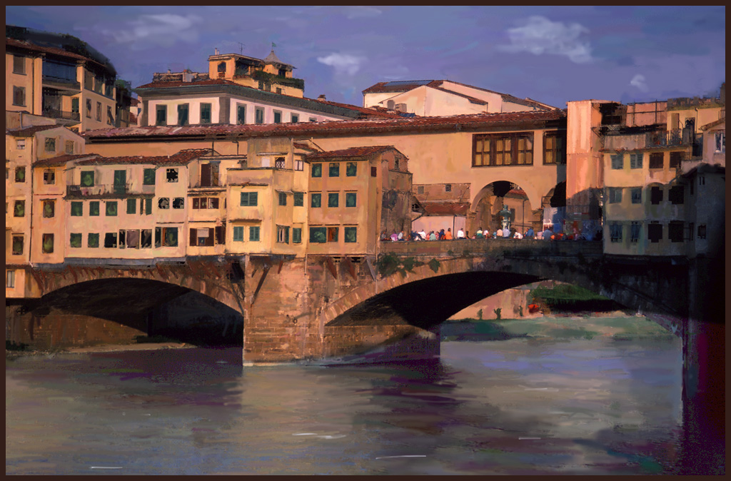
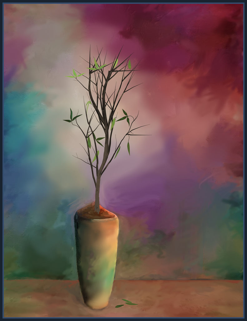
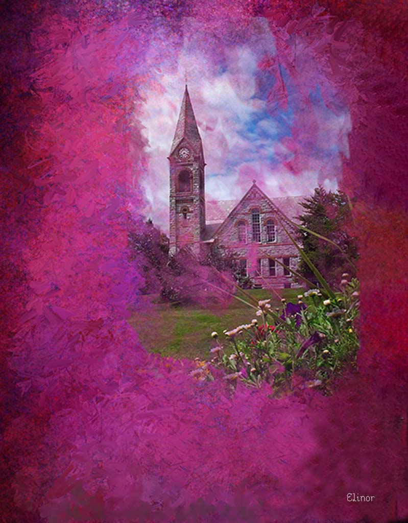
Pat, the simplified, more graphic version of the scene is definitely more interesting than the bland, original photo. Also, by darkening the foreground, you have given more emphasis to all those houses. One slight, easily corrected problem is that the buildings on the left are not straight. Otherwise, a delightful painting. |
Jul 11th |
| 56 |
Jul 19 |
Comment |
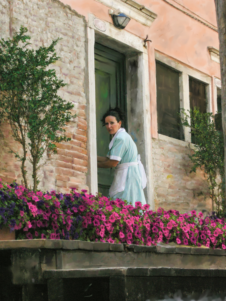
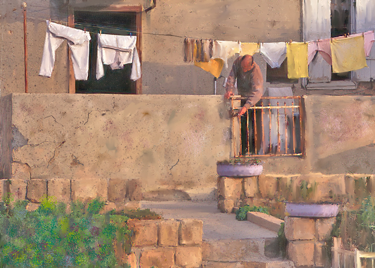
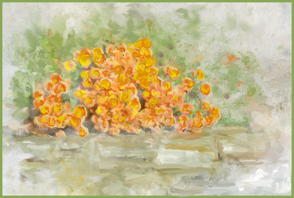
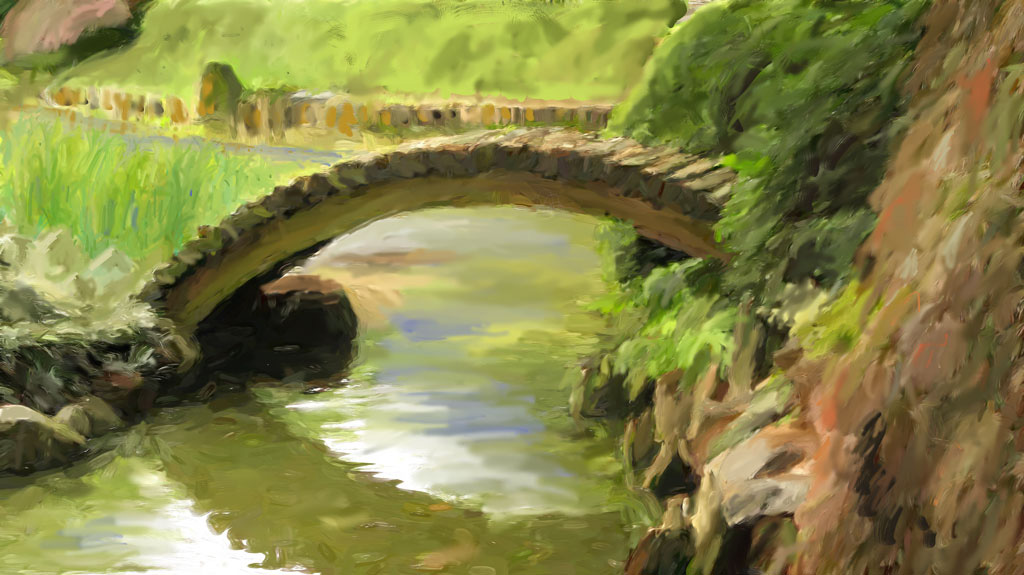
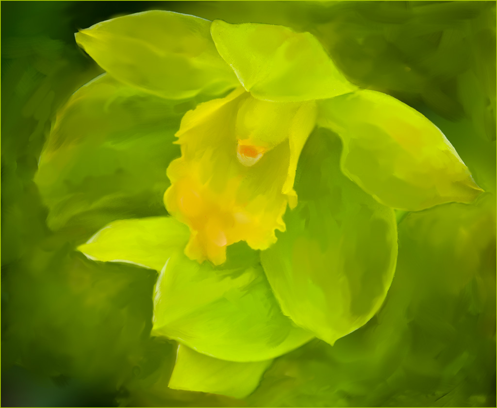
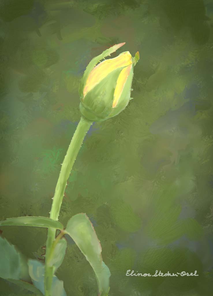
This is a delightful scene, made even more lovely by the soft, watercolor effect. The diagonal line of steps, leading our eye to the yellow bush, is an important part of your composition. |
Jul 11th |
| 56 |
Jul 19 |
Comment |
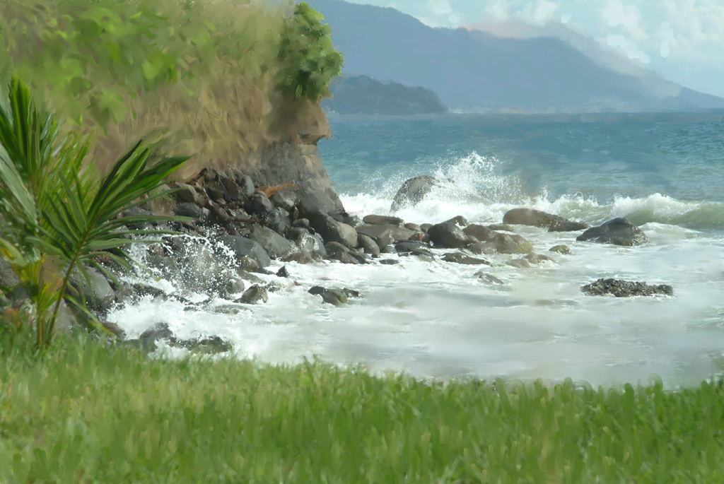
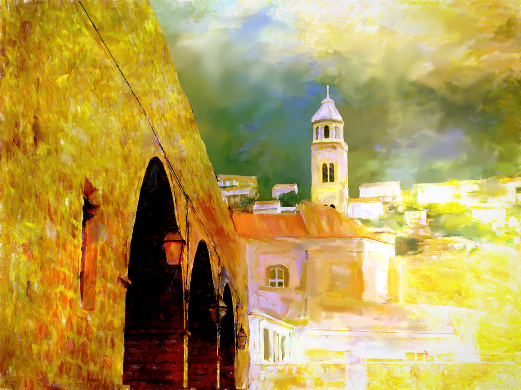
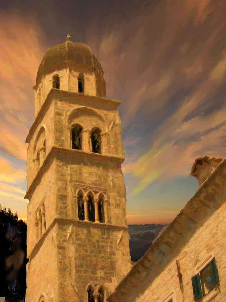
Gerhard, your vibrant colors and your lively brush strokes make this an exciting image. I agree with Terry that darkening the foreground would give more depth to the scene. One other suggestion: I feel that the heavy brush strokes on the sky make it look more like water than sky. I'd like to see smoother skies unless you want to create a stormy effect. But overall, the painting is dynamic. |
Jul 11th |
| 56 |
Jul 19 |
Comment |
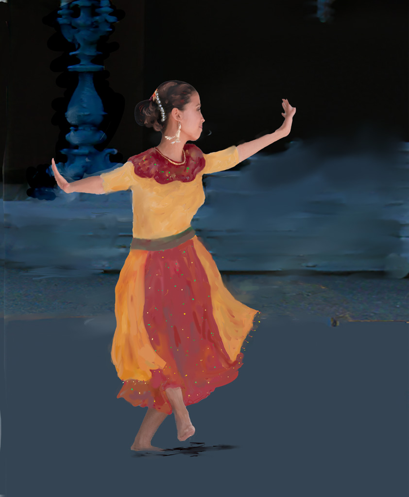
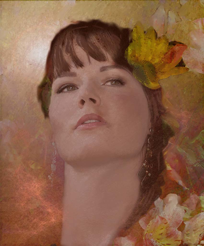
This is a fabulous portrait, Terry. The two diagonals framing him, the cropping and simplification of the background, and the intensity of the color all contribute to its effectiveness. |
Jul 11th |
4 comments - 3 replies for Group 56
|
4 comments - 3 replies Total
|