|
| Group |
Round |
C/R |
Comment |
Date |
Image |
| 5 |
Aug 18 |
Comment |
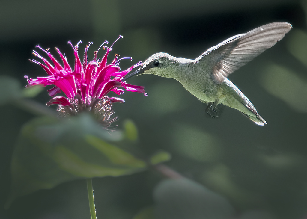
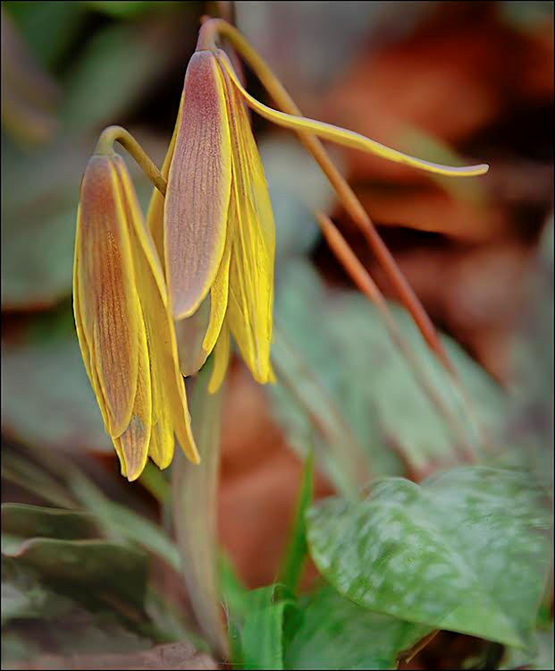
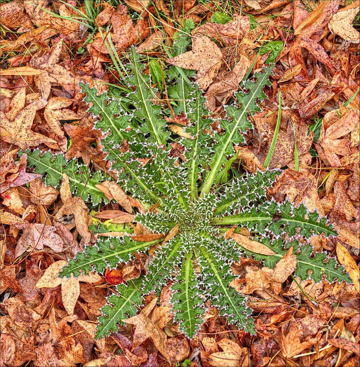
Oliver, you evaluated my picture for the month in group 28, and as I was looking up your images to see what kind of shooting you do, I realize that I have already examined this image with the beautiful lighting one day when I was just checking around. I love the poppy, and this shot is just wonderful, with the side and back lighting and all the details and colors. I am glad you removed some of the distractions. You asked if enough had been taken out, and I suggest that you remove one more.....the bright colored weed that goes up and seems to touch the bottom of the bloom. With this lovely flower, you could remove as much as you want, and still have a great shot, leaving just the main stems. Good job with dof, as I assume you were hand-holding. |
Aug 12th |
1 comment - 0 replies for Group 5
|
| 28 |
Aug 18 |
Reply |
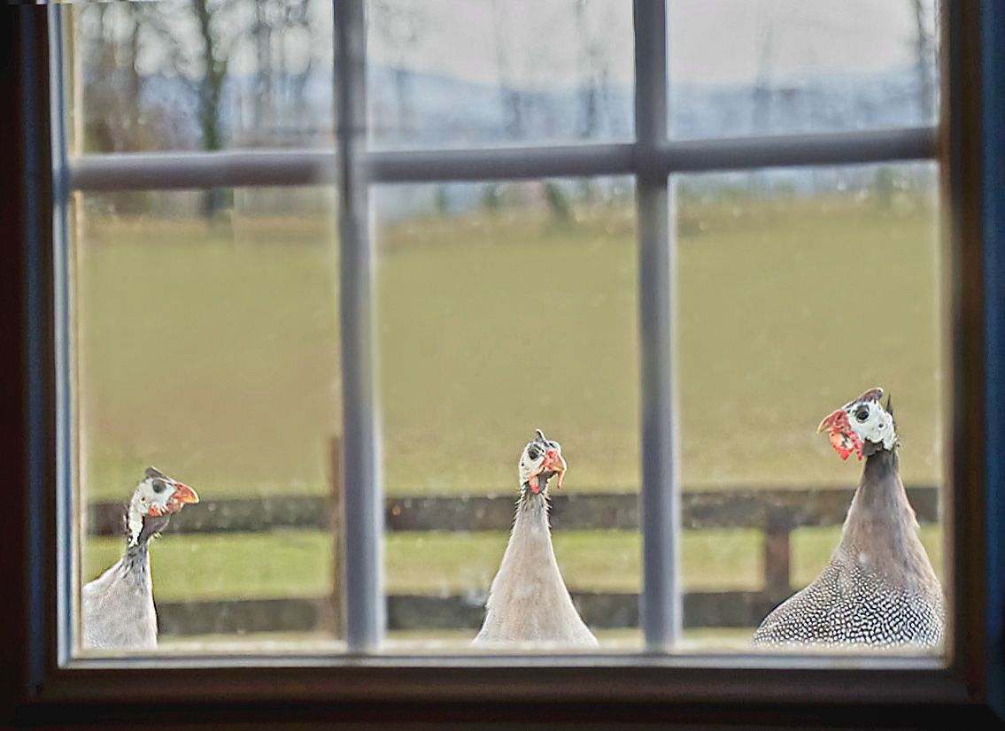
Alice, the background was the grass in the yard behind the objects. It just blurred due to shallow dof. I didn't manipulate the background, just squatted down to get the shot and be on the level of the zinna. |
Aug 27th |
| 28 |
Aug 18 |
Reply |
Thanks Shelia, and I like your angle! |
Aug 14th |
| 28 |
Aug 18 |
Comment |
Lovely color and sharpness of the blossom. I might have a tendency to do something completely 'artsy' with this image, such as change the entire background, or crop as a pano, or perhaps change the background to black and white, or to a pencil drawing. It's ok as is, but I find the outlines of the leaves distracting. The blossom is especially nice, and the color red is not often rendered by my camera this well. Nice job with the blossom. |
Aug 12th |
| 28 |
Aug 18 |
Comment |
This is my favorite of the month. What a cozy, old book-smelling looking place! This would be a place I could enjoy exploring. I like the muted colors, the warmth, and all of the things to look at walking down this hallway. The depth of the image is wonderful. Well-done! |
Aug 12th |
| 28 |
Aug 18 |
Comment |
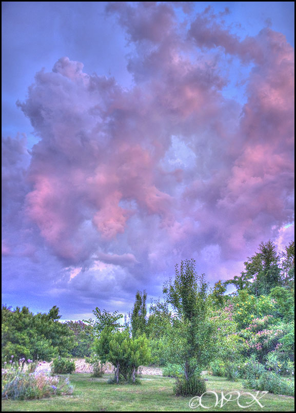
Great job with all those exposures and getting them fit together! I like the black and white better too. I am wondering if you might be able to do something to enhance the details in the clouds a little. It looks like you found a great place to shoot the skyline! I can only imagine what a shot from this place might look like at dusk, with all the city lights on! Might have to seriously decrease the speed, but the payoff would probably be some car light trails. |
Aug 12th |
| 28 |
Aug 18 |
Reply |
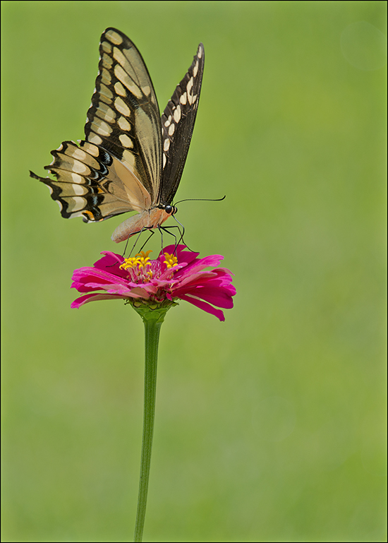
Thank you Oliver Morton! It's so good to have a visitor from other groups! I'm glad you enjoyed the shot. Butterflies are so pretty and dainty looking, with all the little appendages. I use back button focusing, and spot metering on the eye. Thanks for the suggestion about a lighter area around the stem, I hadn't noticed that, but will take under consideration.
|
Aug 12th |
| 28 |
Aug 18 |
Comment |
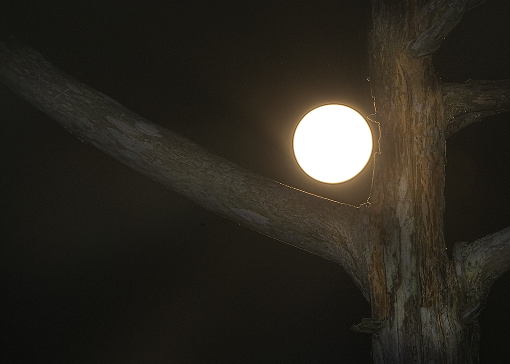
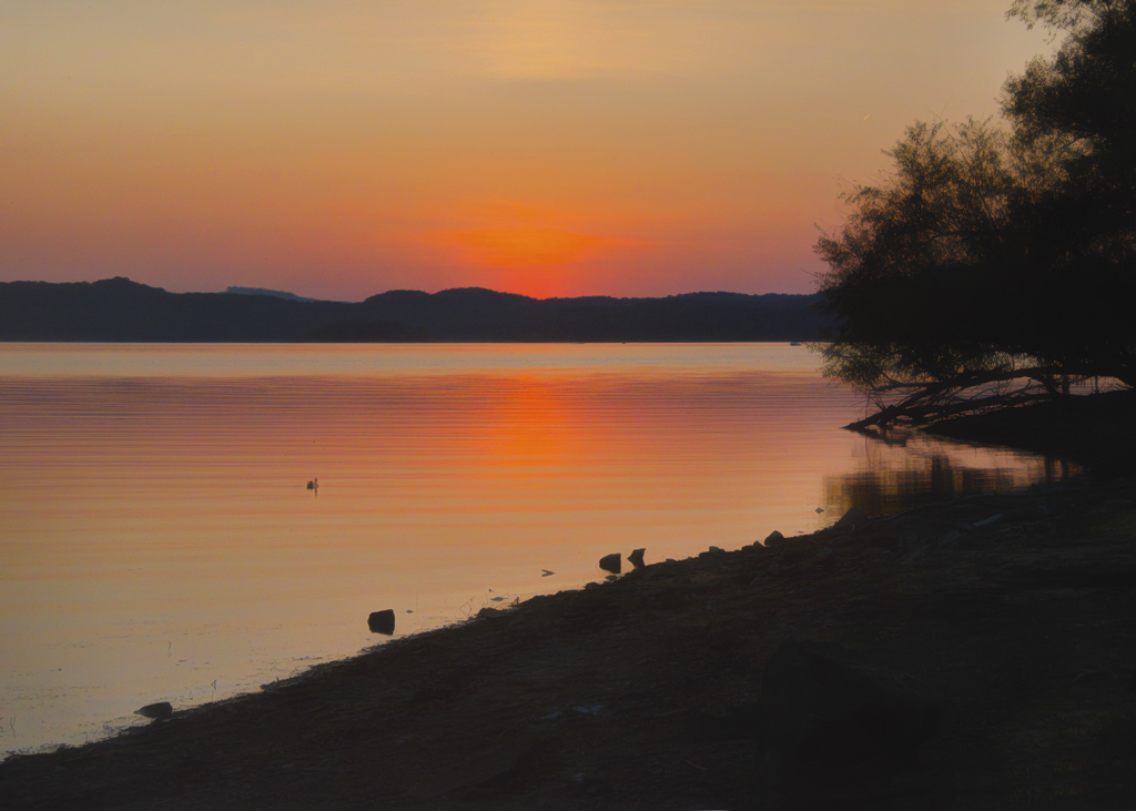
Nice exposure for the lighthouse and water, and I like the details. If you have cropped the image, you might consider retaining more landscape both at the bottom (would the two light reflections meet there perhaps?), and on each side (if the moon and reflection and the lighthouse and reflected light could be on the thirds of the image?), that might create a more dynamic image. As it is, I find my eye being drawn back and forth to both of the light areas. The other thing I wonder about sometimes is what is the best treatment for the moon......but I like the fading of yellow/orange around the moon, but not sure of the circle just inside the moon, unless it is all one color. I'm wondering if the moon color just came out that way, or if you did some enhancing? The moon seems too important in this image, and I might have a tendency to work toward lowering it's importance somehow. What a lovely place to get reflective, night time shots! The house is especially nice, and not blown out! |
Aug 12th |
4 comments - 3 replies for Group 28
|
| 46 |
Aug 18 |
Reply |
Thank you Don, I'll have to try that. |
Aug 21st |
| 46 |
Aug 18 |
Reply |
Thanks Paul. |
Aug 21st |
| 46 |
Aug 18 |
Comment |
The left side of the image is not disturbing to me, but looking at this image a second time, I am again, wondering in a general sense, if lines that bring the eye into an image on the left, which is the direction folks tell us we approach pictures from, should be less instead of more. This picture almost connects, but because of the wall at the end of the fireplace on the left, the lines are not strong connections. So, the question is, do you use those lines, or do you take the shot of just the walkway and arches which makes a nice composition by itself? If the entire fireplace was in the image, would we not then be looking at two pictures or subjects in one image? These are questions I have asked myself in the past as I am taking a picture......anyone else had this dilemma? |
Aug 21st |
| 46 |
Aug 18 |
Comment |
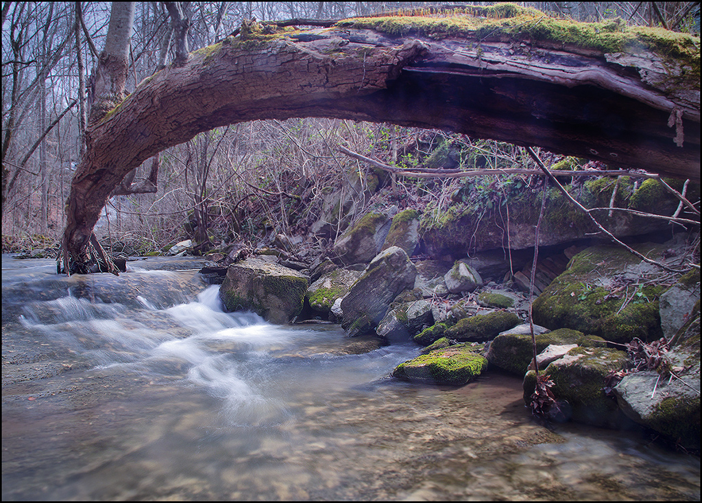
I have wondered in the past if an object such as the tree on the left of the image works well or not......and I suppose that it would be determined by each of our own ideas, feelings, and also each image. In this one, I think the tree on the left could be seen both ways, as an asset, as well as a distraction. Without the tree, I find that the mill becomes more important in the image, but with the tree, it definitely helps to keep the eye in the image, and stops the lines of the bridge and water from wandering out of the picture. Your thoughts? This is an issue that I have questioned myself about, and continue to do so at times when I have the option of leaving a tall element at the edge of an image. |
Aug 21st |
| 46 |
Aug 18 |
Comment |
All I can say Trey, is WOW! Wonderful details, and well-rendered! |
Aug 14th |
| 46 |
Aug 18 |
Reply |
You are probably correct Gary, maybe a bird flying into the trees? I'll have to consider it! Thanks Gary for your input. |
Aug 14th |
| 46 |
Aug 18 |
Reply |
Thanks Richard for your eval. |
Aug 14th |
| 46 |
Aug 18 |
Reply |
Thank you Trey for your suggestion. I'll have to try it! |
Aug 14th |
| 46 |
Aug 18 |
Comment |
Nice details in this image, especially I like the look of the paint, and the textures of the stones and wall. The reflection in the window panes does not bother my eye, and I love you captured the door at the bottom, with a stone keeping it closed. I agree with Richard, the simplicity of the image is refreshing. |
Aug 14th |
| 46 |
Aug 18 |
Comment |
Wonderful dof, and depth to the image, as well as repeating patterns. A delightful shot, with all the details in place! |
Aug 14th |
| 46 |
Aug 18 |
Comment |
It's always fun to try something different for. I like Richard's house removal, letting the tower have more emphasis. I like the waves in image #2. Nice details in the stone work and cliff, making the spot seem like a place to explore! |
Aug 14th |
| 46 |
Aug 18 |
Comment |
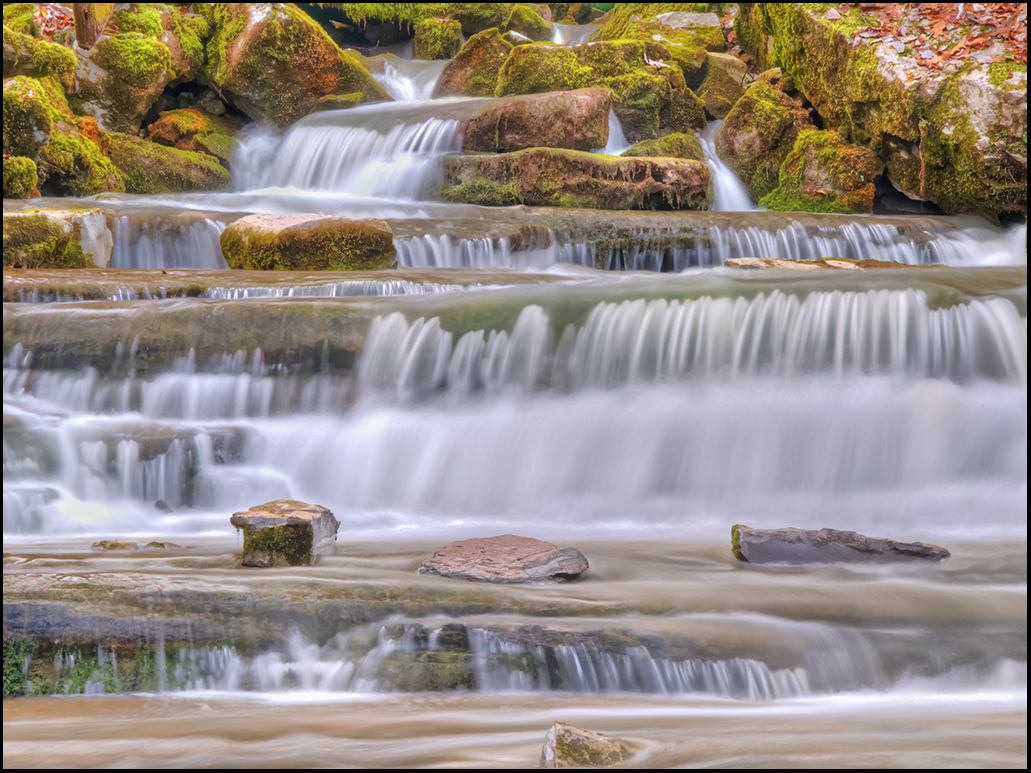
Well, I would be proud to have any of the three of these images. Well-done. I like Gary's changes with the tree and lead up to the mill on the left with the bridge, leaving the water. This is also one place that is still on my bucket list also. I like your treatment of the flowing water Don. |
Aug 14th |
7 comments - 5 replies for Group 46
|
12 comments - 8 replies Total
|